Sizing Tables, Borders, and Cells
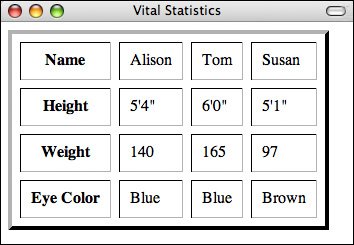
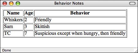
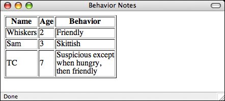
| With the basics out of the way, now you'll look at some of the attributes that can change the overall appearance of your tables. The attributes you'll learn about in this section control the width of your tables and cells, the amount of spacing between cell content and rows and columns, and the width of the borders. Setting Table WidthsThe table in the preceding example relied on the browser itself to decide how wide the table and column widths were going to be. In many cases, this is the best way to make sure that your tables are viewable on different browsers with different screen sizes and widths. Simply let the browser decide. In other cases, however, you might want more control over how wide your tables and columns are, particularly if the defaults the browser comes up with are really strange. In this section, you'll learn a couple of ways to do just this. The width attribute of the <table> element defines how wide the table will be on the page. width can have a value that is either the exact width of the table (in pixels) or a percentage (such as 50% or 75%) of the current browser width, which can therefore change if the window is resized. If width is specified, the width of the columns within the table can be compressed or expanded to fit the required width. To make a table as wide as the browser window, you add the width attribute to the table, as shown in the following line of code: Input <table border="1" width="100%">The result is shown in Figure 8.6. Output Figure 8.6. A table set to 100% width. Note If you make your table too narrow for whatever you put in it, the browser ignores your settings and makes the table as wide as it needs to be to display the content. It's nearly always a better idea to specify your table widths as percentages rather than as specific pixel widths. Because you don't know how wide the browser window will be, using percentages allows your table to be reformatted to whatever width the browser is. Using specific pixel widths might cause your table to run off the page. Also, if you make your tables too wide using a pixel width, your pages might not print properly. Note Specifying column widths in percentages is illegal under the XHTML 1.0 Strict specification. If you want to specify your column widths in that manner, use Transitional DTD or specify the widths in a style sheet. I'll discuss using style sheets in this manner further along in this lesson. Changing Table BordersThe border attribute, which appears immediately inside the opening <table> tag, is the most common attribute of the <table> element. With it, you specify whether border lines are displayed around the table and if so, how wide the borders should be. The border attribute has undergone some changes since it first appeared in HTML:
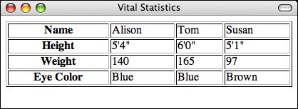
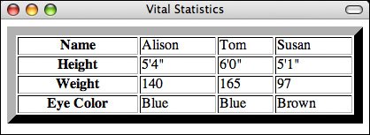
You can change the width of the border drawn around the table. If border has a numeric value, the border around the outside of the table is drawn with that pixel width. The default is border="1". border="0" suppresses the border, just as if you had omitted the border attribute altogether. Figure 8.7 shows a table that has a border width of 10 pixels. The table and border definition looks like this: Input <table border="10" width="100%">Output Figure 8.7. A table with the border width set to 10 pixels. You can also adjust the borders around your tables using CSS, with much finer control than the border attribute provides. Use of the CSS properties associated with borders isn't limited to tables, so I'm going to wait until Lesson 9, "Creating Layouts with CSS," to discuss them. Cell PaddingThe cell padding attribute defines the amount of space between the edges of the cells and the content inside a cell. By default, many browsers draw tables with a cell padding of two pixels. You can add more space by adding the cellpadding attribute to the <table> element, with a value in pixels for the amount of cell padding you want. Here's the revised code for your <table> element, which increases the cell padding to 10 pixels. The result is shown in Figure 8.8: Input <table cellpadding="10" border="1"> Output Figure 8.8. A table with the cell padding set to 10 pixels. A cellpadding attribute with a value of 0 causes the edges of the cells to touch the edges of the cell's contents. This doesn't look good when you're presenting text, but it can be useful in other situations. Cell SpacingCell spacing is similar to cell padding except that it affects the amount of space between cellsthat is, the width of the space between the inner and outer lines that make up the table border. The cellspacing attribute of the <table> element affects the spacing for the table. Cell spacing is two pixels by default. Cell spacing also includes the outline around the table, which is just inside the table's border (as set by the border attribute). Experiment with it, and you can see the difference. For example, Figure 8.9 shows our table with cell spacing of 8 and a border of 4, as shown in the following code: Input <table cellpadding="10" border="4" cellspacing="8"> Output Figure 8.9. How increased cell spacing looks. Note If you want to completely eliminate any whitespace separating content in table cells, you must set the table's border, cell padding, and cell spacing to 0. Laying out your tables this way is unusual, but it can be useful if you've sliced up an image and you want to reassemble it properly on a web page. Column WidthsYou also can apply the width attribute to individual cells (<th> or <td>) to indicate the width of columns in a table. As with table widths, discussed earlier, you can make the width attribute in cells an exact pixel width or a percentage (which is taken as a percentage of the full table width). As with table widths, using percentages rather than specific pixel widths is a better idea because it allows your table to be displayed regardless of the window size. Column widths are useful when you want to have multiple columns of identical widths, regardless of their contents (for example, for some forms of page layout). Figure 8.10 shows your original table from Figure 8.1. This time, however, the table spans 100% of the screen's width. The first column is 40% of the table width and the remaining three columns are 20% each. To accomplish this, the column widths are applied to the heading cells as follows: Input <table border="1" width="100%"> <caption>Vital Statistics</caption> <tr> <th width="40%">Name</th> <th width="20%">Height</th> <th width="20%">Weight</th> <th width="20%">Eye Color</th> </tr> </table> Output Figure 8.10. A table with manually set column widths.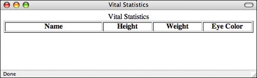 What happens if you have a table that spans 80% of the screen, and it includes the same header cells (40%, 20%, 20%, and 20%) as in the preceding example? Revise the code slightly, changing the width of the entire table to 80%, as shown in Figure 8.11. When you open the new table in your browser, you'll see that the table now spans 80% of the width of your screen. The four columns still span 40%, 20%, 20%, and 20% of the table. To be more specific, the columns span 32%, 16%, 16%, and 16% of the entire screen width: Input <table border="1" width="80%"> <caption>Vital Statistics</caption> <tr> <th width="40%">Name</th> <th width="20%">Height</th> <th width="20%">Weight</th> <th width="20%">Eye Color</th> </tr> </table> Output Figure 8.11. A modified table with manually set column widths.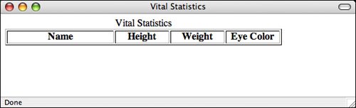 If you are going to specify cell widths, you should make sure to either specify the widths for cells only on one row or to the same values for every row. If you specify more than one value for the width of a column (by specifying different values on multiple rows of a table), there's no good way to predict which one the browser will use. Setting Breaks in TextOften, the easiest way to make small changes to how a table is laid out is by using line breaks (<br /> elements). Line breaks are particularly useful if you have a table in which most of the cells are small and only one or two cells have longer data. As long as the screen width can handle it, generally the browser just creates really long rows. This looks rather funny in some tables. For example, the last row in the table shown in Figure 8.12 is coded as follows: Input <tr> <td>TC</td> <td>7</td> <td>Suspicious except when hungry, then friendly</td> </tr> Output Figure 8.12. A table with one long row. By putting in line breaks, you can wrap that row in a shorter column so that it looks more like the table shown in Figure 8.13. The following shows how the revised code looks for the last row: Input <tr> <td>TC</td> <td>7</td> <td>Suspicious except<br /> when hungry, <br /> then friendly</td> </tr> Output Figure 8.13. The long row fixed with <br/>. On the other hand, you might have a table in which a cell is being wrapped and you want all the data on one line. (This can be particularly important for things such as form elements within table cells, where you want the label and the input field to stay together.) In this instance, you can add the nowrap attribute to the <th> or <td> elements, and the browser keeps all the data in that cell on one line. Note that you can always add <br /> elements to that same cell by hand and get line breaks exactly where you want them. Let's say you have a table where the column headings are wider than the data in the columns. If you want to keep them all online, use nowrap as follows: <table width="50%" summary="Best Hitters of All Time"> <tr> <th>Player Name</th> <th nowrap="nowrap">Batting Average</th> <th nowrap="nowrap">Home Runs</th> <th>RBI</th> </tr> <tr> <td>Babe Ruth</td> <td>.342</td> <td>714</td> <td>2217</td> </tr> <tr> <td>Ted Williams</td> <td>.344</td> <td>521</td> <td>1839</td> </tr> </table> Regardless of the width of the table, the "Batting Average" and "Home Runs" column headings will not wrap. Note The nowrap attribute has been deprecated in HTML 4.01 in favor of using style sheet properties. Be careful when you hard-code table cells with line breaks and nowrap attributes. Remember, your table might be viewed by users with many different screen widths. Try resizing the browser window to make sure your table still looks correct. For the most part, you should try to let the browser format your table and make minor adjustments only when necessary. |

EAN: 2147483647
Pages: 305