Looking at Your Site
| The first thing you should do in order to adapt your site for handheld screens is look at it with your own telephone (and anyone else's you can lay your hands on). To look at your site
Figure 13.4. The style sheet for big screens looks pretty bad on this Openwave handheld browser. Figure 13.5. Opera's desktop browsers can show you what your page will look like in its Opera Mobile software. If no handheld style sheet is available (as above) Opera adapts it automaticallyand not too badly in this case. |
 Tips
Tips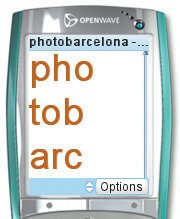

 Visual QuickStart Guide")
EAN: 2147483647
Pages: 340