3.1. How do I do that? To understand how Web Parts work, let's build a simple portal page that contains three Web Parts. There are two ways to add a Web Part to a page: Either way, you must first prepare the way for these controls by adding a WebPartManagerControl and one or more WebPartZone controls to the page.
- WebPartManager
-
Manages all Web Parts controls on a page.
- WebPartZone
-
Contains and provides overall layout for the Web Part controls that compose the main UI of a page. This control serves as an anchor for Web Part controls.
Let's start by creating a Web Part from a standard web server control. First you need to create a home page for the Web Parts. Launch Visual Studio 2005 and create a new web site project. Name the project C:\ASPNET20\chap03-Webparts. Next, drag and drop a WebPartMenuManager control from the Toolbox (under the WebParts tab) onto the default Web Form. The WebPartManager control manages all the Web Parts on a Web Form and must be the first control that you add to the page. To specify where the Web Parts on your page are to be located, insert a 3 1 table onto the form (Layout Table) and drag and drop a WebPartZone control from the Toolbox (under the WebParts tab) into each of its three cells (see Figure 3-1). Each WebPartZone control will serve as the docking area for one or more Web Parts (more on this in Step 5). Table) and drag and drop a WebPartZone control from the Toolbox (under the WebParts tab) into each of its three cells (see Figure 3-1). Each WebPartZone control will serve as the docking area for one or more Web Parts (more on this in Step 5). Figure 3-1. Populating the default Web Form 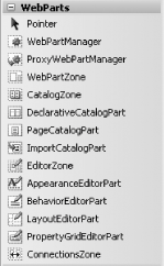
A Web Part zone is an area where Web Parts are anchored. It also defines the default layout and appearance of each Web Part within that zone. Now it's time to add a web server control to the page to give it some functionality. Drag and drop a Calendar control onto WebPartZone1. Apply the Colorful 1 scheme to the Calendar control by selecting it from the Auto Format... link in the Calendar Tasks menu. When you drop a web server control onto a WebPartZone control, the ASP.NET 2.0 Web Parts Framework wraps it with a special type of control known as a GenericWebPart control, which provides the server control with the basic functionality it needs to become a bona fide Web Part. Switch to Source View for the page (Default.aspx in our example), add the <title> attribute to the Calendar control, and set its value to "Today's Date": <asp:Calendar title="Today's Date" runat="server" BorderWidth="1px" Font-Names="Verdana" ...
Note that the Calendar control itself does not support the <title> attribute. However, when a control is added to a WebPartZone control, it is wrapped by a GenericWebPart control, which does support the <title> attribute. The value of the <title> attribute will be used as the header for the GenericWebPart control. Your Web Form should now look like the one shown in Figure 3-2. Figure 3-2. The Calendar control as a Web Part 
Tip: Note that if you drag and drop more than one control onto a WebPartZone control, the controls will be treated as separate Web Parts, each with its own minimize and close buttons. To combine several controls into one Web Part, you should use a Web User control.Alternatively, you can also group web server controls within a Placeholder control or a Panel control and then drop it into the WebPartZone control.
To see how the Calendar control looks in IE, press F5. You will notice an arrow icon in the top-right corner of the Calendar control. Clicking the arrow will reveal two links: Minimize and Close. Click Minimize to minimize the control. To restore the control to its original state, click the Restore link (see Figure 3-3). To close the Web Part, click the Close link. Figure 3-3. The Calendar control 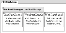
Tip: If you click the Close link, you'll find that you cannot get the Web Part to display again. To open a closed Web Part, refer to the lab Section 3.4, later in this chapter.
Now you've seen how to turn an ordinary web server control into a Web Part. Stop the debugging and return to Visual Studio.
Let's take a look at the second method of adding a Web Part to a portal page: creating a Web User control from scratch and dropping it onto a WebPartZone. The control we're going to build will allow users to search Google.
Tip: A Web User control is a composite control that contains one or more web server controls. Using a Web User control allows you to package multiple web server controls into a single control and then expose public properties and methods so as to customize its behavior.
First you need to create a new control. Add a new Web User control to your project by right-clicking the project name in Solution Explorer and then selecting Web User Control. Name the Web User control Google.ascx. Since we're going to display the Google logo to identify our Web Part, we need to create a folder to store the image. Add a new folder to the project and name it Images (right-click the project name in Solution Explorer and select Add Folder Regular Folder). Save the Google.gif image in the C:\ASPNET\chap03-Webparts\Images folder (see Figure 3-4).
Tip: The image can be downloaded from this book's support site at http://www.oreilly.com/catalog/aspnetadn/.
Figure 3-4. The image in the Images folder 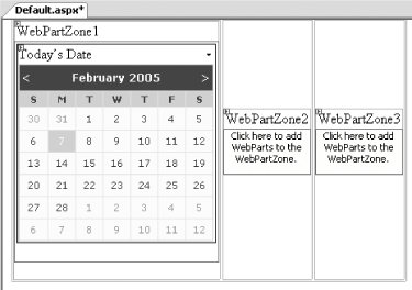
Now you need to implement your control. First, insert a 2 2 table into the Web User control (Layout Table) to organize its contents. Add an Image control, a TextBox control, and a Button control to three of the table cells, as shown in Figure 3-5. Associate Google.gif with the Image control and add the word "Search" to the Button control. Figure 3-5. Populating the Web User control with the various controls 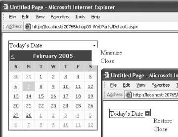
It's time to add the code that will carry out a search when the user enters search terms in the text box and clicks the Search button. Double-click the Search button and type the following code, which will send a search query to Google.com using the terms in the text box: Protected Sub btnSearch_Click(ByVal sender As Object, _ ByVal e As System.EventArgs) _ Handles btnSearch.Click Response.Write(Page.IsValid) Dim queryStr As String = HttpUtility.UrlEncode(txtSearch.Text) Response.Redirect("http://www.google.com/search?q=" & queryStr) End Sub
You can now drag and drop the Google.ascx Web User control from the Solution Explorer onto the WebPartZone2 control in Default.aspx (see Figure 3-6). Figure 3-6. Dragging and dropping a Web User control onto a WebPartZone control 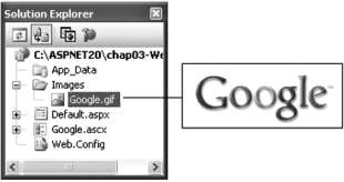
Note that the Google control is untitled. To add a title, switch to Source View and add the <title> attribute to the newly added Web User control, assigning it the value "Google Search": <uc1:Google title="Google Search" runat="server" />
To see how the Web User control looks in IE, press F5. Your portal page should now resemble the one shown in Figure 3-7.
Implementing the IWebPart Interface To explicitly expose a Web User control as a WebPart control, you need to implement the IWebPart interface and its properties. Doing so will allow your Web User control to access Web Part-specific properties, such as the title of a WebPart control, an icon for the Web Part, and more: Partial Class Google_ascx Inherits System.Web.UI.UserControl Implements IWebPart
If your Web User control implements the IWebPart interface, WebPart properties such as Title and TitleUrl will now appear in the Properties window of the Web User control. Compare this to simply adding a Web User control to a WebPartZone control, which turns it into a GenericWebPart control. For a GenericWebPart control, the Properties window will not display the Web Part-specific properties of the control. The advantage of implementing the IWebPart interface is that a control implementing it has performance advantage over a GenericWebPart control; it also has more advanced properties over those offered by a GenericWebPart control. To learn how to implement the IWebPart interface, refer to the MSDN Help topic "IWebPart Members." |
Figure 3-7. Displaying the two Web Parts on the page 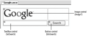
3.1.1. What about... ...customizing the look-and-feel of Web Parts? By default, the look and feel of Web Part controls is determined by the default layout set by the WebPartZone control. By default, Web Parts display their various options (such as Minimize, Close, etc.) as hyperlinks. You adjust the look and feel of Web Parts by altering the properties of the containing WebPartZone control, and you can customize the look of the option links by adding your own images. Let's see how you can do that.
Note: Remember, the settings in a WebPartZone control affect the WebPart controls it contains. So you have to set each WebPartZone control in order to adjust the look and feel of its Web Parts.
First, you'll need some images to use as icons. Add the images shown in Figure 3-8 to the Images folder of your project.
Tip: The images can be downloaded from this book's support site at http://www.oreilly.com/catalog/aspnetadn/.
Figure 3-8. The images stored in the Images folder 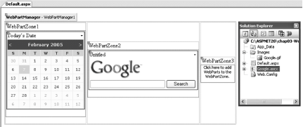
Now you'll want to assign each of the images to one of the option links. Select the WebPartZone1 control and view its Properties window. Locate the following properties and set their ImageURL properties as follows: CloseVerb.ImageUrl="Images/CloseVerb.gif" EditVerb.ImageUrl="Images/EditVerb.gif" MinimizeVerb.ImageUrl="Images/MinimizeVerb.gif" RestoreVerb.ImageUrl="Images/RestoreVerb.gif"
Apply the Professional scheme to the WebPartZone1 control by clicking on the Auto Format... link in the WebPartZone Tasks menu (see Figure 3-9). Likewise, apply the Color scheme to the WebPartZone2 control. Figure 3-9. Apply a scheme to the WebPartZone control 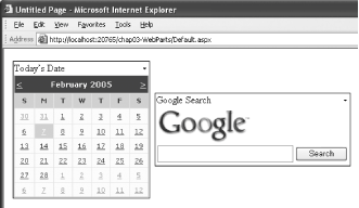
Note: Settings applied to a WebPartZone control affect all the Web Parts controls contained in that Web Part zone. If a Web Part is moved from one Web Part zone into another, it will assume the behavior of the Web Part zone it is in.
Press F5 to test the application. You will realize that the Calendar control in the first WebPartZone control has icons displayed next to the Minimize and Close link. In contrast, the Web User control in the second WebPartZone control does not have the icons (see Figure 3-10). This is because you only configured the first WebPartZone control for displaying icons. In the next lab, you will learn how to allow your user to rearrange the various Web Parts on the page. Figure 3-10. Examining the two Web Parts in the two WebPartZone controls 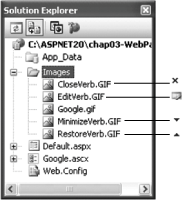
3.1.2. Where can I learn more? One of the common questions about Web Parts in ASP.NET 2.0 is whether they are compatible with SharePoint Portal Server. The current version of SharePoint Portal Server is not compatible with the ASP.NET 2.0 Web Parts Framework. However, the next release of SharePoint Portal Server will use the new ASP.NET 2.0 Web Parts Framework, and hence Web Parts created with ASP.NET 2.0 could be reused by the new SharePoint Portal Server. To learn how to develop Web Parts for SharePoint Portal Server 2003 in .NET, check out the following article: http://www.devx.com/dotnet/Article/17518. |
 A Developer's Notebook 2005")