1.9. Create an Image Map Modern web sites use image maps to allow users to navigate to another part of the site, or to initiate an action by clicking on one or more hotspots of an image. For example, you want to display a world map on a page so that users can click on specific parts of the map to see information about a particular country. ASP.NET 2.0 includes a new ImageMap control that allows you to create image maps easily and painlessly. The ImageMap control can be found in the Visual Studio Toolbox under the Standard tab.
Note: Use the new ImageMap control to display an image map on your web page.
1.9.1. How do I do that? To see how the ImageMap control works, you will use an ImageMap control to display the image of a Pocket PC. You will define three different hotspots of different shapes on the Pocket PC so that users are able to click on the different parts of the image to see more information. In Visual Studio 2005, create a new web site project and name it C:\ASPNET20\chap01-ImageMap. Double-click the ImageMap control in the Toolbox to add a control to the default Web Form. In Solution Explorer, right-click the project name and add a new folder named Images, where you'll store the image used in this project. Save an image named dellaxim.jpg (see Figure 1-32) into the new folder: C:\ASPNET20\chap01-ImageMap\Images\. Figure 1-32. Displaying a Pocket PC using the ImageMap control 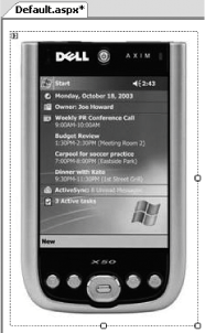
To display the image in the ImageMap control, set its ImageURL property to point to the file you just saved (Images/dellaxim.jpg ). The ImageMap control will now display the image of a Pocket PC, as shown in Figure 1-32. An image map works by providing one or more hotspots for users to click on, each initiating a particular actionfor example, jumping to another page or altering the image itself. To define one or more hotspots, go to the Properties window for the ImageMap control, scroll down to the Hotspots property, and click on the Collections button (...) to invoke the HotSpot Collection Editor (shown in Figure 1-33). The ImageMap control supports three kinds of hotspot: circles (CircleHotSpot), rectangles (RectangleHotSpot), and polygons (PolygonHotSpot). The drop-down menu to the right of the dialog's Add button dialog lets you choose the type of hotspot to add. Once you add a hotspot, a Properties window appears that allows you to specify the location and dimensions of the hotspot, as well as its key properties. Figure 1-33 displays the properties of a CircleHotSpot that has a radius of 5 and x and y coordinates of 103 and 26, respectively. Figure 1-33. Adding hotspots to the ImageMap control 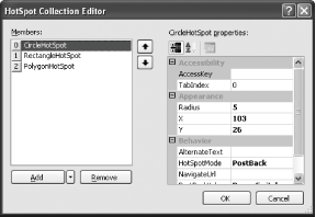
You can also specify your hotspots by hand. You can switch to Source View and add in the hotspots elements manually, like this: <asp:ImageMap runat="server" ImageUrl="Images/dellaxim.jpg"> <asp:CircleHotSpot HotSpotMode="PostBack" X="103" Y="26" PostBackValue="PowerSwitch" Radius="5" /> <asp:RectangleHotSpot Top="48" Bottom="242" Left="30" NavigateUrl="./screen.aspx" Right="177" /> <asp:PolygonHotSpot Coordinates="92,273,112,273,123,287,112,303,92,303,83,287" PostBackValue="Navigation" HotSpotMode="PostBack" /> </asp:ImageMap>
Tip: You can use Microsoft Paint to display the image and then position your cursor at the various hotspots you want to define. You can find the coordinates of the cursor at the bottom of the window.
If you add the code shown in Step 6 or use the same attribute values to create hotspots with the HotSpot Collection Editor, you will end up with the hotspots shown in Figure 1-34. Figure 1-34. Defining the hotspots in the ImageMap control 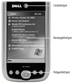
Note: The ImageMap control supports three types of hotspot: circles, rectangles, and polygons.
Figure 1-34 shows an ImageMap with the three hotspots: a CircleHotSpot, a RectangleHotSpot, and a PolygonHotSpot. The CircleHotSpot defines the region containing the power switch of the Pocket PC as a circle hotspot, whereas the RectangleHotSpot defines the screen region as a rectangle hotspot. The PolygonHotSpot defines the navigational buttons on the Pocket PC as a polygon hotspot. A HotSpot control supports one of four modes of behavior, defined by its HotSpotMode property:
- Not Set
-
If a hotspot's HotSpotMode is set to "Not Set", its behavior will assume that of the HotSpotMode as defined in the ImageMap control.
- Navigate
-
Another page can be loaded when a hotspot is clicked.
- PostBack
-
A postback is sent to the server. This is useful in cases where you need to perform some action (such as increment a variable) when the user clicks on a hotspot.
- Inactive
-
Disables the hotspot.
Tip: The HotSpotMode property of the ImageMap control defines the default behavior of all the hotspots in that control's HotSpot collection. A particular hotspot can override this behavior by setting its own HotSpotMode property.
To illustrate how a hotspot can be used to postback to a server, set the HotSpotMode property of the CircleHotSpot to PostBack and the PostBackValue property value to PowerSwitch. To receive the postback value on the server side, add an event handler to service the click event of the ImageMap control: Protected Sub ImageMap1_Click(ByVal sender As Object, _ ByVal e As System.Web.UI.WebControls.ImageMapEventArgs) _ Handles ImageMap1.Click Dim str As String = "You have clicked " & e.PostBackValue Response.Write(str) End Sub
Add a new Web Form to your project (right-click the project name in Solution Explorer, select Add New Item..., and then select Web Form) and name it screen.aspx. This page will be displayed when the user clicks on the RectangleHotSpot. Use the RectangleHotSpot to navigate to another page by setting its HotSpotMode property to Navigate and setting the NavigateURL property value to screen.aspx. Press F5 to test the application. Note how your mouse pointer changes when it hovers over the various hotspots.
1.9.2. What about... ...adding Tool Tip text to the hotspots? You can add Tool Tip text to the various controls in the ImageControl control using the AlternateText property. Adding Tool Tip text to hotspots greatly improves the usability of your application, as users can view more information about a hotspot. You can add Tool Tip text in Source View: <asp:CircleHotSpot HotSpotMode="PostBack" X="103" Y="26" Radius="5" PostBackValue="PowerSwitch" AlternateText="Power Switch" />
You can also add it programmatically: Protected Sub Page_Load(ByVal sender As Object, _ ByVal e As System.EventArgs) _ Handles Me.Load ImageMap1.HotSpots(0).AlternateText = "Power Switch" ImageMap1.HotSpots(1).AlternateText = "Screen" ImageMap1.HotSpots(2).AlternateText = "Navigation" End Sub
The next time the user's mouse hovers over the hotspots, he will see the Tool Tip text as shown in Figure 1-35. Figure 1-35. Displaying the Tool Tip text 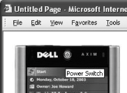
1.9.3. Where can I learn more? Besides using the ImageMap control to implement an image map, you can use the ImageButton as an image map. To see how, check out this link: http://samples.gotdotnet.com/quickstart/aspplus/samples/webforms/ctrlref/webctrl/imagebutton/doc_imagebut.aspx. |
 A Developer's Notebook 2005")