Graphic Effects With Blending Modes
|
|
|
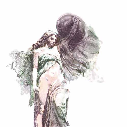
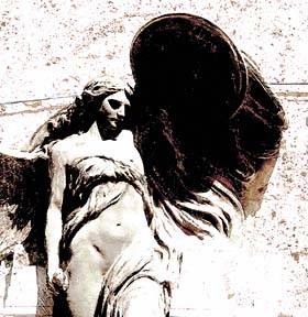
Photoshop's blending modes allow you to combine multiple sources of pixel data for a wide variety of graphic effects. The two data sources can be adjacent layers in the Layers palette, the pixel value in a brush as it paints on a target layer, or even the result of a filter effect in comparison to the previous state of the image. As a result, blending modes are everywhereon the Layers palette, on the Options bar for paint tools, and in the Fade command under the Edit menu, just to name a few locations. Blending modes compare the information being applied (such as a brush stroke, an upper layer, or a new filter effect) with the target data (such as a layer or a previous unfiltered state). Based on the comparison and the criterion of the blending mode, Photoshop makes judgments about which pixel value it displaysthe new value or the previous value. The general effect categories allow you to lighten, darken, combine, or apply a specific aspect of the pixel informationsuch as the luminosity, color, or hue. For example, the Lighten blending modes look at the two pixel values and display the one that's lighter; the Overlay blending modes combine and average the pixel values. You don't need to understand how each mode works, the key is to jump in and experiment. The modes are arranged in logical groups; everything in the Lighten group creates a lighter result, everything in the Darken group darkens. In this example, we'll look at the range of results that can be generated by modifying just a couple of layers along with the full spectrum of mode options. Rather than progressing through a linear sequence that results in a single effect, this exploration shows the wide range of options you can create. Marconi Drawing
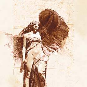
About the Original Image For this exploration, the perfect starting point is the completed drawing from the previous exploration. It has a photo and graphics we can combine, and the paper scan can be added or subtracted to create additional variety. I know it's not a source photo per se, but it does contain multiple sets of pixel data with which we can experiment. Besides, you should be very familiar with its construction at this point! Building the EffectsThe first step in this exploration is to drag the photo of the Marconi Statue drawing to the top of the layer stack. We'll be applying several blending modes to this image to alter the drawing in the lower layers. With the photo layer active at the top of the layer stack, I selected Color from the blending mode pull-down menu in the Layers palette. This effect applies the color values from the photo to the lower pixel values without altering the drawing marks. The photo information is sublimated in favor of the drawing. Because the photo source does not extend to the edges of the image frame, strips of cream-colored paper appeared vertically along the sides. To fix this, I selected the Paintbucket tool and Option-clicked (Alt-clicked in Windows) in the gray background behind the statue. The mouse pointer changed to an Eyedropper, and the background color became active. I then clicked once on either side of the image to fill in the strips with the gray color, which smoothed the background to a solid gray, completing this iteration (see Figure
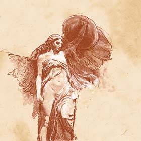
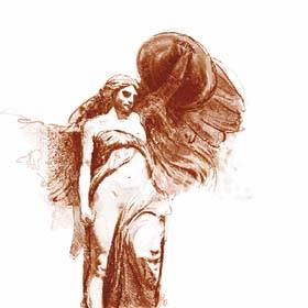
The Vivid Light Blending ModeBecause the shadow area in the shield was such a prominent part of the original image, I wanted to create a version that had an extremely high-contrast feeling, with dark, solid shadows. I started by highlighting the photo layer and selected Vivid Light from the blending mode menu in the Layers palette. This overlay effect creates bright whites, high contrast, and highly saturated areas of color around the edges of objects. In this case, it blew out the highlights to a flat white, while creating a red-and-ochre cast from the underlying scan of the paper layer (see Figure
To tone down the color a bit, I highlighted the photo layer and selected Hue/Saturation from the Adjustment Layer pull-down menu, adding the new layer above the photo layer. I set the Hue slider to -13, the Saturation slider to -58, and the Lightness slider to -1. To focus the attention more on the figure, I cropped the image to eliminate a lot of the white space: I used the Crop tool to draw a rectangular selection horizontally around the figure, to the edges of the stone-wall texture. The crop clipped the figure vertically just above the left knee and at the top of the shield, completing this second version (see Figure
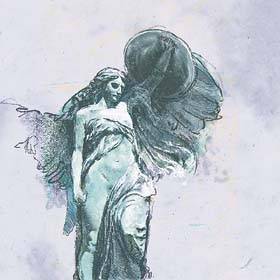
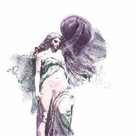
The Soft Light Blending ModeThis next version results in another drawing effect that feels significantly different than the result of the Conté Crayon exploration. It starts by setting the blending mode on the photo layer to Soft Light, which creates a very soft and subtle effect. When this blending mode is used, the target layer of information almost always dominates, while the information being applied is muted and diminished. As you can see in Figure
Turning Off Image LayersTo push the image further, I turned off the visibility icon for the paper scan layer, eliminating the cream-colored background and reverting the background to pure white. I felt that the cream color was distracting from the marks of the drawing, making things a bit muddy and inarticulate. After I'd reduced the background to pure white, it felt wrong to leave the white layer in the drawing active. When I shut it off, the drawing felt more direct and immediate. I also shut off the detail layers in the face and leg, which were added in the final steps of the Conté Crayon exploration. Although the resulting face was rounder and less detailed, I liked the way the white of the paper moved from the chest to the face and through the hair. The drawing felt more cohesive (see Figure
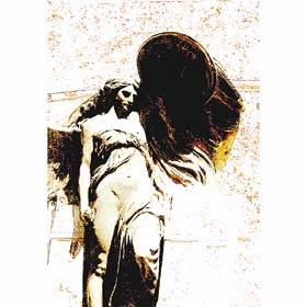
A Final Color ShiftThe last iteration is not so much a blending mode effect as it is the pointed application of the Hue/Saturation controls. At this point, my blending mode iterations had turned the figure white, green, and several shades of ochre; a logical conclusion to the process was to convert the figure to a more natural flesh color. To do this, I set the photo layer's blending mode to Color, applying the colors from the photo to the underlying drawing. The Hue/Saturation adjustment layer I had created earlier was turned off and sitting at the top of the layer stack. To shift the colors, I turned the adjustment layer back on and began looking for the proper Hue setting to simulate a flesh color for the skin areas of the figure. I ended up moving the Hue slider to -118. I also set Saturation at +55 and Lightness at -1. These settings created a pretty good skin tone, although there was a distracting magenta tone in the shadows of the shield and around the folds of some of the fabric. The easiest way to fix this was with a layer mask. With the Hue/Saturation adjustment layer still active, I clicked the Add Layer Mask icon to add a layer. With a 300-pixel brush and a foreground color of black, I painted the mask into the shield and fabric areas. This action hid the latest Hue/Saturation effect and allowed the Color blending mode from the photo layer to come through. Finally, I turned back on the Whites layer (the layer with the crayoned highlights that I had turned off when I changed the paper to white), shut off the Rough-in layer (the first crayoned layer that outlined the statue) to let the color and texture dominate, and reactivated the details in the face. The result of this final iteration looks like a watercolor sketch (see Figure
|
|
|
EAN: 2147483647
Pages: 141