| Organization charts, often referred to as org charts, are diagrams, but their purpose is explicitly to show organizational relationships. You might assume that such charts are used only in a business setting to show who's the boss and how he or she is related to others in the organization. However, organization charts can be used for groups or clubs, churches, government, and in any other instance to visualize reporting lines. You can even use them to show hierarchical relationships, such as in the plant or animal kingdoms. To insert an organization chart, follow these steps: Choose Insert, Diagram or click the Insert Diagram or Organization Chart button on the Drawing toolbar. PowerPoint displays the Diagram Gallery (refer to Figure 10.2). Click the Organization Chart icon if it's not already selected. Click OK to insert an organization chart. PowerPoint displays not only the chart, but also the Organization Chart toolbar (see Figure 10.8). Figure 10.8. You can use the Organization Chart toolbar to quickly add positions or to modify chart elements. 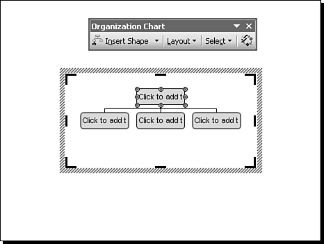
You can now use the organization chart box (the placeholder box that contains the organization chart) to create and modify your chosen organization chart style. The organization chart box works much like other PowerPoint objects in that you can move it and change its order relative to other objects on the slide. In fact, unlike with diagram and text boxes, dragging the sizing handles on an organization chart box enlarges or reduces the chart and the text within the chart boxes. Understanding How an Organization Chart Is Organized An organization chart is similar to a diagram, but it always requires someone or something at the head. From that point on, you can add assistants or subordinates. Except for the head, anyone can also have co-workers, as well as assistants and subordinates...if the budget allows! Figure 10.9 shows examples of relationships in an organization chart. Figure 10.9. Organization chart terminology relates to employee relationships, but chart elements can also be used to show other kinds of relationships. 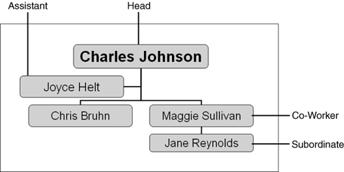 Organization chart layouts fall into four basic types. To see and change these types, click the drop-down menu on the Layout button on the Organization Chart toolbar (see Figure 10.10). Figure 10.10. Each organization chart level can have its own layout style, making it possible to fit more positions in a limited amount of space. 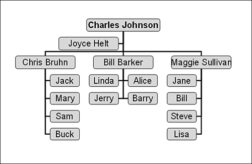 Standard The organization chart lines branch out in two directions and then down to the next tier of the organization. Both Hanging The organization chart lines go down first and then spread out sideways to both sides for persons of equal rank. Left Hanging or Right Hanging The organization chart line goes down and then all the items in the same tier are either at the left or the right, respectively.
The layout you choose sometimes has more to do with how many items you have to fit in the chart than it does with rank. However, you also need to choose a layout that shows as clearly as possible the relationships between various items in the chart. Entering Organization Chart Data What comes first: the organization or the people in it? Let's explore how to add names of people first, and then in the next section you'll add, delete, and move positions. To add text to an organization chart box, do as the box says: "Click to add." PowerPoint opens a text box that fits inside the shape you selected, and it centers the insertion point both horizontally and vertically. However, this isn't any ordinary text box. Here's what happens as you add text: Text does not wrap within the text box. You can press Enter to force a new line, but the organization chart box does not expand to accommodate the text. If you type too much text, PowerPoint displays the text outside the box. If you click the Fit Text button on the Organization Chart toolbar, PowerPoint reduces the font size so that it all fits, even if the result is unreadable because it's so small. This also reduces proportionally the font size of text in the rest of the organization chart. You should avoid long lines of text. If you must type lots of text in a box, you might prefer to select the text in that box and change its font size instead of choosing Fit Text. This prevents the reduction in font size of text in other boxes. Text options such as spelling or style options are active in these text boxes, just as they are for any text you type in a slide.
Adding text takes some getting used to, especially if you plan to include a lot of positions or if positions have long names. Modifying Organization Chart Elements I suspect there aren't many organizations that have as few people as are shown in the default PowerPoint organization chart (refer to Figure 10.8). Therefore, you need to add members of your organization and make their relationships clear. Fortunately, adding, deleting, and moving members is easy. All you have to do is select the point of the organization that you plan to modify and then remember three basic types of relationships. To add a member, click a box in the organization chart to which the person will be linked and then click the Insert Shape drop-down menu on the Organization Chart toolbar to select one of these three relationship types (see Figure 10.11): Figure 10.11. Select a chart member before inserting a related position. 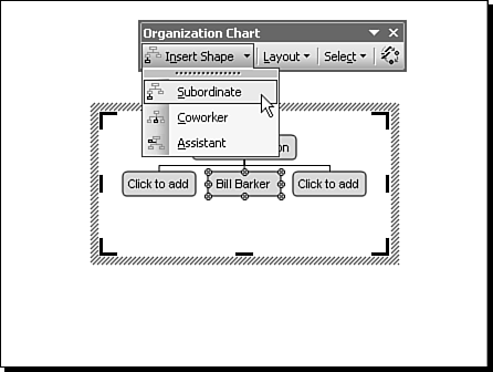 Subordinate Typically, this shape is appended beneath the currently selected position. The line connecting the two usually signifies a subordinate role or that the added person reports to the person he or she is appended to. Coworker Typically, this shape is appended to the same position as is the selected position. The new box and the selected one report to the same person. Assistant An assistant can be defined in a number of ways. Generally, although the assistant has the "ear" of and a special relationship with the "boss," those who report to that boss don't have to go through the assistant (unless, of course, you work at the White House).
As you add individuals to the organization, the size of the shapes and the text they contain gets smaller, to make room for everyone. After you create a chart, it's also easy to move people around, reorganizing and promoting, demoting, hiring, and firing as you will. But don't let the power go to your head...this is only an exercise! To move part of an organization, follow these steps: Click the top person in the group you want to move. If the selected person also has subordinates, you must first select the entire branch. Choose Select from the Organization Chart toolbar and then choose Branch. PowerPoint selects the whole branch (see Figure 10.12). Figure 10.12. To move a position that has subordinates, you must first select the entire branch. 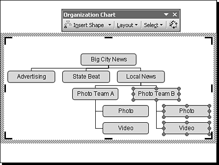 Drag the top person in the branch directly on top of the person to whom he or she will report (for example, the State Beat group). Release the mouse button to move the group (see Figure 10.13). If you get it wrong, try again or use Undo to start over. Figure 10.13. When you move a branch, the AutoLayout feature automatically adjusts the location and shape of lines and boxes for the entire chart. 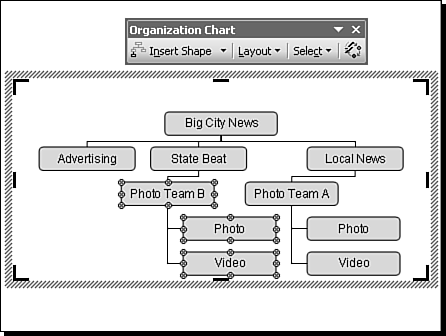
Tip  | If you need to create a detailed organization chart but have limited space to do so, you can consolidate areas of the chart by showing departments rather than individuals. You can also create the top-level employees (for example, department heads) and then indicate that "Department X" continues on slide nn. Then on slide nn, the department head shows as the head of that slide's organization chart. |
Note that you can't move an individual and leave subordinates hanging by themselves. If you move a person, you have to move his or her entire branch. However, if you delete a position, you automatically promote subordinate positions. If you want to remove a person but maintain the organizational relationships, delete the text from the shape don't delete the shape itself. Play around a bit by adding, deleting, and moving positions. With a little practice, you'll be able to create accurate organization charts in no time at all. Formatting Organization Chart Elements PowerPoint's default organization chart elements are like other diagram chart elements because they depend on the background design being used. You can modify an entire chart by using the AutoFormat option: Select the organization chart.  Click the AutoFormat button on the Organization Chart toolbar. PowerPoint displays the Organization Chart Style Gallery, which is similar to the Diagram Style Gallery, but which includes additional options. Click the AutoFormat button on the Organization Chart toolbar. PowerPoint displays the Organization Chart Style Gallery, which is similar to the Diagram Style Gallery, but which includes additional options.
Click diagram styles to preview what they look like. For example, one style that is used only for organization charts is the Brackets style (see Figure 10.14). Figure 10.14. Using predefined organization chart styles can save you time. 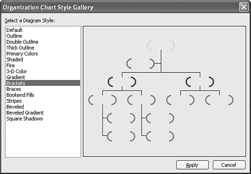 Click Apply to change the organization chart style.
You can also format individual organization chart boxes and lines, but first you have to turn off the AutoFormat feature. To change an individual shape, follow these steps: Right-click the organization chart. If the context menu doesn't display Use AutoFormat, right-click somewhere else until it does. If Use AutoFormat is checked, click it to deselect it. If it's already unchecked, click elsewhere to close the context menu. Click a shape in the organization chart that you want to change (for example, the head of the organization; see Figure 10.15). Changes you can make include the following: Figure 10.15. You can change individual organization chart elements to make them stand out or to distinguish among various personnel types. 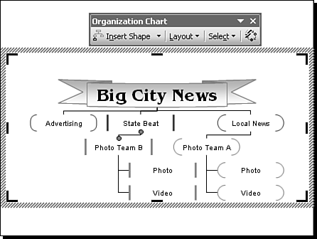 Double-click the edge of the shape to display the Format AutoShape dialog box, where you can change line colors and styles, shape fills (including gradients), and more. Choose Draw, Change AutoShape on the Drawing toolbar and select a different shape.
To further customize the shape, choose Layout from the Organization Chart toolbar and deselect AutoLayout. This allows you to do the following: Select text or the entire shape and change the font, font size, or other font attributes.
You can also change connecting lines, individually or altogether. To change a line, follow these steps: Click the line to select it and to display its edit points (refer to Figure 10.15). Use the Drawing toolbar to change the line's color or to apply other line styles.
To change all lines in the organization chart at once, choose Select, All Connecting Lines from the Organization Chart toolbar. Then apply changes as you do for single lines. Caution  | If you make changes to organization chart shapes or lines and then turn on AutoLayout or AutoFormat, most of the changes you have made revert back to the original format and style. When you decide to customize chart elements, leave AutoLayout and AutoFormat off, unless you intend to wipe out your changes. |
Finally, you can connect chart shapes just about any way you'd like to by modifying the AutoShape connector lines (see Figure 10.16). Figure 10.16. Organization charts can be made to fit unusual organizational structures. 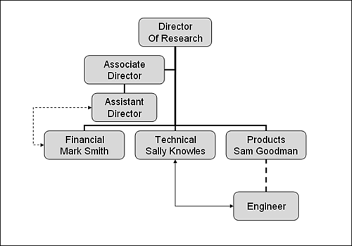  For details on using AutoShape connector lines, see p. 127. For details on using AutoShape connector lines, see p. 127.
The Absolute Minimum Diagrams and organization charts are two excellent ways of presenting relationships among concepts, facts, or people. In this chapter, you did the following: You learned to create effective diagrams to illustrate concepts. You found out that each diagram type has a unique purpose. You learned how to format diagram elements. You explored the use of organization charts for business and other situations. You learned to add, delete, and move organization chart elements. You learned how to change chart shapes and lines.
In Chapter 11, "Animating Slide Show Objects," things really jump as you learn to animate PowerPoint objects. |
|