Adding a Diagram
| Adding a diagram to a PowerPoint slide is simple. You can insert a diagram directly onto the slide or you can choose a content layout and create the diagram in the content placeholder. To insert a diagram directly onto a slide, follow these steps:
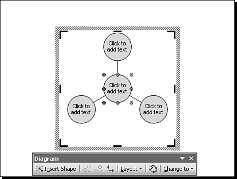
Figure 10.3. The Diagram toolbar is extremely useful for modifying and working with diagrams. You now can use the diagram box (the placeholder box that contains the diagram) to create and modify your chosen diagram style. The diagram box works much like other PowerPoint objects in that you can move it and change its order relative to other objects on the slide. However, by default, the box works more like a text box than like other objects in that as you change it, the chart inside doesn't change size. The sizing handles also have a different look (refer to Figure 10.3). If you drag any of the corner or side sizing handles outward, the size of the diagram box expands. When you release the mouse, however, the diagram inside simply centers itself in the new box, but it doesn't expand. If you drag the sizing handles inward, you find that you can't go any farther than the diagram itself. To expand or shrink a diagram along with the diagram box, follow these steps:
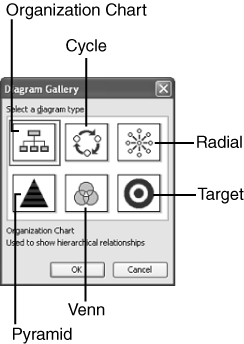
Understanding Diagram Types and PurposesAs with data chart types, you have to determine whether a diagram type is right for the kind of ideas or concepts you're trying to communicate. With the exception of the Venn diagram, I suspect you can pretty much figure out what each type of diagram is used for. Nevertheless, a brief description might help you choose the right one:
Tip
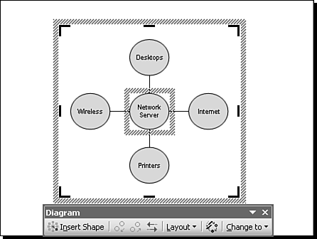
Adding and Organizing Diagram InformationAfter you insert a diagram (refer to Figure 10.3), you can modify it. For now, let's talk about the radial diagram. Much of what you learn with one diagram type also applies to others. Later in this chapter you'll learn about specific issues related to other diagram types. Although you might be tempted to worry about things like colors and shapes, focus first on the content of your diagram. For example, Figure 10.3 shows a central object and three peripheral objects. Its goal is to show the relationship between a network server and four objects: a printer, a desktop computer, a laptop computer, and the Internet. To add a shape to a diagram, simply click the Insert Shape button on the Diagram toolbar. You can also right-click the shape and from the context menu choose Insert Shape. By default, the diagram is controlled by the AutoLayout feature, so when you add a shape, PowerPoint also adds a connecting line and adjusts all connected shapes proportionally (see Figure 10.4, which shows a diagram with text added). Figure 10.4. PowerPoint's AutoLayout feature adjusts a diagram automatically as you add or remove elements. You can continue to add shapes as needed, or if you decide you need to remove one, you right-click the shape and choose Delete Shape. Note that you must click the very edge of the shape, or you won't get the context menu that allows you to insert or delete a shape. You're now ready to begin adding textual information. The text placeholders tell you what to do, so click and begin typing. For example, type Network Server in the center circle, and type the connecting devices in the other circles (refer to Figure 10.4). If you type a lot of text, you'll notice immediately that the text does not wrap like it does in normal text boxes. For example, if you want "Network Server" to fit within the circle, you need to press Enter after "Network" and type "Server" on a second line. You should try to keep your text brief for two reasons. Too much text is hard to digest, and very small text is hard to read. However, if your text doesn't fit within a shape, you can select the text and change the font or font size as needed. You can also enlarge shapes. You'll learn more about this option in the next section, "Formatting Diagram Elements." After you add text to the various diagram elements, you can also change their order. For example, you might decide you want the Internet circle (refer to Figure 10.4) to appear at the top of the diagram instead of at the right side. Although you could delete the text and type it over, there's an easier way. To change the order of a diagram element, follow these steps:
Formatting Diagram Elements
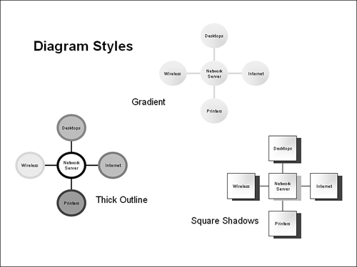
The default style is nicely understated. Some of the other styles, however, add pizzazz and sometimes even border on the garish. Click each style to see what it looks like in the preview box. When you find one you like, click Apply. Figure 10.5 shows three styles: thick outline, gradient, and square shadows. Figure 10.5. PowerPoint's automatic diagram styles range from subtle to loud, to match the tone of almost any slide show. You can also format individual diagram elements the same way you do other graphic images, with a few limitations. For example, to change the line or the fill of a diagram shape, follow these steps:
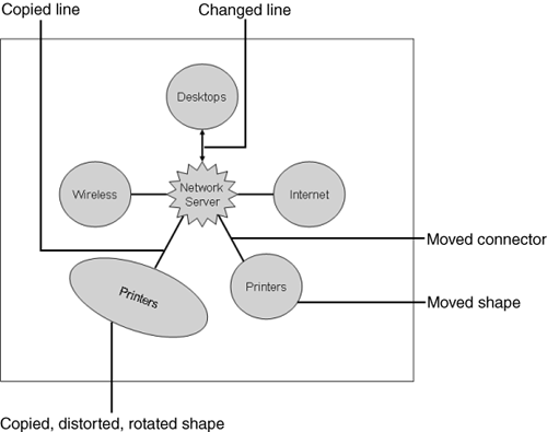
If you want to change several shapes at the same time and in the same way, select them all by holding down the Shift key or the Ctrl key while clicking them. Then follow steps 3 6 above. You can also use the Drawing toolbar to quickly make changes to diagram elements. Simply select the element(s) you want to change and choose from options on the toolbar such as fill, line, or text color, and line, shadow, or 3-D styles. You can also change a shape by choosing Draw, Change AutoShape from the Drawing toolbar. By using these options you can come up with nearly any look you want. But be careful: You can also waste a lot of time playing with options that may add glitz but little communicative substance to a diagram. Already you've seen that individual shapes can't be sized or moved. That's because by default diagrams are controlled by the AutoLayout feature, which simply forces the diagram objects to certain predetermined locations. If you turn off this feature, you can modify nearly any object in the diagram. To turn off the AutoLayout feature, click Layout on the Diagram toolbar and then click AutoLayout. If you later select AutoLayout again, shapes and connectors are restored to their original location, and changes you have made are wiped out. Figure 10.6 shows some of the things you can do with AutoLayout turned off. For example, you can do the following: Figure 10.6. If you turn off AutoLayout, you can reconfigure diagram elements by hand.
Note these peculiarities:
At this point you might be wondering why you'd want to make these changes. Let's take a look at one possible reason for turning off the AutoLayout feature. Suppose you're creating a Venn diagram to illustrate breadth of responsibilities among three different groups. By turning off AutoLayout, you can increase the size of the most influential of the groups and move it to overlay a larger portion of a smaller, dependent group. You could even separate another group entirely, adding a dotted connector line to show a collaborative relationship (see Figure 10.7). Figure 10.7. Turning off AutoLayout enables you to modify the size and location of diagram elements to more accurately illustrate your point. |


EAN: 2147483647
Pages: 154
- Chapter X Converting Browsers to Buyers: Key Considerations in Designing Business-to-Consumer Web Sites
- Chapter XI User Satisfaction with Web Portals: An Empirical Study
- Chapter XIII Shopping Agent Web Sites: A Comparative Shopping Environment
- Chapter XV Customer Trust in Online Commerce
- Chapter XVI Turning Web Surfers into Loyal Customers: Cognitive Lock-In Through Interface Design and Web Site Usability