| Spot color channels are used to apply a spot (custom) color to a selected area or areas of your image for printing. Spot colors are premixed inks used instead of, or in addition to, the process color (CMYK) inks. Each spot color requires its own plate on the press. A varnish also requires a separate plate and is considered a spot color. Like duotones, the technique of using spot colors applies only to offset printing, not to Web graphics. You use spot colors in the following situations: If you can only afford to print in two or three inks. If you need to match exactly a color used in a logo. If you want to extend the range of a four-color print job by using a "bump plate"pumping up a particular color so it has more vibrancy than would be possible when printing in CMYK. If you want to use a varnish to make specific parts of your design stand out.
Spot colors cannot be applied to individual layers. This means that rather than construct your document with layers, you build the document with spot color channels. These spot color channels overprint the composite image in the order in which they appear in the Channels palette. This poster by fabulous San Francisco artist Hugh D'Andrade is printed in two colors: black and Pantone 5493. Figure 2.44. The two-color poster (example A) and its Layers palette and Channels palette (example B). 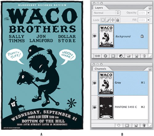
Note that the Layers palette contains only one layer (and the Layer thumbnail does not show the background color). The Channels palette displays the gray channelthe image is actually in Grayscale modewhich contains all the black information, and the Pantone 5493 channel, which contains the background color. Here's how Hugh created his artwork: 1. | Begin by creating artwork as two separate layers in an RGB document, with the black layer above the background color layer. While this wasn't strictly necessary, Hugh found it easier to do this. To begin with, the gray blue of the background was mixed with RGB colors.
| 2. | When satisfied with the way things look, save a copy of the file in Grayscale mode, choosing Don't Merge to retain the layers.
| 3. | Load the bottom color layer as a selection by Command/Ctrl-clicking its layer thumbnail in the Layers palette, and choose New Spot Channel from the Channels palette menu.
| 4. | Choose the closest Pantone equivalent to the color of the RGB image.
| 5. | For Solidity, leave the value at 0 percent. This option simulates on-screen the density of the printed spot color. A value of 0 percent simulates a transparent ink that completely reveals the inks beneathin this case black. At a value of 100 percent, the blue gray would completely cover the black.
| 6. | Return to the Layers palette and delete the background layer by dragging its thumbnail to the Trash icon at the bottom of the Layers palette.
| 7. | Select and delete any areas of the spot color channel that need to be knocked out. Because certain details from the Gray channel need to knock out of Pantone 5493 channelthe speech bubbles, the eyes on the boy and the horseHugh selected these by Shift-clicking with the Magic Wand tool on the Gray channel and then switched to the Pantone 5493 channel in the Channels palette and deleted these areas.
|
Figure 2.45. The Gray channel (example A) and the Spot Color (Pantone 5493) channel (example B). 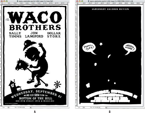
|