Camera Raw Image Controls
| The image controlsthe ones you're likely to change with each imageoccupy the rest of the Camera Raw dialog box. The five control tabs are:
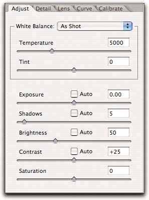
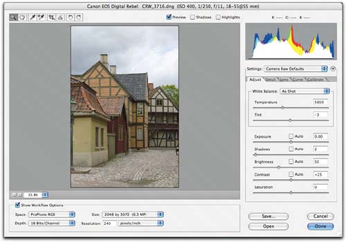
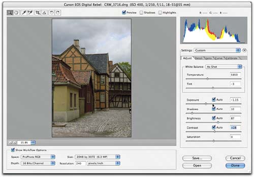
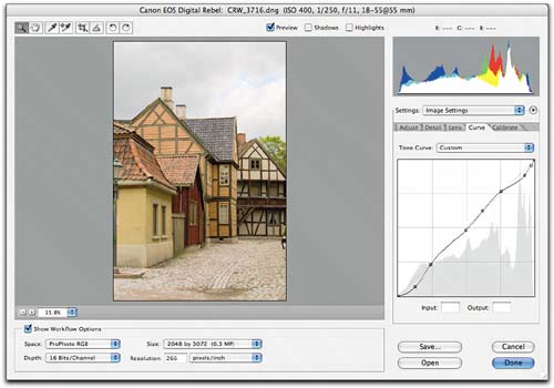
You can switch quickly between tabs by pressing Command-Option-1 through Command-Option-5. The image controls are really the meat and potatoes of Camera Raw, offering very precise control over your raw conversions. Some of the controls may seem to offer functionality that also exists in Photoshop, but there's a significant difference between editing the tone mapping in Camera Raw, which tailors the conversion from linear to gamma-corrected space, and editing the tone mapping by stretching and squeezing the bits in a gamma-corrected space in Photoshopsee "Image Editing and Image Degradation" in Chapter 2, How Camera Raw Works. The more work you do in Camera Raw, the less work you'll need to do afterwards in Photoshop. At the same time, if you get your images close to the way you want them in Camera Raw, they'll be able to withstand much more editing in Photoshopwhich you may need to do to optimize for a specific output process, or to harmonize the appearance of different images you want to combine into a single image. The Adjust TabThe controls in the Adjust tab let you tweak the white balance, exposure, tonal behavior, and saturation. It's the default tab in Camera Raw but you can always get to it by pressing Command-Option-1. Three controls in this tab are key: the Temperature, Tint, and Exposure controls let you do things to the image that simply cannot be replicated using Photoshop's tools on the converted image. The Contrast, Brightness, and Shadows controls provide similar functionality to Photoshop's Levels and Curves, with the important difference that they operate on the high-bit linear data in the raw capture, rather than on gamma-encoded data post-conversion. If you make major corrections ("major" meaning more than half a stop) with the Exposure slider, you'll certainly want to use the Brightness, Contrast, and Shadows controls to shape the raw data the way you want it before converting the raw image. With smaller Exposure corrections, you may still need to shape the tone in Camera Raw rather than in Photoshop, especially if you want to avoid shadow noise in underexposed images. The Saturation control in Camera Raw offers slightly finer global adjustments than Photoshop's Hue/Saturation command, though unlike the Photoshop command, it doesn't allow you to address different color ranges selectively. See Figure 4-23. Figure 4-23. The Adjust tabThe Temperature and Tint sliders set the overall color balance. The Exposure, Shadows, Brightness, and Contrast sliders shape the tone mapping. The Saturation slider sets global saturation.
White BalanceThe two controls that set the white balance, Temperature and Tint, are the main tools for adjusting color in the image. Setting the white balance correctly should make the rest of the color more or less fall into place in terms of hue. Note that "correct white balance" includes, but isn't limited to, "accurate white balance"you can use white balance as a creative tool. If you find yourself consistently making the exact same selective color corrections in Photoshop on your processed raws, you may want to visit the Calibrate tab to tweak the color for your specific camerasee "The Calibrate Tab," later in this chapter.
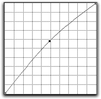
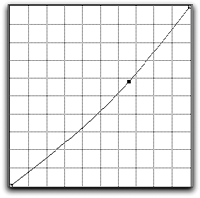
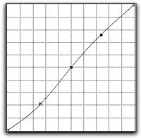
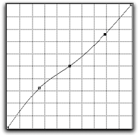
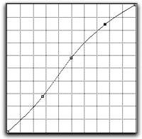
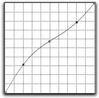
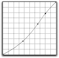
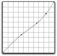
Tip Use the White Balance Tool for Rough White Balance, Then Fine-Tune with the Sliders. To get the approximate settings for Temperature and Tint, click the white balance tool on an area of detail white. This automatically sets the Temperature and Tint controls to produce as close to a neutral as possible. Then make small moves with the Temperature (and, if necessary, the Tint) control to fine-tune the results. The white balance controls let you alter the color balance dramatically with virtually no image degradation, which you simply can't do on the converted image in Photoshop. Camera Raw's controls alter the colorimetric interpretation of the image in the conversion to RGB, while Photoshop's Color Balance and Photo Filter features stretch or squeeze the levels in individual channels. Compared to changing color balance in Photoshop, doing so in Camera Raw is almost lossless. Tone mapping controlsLearning how the four tone mapping controlsExposure, Shadows, Contrast, and Brightnessinteract is essential if you want to exercise control over the image's tonal values. It may not be obvious, but the controls work together to produce a five-point curve adjustment. Exposure and Shadows set the white and black endpoints, respectively. Brightness adjusts the midpoint. Contrast applies an S-curve around the midpoint set by Brightness, darkening values below the midpoint and brightening those above. Figure 4-25 shows Brightness and Contrast adjustments translated approximately into Photoshop Curves. Figure 4-25. Tonal adjustmentsBrightness + 25
Brightness - 25
Contrast + 25
Contrast -25
Brightness + 25 Contrast + 25
Contrast + 25 Brightness - 25
Contrast -25 Brightness + 25
Brightness - 25 Contrast -25
When you use significant negative Exposure adjustments, the logic of the tonal controls changes somewhat, because extended highlight recovery tries to undo some of the highlight compression applied by the Brightness slider, but the same general principles still apply.
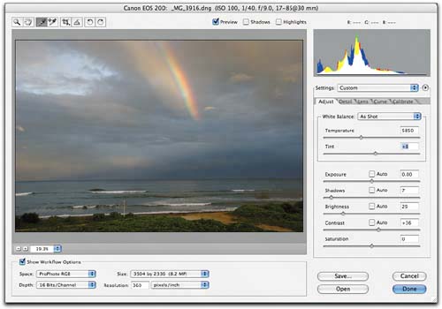
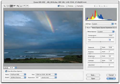
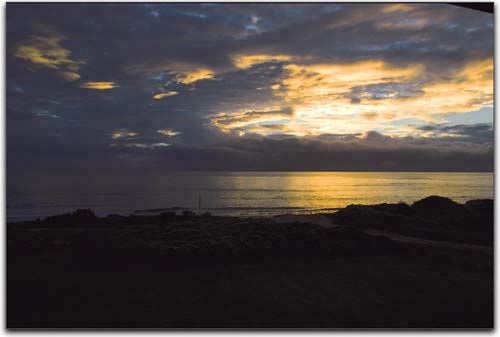
SaturationThe Saturation slider acts like a gentler version of the Saturation slider in Photoshop's Hue/Saturation command. It offers somewhat finer adjustments than Hue/Saturation; but a Hue/Saturation Adjustment Layer allows you to fine-tune by varying the layer opacity, so as with Shadows, Brightness, and Contrast, it's pretty much a wash whether you make the adjustments in Camera Raw or in Photoshop. The up and down arrow keys change the saturation in increments of 1. Adding Shift changes the saturation in increments of 10. Figure 4-27 shows a normally exposed image as shot, and a typical set of adjustments that we might make in Camera Raw's Adjust tab. I'll look at the fairly complex interaction of the Exposure, Shadows, Brightness, and Contrast controls on more difficult exposures in Chapter 5, Hands-On Camera Raw. Figure 4-27. Typical Adjust tab adjustmentsThe image as shot, with my Camera Raw Default settings (they differ from the shipping defaults in that Use Auto Adjustments is disabled, and the Shadows slider value is set to 2).
The image at Camera Raw 3.0 shipping default settings, with Use Auto Adjustments enabledin this case, auto did the opposite of what I wanted!
The adjusted image. I warmed the image by increasing the color temperature and tint; brightened it by raising the Brightness value, which in turn required reducing the Exposure value to hold detail in the sky; and added contrast with the Contrast and Shadows sliders. I'll fine-tune the contrast using the Curve tab.
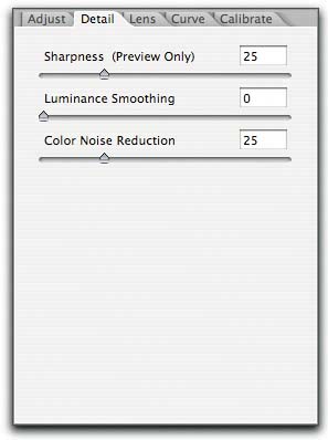
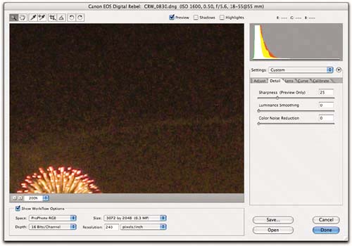
The Detail TabThe sliders in the Detail tab (press Command-Option-2) let you apply global sharpening and reduce noise in both luminance and color (see Figure 4-28). To see the effect of these controls, you need to zoom the preview to at least 100%often 200% or higher is more usefulbecause while the Camera Raw preview tries to show their effect at 50% or higher zoom, they're hard to see until you zoom in. The up and down arrow keys move the sliders in increments of 1. Adding Shift moves the sliders in increments of 10. Figure 4-28. The Detail tab
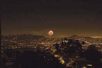
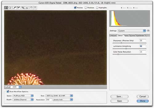
Most cameras need some amount of color noise reduction regardless of ISO speed. Each camera vendor makes its own compromise between image softness and color artifactingif an image detail falls on only a red, only a green, or only a blue pixel, the demosaicing algorithm has to make some guesses to figure out what color the resulting image pixel should really be, and sometimes single-pixel color artifacts result. Color noise reduction can also eliminate rainbow artifacts in highlights and green-magenta splotches in neutral grays. The need for luminance noise reduction, though, is more dependent on ISO speed and image content. SharpnessThe Sharpness slider lets you apply a variant of Unsharp Mask to the preview image or to both the preview and the converted image, depending on how you set Camera Raw Preferences (see "The Camera Raw Menu," earlier in this chapter). Unlike Unsharp Mask, Camera Raw's Sharpness only offers a single controlthe Threshold value is calculated automatically based on the camera model, ISO, and exposure compensation values reported in the image's metadata. I find the Sharpness control a bit of a blunt instrument. I usually set the preference so that Sharpness only applies to the preview, and apply more controlled sharpening post-conversion in Photoshop. But if I'm simply trying to get a bunch of images processed for approval, trying to make them good rather than great, I may apply a quick sharpen here, knowing that I can reprocess the "hero" shots from the raw file with no sharpening once I know which ones they are. Luminance SmoothingThe Luminance Smoothing slider lets you control grayscale noise that makes the image appear grainyit's typically a problem when shooting at high ISO speeds. The default setting is zero, which provides no smoothing; but many cameras benefit from a small amountsay 2 to 4of luminance smoothing even at slow speeds, so you may want to experiment to find a good default for your camera. At high ISO speeds800 and up you'll almost certainly need to apply luminance smoothing at much higher settings. At very high settings, the Luminance Smoothing slider produces images that look like they've been hit with the Median filter, so always check the entire image at 100% view or above before committing to a setting. Bear in mind that the controls in the Adjust tab can have a huge impact on the visibility of noise. Unlike many raw converters, Camera Raw gives you access to everything the camera has captured, including, sometimes, extremely noisy shadows that other converters may simply map to black. Attempting to pull shadow detail out of an underexposed image will almost certainly result in noisy shadows. Color Noise ReductionColor noise manifests itself as random speckles of color rather than gray, and in my experience, all cameras need some amount of color noise reduction. While the visibility of color noise varies with ISO speed, the required correction seems to vary much less than that that required for luminance noise, so you can generally find a good default value for your camera and deviate from it only when you see an obvious problem. It's difficult to show typical noise scenarios in print (bear in mind that noise that looks objectionable on the displayed RGB file is often quite invisible by the time the image has been converted to CMYK and printed), so Figure 4-29 shows something close to a worst-case scenarioISO 1600 with sodium-vapor lighting! Figure 4-29. Noise reduction
The image at 200% view (right), and the entire image (below)
Color Noise Reduction set to 15 removes the color noise.
Luminance Smoothing set to 40 greatly reduces the luminance noise (higher settings softened the image wthout significantly helping the noise).
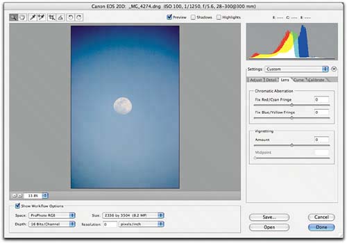
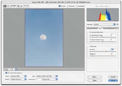
The Lens TabThe controls in the Lens tab (press Command-Option 3) let you address two problems that occasionally show up in digital captures, one much more common than the other (see Figure 4-30). The up and down arrow keys move the sliders in increments of 1. Adding Shift moves the sliders in increments of 10. Figure 4-30. The Lens tab
Chromatic aberrationChromatic aberration is a phenomenon where the lens fails to focus the red, green, and blue wavelengths of the light to exactly the same spot, causing red and cyan color fringes along high-contrast edges. In severe cases, you may also see some blue and yellow fringing. It typically happens with wide-angle shots, especially with the wide end of zoom lenses. Vignetting happens when the lens fails to illuminate the entire area of the sensor evenly, and shows up as darkening in the corners of the image. It's common when shooting at wide apertures. Some pundits claim that chromatic aberration in digital captures is caused by the microlenses some camera vendors place in front of each element in the array, but I'm skepticalI've seen it happen on cameras without microlenses, using wide-angle lenses that don't display chromatic aberration when shooting film. I believe it's simply because digital capture is more demanding on lensesfilm scatters the incoming light due to grain and to the presence of the multiple layers in the emulsion, so it's somewhat more forgiving than digital sensors. Whatever the reason, it's entirely likely that you'll encounter chromatic aberration in some wide-angle shots.
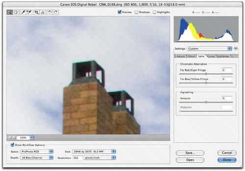
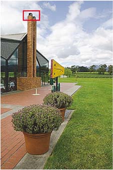
Figure 4-31 shows before-and-after versions of a chromatic aberration correction. As with the controls in the Detail tab, zoom the preview to 100% or more when making corrections with the chromatic aberration sliders. Figure 4-31. Chromatic aberration correction
Detail from the image (below left) shown before chromatic aberration correction (right) and after chromatic aberration correction (below right). Note that before applying the correction, I set Sharpness in the Detail tab to zero to make it easier to see where the fringing starts and ends.
VignettingVignetting, where the lens fails to illuminate the entire sensor area, darkening the corners, is usually a less-obvious problem, but you may encounter it when shooting wide open. See Figure 4-32.
Figure 4-32. Vignetting correctionVignetting often becomes objectionable when shooting a bright sky at wide apertures. The image before vignetting correction is shown above right; the corrected image is shown below right.
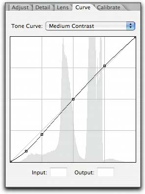
The Curve TabNew to Camera Raw 3.0, the Curve tab (press Command-Option-4) offers a luminosity-based curve control that lets you fine-tune the image's tonality. If you're used to thinking of Photoshop's Curves command as the best way to edit images, you may be tempted to skip the slider controls in the Adjust tab and use the Curve tab for all your tone-mapping adjustments, but that's not a good idea! To understand why it isn't a good idea, you need to know a little about how the Curve tab actually works. Like the sliders on the Adjust tab, the Curve tab operates on the linear capturein fact, the slider adjustments and the curve adjustments get concatenated into a single operation during the raw conversion. But the user interface for the Curve tab makes it appear that the curve is operating on gamma-2.2-encoded data. If the curve interface corresponded directly to the linear data, the midtone value would be around level 50, and the three-quarter tone would be all the way down at level 10 or so, which would make it pretty hard to edit! (If this paragraph went straight over your head, go back and take another look at "Exposure and Linear Capture" in Chapter 1, Digital Camera Raw, and "Gamma and Tone Mapping" in Chapter 2, How Camera Raw Works!) The upshot of this is that, from a user interface standpoint, the Curve tab works on top of the slider adjustments in the Adjust tab. You'll find that it's much easier to use the sliders for rough tonal shaping and the Curve tab for fine-tuning than it is to try to do all the heavy lifting in the Curve tab. See Figure 4-33. Figure 4-33. The Curve tab
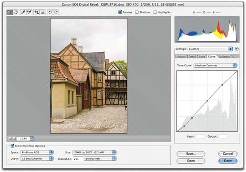
NavigationCamera Raw's Curve tab shares many convenience features with Photoshop's Curves dialog box, along with a few subtle differences. When you press Command and mouse over the image, a small white circle appears on the curve showing where on the curve the pixels under the cursor lie. Command-clicking places a point on the curve at that location. To delete a curve point, Command-click it, select it and press the Delete key, or drag it over one of the adjacent curve points. Control-Tab selects the next curve point, Control-Shift tab the previous point. To select multiple curve points, Shift-click on each one. The up, down, left, and right arrow keys move the selected curve point by one level: add Shift to move in increments of 10 levels. You can also enter numeric values for the selected curve point in the Input and Output entry fields. Tone Curve menuThe Tone Curve menu contains three preset curvesLinear, Medium Contrast, and Strong Contrastand Custom, which indicates a custom-edited tone curve. The default tone curve is Medium Contrast, but if you prefer a different default, you can change it, then save a new Camera Raw Default. In addition, you can save tone curves just like you can save any other custom subset of settings. To make saved tone curves appear automatically on the Tone Curve menu, save them in User/Library/Application Support/Adobe/Camera Raw/Curves (Mac), or Documents and Settings\User\Application Data\Adobe\Camera Raw\Curves (Windows)this is a different folder from the one for all other Camera Raw settings and subsets, but if you save a subset containing only a tone curve, it gets saved in this folder automatically. If you save tone curves anywhere else, you can load them using Camera Raw's Load Settings command. See "Loading and Saving Settings," earlier in this chapter. Adjustments and PreviewingOne key difference between Photoshop's Curves and Camera Raw's Curve tab is that the latter doesn't offer a real-time preview. Photoshop's Curves simply adjusts pixel values directly, but Camera Raw's Curve tab controls have to do a lot more work in mapping the edits you've specified in the gamma 2.2 interface of the tone curve onto the linear data as modified by the sliders in the Adjust tab. Today's machines simply don't have enough horsepower to update the preview in real time. I find that the most practical way to adjust the curve is to place points by Command-clicking, then use the arrow keys to make an adjustment, wait for the preview to update, and continue to fine-tune using the arrow keys. Figure 4-34 shows a typical Curve tab adjustment. Figure 4-34. Curve tab adjustmentsThe image from Figure 4-27 with the default Medium Contrast tone curve
The image after a curve adjustment. The points at the top of the curve put some detail back in the sky, while the point at the bottom of the curve punches the shadows.
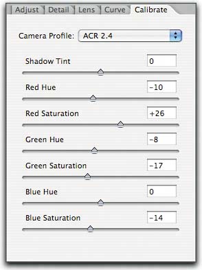
The curve is particularly effective for fine-tuning highlight detail, simply because in a linear capture, that's where most of the data lies. Notice that in the above example, I bent the curve in the highlight region about the same amount as I did in the shadows, but the difference it made to the highlights is much more visually obvious than the change to the shadows. To shape the shadows, things go much more easily when you get as close as possible with the slider controls in the Adjust tab, and reserve the curve for small tweaks to the slider results. The Calibrate TabThe controls in the Calibrate tab (press Command-Option-5) let you fine-tune the behavior of the built-in camera profiles to tweak for any variations between your camera and the one that was used to build Camera Raw's built-in profiles for the camera model (see Figure 4-35). The up and down arrow keys move the sliders in increments of 1. Adding Shift moves the sliders in increments of 10. Figure 4-35. The Calibrate tab
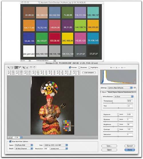
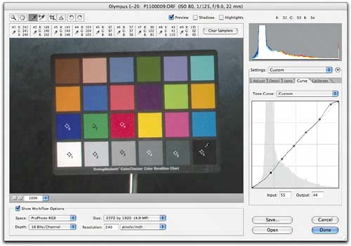
Camera ProfileFor most cameras, the only choice on the Camera Profile menu is ACR 2.4, indicating that the built-in profiles used in Camera Raw 3.0 are the same as the ones in Camera Raw 2.4. For a few cameras, Camera Raw 3.0 offers new, improved profiles. If you have legacy images adjusted for the Camera Raw 2.4 profiles you can choose the ACR 2.4 profiles from this menu, while taking advantage of the new profiles for new images. Calibration targetsI find that the most effective way to use the Calibrate controls is to shoot a 24-patch Macbeth ColorChecker, and then compare it with an accurate version of the target converted to the ProPhoto RGB working space. You can download a ProPhoto RGB image of the ColorChecker, made from averaged measurements of several physical targets, from www.colorremedies.com/realworldcolor/downloads.html. Make sure that the target you're shooting is evenly lit, and if you're relying on the camera's built-in metering, avoid having anything significantly brighter than the target's white patch in the sceneusing shiny metal clips to hold the target in place is a Bad Idea! Ideally, with no Exposure correction, the white patch should be around level 237245. The processThe object of the exercise is to edit the raw image of the captured target to match as closely as possible the values in the reference ProPhoto RGB image of the ColorChecker. By far the easiest way to do this is to employ the free Colorbrator script written by my friend and colleague Thomas Fors. You can download the script, along with the instructions for using it, from www.Chromoholics.com/Colorbrator.html. But for those of you who like to do things the hard way, or simply want to understand what the script is doing, I'll describe the manual process that the script automates. It's a two-step process (though you may find that you need to do each of the two steps more than once). Start by adjusting the tonal controls in the Adjust tab to first get approximately the same luminance values for the black and white patches as are in the ProPhoto RGB file, and then to get an approximate visual match to the gray patches in the ProPhoto RGB image. It's better to concentrate on getting a good visual match rather than trying obsessively to match the numbers exactly, but the numbers can be very helpful in guiding you towards the visual match. You'll find that the ProPhoto RGB file from www.colorremedies.com displays the numerical values for each patch, so you can easily compare the RGB numbers in the ColorChecker image with those supplied by Camera Raw's RGB readout and color samplerssee Figure 4-36. Figure 4-36. Calibration setupYour capture of the ColorChecker may look quite different from this one, but the same principles apply! Arrange your windows so that you can see both the ProPhoto RGB reference file and the target capture, then place color samplers on all six gray patches and on the red, green, and blue patches.
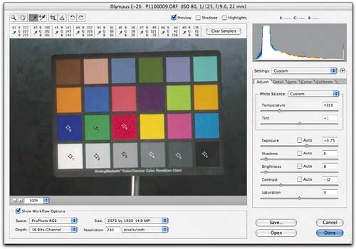
Once you've matched the tonality of the gray patches to the reference ProPhoto RGB file, you can proceed to the Calibrate tab, where you can adjust red, green, and blue hue and saturation as well as shadow tint. Don't try to achieve an exact numeric match for every patchthat's a fast route to the funny farm! Instead, try to nail the relative overall hue and saturation relationships, using the numbers as a guide. Now let's look at the adjustments in detail. Tonal adjustmentsBefore touching the Calibrate controls, use the tonal controls in the Adjust tab to create a reasonable contrast match to the ColorChecker image. I suggest the following step-by-step procedure, always comparing the patches in the raw image to those in the ColorChecker image.
You'll usually need to bring the Brightness and Contrast values down to the point where the image looks extremely flat. Don't worrythis is normal, and the goal is simply to get the overall contrast to match the relatively low contrast of the ColorChecker. Once you've tweaked the color response in the Calibrate tab, you're free to tweak the tonality without affecting hue and saturation. But if you don't match the overall contrast of the target, your color tweaks will be wildly off, and will produce unpredictable color shifts as you tweak the tonal values. See Figure 4-37. Figure 4-37. Tonal adjustmentsUse the Exposure, Shadows, Brightness, and Contrast sliders to get the values in the gray patches as close as possible to those in the ProPhoto RGB file.
Once you've adjusted the sliders to get as close as possible, you can fine-tune the result with the Curve tabplace a point for each gray patch, and tweak the curve to get the closest possible match. See Figure 4-38. Figure 4-38. Fine-tuning with the Curve tabIn the Curve tab, Command-click on each gray patch to make a curve point, then adjust the curve to fine-tune the gray patch values.
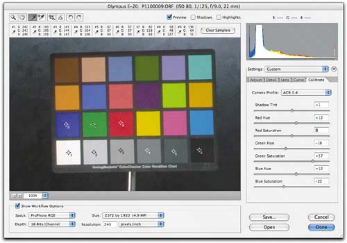
Calibrate adjustmentsNow you're ready to proceed with the Calibrate tab adjustments. The Calibrate tab offers a Shadow Tint control, and separate Hue and Saturation controls for Red, Green, and Blue.
The key point to wrap your head around in using the Hue and Saturation adjustments is this: The Red Hue and Red Saturation sliders don't adjust the red value, rather they adjust the blue and green; the Green Hue and Saturation sliders adjust red and blue; and the Blue Hue and Saturation sliders adjust red and green. Concentrate on the red (R3C1), green (R3C2), and blue (R3C3) patches in the target. Positive adjustments to the Red Hue slider increase green and decrease blue; negative ones decrease green and increase blue. Positive adjustments to the Red Saturation slider decrease green and blue equally; negative ones increase green and blue equally. Adjust the Red Hue and Saturation while checking the red patch, the Green Hue and Saturation while adjusting the green patch, and the Blue Hue and Saturation while adjusting the blue patch. I suggest adjusting green, then blue, then red. You'll quickly notice that everything you do here affects everything else! You may have to go through two or three rounds of tweaking the sliders, and possibly revisit the tweaks you made in the Curve tab. But if you persevere, five to ten minutes' work can get you a very close visual match. An exact numeric match is unlikely, but you can get close. The important things to nail are the relative proportions of red, green, and blue in the red, green, and blue patcheswhen you get these right, the rest of the color pretty much falls into placesee Figure 4-39. You may want to create separate calibrations for tungsten and for strobe or daylightmany cameras respond significantly differently to tungsten and to daylight (or daylight-like) sources. Figure 4-39. Calibrate tab editsUse the Calibrate controls to adjust the proportions of red, green, and blue in each of the red, green, and blue patches.
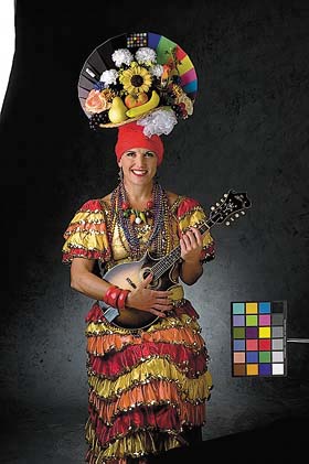
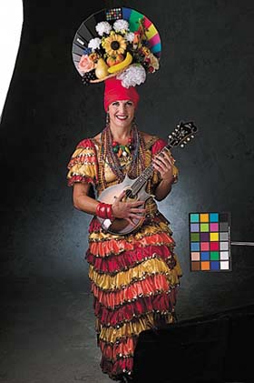
The key is to match the proportions of red, green, and blue in each patch rather than the absolute values. For example, the red patch in the physical ColorChecker measures R122, G58, B46 when the Lab measurements are converted to ProPhoto RGB, but the red value of the patch in the capture is around 136, so you need to adjust the aim points accordingly. If you divide 136 (the actual red value) by 122 (the reference red value), you get 1.1. Calculate the aim points for the red patch's blue and green values by multiplying the values in the reference image by 1.1 to get the aim points of 64 for green and 51 for blue. Once you've dialed in your camera's response, you can incorporate the Calibrate settings into a new Camera Default for that camera, using the Save New Camera Raw Defaults command on the Camera Raw menu. But don't forget to zero out the Adjust and Curve tabs to your desired default rather than the very low-contrast settings required by this exercise! It may be tempting to use the Calibrate controls as color-correction tools, and within limits you can do so; but if you often need to do so, it's a sign that the calibration for your camera leaves something to be desired. That said, the Calibrate controls offer some interesting creative possibilities that I'll demonstrate in Chapter 5, Hands-On Camera Raw. Figure 4-40 shows images from several cameras before and after applying custom calibration settings. They demonstrate the effectiveness of the feature in dialing in the performance of very different cameras. Figure 4-40. Before and after calibrationThe top row shows images at camera default settings; the bottom row shows the same images after applying Calibrate adjustments.
Canon EOS 1Ds
Nikon D1H
Nikon D100
Photography by Peter Fox
|


EAN: N/A
Pages: 112