Using the Chart Expert
| Reflecting back on the sample reports used in Chapters 2 and 3, you might find that there are opportunities for enhancement through the addition of meaningful charts. As you learned in Chapter 2 with groupings, it is quite easy to summarize the data you collect for a report into meaningful categories or groups. Chapter 2 reviews some examples of grouping based on fields such as country and employee ID. By hiding or suppressing the detail sections of reports, you learned how to bring the meaningful summarizations around these types of groups to the forefront. To further bring this aggregated data to the business user's attention, you can create a chart on this grouped data using the Chart Expert. To open the Chart Expert, either click on the Chart icon located on the Insert toolbar or select the Insert Chart option under the main Insert menu and then after placing the chart placeholder on your report in the desired section, access the Chart Expert menu option from the chart's rightclick menu. Figure 8.1 displays the Chart Expert. Figure 8.1. The Chart Expert dialog enables the rapid addition of valuable charts to reports.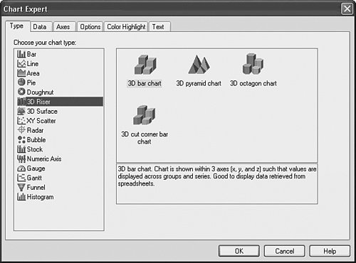 After you access the Chart Expert, several steps are required to actually complete the chart. These are reviewed in the next five sections. Using the Chart Expert Type TabThe Chart Expert consists of six different tabs. The initial display tab on the Chart Expert is the Type tab, shown in Figure 8.1. On this tab, the type of graphic or chart is selected. In Crystal Reports version XI, there are more than 40 different basic chart types from which to select. In addition to the classic bar, line, pie, and area charts, new chart types in versions 9,10, and XI are listed in Table 8.1.
These charts have been added to expand the visual capabilities of Crystal Reports and enrich your report presentations. Let's create a Sample Customer Order Listing report and add a chart to it that highlights the Company's Top 10 Customers in the following steps:
Figure 8.2 displays the result of these five steps. You will continue creating this chart in the next four sections. Figure 8.2. The Type tab on the Chart Expert dialog for the Sample Top 10 Customers report. Table 8.2 highlights some common reports, their contained graphics, and the benefits of using them.
Using the Chart Expert Data TabAfter a chart type has been selected in the Type tab, click on the Data tab. The Data tab enables the selection of the specific data on which the chart is based and the chart's location on the report. Figure 8.3 displays one view of the second tab of the Chart Expert. This view might vary depending on the different Chart Type options you have selected. The Data tab is composed of two sections: Layout and Data. These sections and corresponding options are discussed next. Figure 8.3. The Data tab of the Chart Expert enables specification of layout and data options.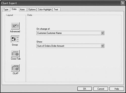 Specifying Chart LayoutThe Chart Layout section specifies the data selection options that the selected chart provides to the report designer. The actual data is selected in the Chart Data section. Note that the options presented in that section are dependent on the specific Chart Layout button you have selected. Table 8.3 lists the different layout buttons and their typical uses.
The Cross-Tab and OLAP layout buttons and their related options are explored in Chapters 10, "Using Cross-Tabs for Summarized Reporting," and 16, "Formatting Multidimensional Reporting Against OLAP Data," because they relate to very specific report types. The next section explores the detailed data options that the Advanced and Grouping layout buttons enable. Specifying Chart DataFigure 8.3 displays the Data tab with the Group layout button selected. As previously described, this layout option is designed to facilitate the quick creation of a chart with a minimal amount of effort. To accomplish this rapid chart creation, two pieces of information are requested through two drop-down boxesOn Change Of (grouping item) and Show (field to be shown in the chart) selections. The On Change Of field is used to determine where the selected chart breaks the report data to be displayed. The Show field specifies the summary field to be displayed for each break of the data. To continue adding a bar chart to the sample report, follow these steps:
Note When leveraging the Rapid Chart Creation functionality of the Group layout option, it's worth noting that you are limited to chart creation based on existing summary fields already created in your reports and inserted into existing group sections. For more flexible chart creation, you can use the Advanced layout option described later. Figure 8.4 displays the Data tab with the Advanced Layout button selected. The additional options presented here give you more flexibility in the charts that you can create. Figure 8.4. The Data tab with the Advanced Layout button selected. The On Change Of and Show Values fields should be recognizable in this new window although they are selected in a much more flexible manner (see the right side of the Data section beside the Available Fields listing) described next. The On Change Of field is now only one selection option (among three) in its own drop-down box. If you need to create a chart based on changing a specific field (as you did with the standard group layout), select the On Change Of charting option and then specify the field or fields to break the chart sections on by selecting any of the fields in the available fields listing. Unlike the drop-down box under the Group layout, you can select any of the available report fields in this interface, dynamically order them with the Order button or restrict their display on the report to a specified Top or Bottom N with the Top N button. You can also dynamically select multiple fields for the chart to break on, and none of the selected fields need already be on the report or have summary fields previously existing on the report for them. The remaining two options in the On Change Of drop-down box are For Each Record and For All Records. These two options enable charts to be created either against all data in a report or for each detailed record in a report. Tip When using the For All Records charting option, you can select the field to be displayed for each break by selecting a field from the Available Fields list in the list box beneath the For All Records drop-down box. After selecting any of these options, you need to select a Show Value(s) field to enable the chart's creation. This selection specifies the summary field to be displayed for each break of the data and can come from any field (database, report, formula, and so on) that is listed in the available field's list. To select the Show Value fields, highlight the intended field and use the selection arrow buttons adjacent to the Show Values list box. Note You do not need to have an existing summary on your report to use it for a graph in the Advanced Charting layout options. You can add any field to the Show Values list and then dynamically create a summary by clicking on the Set Summary Operation button. These dynamically created summaries are created automatically and used by the chart. This is one of the unique features of Crystal Reports that provides you with more charting flexibility. Using the Chart Expert Axes TabThe fourth tab in the Chart Expert dialog, the Axes tab, only appears if the Automatically Select Chart Options check box has been deselected on the Type tab. You can then select the Axes tab by clicking it. This tab enables you to customize chart gridlines, data value scales, data value ranges, and data value divisions. Figure 8.6 displays the Axes tab of the Chart Expert dialog for a bar chart. Figure 8.5. The Axes tab of the Chart Expert allows specification of gridline display, axis ranges, and divisions.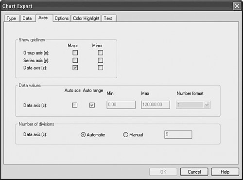 Figure 8.6. The Chart Expert Options tab allows specification of data points and legends for the involved chart. Note This tab only appears when the selected chart type has axes within it (for example, a bar chart or line chart) and does not display for other chart types such as a pie chart. To continue adding a bar chart to the sample report, try the following step: Select the Major Gridlines check box for the data axis. This facilitates the reading of the bar charts. You will finish creating this bar chart in the following section. Tip By manually setting both the Min/Max Data Ranges and the Number of Divisions, you are able to customize your data axis gridline display labels. Using the Chart Expert Options TabThe Options tab in the Chart Expert only appears if the Automatically Select Chart Options check box has been deselected on the Type tab. The Options tab enables you to customize chart coloring, data-point labeling, legend placement, legend format options, and several other chart typespecific formatting options. Figure 8.7 displays the Options tab of the Chart Expert dialog for a bar chart. Figure 8.7. The Text tab of the Chart Expert allows specification of text labels for the associated chart.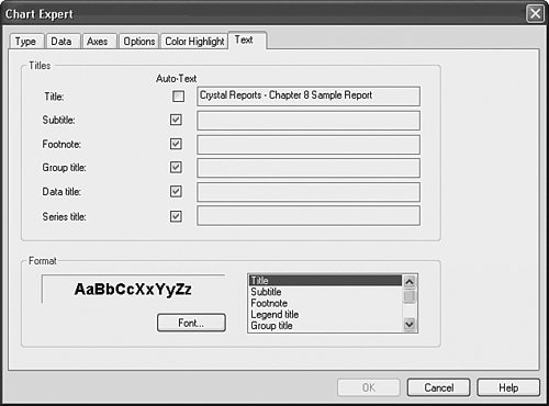 To continue customizing the bar chart you have been adding to your working sample report, follow these steps:
Using the Chart Expert Color Highlight TabNew to XI, the Color Highlight tab provides you with an easy method of controlling the color of the different elements (such as bars, pie slices, and so forth) in your created charts. This functionality was hard to find in previous versions of Crystal Reports, yet it was previously available through the Format button under the Chart Expert Options tab. Tip The color highlighting functionality enables you to create charts with consistent coloring both within and across your reports. In the sample report in this chapter, you could specify the color of any particular customer(s) or you could specify the color of multiple bars based on the sum of the Orders Amount field. An example might be that where the sum of Orders Amount is greater than 75,000, the involved bar should be colored black to highlight the positive impact on Xtreme's bottom line. Using the Chart Expert Text TabAfter a chart type and data have been specified, select the Text tab. This tab on the Chart Expert dialog enables you to specify titles and title formatting that the chart displays when it is placed on the report. Figure 8.7 shows the Text tab of the Chart Expert. To finish adding the bar chart to the sample report, follow these steps:
Figure 8.8. A sample Customer Orders report with a bar chart highlighting the visual benefits of charting.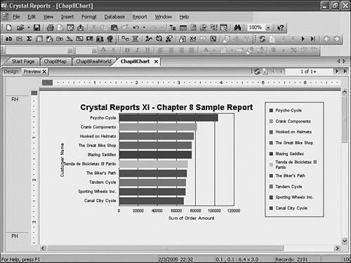 If you find your chart is slightly different in appearance or imperfect, that is okay. You have plenty of powerful fine-tuning tools at your disposal, and they will be explored at the end of this chapter. |
EAN: 2147483647
Pages: 365