| Access's Chart Wizard is quite parochial: It insists on creating a crosstab query for you. After you've created a chart with the Chart Wizard, however, you can change the graph's Row Source property value to specify a previously created crosstab query of your own design. Linked graphs or charts display a succession of graphical representations of related data. Linked graphs are useful for delivering more detailed information than bar or area charts can impart. For example, it's difficult to interpret trends for sales of product categories in a stacked area chart. Linked graphs let you drill down into the data behind summary charts and add features to aid data interpretation such as trendlines. Linked graphs are one of Access 2003's most powerful features. For this linked graph example, you create the qry1997SalesChartCT crosstab query and use the query as the Row Source of the unbound object frame to complete the linked graph example in the following section. The linked graph example doesn't work with the crosstab query created by the Chart Wizard in the preceding steps. The Chart Wizard's crosstab query result set has months in rows and categories in columns. Designing the Crosstab Query for the Graph To create the qry1997SalesChartCT query from qry1997SalesChart, follow these steps:   Create a new query in Design view, add the qry1997SalesChart query, and choose Query, Crosstab Query. Create a new query in Design view, add the qry1997SalesChart query, and choose Query, Crosstab Query.
Drag the CategoryName field to the first column of the query and select Row Heading in the Crosstab row. Alias the CategoryName field by typing Categories: at the beginning of the Field text box. Type the expression Month:Format([ShippedDate], "mmm") into the second Fields cell to use three-letter month abbreviations. Then, select Column Heading in the Crosstab cell. Drag the Amount field to the third column, set the Total cell to Sum, and set the Crosstab cell to Value (see Figure 18.24). Figure 18.24. A Jet crosstab query for a linked graph requires specifying a Row Heading, Column Heading, and Value in the Crosstab row of the query design grid. 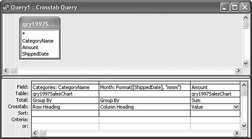 Double-click an empty region of the upper query pane to open the Query Properties sheet. In the Column Headings text box, type the 12 month abbreviations, Jan,... Dec, separated by commas to arrange the columns in date, not alphabetic, sequence. Access adds the quotes around the month abbreviations for you (see Figure 18.25). Figure 18.25. In the Query Properties dialog, add a comma-separated list of column headings that correspond to your crosstab query's Format expression for the Column Heading values. 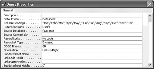 Save your query as qry1997SalesChartCT.  Click the Run button to check your query result set (see Figure 18.26). Click the Run button to check your query result set (see Figure 18.26).
Figure 18.26. This Jet crosstab query provides the value of the Row Source property for the linked graph. 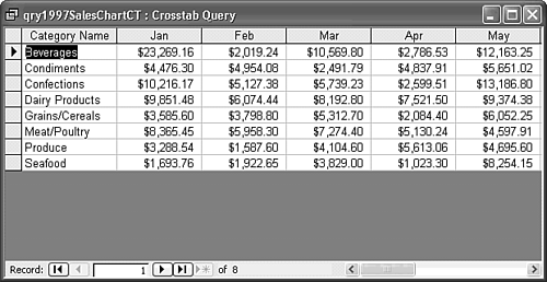
Jet SQL The crosstab query for the linked chart differs from that created by the Chart Wizard for an unlinked chart or graph. Following is the Jet SQL statement for the linked chart's data source: TRANSFORM Sum(qry1997SalesChart.Amount) AS SumOfAmount SELECT qry1997SalesChart.CategoryName AS Categories FROM qry1997SalesChart GROUP BY qry1997SalesChart.CategoryName PIVOT Format([ShippedDate],"mmm") In ("Jan","Feb","Mar","Apr","May","Jun", "Jul","Aug","Sep","Oct","Nov","Dec"); The primary difference between the two queries is the GROUP BY clause, which groups the data by the CategoryName column, rather than by a date expression. In this case, the In predicate is required to return the monthly data in date instead of alphabetic order. |
Assigning the Crosstab Query as the Graph's Row Source The next stage in the process is to take advantage of your existing MSGraph design by changing its data source from the Chart Wizard's Jet SQL statement to the new crosstab query. Do the following:   Open frm1997SalesByCategoryChart in Form view, select the chart's object frame (OLEUnbound0), and open its Properties window. Open frm1997SalesByCategoryChart in Form view, select the chart's object frame (OLEUnbound0), and open its Properties window.
Open the Row Source list box, and select qry1997SalesChartCT as the value of the Row Source property. The graph displays category labels on the x-axis and month labels in the legend. Double-click to activate the graph, and choose Data, Series in Rows from Access's menu. Verify that your line graph appears the same as the graph that the Chart Wizard created in the earlier "Modifying the Design Features of Your Graph" section (refer to Figure 18.14).
 | If you're having trouble getting labels into the correct location, see "Reversing the X-Axis and Legend Labels" in the "Troubleshooting" section at the end of this chapter. |
Linking the Graph to a Single Record of a Table or Query You create a linked graph or chart by setting the values of the MSGraph object's Link Child Fields and Link Master Fields properties. The link is similar to that between a form and subform. A linked graph displays the data series from the current row of the table or query that serves as the Record Source of the form. As you move the record pointer with the record navigation buttons, the graph is redrawn to reflect the data values in the selected row. To change the frm1997SalesByCategoryChart form to accommodate a linked graph, follow these steps:   Change to Form Design view, click the Select Form button, and then click the Properties button to open the Properties window for the form. Change to Form Design view, click the Select Form button, and then click the Properties button to open the Properties window for the form.
Click the Data tab, open the Record Source list box, and select qry1997SalesChartCT as the value of the Record Source property of the form, which binds the form to the crosstab query. Your form needs record-navigation buttons for a linked graph or chart, so click the Format tab and set the value of the Navigation Buttons property to Yes. Select the unbound object frame (OLEUnbound0) and then click the Data tab. Verify that qry19971997SalesChartCT is the Row Source for the chart. Type Categories as the value of the Link Child Fields and Link Master Fields properties (see Figure 18.27). Disregard the "Can't build a link between unbound forms" error messages that might appear after typing the Link Child Fields value. Figure 18.27. Type the column name of the field on which to link the graph and the form in the Link Master Fields and Link Child Fields text boxes. You can't use the Builder button to create the link; you receive an error message if you try. 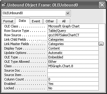 Note Using this technique, you create the link between the current record of the form and the row of the query that serves as the Row Source property of the graph (through the aliased Categories column of the query). To test your linked graph, click the Form View button. If (in the earlier "Changing the Graph to a Chart" section) you saved the line graph version of the form, your graph initially appears as shown in Figure 18.28. Figure 18.28. The linked graph displays a single line and legend entry for each of the eight product categories. 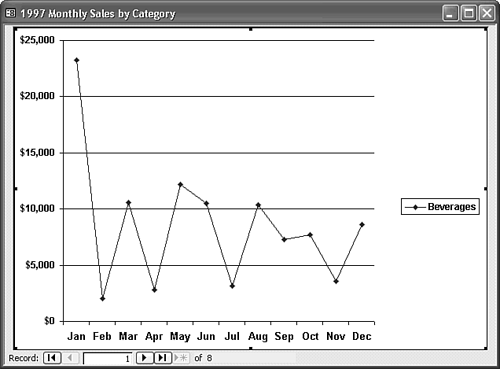 The single line appears a bit anemic for a graph of this size, so double-click the graph to activate it in place. Right-click the line with all data points selected, and choose Format Data Series to display the Format Data Series dialog. Click the Patterns tab, select the Custom option, open the Weight drop-down list, and choose the thickest line it offers. Optionally, change the color from Automatic to a color from the pick list. To change the data-point marker, select the Custom option, open the Style drop-down list, and select the square shape. Use the drop-down lists to set the Foreground and Background colors of the marker to automatic to add solid markers of the color complementary to the line. Optionally, increase the size of the markers by a couple of points (see Figure 18.29). Click OK to close the dialog and implement your design changes. Figure 18.29. The Format Data Series dialog lets you change the thickness and color of the graph's line, add and format data markers, and change the line segment to a continuous curve between data points (called smoothing, which is shown later in Figure 8.31). 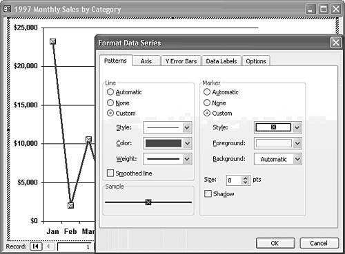 Double-click the legend box to open the Format Legend dialog. On the Patterns page, click the None option in the Border frame to remove the border from the legend. Click the Font tab, turn the Bold attribute on, and change the font size to 11 points. Click OK to close the dialog and apply your modification to the legend. To use your enhanced legend as a title for the chart, click and drag the legend to a location above the graph. Click the plot area to display the chart's sizing handles; drag the middle sizing handle to the right to increase the width of the plot area (see Figure 18.30). Figure 18.30. This graph is reformatted with increased line thickness, added data points, and a modified legend to act as the chart title. 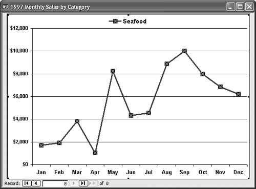  Click the record navigation buttons to display a graph of the sales for each of the eight categories. As you change categories, notice that the y-axis scale changes. The maximum range for the Beverages category is $25,000, while that for Condiments is $7,000. Click the record navigation buttons to display a graph of the sales for each of the eight categories. As you change categories, notice that the y-axis scale changes. The maximum range for the Beverages category is $25,000, while that for Condiments is $7,000.
To add a trendline to your graph, activate the graph, and choose Chart, Add Trendline to open the Add Trendline dialog. Accept the default Linear trendline on the Type page, and click the Options tab. Select the Custom option and type a legend for the trendline, such as 1997 Sales Trend, and click OK. To remove the sizing handles from the Form view of the deactivated object, change to Design view, select the object frame, and open the Properties window. Click the Data tab, and change the Enabled property value to No and Locked to Yes. (You can't change Locked to Yes in Form view.) Changing these two property values prevents users from activating the graph. With the Smoothed Line check box of the Data Series dialog marked, your modified graph appears in Form view as shown in Figure 18.31. Refer to Figure 18.29 for setting the Smoothed Line option. Figure 18.31. Adding a trend line to the graph aids interpretation of the data. Smoothing the data series line implies the existence of additional data points between those in the Datasheet, such as the slower decline from May to June. 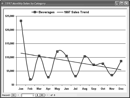 Choose File, Save As, and then save your bound graph form with a new name, such as frm1997SalesByCategoryChartLinked.
|