| The properties that apply to the entire form, to the five sections of the form, and to each control object on the form are determined by the values shown in the Properties window. To view the Properties window for a control, select the control by clicking anywhere on its surface; then click the Properties button on the toolbar. Alternatively, right-click the control and choose Properties from the pop-up menu. The following list describes how to select and display the properties of form sections and control objects: Header section only To select the Form Header, click the Form Header or Page Header bar. The set of properties you work with applies only to the Form Header or Page Header section. Detail section only To select the Detail section, click the Detail bar. You get a set of properties similar to those of the Form Header section, but all of these apply to the Detail section. Footer section only To select the Footer section, click the Form Footer or Page Footer bar. A set of properties identical to the header properties is available for the footer sections. A Form Footer appears only if a Form Header has been added. The same applies to Page Headers and Footers. Control object (or both elements of a control with an associated label) Click the surface of the control to select the control. Each type of control has its own set of properties. Displaying the properties of multiple-control objects is the subject of the section "Selecting, Moving, and Sizing a Single Control" later in this chapter.
Changing the Size of the Form Header and Form Footer You can change the height of a form section by dragging the Form Header, Page Header, Detail, Page Footer, or Form Footer bar vertically with the mouse. When you position the mouse pointer at the top edge of a section divider bar, it turns into a line with two vertical arrows. You drag the pointer with the mouse to adjust the size of the section above the mouse pointer. The height of the Detail section is determined by the vertical dimension of the window in which the form is displayed, less the combined heights of all the header and footer sections that are fixed in position. When you adjust the vertical scroll bar, only the Detail section scrolls. Selecting, Moving, and Sizing a Single Control When you select a control object by clicking its surface, the object is enclosed by a shadow line with an anchor rectangle at its upper-left corner and seven smaller, rectangular sizing handles (see Figure 14.18). Figure 14.18. The appearance of selection or sizing handles and the mouse pointer depend on the moving or sizing operation in progress. 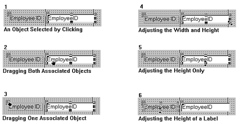 Note Most controls have attached labels. When you select one of these objects, the label and object are selected as a unit.
Selecting and deselecting controls is a toggling process. Toggling means repeating an action with the effect of alternating between On and Off conditions. The Properties, Field List, and Toolbox buttons on the toolbar as well as their corresponding menu choices are toggles. The Properties window, for example, appears and disappears if you repeatedly click the Properties button. The following choices are available for moving or changing the size of a control object (the numbers correspond to the numbers in Figure 14.18): To select a control (and its associated label, if any), click anywhere on its surface. Tip If you have trouble selecting a small control, such as a thin line (particularly one that is adjacent to a section bar), you can select the control using the Object drop-down list on the toolbar or in the drop-down list at the top of the Properties window. To move the control (and its associated label, if any) to a new position, move the mouse pointer within the outline of the object at any point other than the small resizing handles or the confines of a text box (where the cursor can become an editing cursor). The mouse pointer becomes a hand symbol when it's on an area that you can use to move the entire control. Press and hold down the left mouse button while dragging the hand symbol to the new location for the control. An outline of the control indicates its position as you move the mouse. When the control is where you want it to be, release the mouse button to drop the control in its new position. Tip If the control doesn't have an associated label, you can drag the control's anchor handle at the upper-left corner to move the control. To separately move the elements of a control that has an associated label, position the mouse pointer on the anchor handle in the upper-left corner of the control that you want to move. The mouse pointer becomes a hand with an extended finger. Click and drag the individual element to its new position and then release the mouse button. To simultaneously adjust the width and height of a control, click the small sizing handle at any of the three corners of the outline of the control. The mouse pointer becomes a diagonal two-headed arrow. Click and drag this arrow to a new position and then release the mouse button. To adjust only the height or width of the control, click the sizing handle on one of the horizontal or vertical surfaces of the outline. The mouse pointer becomes a vertical or horizontal two-headed arrow. Click and drag this arrow to a new position and then release the mouse button. To adjust the height or width of the label only, select the label as described in step 3, and then adjust the label's dimensions.
Aligning Controls to the Grid The Form Design window includes a grid that consists of one-pixel dots with a default spacing of 24 to the inch horizontally and 24 to the inch vertically. When the grid is visible, you can use the grid dots to assist in maintaining the horizontal and vertical alignment of rows and columns of controls. Even if the grid isn't visible, you can cause controls to "snap to the grid" by choosing Format, Snap to Grid. This menu command is a toggle, and when Snap to Grid is active, the menu choice is checked. Whenever you move a control while Snap to Grid is active, the upper-left corner of the object jumps to the closest grid dot. You can cause the size of control objects to conform to grid spacing by choosing Format, Size, To Grid. You also can make the size of the control fit its content by choosing Format, Size, To Fit. Tip If Snap to Grid is on and you want to locate or size a control without reference to the grid, press and hold the Ctrl key while you move or resize the control.
Toggling the View, Grid menu command controls the visibility of the grid; by default, the grid is visible for all new forms. If the grid spacing is set to more than 24 per inch or 10 per centimeter, the dots aren't visible. For "non-metrified" users, better values are 10 per inch for Grid X and 12 per inch for Grid Y. This grid dot spacing is optimum for text controls that use the default 8-point MS Sans Serif font. To change the grid spacing for a form, follow these steps:  Click the Form Select button or press Ctrl+R to select the entire form. Click the Form Select button or press Ctrl+R to select the entire form.
 Click the toolbar's Properties button to open the Properties window. Click the toolbar's Properties button to open the Properties window.
Click the Format tab, and then scroll through the list until the Grid X and Grid Y properties are visible. Change the value of Grid X to 10 dots per inch (dpi) and Grid Y to 12 dpi, or change both values to 16 (if you want controls to align with inch ruler ticks). Metrified users are likely to prefer a value of 10 for both Grid X and Grid Y.
Selecting and Moving Multiple Controls You can select and move several objects at a time by using one of the following methods: Enclose the objects with a selection rectangle. Begin by clicking the surface of the form outside the outline of a control object. Press and hold down the mouse button while dragging the mouse pointer to create an enclosing rectangle that includes each of the objects you want to select (see Figure 14.19). Release the mouse button. You can now move the group of objects by clicking and dragging the anchor handle of any one of them. Figure 14.19. Selecting a group of objects by dragging a selection rectangle.  Click to select one object; then hold down the Shift key while you click to select the next object. You can repeat this step as many times as necessary to select all the objects you want. To remove a selected object from a group, hold down the Shift key and click the object with the mouse to deselect it. To deselect an entire group, click any inactive area of the form. An inactive area is an area outside the outline of a control. To create a group of the multiselected objects, choose Format, Group. The selection rectangle permanently encloses the objects, which lose their individual selection rectangles. Choose Format, Ungroup to remove the group attribute from the enclosed objects.
If you select or deselect a control with an associated label, the label is selected or deselected along with the control. You can change some property values such as font size and foreground or background color of all multiply-selected controls. Note The selection rectangle selects a control if any part of the control is included within the rectangle. This behavior is unlike many drawing applications in which the entire object must be enclosed to be selected. You can change the behavior of Access's selection rectangle to require full enclosure of the object by choosing Tools, Options; selecting the Forms/Reports tab (refer to Figure 14.11); and changing the value of the Selection Behavior option from Partially Enclosed to Fully Enclosed.
Aligning a Group of Controls You can align selected individual controls, or groups of controls, to the grid or each other by choosing Format, Align and completing the following actions: To fine-adjust the position of a control by the width of a single pixel, select the control and press Ctrl+Arrow. To align a selected control (or group of controls) to the grid, choose To Grid from the submenu. To adjust the positions of controls within a selected columnar group so that their left edges fall into vertical alignment with the leftmost control, choose Left from the submenu. To adjust the positions of controls within a selected columnar group so that their right edges fall into vertical alignment with the right edge of the rightmost control, choose Right from the submenu. To align rows of controls at their top edges, choose Top from the submenu. To align rows of controls at their bottom edges, choose Bottom from the submenu.
Your forms have a more professional appearance if you take the time to align groups of controls vertically and horizontally. Tip To quickly select a group of controls in a column or row, click within the horizontal or vertical ruler. This shortcut selects all controls intersected by the vertical or horizontal projection of the arrow that appears when you move the mouse within the ruler.
Using the Windows Clipboard and Deleting Controls   All conventional Windows Clipboard commands apply to control objects. You can cut or copy a selected control or group of controls to the Clipboard. After that, you can paste the control or group to the form using Edit menu commands and then relocate the pasted control or group as desired. Access uses the Windows keyboard shortcut keys: Ctrl+X to cut, Ctrl+C to copy selected controls to the Clipboard, and Ctrl+V to paste the Clipboard contents. The traditional Shift+Delete, Ctrl+Insert, and Shift+Insert commands perform the same operations. All conventional Windows Clipboard commands apply to control objects. You can cut or copy a selected control or group of controls to the Clipboard. After that, you can paste the control or group to the form using Edit menu commands and then relocate the pasted control or group as desired. Access uses the Windows keyboard shortcut keys: Ctrl+X to cut, Ctrl+C to copy selected controls to the Clipboard, and Ctrl+V to paste the Clipboard contents. The traditional Shift+Delete, Ctrl+Insert, and Shift+Insert commands perform the same operations.
You can delete a control by selecting it and then pressing Delete. If you accidentally delete a label associated with a control and Edit, Undo doesn't solve the problem, do the following: select another label, copy it to the Clipboard, select the control the label needs to be associated with, and paste the label to the control. Changing the Color and Border Style of a Control As mentioned earlier in this chapter, the default color for the text and borders of controls is black. Borders are one pixel wide (called hairline width). Some objects, such as text boxes, have default borders. Labels have a gray background color by default, but a better choice for the default label color would have been transparent. Transparent means that the background color of the object under the control (the form section, in this case) appears within the control except in areas of the control that are occupied by text or pictures. You control the color and border widths of a control from the Line/Border Color and Line/Border Width buttons on the Formatting toolbar. You must select a border style directly in the Properties window. To change the color or border width of a selected control or group of controls, follow these steps: Select the control(s) whose color or border width you want to change.  Click the arrow of the Fill/Back Color toolbar button to open the color palette pop-up window. Click the color square you want or click the Transparent button to make the background transparent. Click the arrow of the Fill/Back Color toolbar button to open the color palette pop-up window. Click the color square you want or click the Transparent button to make the background transparent.
 Click the arrow of the Line/Border Color toolbar button to open the color palette pop-up window, where you change the border color for any selected control with borders. Click the arrow of the Line/Border Color toolbar button to open the color palette pop-up window, where you change the border color for any selected control with borders.
 Click the arrow of the Line/Border Width toolbar button to open the border width pop-up window, where you change the thickness of the border for any selected control whose borders are enabled. Click the arrow of the Line/Border Width toolbar button to open the border width pop-up window, where you change the thickness of the border for any selected control whose borders are enabled.
 Click the arrow of the Font/Fore Color toolbar button to open the color palette pop-up window, where you change the color of the text of selected controls. Click the arrow of the Font/Fore Color toolbar button to open the color palette pop-up window, where you change the color of the text of selected controls.
Note The general practice for Windows data-entry forms is to indicate editable elements with borders and clear backgrounds. Still, some popular software uses reverse video as the default to indicate editable text. You can create the effect of reverse video by choosing black or another dark color for the fill of a text box control and a light color for its text. If you decide to implement reverse text, remember that reverse text is more difficult to read than normal text, so consider using a larger font and adding the bold attribute to ensure legibility.
To set the border style, you must select the Border Style property directly in the Properties window, as explained earlier in this chapter. Changing the Content of Text Controls You can edit the content of text controls by using conventional Windows text-editing techniques. When you place the mouse pointer within the confines of a text control and click the mouse button, the mouse pointer becomes the Windows text-editing cursor that you use to insert or delete text. You can select text by dragging the mouse over it or by holding down Shift and moving the cursor with the arrow keys. All Windows Clipboard operations are applicable to text within controls. Keyboard text selection and editing techniques using the arrow keys in combination with Shift are available, also. If you change the name of a field in a text box and make an error naming the field, you receive a "#Name?" error message in the offending text box when you select Run mode. Following is a better method of changing a text box with an associated label: Delete the existing field control by clicking to select it and then pressing Delete.  Click the Field List button in the Properties bar to display the Field List dialog. Click the Field List button in the Properties bar to display the Field List dialog.
Scroll through the entries in the list until you find the field name you want. Click the field name to select it; then drag the field name to the location of the deleted control. Release the mouse button to drop the new name. Close the Field List dialog when you're finished.
You can relocate and resize the new field caption and text box (or edit the caption) as necessary. Using the Format Painter  The Format Painter lets you quickly copy the format of any control on the form to any other control on the form. The Format Painter copies only those formatting properties that are relevant to the control on which you apply the Format Painter. To use the Format Painter, follow these steps: The Format Painter lets you quickly copy the format of any control on the form to any other control on the form. The Format Painter copies only those formatting properties that are relevant to the control on which you apply the Format Painter. To use the Format Painter, follow these steps:
Select the control with the formatting you want to copy. Click or double-click the Format Painter button on the toolbar; the mouse cursor changes to a pointing arrow with a paintbrush icon attached to it. (Double-clicking "locks" the Format Painter on. Double-click the Format Painter button only if you want to copy the formatting to more than one control.) Click any control that you want to copy the formatting to; the Format Painter copies all relevant formatting properties to this control. If you didn't double-click the Format Painter button, the Format Painter turns itself off after copying the formatting properties to one control. If you locked the Format Painter on by double-clicking its button, you can repeat step 3 as many times as you want. Click the Format Painter button again to turn off the Format Painter.
Typically, you use the Format Painter to quickly set the formatting properties for field text labels, or in any situation where selecting several controls by dragging a selection rectangle seems undesirable. By locking the Format Painter, it's easy to format several controls one after another. |