Commonly Used Controls
3 4
Of all the controls you can place on a form, labels and text boxes lead the pack in frequency of use, generally paired as a text box with an attached label. The text box displays data from a single field, and the label's caption describes the data. Some forms might need only text boxes and labels, but for more complex display and selection of data, you can use other controls, such as an image control to display an image, an optiongroup to allow users to select from a group of choices, or a command button to run code. The controls most commonly used on forms are described in this section; and the less commonly used controls are discussed in the following section.
Labels

You can use labels in two ways: as stand-alone labels and as attached labels. Stand-alone labels add descriptive text to a form. For example, you might use a label to identify a group of controls, as shown in the frmAuthors form in Figure 6-8, in which stand-alone labels identify groups of online IDs and telephone numbers. (You can find the frmAuthors form in the Crafts database on the companion CD.)
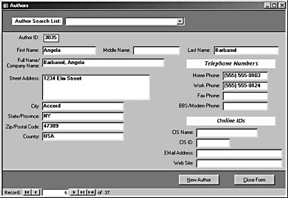
Figure 6-8. On the form shown here, stand-alone labels identify groups of controls containing information about telephone numbers and online IDs.
The frmAuthors form also contains attached labels. An attached label is linked to another control, usually a text box, combo box, or list box. When you move the parent control, the attached label control moves along with it. Each text box control on frmAuthors has an attached label control. By default, when you place a text box, combo box, or list box control on a form, it has an attached label control.
tip - Change label and text box properties in Form view
You can experiment with changing various properties of labels and text boxes in Form view by setting the form's Allow Design Changes property to All Views. Press Alt+Enter to open the form's properties sheet in Form view. (The F4 hot key works only in Design view.)
Troubleshooting - A label or command button caption containing an ampersand isn't displayed correctly
The ampersand character is used to define a hot key. To make an ampersand appear in Form view, you must use two ampersands, as in the following label:
Phones && IDs
note - Property names
In VBA code, property names have no spaces, while in properties sheets they may have spaces. For example, you'll see Special Effect in a text box properties sheet, but when referencing this property in VBA code, it is SpecialEffect.
Label Format Properties
You can use the Special Effect property to give labels and text boxes a variety of styles. Figure 6-9 illustrates the six Special Effect selections for labels and text boxes.

Figure 6-9. You can use the Special Effect property to format labels and text boxes in a variety of ways.
The format properties of labels (and text boxes) are interrelated in the following ways:
- If you set a label's Special Effect property to Etched or Chiseled, its Back Style property will be set to Transparent.
- If a label has any Special Effect property setting other than Flat and you set the Border Width property to anything other than Hairline, the Special Effect property will be set to Flat.
- A label with the Etched or Chiseled Special Effect property setting should have its Border Style property set to Transparent. If you set this property to Normal, the visual effect of the Etched or Chiseled style will be lost.
- If a label has any Special Effect property setting other than Flat and you set the Border Style property to anything other than Transparent, the Special Effect property will be set to Flat.
- Labels with the Raised Special Effect setting should have the Back Style property set to Transparent. If you set this property to Normal, the visual effect of the Raised style will be lost.
caution
Although the Border Style property has many style selections (see Figure 6-10), you probably shouldn't use any of them except Transparent and Solid (unless you're preparing a circus poster).
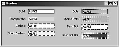
Figure 6-10. Most of the border styles are too busy for everyday use.
Text Boxes
A bound text box control displays data from the field to which it's bound; an unbound text box control can be used to accept a user entry that doesn't need to be saved in a table or (more commonly) to display the results of a calculated expression. For example, the following expression in the Control Source property of a text box displays the extended price for that record:
=[UnitPrice] * [Quantity]
You can dramatically change the appearance of a text box by adjusting the Border Style, Border Width, and Special Effect properties, just as you can modify labels. (See the section "Labels," for a list of interactions among format properties; see Figure 6-9 for illustrations.) However, just because you can apply a variety of attributes to text boxes doesn't mean you should. Shadowed, etched, or chiseled text boxes with 6-point dashed borders are distracting and give your application an amateurish look. For this reason, you might want to stick to either the Flat or Sunken special effect, white or light-colored backgrounds, and dark hairline borders, at least for business applications.
note
When you select multiple controls, only the properties they all share are displayed in the Multiple Controls properties sheet. You have to set the other properties in each individual control's properties sheet.
Option Groups
An option group allows you to choose one of a set of alternative choices, such as a shipping method or a choice of Print, Preview, or Save To File. Each alternative is represented by an option button, a check box, or (rarely, and not recommended) a toggle button.
tip
When used in an option group, toggle buttons aren't as intuitive to users as option buttons or check boxes so you probably shouldn't use them for this purpose. See the section "Toggle Buttons," for more details.
The form's user can select only one option in an option group at any time. Using an option group is a little like using the controls on a car radio-you can be tuned to only one station at a time, which is why option buttons are sometimes called radio buttons.
note
Although option groups can be unbound, an unbound option group control has little use, since there is no way to respond to a choice-you might as well use a rectangle.
tip - Create option groups that allow non-exclusive multiple choices
If you want to create a control that looks like an option group but allows multiple choices, surround a group of stand-alone check boxes with a rectangle. In this case, the check boxes are not part of an option group, and each one can be set to Yes or No separately.
Option Buttons
An option button is a small circle with a black dot in the center when selected and no dot when not selected. Within an option group, option buttons represent the choices the user can make. (Only one option button can be selected at a time.) Stand-alone option buttons work like check boxes, representing a Yes/No choice. However, users are less familiar with option buttons used as stand-alone controls, so it's better to use them only within option groups.
Check Boxes
Like option buttons, check boxes represent a Yes/No choice. Check boxes are familiar to users from paper forms, so they are the best choice for stand-alone controls used for Yes/No, True/False, or other binary choices. Check box controls also have a TripleState property that cycles an unbound check box control through three states instead of the usual two: Checked (True), Unchecked (False), and Dimmed (Null).
caution
Setting TripleState to Yes for a bound check box control isn't as useful as it could be because once you've checked a check box, clicking it again just clears it; you can't set the field's value to Null in the interface, nor can you set it to True again.
Combo Boxes
A combo box control has a box at the top for the user to enter text and a drop-down list for selecting an entry. This flexibility gives users a choice of typing in text or clicking a selection in the list. A combo box can be bound to a field in the form's record source; this is the field that's modified when the user makes a selection (or enters text) in the combo box.
Combo boxes also have two special properties for specifying the source of data for the drop-down list: Row Source Type and Row Source. The Row Source Type property of a combo box offers the following three choices, each of which determines the type of data that can be entered in the Row Source property:
- Table/Query. Lets you use a table or query from the current database (including linked tables) as the Row Source value. Using a table or query makes thelist dynamic because it will always be up to date as records are added to or deleted from the underlying table.
- Value List. Lets you manually enter the list choices as a list of semicolon-separated values typed into the property box, such as Regular; Preferred; Deluxe. Value lists are handy if you want your form to present a small number of fixed choices. Value lists are required if you want to use the new AddItem and RemoveItem methods for combo boxes and text boxes.
See the "Paired List Boxes" section for more details on using the AddItem and RemoveItem methods with list boxes.
- Field List. Shows the fields in a table specified in the Row Source property. This choice is useful when you need to select a field to set up a query condition.
When you select Table/Query as the row source type and then select a table or query for the row source, only the first column in the table or query will be displayed in the combo box's list unless you change the value of the Column Count property to a higher number. This column will also be the bound column (the one whose value is saved to the field specified in the combo box's Control Source property) unless you specify a different column in the Bound Column property.
Troubleshooting - I can't select a value in a combo box or list box-the computer just beeps when I click on a selection in the drop-down list
If you're unable to select a value in a combo box or list box, check the following:
- Is the control source missing or misspelled?
- Are you using the correct data type? The field selected in the combo box might be the wrong data type for the field to which the combo box is bound. You can't save a text value to a numeric field, for example.
Reselect the appropriate field for the Control Source property, and verify that it's the correct data type for the bound column of the combo box or list box.
You have several other options for setting the row sources of combo boxes. You can click the Build button next to the Row Source property to open the Query Builderwindow and create a SQL statement to use as the source of the combo box's list. You can also assign a Data Access Objects (DAO) or ActiveX Data Objects (ADO) recordset in VBA code as a combo box's Row Source property.
Troubleshooting - I don't know how to reference data in a specific column of a combo box or list box
To reference a specific column in a combo box's list, use the Column property with a number starting at 0. For example, the following expression as a text box's control source would display the value in the second column of a combo box's list:
=[cboSelectAuthor].Column(1)
Combo boxes have many specialized uses; some of the most common uses are described in the following sections. If you aren't familiar with writing VBA code, you might want to first read Chapter 20, "Customizing Your Database Using VBA Code," and then read these sections.
Troubleshooting - I can't type a new value in a combo box, or the value I type isn't added to the list.
If you can't type a new value into a combo box, the Limit To List property is set to Yes. Change it to No.
When you type a value into a combo box, the value isn't automatically added to the drop-down list. You need to write an event procedure for the NotInList event to add the item to the list's row source.
See the section "Add-To Combo Boxes," for details about writing an event procedure to add an item to a list.
Record Selector Combo Boxes
An unbound combo box (see Figure 6-11) is often used as a record selector in the header of a form so that the user can jump to a record by selecting a name or some other distinctive field. The combo box is unbound because it isn't used to modify data; the value selected from its list is simply used in code to go to the selected record.
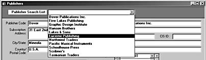
Figure 6-11. This record selector combo box is located in the header of the frmPublishers form in the Crafts database.
The sample Crafts database has a form (frmPublishers) used to enter and edit publisher data. This form has a record selector combo box in its header, to make it easier to select a specific publisher record to edit. Figure 6-12 shows the Publisher Search List combo box's properties sheet.
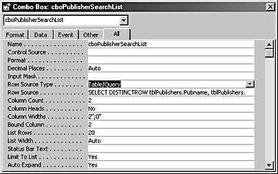
Figure 6-12. You can use the properties sheet of a record selector combo box to specify the combo box's row source and other properties.
Use the following properties to set up a record selector combo box:
- Row Source Type. Select Table/Query as the Row Source Type property because this property needs to be set to the same record source as the form (or to a subset of that record source).
- Row Source. Set this property to the same value as the form's Record Source property or to a query or an SQL statement that contains only the fields needed for the combo box's drop-down list.
- Column Count. Set this property to the number of columns you want to display in the combo box's drop-down list, including invisible columns.
- Column Heads. Set this property to Yes if you want to display the names of the fields used in the drop-down list as column headings.
- Column Widths. Use this property to set the width of each column in the drop-down list. Set a column to 0 to make it invisible. Often the bound column is made invisible so that the user can make a selection from the list using a more comprehensible field, such as a person's name instead of his or her employee ID.
- Bound Column. Use this property to specify which column is the bound column, starting with 1. Although the combo box is unbound, you still have to supply a value for this property because the code in the event procedure willpick up the value of the bound column. Set this property to the number of the column containing the ID field used to select a new record.
- List Rows. Use this property to set the number of rows to display in the list.
- List Width. Set this property to Auto to make the list the same width as the combo box control. You can set the property to a specific width if you want to make the list wider than the combo box itself. (This is often necessary when multiple columns are displayed in the list.)
The following VBA event procedure is attached to the combo box's AfterUpdate event:
Private Sub cboPublisherSearchList_AfterUpdate() On Error GoTo ErrorHandler Dim strSearch As String strSearch = "[PublisherCode] = " & Chr$(39) & _ Me![cboPublisherSearchList] & Chr$(39) 'Find the record that matches the control. Me.Requery Me.RecordsetClone.FindFirst strSearch Me.Bookmark = Me.RecordsetClone.Bookmark ErrorHandlerExit: Exit Sub ErrorHandler: MsgBox "Error No: " & Err.Number & "; Description: " & _ Err.Description Resume ErrorHandlerExit End Sub
The search string used to locate a record by PublisherCode wraps the value from the combo box in single quotation marks (using the Chr$(39) function) because this field is a text field. You can omit the quotes when searching for a numeric field, as in the following equivalent line of code from the record selector combo box in frmAuthors, which searches using the AuthorID AutoNumber field:
strSearch = "[AuthorID] = " & Me![cboAuthorSearchList]
Add-To Combo Boxes
You can use an add-to combo box when you want to let users select from a list of values or add a new value to the list on the fly. If you set a combo box's Limit To List property to No, users can save a typed entry in the combo box's bound field if the value isn't found in the list. Those values won't be available for other users to select, however, since they aren't saved in the row source table.
If you want to let users add new entries to the table used as the row source for the combo box's list, use the combo box's NotInList event. Make sure that the Limit To List property is set to Yes (the default value). The cboCategoryName combo box on the Test Controls form in the Controls 2000 database (on the companion CD) is an add-to combo box, so you can add new categories to tblCategories. Its NotInList event procedure is shown here:
Private Sub cboCategoryName_NotInList(strNewData As String, _ intResponse As Integer) 'Set Limit To List property to Yes. On Error GoTo ErrorHandler Dim intResult As Integer Dim strTitle As String Dim intMsgDialog As Integer Dim strMsg1 As String Dim strMsg2 As String Dim strMsg As String Dim cbo As Access.ComboBox Dim dbs As DAO.Database Dim rst As DAO.Recordset Dim strTable As String Dim strEntry As String Dim strFieldName As String 'The name of the lookup table strTable = "tblCategories" 'The type of item to add to the table strEntry = "Food category" 'The field in the lookup table in which the new entry is stored strFieldName = "CategoryName" 'The add-to combo box Set cbo = Me![cboCategoryName] 'Display a message box asking whether the user wants to add 'a new entry. strTitle = strEntry & " not in list" intMsgDialog = vbYesNo + vbExclamation + vbDefaultButton1 strMsg1 = "Do you want to add " strMsg2 = " as a new " & strEntry & " entry?" strMsg = strMsg1 + strNewData + strMsg2 intResult = MsgBox(strMsg, intMsgDialog, strTitle) If intResult = vbNo Then 'Cancel adding the new entry to the lookup table. intResponse = acDataErrContinue cbo.Undo Exit Sub ElseIf intResult = vbYes Then 'Add a new record to the lookup table. Set dbs = CurrentDb Set rst = dbs.OpenRecordset(strTable) rst.AddNew rst(strFieldName) = strNewData rst.Update rst.Close 'Continue without displaying default error message. intResponse = acDataErrAdded End If ErrorHandlerExit: Exit Sub ErrorHandler: MsgBox "Error No: " & Err.Number & "; Description: " & _ Err.Description Resume ErrorHandlerExit End Sub
note
This event procedure makes extensive use of variables, thus facilitating reuse of the code on other forms. After copying the code into the AfterUpdate event procedure of an unbound combo box on the new form, all you have to do is set the values of the four variables listed directly under the Declarations section of the procedure (table name, item name, field name, and combo box). The rest of the code needs no alteration.
Figure 6-13 shows the add-to combo box in action. If the user types Vegetarian in the text box portion of the combo box and presses Enter, the message box created in the event procedure appears. Clicking Yes adds the new entry to tblCategories; clicking No cancels the addition.

Figure 6-13. This message box pops up from a NotInList procedure.
Figure 6-14 shows the new entry at the bottom of the combo box's drop-down list.
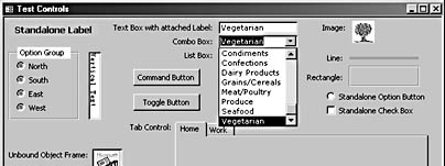
Figure 6-14. A new entry added to an add-to combo box's list looks like this.
note
Although a new entry is saved to the form's record source, it might not appear in the drop-down list immediately. To refresh the list, position the insertion point in the combo box, and press F9.
Linked Combo Boxes
Sometimes you need a pair of linked combo boxes to make a selection. For example, you might want to select a sales region in one combo box and then select a salesperson in a second combo box that displays only salespersons in the selected sales region. To demonstrate linked combo boxes, I created a new table (tblSalesRegions) in the Controls 2002 database, and added a SalesRegion field to tblEmployees (a copy of the Northwind Employees table). Then I entered a SalesRegion value for each employee, selecting the values from tblSalesRegions. I then created aform (frmLinkedControls) containing two combo box controls: cboSalesRegion and cboSalesperson.
The row source of cboSalesRegion is set to tblSalesRegions; cboSalesperson's row source is initially set to tblEmployees. To limit cboSalesperson's list to only employees attached to the region selected in cboSalesRegion, I added the following criterion to the Region field in cboSalesperson's Row Source SQL statement, as follows:
Forms![frmLinkedControls]![cboSalesRegion]
I also created an expression to display the employee's full name, last name first, in the column to be displayed in the drop-down list. The complete SQL statement for the combo box's Row Source property is shown here:
SELECT tblEmployees.EmployeeID, [LastName] & ", " & [FirstName] AS FullName FROM tblEmployees WHERE (((tblEmployees.SalesRegion)= Forms!frmLinkedControls![cboSalesRegion]));
The first column in the SELECT statement contains EmployeeID, which isn't displayed in the drop-down list. (Its width is set to 0.) The EmployeeID field is the one you'd normally use to work with an employee record in a real application because it's the key field for the table.
One final touch is needed: an AfterUpdate event procedure on cboSalesRegion with a statement to set the cboSalesperson value to Null to clear the combo box and a Requery statement to repopulate it. This step ensures that cboSalesperson will always be filtered for the correct sales region. This event procedure is shown here:
Private Sub cboSalesRegion_AfterUpdate() Me![cboSalesperson] = Null Me![cboSalesperson].Requery End Sub
Figure 6-15 shows the cboSalesperson combo box, listing employees from the Southeast sales region.
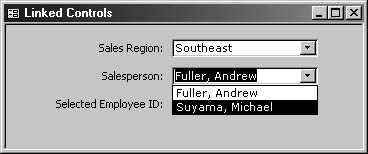
Figure 6-15. The second combo box in a pair of linked combo boxes displays information filtered by the selection in the first combo box.
Display a Bound Column Value in a Combo Box
You can use an unbound text box to display the value of a bound column in a combo box. (This value is often not displayed in the drop-down list.) The syntax requires you to use an equal sign (=) in front of the control name, which is enclosed in brackets. The employee ID of the selected employee is displayed in a locked text box on the form, as shown in Figure 6-16.
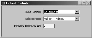
Figure 6-16. This text box displays the employee ID of the employee selected in the Salesperson combo box.
The text box's row source is shown here:
=[cboSalesperson]
List Boxes
List boxes are similar to combo boxes in that they display a list of items from a table, a value list, or a record source assigned in code. However, list boxes don't offer the opportunity to add a new entry, and they take up more space than combo boxes because they display multiple items at once. Generally speaking, combo boxes are more useful than list boxes for selecting one item from a number of items on a form, but list boxes can be useful for selecting one of a small number of choices or for special purposes such as those discussed in the following sections.
Multiple-Selection List Boxes
When you need to select several entries from a list and perform the same action on all of them, a multiple-selection list box (sometimes called a multiselect list box) is an excellent choice. Multiple-selection list boxes are especially useful on Access forms because Access has an ItemsSelected collection that you can use to process just the items selected in the list box.
To create a multiple-selection list box, place a list box on a form and set its MultiSelect property to Extended; this allows you to select items by using the Ctrl+click and Shift+click hot keys.
The following example uses the frmMultiSelectListBox form from the Controls 2002 database. Figure 6-17 shows a multiple-selection list box with several items selected; clicking Print Labels runs a procedure that clears the temporary table tblContactsForLabels and then fills it with just the selected records from tblContacts. (You need to save the selected items to a table to use as the report's record source because an ItemsSelected collection can't be used directly as a report's record source.)

Figure 6-17. This list box has its MultiSelect property set to Extended.
The rptContactLabels report (which is bound to tblContactsForLabels) then opens in Print Preview, as shown in Figure 6-18.
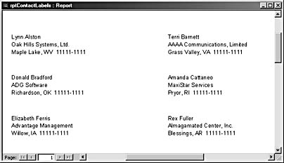
Figure 6-18. This report is based on selections from a multiple-selection list box.
The Click event procedure for the cmdPrintLabels command button is shown here:
Private Sub cmdPrintLabels_Click() On Error GoTo ErrorHandler Dim lst As Access.ListBox Dim strName As String Dim strAddress As String Dim strJobTitle As String Dim strTestFile As String Dim varItem As Variant Dim intIndex As Integer Dim intCount As Integer Dim intRow As Integer Dim intColumn As Integer Dim strTest As String Dim i As String Dim lngID As Long Set lst = Me![lstSelectContacts] 'Clear old temp table. DoCmd.SetWarnings False strSQL = "DELETE * from tblContactsForLabels" DoCmd.RunSQL strSQL 'Check that at least one contact has been selected. If lst.ItemsSelected.Count = 0 Then MsgBox "Please select at least one contact." lst.SetFocus Exit Sub End If For Each varItem In lst.ItemsSelected 'Check for required address information. strTest = Nz(lst.Column(5, varItem)) Debug.Print "Street address: " & strTest If strTest = "" Then Debug.Print "Can't send letter -- no street address!" Exit Sub End If strTest = Nz(lst.Column(6, varItem)) Debug.Print "City: " & strTest If strTest = "" Then Debug.Print "Can't send letter -- no city!" Exit Sub End If strTest = Nz(lst.Column(8, varItem)) Debug.Print "Postal code: " & strTest If strTest = "" Then Debug.Print "Can't send letter -- no postal code!" Exit Sub End If 'All information is present; write a record to the temp table. lngID = lst.Column(0, varItem) Debug.Print "Selected ID: " & lngID strSQL = "INSERT INTO tblContactsForLabels (ContactID, & "FirstName, LastName, Salutation, StreetAddress, " _ & "City, StateOrProvince, " _ & "PostalCode, Country, CompanyName, JobTitle )" _ & "SELECT ContactID, FirstName, LastName, Salutation, " _ & "StreetAddress, City, StateOrProvince, PostalCode, " _ & "Country, CompanyName, JobTitle FROM tblContacts " _ & "WHERE ContactID = " & lngID & ";" DoCmd.RunSQL strSQL Next varItem 'Print report. DoCmd.OpenReport reportname:="rptContactLabels", _ View:=acViewPreview ErrorHandlerExit: Exit Sub ErrorHandler: MsgBox "Error No: " & Err.Number & "; Description: " & _ Err.Description Resume ErrorHandlerExit End Sub
Paired List Boxes
If you've used the Form Wizard or the Report Wizard, you've seen paired list boxes. Paired list boxes allow the user to select from a number of items in a list and add them to a list of choices. Some users find this method more intuitive than using a multiple-selection list box because all the selected items are displayed together in their own list box. Figure 6-19 shows the first screen of the Report Wizard; the Available Fields list box is loaded with a list of all the fields in the selected table or query. As you select fields, they're removed from that list box and moved to the Selected Fields list box.
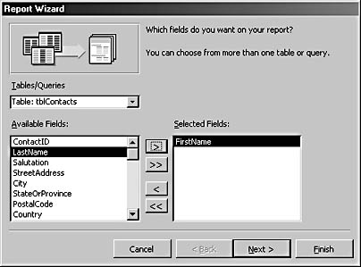
Figure 6-19. These paired list boxes are shown on the first page of the Report Wizard.
Implementation of paired list boxes is easier than ever in Access 2002 because you can use the new RemoveItem and AddItem methods to streamline the process of moving an item from one list box to another.
To create a set of paired list boxes, follow these steps (the finished form, frmPairedListboxes, is located in the Controls 2002 sample database):
- Place two list boxes on a form. One will be an Available Items list box, and the other will be a Selected Items list box.
- Set the Row Source Type property for the Available Items list box to Value List.
- Enter the list values in the Row Source property for the Available Items list box by using a semicolon-separated string such as this one:
"Beverages";"Condiments";"Confections";"Dairy Products"; "Grains/Cereals";"Meat/Poultry";"Produce";"Seafood"
The Selected Items list box should also have its Row Source Type property set to Value List. Leave its Row Source property blank.
note
The AddItem and RemoveItem methods work only for value lists.
You can create a set of paired multiple-selection list boxes if you use a table as the row source, but for this example I wanted to use the new AddItem and RemoveItem methods, and the multiple selection was lost after I tested removing an item from the Available Items list, as a user would do. Because the multiple-selection feature lost its usefulness, I made the paired list boxes on the form shown in Figure 6-20 single-selection list boxes.

Figure 6-20. This form contains paired list boxes, which use the AddItem and RemoveItem methods to add or delete list items.
InsideOut
When you use the AddItem method to add values to a list box, the values are normally added at the end of the list. Although you can add an item at a particular location (by using its Index number), you won't have a way to sort the list alphabetically. If you need paired list boxes in which the second list is always sorted correctly, you need to use tables or queries as the list box row sources and append and delete queries to add or remove items.
Command Buttons
Typically, you'll use command buttons to run code to perform an action, adding the code to the command button's Click event procedure. The command buttons in the paired list boxes form shown in Figure 6-20 run the procedures that remove the selected item from the Available Items list box and add it to the Selected Items list box. These procedures are listed here, along with the variables declared in the form module's Declarations section:
Dim lstAvailable As Access.ListBox Dim lstSelected As Access.ListBox Dim strItem As String Dim intItem As Integer Dim varItem As Variant Dim intIndex As Integer Dim intCount As Integer Dim intRow As Integer Dim intColumn As Integer Private Sub cmdAdd_Click() On Error GoTo ErrorHandler Set lstSelected = Me![lstSelectedItemsSingle] Set lstAvailable = Me![lstAvailableItemsSingle] 'Check that at least one item has been selected. Debug.Print "Item count: " & lstAvailable.ItemsSelected.Count If lstAvailable.ItemsSelected.Count = 0 Then MsgBox "Please select an item." lstAvailable.SetFocus Exit Sub End If strItem = lstAvailable.Value intItem = lstAvailable.ListIndex 'Add selected item to Selected Items list. lstSelected.AddItem Item:=strItem 'Delete selected item from Available Items list. lstAvailable.RemoveItem Index:=intItem ErrorHandlerExit: Exit Sub ErrorHandler: MsgBox "Error No: " & Err.Number & "; Description: " & _ Err.Description Resume ErrorHandlerExit End Sub Private Sub cmdRemove_Click() On Error GoTo ErrorHandler Set lstSelected = Me![lstSelectedItemsSingle] Set lstAvailable = Me![lstAvailableItemsSingle] 'Check that at least one item has been selected. If lstSelected.ItemsSelected.Count = 0 Then MsgBox "Please select an item" lstSelected.SetFocus Exit Sub End If strItem = lstSelected.Value intItem = lstSelected.ListIndex 'Add selected item to Available Items list. lstAvailable.AddItem Item:=strItem 'Delete selected item from Selected Items list. lstSelected.RemoveItem Index:=intItem ErrorHandlerExit: Exit Sub ErrorHandler: MsgBox "Error No: " & Err.Number & "; Description: " & _ Err.Description Resume ErrorHandlerExit End Sub
Tabs
Tab controls allow you to manage large quantities of data on a form without crowding controls together or creating a difficult-to-navigate multipage form. You can use a tab control in two ways: to divide the controls from a single record source into groups, displaying one group of controls on each page of the tab control, or to display data from different tables or queries on each page by using subforms, one subform per page of the tab control.
note
Properly speaking, the tabs on a Tab control (or any tabbed dialog box) are the protruding bits with captions at the top of each page; however, in ordinary usage, "tab" is often used to reference the entire page. When writing VBA code, you must use Page since each page on a Tab control is a Page object.
The Northwind Employees form uses a tab control with two pages to split data from the Employees table into Company Info and Personal Info groups, as shown in Figure 6-21.
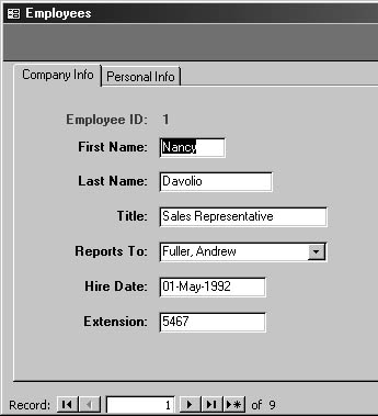
Figure 6-21. The Northwind Employees form uses a tab control to divide employee data into two groups.
When the data for all the pages of a tab control comes from the same record source, all you need to do is place controls bound to fields in the record source on the appropriate pages of the tab control in Design view, as shown in Figure 6-22.
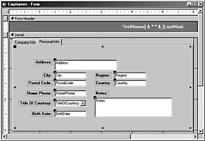
Figure 6-22. These controls (and those on the Company Info page) are bound to fields in the Employees table (the record source for the Northwind Employees form).
You can also use another technique: Place a subform bound to a different record source on each page of the tab control. This technique is illustrated in the fpriBooksAndVideos form in the sample Crafts 2002 database, shown in Figure 6-23. The tab control at the bottom of the detail section of this form has three pages, each of which contains a subform control bound to a different table.
Figure 6-23. This tab control on the Crafts fpriBooksAndVideos form has a subform on each page.
Tab Control Techniques
Working with tab controls can be a little tricky. Here are some special techniques:
- If you want to set the focus on a tab control so that you can move it or resize it, click the blank gray area to the right of the tabs at the top of the tab control.
- If you want to place a control on a specific page of a tab control, click the tab belonging to that page. Black squares will appear around the page, as shown in Figure 6-24.
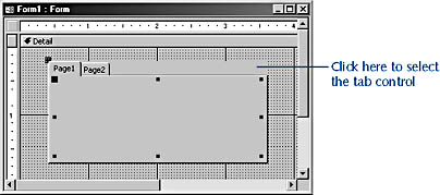
Figure 6-24. Page1 is selected on this tab control.
After clicking the tab, drag a field to the page from the field list. The page turns black when the field is positioned over it, as shown in Figure 6-25.
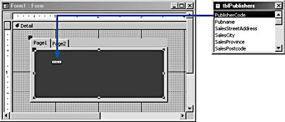
Figure 6-25. You can drag a field to a page of a tab control.
For further details on working with controls, see Chapter 8, "Using Design Tools."
Subforms/Subreports
The subform/subreport control (usually called a subform control when it's used on forms) can display data from a variety of source objects, such as other forms, tables, or queries (or reports, only when this control is placed on a report). Typically, subform controls are used to display data from other forms because a subform whose source object is another form (as opposed to a table or query) gives you more control over what data is displayed and how it's displayed.
Figure 6-26 shows the Source Object drop-down list for a subform control. The list displays forms first (without a prefix), then tables, and then queries.
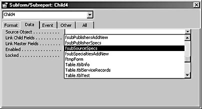
Figure 6-26. You can select a source object for a subform control from the Source Object drop-down list.
note
If you use a naming convention and give a distinctive prefix to forms intended for use as subforms, those forms will be easy to identify in the Source Object drop-down list. I use the fsub tag for these forms, in accordance with the LNC. See Chapter 20, "Customizing Your Database Using VBA Code," for more information about using a naming convention in Access databases.
Although normally it's best to use subform controls to display forms, in one situation displaying a table might be appropriate: If you want a datasheet-type subform with aworking subdatasheet, you must select a table as a subform's source object; a datasheet form used as the source object of a subform control doesn't have the extra column with the plus signs used to open up a subdatasheet displaying data from the linked table. Figure 6-27 shows a form bound to tblEmployees, with a subform control whose source object is tblOrders. You can find this form in the Controls 2002 database. Clicking the plus sign to the left of an order record opens a subdatasheet that shows the order details for that order.
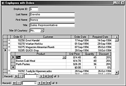
Figure 6-27. This form has a subform bound to a table with a subdatasheet.
tip
If you create an AutoForm based on a table that is the "one" side of a one-to-many relationship, use a subform control to place the "many" table on the form.
For more information about using subforms to display both linked and unlinked data on forms, see Chapter 5, "Creating Forms for Entering, Editing, and Viewing Data."
Lines
As the name suggests, you use line controls to place lines on forms, usually to separate areas containing different types of controls. In general, lines are more commonly used on reports than on forms, but they can be useful on forms too, especially to separate controls into groups. A line can be vertical, horizontal, or slanted.
You can apply various special effects to lines, but these effects don't work the same for lines as they do for text boxes and other controls that have the Special Effect property. The Flat Special Effect property (the default setting) renders the line as an ordinary line. The Border Width settings are fairly self-explanatory: The line appears hair-thin if you select the Hairline setting and quite thick if you select the maximum setting of 6 points. You can also select a line color from the regular palette for the Border Color property.
As shown in Figure 6-28, the six line controls on the right side of the Lines And Rectangles form all have a Border Width of 6 points and a Border Color of bright blue; they differ only in the Special Effect property. The Raised, Sunken, Etched, Shadowed, and Chiseled lines do not display their Border Width or Border Color property selection, and therefore, they look exactly the same.

Figure 6-28. This form contains lines and rectangles that display various Special Effect settings.
caution
Avoid using rectangles with the Raised special effect-a raised rectangle looks just like a command button and will probably confuse users who expect something to happen when they click it.
Rectangles
Rectangles can be solid or transparent, and they have the same Border Style and Special Effect property selections as lines. However, unlike lines, the six Special Effect choices for rectangles all look different, as you can see in Figure 6-28. Prior to Access 2000, it wasn't possible to adjust the margins around a label's caption, so placing a label with a transparent background on top of a solid rectangle was the only way to have text centered in a colored rectangle. Now, however, you can use the Top Margin and Bottom Margin properties of a label or text box control to manually adjust text to a vertically centered position.
caution
Ifa rectangle has a Special Effect property set to anything other than Flat or Shadowed and you set its Border Width property to a value wider than Hairline, its Special Effect property will change to Flat.
The blue rectangle with the white text in the upper left corner of the form shown in Figure 6-28 is a label within a rectangle; the pink rectangle with black text below is a label with its Top Margin and Bottom Margin properties set to 0.1". Setting the Left Margin and Right Margin properties isn't necessary; instead, set the Text Align property to Centered to center the label text horizontally.
EAN: 2147483647
Pages: 172