The Basics of Printing
|
| < Day Day Up > |
|
Arguments aside, FreeHand can print with the best of them. Whether your job is destined for a slick full-color brochure, a black and white newspaper ad, or a T-shirt, FreeHand makes it easy for you to get the optimal output you need for the printer to do the job as you have designed it. There are considerations that must be resolved before getting the job underway, though. First in my mind is usually whether the job will be printed in black and white, full-color (CMYK), or spot color.
Black-and-white
Black-and-white print jobs are assumed to be the simplest and cheapest way to go. But that's not necessarily true. After all, look at your local newspaper — there's nothing simple or uncomplicated about all that black ink, especially when it comes to the reproduction of photo- graphs. A black-and-white job is considered cheap because it uses only one ink color. But the preparation of a single-color job can be just as time-consuming and expensive for the graphic designer. It can also be as effective or even more effective than a full-color job.
Halftones
To reproduce photographs, the images must be converted to a halftone. Originally, halftones were created by placing a screen between a negative and the projected image. Where lines in the screen covered up the negative, no image was allowed to form on the negative. When light passed through the screen, an image was created on the film in a pattern of dots. When printed on white paper, a pattern of large dots creates the illusion of darkness, smaller dots, or white space on the paper build the lighter areas of the image. Today, it's all done electronically, but the end results are the same. A halftone example is shown in Figure 13-1.
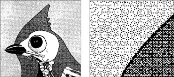
Figure 13-1: A color halftone (in black and white), and an enlargement showing the rosette pattern
The substrate is the material on which your document will be ultimately printed. A t-shirt is one kind of substrate, glass is another, and there are thousands of types and colors of paper. Different substrates require different screen resolutions. A high-gloss paper stock used for a brochure or coffee table book lets the ink dots sit on the top of the paper and dry, creating a sharp image. The absorbent nature of newsprint demands that the ink is sucked into the paper itself, causing what printers call dot-gain. It doesn't take too much imagination to see that the same halftone will print differently on different papers. If you created the halftone for a fairly smooth text stock, and then put newsprint and glossy, coated stock in the press, you'd get different results. The glossy paper would provide a light halftone because the ink isn't applied heavily enough to fill in all the white space around the ink dots. The newsprint copy would be dark and muddy because too much ink was applied and spread into white areas as the ink was absorbed into the paper.
To minimize the problems with dot-gain, paper absorption, and so on, there is a general rule about screen ruling (lines per inch, or lpi). Most newspapers are happy with 65 to 85 lpi. Medium-quality offset printers can hold dots up to 150 lpi. High-end printing presses can go up to 200 lpi and more. To get optimal results, it's best to have a conversation about the images you will be reproducing, the paper stock, and the capabilities of the press and pressman with your printer before you create halftones.
CMYK
Full-color images are produced (printed) by using shades of cyan, magenta, yellow, and black inks. The shades are created from a series of halftone dots; one halftone has been made for each of the four colors. Each halftone screen is rotated so the dots don't line up on each other. In fact, they usually make a pattern called a rosette. By mixing tints of the four colors, it is possible to build a large spectrum of color. That spectrum, or gamut, is not as large as the gamut your monitor produces, and not nearly as large as the human eye can perceive. But, it's the backbone of the printing industry right now. Several colors cannot be printed using the CMYK process. Refer to a swatch book such as the PANTONE Solid To Process book that compares inks "right out of the can" to their CMYK counterpart.
Hexachrome printing
For more adventurous people with deeper pockets, you can also reproduce your artwork with Hexachrome output. As the name implies, the process uses six colors to create a richly colored, lush image. Printing Hexachrome projects is certainly a situation that requires detailed conversations with your printer. It's beyond the scope of this book, but basically, the process uses CMYK colors, plus special orange and green inks to gain a larger, more vibrant color gamut. The colors are displayed in RGB (using your monitor's profile) and require RGB TIFFs to separate into CMYKOG. On the other hand, if you have a CMYK TIFF, it will separate as CMYK and ignore the orange and green plates. Unless Print Spot Colors as Process is selected in the Separations panel of the Print Setup dialog box, spot colors will be separated as usual (explained in the next section). If Print Spot Colors as Process is selected, the spot colors will reproduce as CMYK.
Spot colors
For all those colors that can't be printed with CMYK, ink manufacturers such as Pantone, Focoltone, Munsell, and Toyo have produced thousands of ink colors. These colors are referred to as spot colors. They are the rich blues, reds, and grays that you just can't get from CMYK. They're also fluorescent, metallic, and pastel. A black and white job can just as well be a blue and white job. After all, the service bureau or printer is going to output a single sheet of film for your spot color. Even if you had intended to print the job in a dark blue ink, you can change your mind and use a rich burgundy color instead. Of course, the printer will have a few choice words for you if he's already ordered a special ink for you. Since spot color inks are "right out of the can," they must be ordered for specific jobs. The presses must be cleaned of any ink used previously, and the spot color placed in the press and adjusted. This is extremely labor-intensive, and therefore the cost of a spot color job is usually higher than a black and white job, even though only one ink is being run. I remember a printer that had "free color specials" every day of the week. Monday it was red, Tuesday it was brown, Wednesday was blue, and so on. The customer could get the job printed in one of these colors at the same price as using black ink because the press was going to print nothing but that color all day.
|
| < Day Day Up > |
|
EAN: 2147483647
Pages: 491
- Using SQL Data Definition Language (DDL) to Create Data Tables and Other Database Objects
- Understanding SQL Transactions and Transaction Logs
- Using Keys and Constraints to Maintain Database Integrity
- Understanding Transaction Isolation Levels and Concurrent Processing
- Writing Advanced Queries and Subqueries