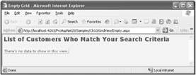
Figure 10-2: The GridView control in action on an empty data source.
The GridView is the successor to the ASP.NET 1.x DataGrid control. It provides the same base set of capabilities, plus a long list of extensions and improvements. As mentioned, the DataGrid which is still fully supported in ASP.NET 2.0 is an extremely powerful and versatile control. However, it has one big drawback: it requires you to write a lot of custom code, even to handle relatively simple and common operations such as paging, sorting, editing, or deleting data. The GridView control was designed to work around this limitation and make two-way data binding happen with as little code as possible. The control is tightly coupled to the family of new data source controls, and it can handle direct data source updates as long as the underlying data source object supports these capabilities.
This virtually codeless two-way data binding is by far the most notable feature of the new GridView control, but other enhancements are numerous. The control is an improvement over the DataGrid control because it has the ability to define multiple primary key fields, new column types, and style and templating options. The GridView also has an extended eventing model that allows you to handle or cancel events.
The GridView control provides a tabular grid-like view of the contents of a data source. Each column represents a data source field, and each row represents a record. The class is declared as follows:
public class GridView : CompositeDataBoundControl, ICallbackContainer, ICallbackEventHandler
The base class ensures data-binding and naming-container support. The ICallbackContainer and ICallbackEventHandler interfaces provide more effective paging and sorting than is now supported. It does this through client-side, out-of-band calls that use the new script callback technology. (I'll talk more about this later.) Let's begin our tour of the GridView control by looking at the control's programming interface.
The GridView supports a large set of properties that fall into the following broad categories: behavior, visual settings, style, state, and templates. Table 10-6 details the properties that affect the behavior of the GridView.
| Property | Description |
|---|---|
| AllowPaging | Indicates whether the control supports paging. |
| AllowSorting | Indicates whether the control supports sorting. |
| AutoGenerateColumns | Indicates whether columns are automatically created for each field in the data source. The default is true. |
| AutoGenerateDeleteButton | Indicates whether the control includes a button column to let users delete the record that is mapped to the clicked row. |
| AutoGenerateEditButton | Indicates whether the control includes a button column to let users edit the record that is mapped to the clicked row. |
| AutoGenerateSelectButton | Indicates whether the control includes a button column to let users select the record that is mapped to the clicked row. |
| DataMember | Indicates the specific table in a multimember data source to bind to the grid. The property works in conjunction with DataSource. If DataSource is a DataSet object, it contains the name of the particular table to bind. |
| DataSource | Gets or sets the data source object that contains the values to populate the control. |
| DataSourceID | Indicates the bound data source control. |
| EnableSortingAndPagingCallbacks | Indicates whether sorting and paging are accomplished using script callback functions. Disabled by default. |
| RowHeaderColumn | Name of the column to use as the column header. This property is designed for improving accessibility. |
| SortDirection | Gets the direction of the column current sort. |
| SortExpression | Gets the current sort expression. |
| UseAccessibleHeader | Specifies whether to render <th> tags for the column headers instead of default <td> tags. |
The SortDirection and SortExpression properties specify the direction and the sort expression on the column that currently determines the order of the rows. Both properties are set by the control's built-in sorting mechanism when users click a column's header. The whole sorting engine is enabled and disabled through the AllowSorting property. The EnableSortingAndPagingCallbacks property toggles on and off the control's capability of using script callbacks to page and sort without doing roundtrips to the server and changing the entire page.
Each row displayed within a GridView control corresponds to a special type of grid item. The list of predefined types of items is nearly identical to that of the DataGrid and includes items such as the header, rows and alternating rows, footer, and pager. These items are static in the sense that they remain in place for the lifetime of the control in the application. Other types of items are active for a short period of time the time needed to accomplish a certain operation. Dynamic items are the edit row, the selected row, and the EmptyData item. EmptyData identifies the body of the grid when the grid is bound to an empty data source.
| Note | The GridView control provides a few properties specifically designed for accessibility. They are UseAccessibleHeader, Caption, CaptionAlign, and RowHeaderColumn. When you set RowHeaderColumn, all the column cells will be rendered with the default header style (boldface type). However, ShowHeader, HeaderStyle, and other header-related properties don't affect the column indicated by RowHeaderColumn. |
Table 10-7 details the style properties available on the GridView control.
| Style | Description |
|---|---|
| AlternatingRowStyle | Defines the style properties for every other row in the table |
| EditRowStyle | Defines the style properties for the row being edited |
| FooterStyle | Defines the style properties for the grid's footer |
| HeaderStyle | Defines the style properties for the grid's header |
| EmptyDataRowStyle | Defines the style properties for the empty row, which is rendered when the GridView is bound to empty data sources |
| PagerStyle | Defines the style properties for the grid's pager |
| RowStyle | Defines the style properties for the rows in the table |
| SelectedRowStyle | Defines the style properties for the currently selected row |
Table 10-8 lists most of the properties that affect the appearance of the control, and Table 10-9 details the templating properties.
| Property | Description |
|---|---|
| BackImageUrl | Indicates the URL to an image to display in the background |
| Caption | The text to render in the control's caption |
| CaptionAlign | Alignment of the caption text |
| CellPadding | Indicates the amount of space (in pixels) between the contents of a cell and the border |
| CellSpacing | Indicates the amount of space (in pixels) between cells |
| GridLines | Indicates the gridline style for the control |
| HorizontalAlign | Indicates the horizontal alignment of the control on the page |
| EmptyDataText | Indicates the text to render in the control when it is bound to an empty data source |
| PagerSettings | References an object that lets you set the properties of the pager buttons |
| ShowFooter | Indicates whether the footer row is displayed |
| ShowHeader | Indicates whether the header row is displayed |
| Template | Description |
|---|---|
| EmptyDataTemplate | Indicates the template content to be rendered when the control is bound to an empty source. This property takes precedence over EmptyDataText if both are set. If neither is set, the grid isn't rendered if bound to an empty data source. |
| PagerTemplate | Indicates the template content to be rendered for the pager. This property overrides any settings you might have made through the PagerSettings property. |
The PagerSettings object groups together all the visual properties you can set on the pager. Many of these properties should sound familiar to DataGrid programmers. The PagerSettings class also adds some new properties to accommodate new predefined buttons (first and last pages), and it uses images instead of text in the links. (You need to figure out a trick to do the same with a DataGrid.)
The final block of properties the state properties is shown in Table 10-10. State properties return information about the internal state of the control.
| Property | Description |
|---|---|
| BottomPagerRow | Returns a GridViewRow object that represents the bottom pager of the grid. |
| Columns | Gets a collection of objects that represent the columns in the grid. The collection is always empty if columns are auto-generated. |
| DataKeyNames | Gets an array that contains the names of the primary key fields for the currently displayed items. |
| DataKeys | Gets a collection of DataKey objects that represent the values of the primary key fields set in DataKeyNames for the currently displayed records. |
| EditIndex | Gets and sets the 0-based index that identifies the row currently rendered in edit mode. |
| FooterRow | Returns a GridViewRow object that represents the footer. |
| HeaderRow | Returns a GridViewRow object that represents the header. |
| PageCount | Gets the number of pages required to display the records of the data source. |
| PageIndex | Gets and sets the 0-based index that identifies the currently displayed page of data. |
| PageSize | Indicates the number of records to display on a page. |
| Rows | Gets a collection of GridViewRow objects that represent the data rows currently displayed in the control. |
| SelectedDataKey | Returns the DataKey object for the currently selected record. |
| SelectedIndex | Gets and sets the 0-based index that identifies the row currently selected. |
| SelectedRow | Returns a GridViewRow object that represents the currently selected row. |
| SelectedValue | Returns the explicit value of the key as stored in the DataKey object. Similar to SelectedDataKey. |
| TopPagerRow | Returns a GridViewRow object that represents the top pager of the grid. |
The GridView is designed to leverage the new data source object model, and it works best when bound to a data source control via the DataSourceID property. The GridView also supports the classic DataSource property, but if you bind data in that way, some of the features (such as built-in updates and paging) become unavailable.
The GridView control doesn't have methods other than DataBind. As mentioned, though, in many situations you don't need to call methods on the GridView control. The data-binding process is started implicitly when you bind the GridView to a data source control.
In ASP.NET 2.0, many controls, and the Page class itself, feature pairs of events of the type doing/done. Key operations in the control life cycle are wrapped by a pair of events one firing before the operation takes place, and one firing immediately after the operation is completed. The GridView class is no exception. The list of events is shown in Table 10-11.
| Event | Description |
|---|---|
| PageIndexChanging, PageIndexChanged | Both events occur when one of the pager buttons is clicked. They fire before and after the grid control handles the paging operation, respectively. |
| RowCancelingEdit | Occurs when the Cancel button of a row in edit mode is clicked, but before the row exits edit mode. |
| RowCommand | Occurs when a button is clicked. |
| RowCreated | Occurs when a row is created. |
| RowDataBound | Occurs when a data row is bound to data. |
| RowDeleting, RowDeleted | Both events occur when a row's Delete button is clicked. They fire before and after the grid control deletes the row, respectively. |
| RowEditing | Occurs when a row's Edit button is clicked but before the control enters edit mode. |
| RowUpdating, RowUpdated | Both events occur when a row's Update button is clicked. They fire before and after the grid control updates the row, respectively. |
| SelectedIndexChanging, SelectedIndexChanged | Both events occur when a row's Select button is clicked. The two events occur before and after the grid control handles the select operation, respectively. |
| Sorting, Sorted | Both events occur when the hyperlink to sort a column is clicked. They fire before and after the grid control handles the sort operation, respectively. |
RowCreated and RowDataBound events are the same as the DataGrid's ItemCreated and ItemDataBound events, with new names. They behave exactly as they do in ASP.NET 1.x. The same is true of the RowCommand event, which is the same as the DataGrid's ItemCommand event.
The availability of events that announce a certain operation significantly enhances your programming power. By hooking the RowUpdating event, you can cross-check what is being updated and validate the new values. Likewise, you might want to handle the RowUpdating event to HTML-encode the values supplied by the client before they are persisted to the underlying data store. This simple trick helps you to fend off script injections.
The following code demonstrates the simplest way to bind data to a GridView control. The data source object keeps the page virtually code-free.
<asp:ObjectDataSource runat="server" TypeName="ProAspNet20.DAL.Customers" SelectMethod="LoadAll"> </asp:ObjectDataSource> <asp:GridView runat="server" DataSource />
Setting the DataSourceID property triggers the binding process, which runs the data source query and populates the user interface of the grid. You need not write any binding code. (Note that you still have to write the LoadAll method and the DAL.)
By default, the GridView control auto-generates enough columns to contain all the data coming through the data source. In other cases, you might want to control and style each column individually. For this to happen, the binding process should be refined a little bit.
If no data source property is set, the GridView control doesn't render anything. If an empty data source object is bound and an EmptyDataTemplate template is specified, the results shown to the user have a more friendly look:
<asp:gridview runat="server" datasource> <emptydatatemplate> <asp:label runat="server"> There's no data to show in this view. </asp:label> </emptydatatemplate> </asp:gridview>
The EmptyDataTemplate property is ignored if the bound data source is not empty. Figure 10-2 shows the output generated by the empty template.

Figure 10-2: The GridView control in action on an empty data source.
When you use a declared set of columns, the AutoGenerateColumns property of the grid is typically set to false. However, this is not a strict requirement a grid can have declared and autogenerated columns. In this case, declared columns appear first. Note also that auto-generated columns are not added to the Columns collection. As a result, when column auto-generation is used, the Columns collection is typically empty.
The Columns property is a collection of DataControlField objects. The DataControlField object is akin to the DataGrid's DataGridColumn object, but it has a more general name because these field objects can be reused in other data-bound controls that do not necessarily render columns. (For example, in the DetailsView control, the same class is used to render a row.)
You can define your columns either declaratively or programmatically. In the latter case, you just instantiate any needed data field objects and add them to the Columns collection. The following code adds a data-bound column to the grid:
BoundField field = new BoundField(); field.DataField = "companyname"; field.HeaderText = "Company Name"; grid.ColumnFields.Add(field);
Columns of data are displayed in the order that the column fields appear in the collection. To statically declare your columns in the .aspx source file, you use the <Columns> tag, as shown here:
<columns> <asp:boundfield datafield="customerid" headertext="ID" /> <asp:boundfield datafield="companyname" headertext="Company Name" /> </columns>
Table 10-12 lists the column field classes that can be used in a GridView control. All the classes inherit DataControlField.
| Type | Description |
|---|---|
| BoundField | Default column type. Displays the value of a field as plain text. |
| ButtonField | Displays the value of a field as a command button. You can choose the link button or the push button style. |
| CheckBoxField | Displays the value of a field as a check box. It is commonly used to render Boolean values. |
| CommandField | Enhanced version of ButtonField, represents a special command such as Select, Delete, Insert, or Update. It's rarely useful with GridView controls; the field is tailor-made for DetailsView controls. (GridView and DetailsView share the set of classes derived from DataControlField.) |
| HyperLinkField | Displays the value of a field as a hyperlink. When the hyperlink is clicked, the browser navigates to the specified URL. |
| ImageField | Displays the value of a field as the Src property of an <img> HTML tag. The content of the bound field should be the URL to the physical image. |
| TemplateField | Displays user-defined content for each item in the column. You use this column type when you want to create a custom column field. The template can contain any number of data fields combined with literals, images, and other controls. |
Table 10-13 lists the main properties shared by all column types.
| Property | Description |
|---|---|
| AccessibleHeaderText | The text that represents abbreviated text read by screen readers of Assistive Technology devices. |
| FooterStyle | Gets the style object for the column's footer. |
| FooterText | Gets and sets the text for the column's footer. |
| HeaderImageUrl | Gets and sets the URL of the image to place in the column's header. |
| HeaderStyle | Gets the style object for the column's header. |
| HeaderText | Gets and sets the text for the column's header. |
| InsertVisible | Indicates whether the field is visible when its parent data-bound control is in insert mode. This property does not apply to GridView controls. |
| ItemStyle | Gets the style object for the various columns' cells. |
| ShowHeader | Indicates whether the column's header is rendered. |
| SortExpression | Gets and sets the expression used to sort the grid contents when the column's header is clicked. Typically, this string property is set to the name of the bound data field. |
The properties listed in Table 10-13 represent a subset of the properties that each column type actually provides. In particular, each type of column defines a tailor-made set of properties to define and configure the bound field. Refer to the MSDN documentation for details on the programming interface of GridView's column types.
The BoundField class represents a field that is displayed as plain text in a data-bound control such as GridView or DetailsView. To specify the field to display, you set the DataField property to the field's name. You can apply a custom formatting string to the displayed value by setting the DataFormatString property. The NullDisplayText property lets you specify alternative text to display should the value be null. Finally, by setting the ConvertEmptyStringToNull property to true, you force the class to consider empty strings as null values.
A BoundField can be programmatically hidden from view through the Visible property while the ReadOnly property prevents the displayed value from being modified in edit mode. To display a caption in the header or footer sections, set the HeaderText and FooterText properties, respectively. You can also choose to display an image in the header instead of text. In this case, you set the HeaderImageUrl property.
A button field is useful to put a clickable element in a grid's column. You typically use a button field to trigger an action against the current row. A button field represents any action that you want to handle through a server-side event. When the button is clicked, the page posts back and fires a RowCommand event. Figure 10-3 shows a sample.
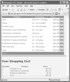
Figure 10-3: Button fields in a GridView control.
The following listing shows the markup code behind the grid in the figure:
<asp:GridView runat="server" DataSource AutoGenerateColumns="false" AllowPaging="true" OnRowCommand="GridView1_RowCommand"> <HeaderStyle backcolor="gray" font-bold="true" height="200%" /> <PagerStyle backcolor="gray" font-bold="true" height="200%" /> <PagerSettings Mode="NextPreviousFirstLast" /> <Columns> <asp:BoundField datafield="productname" headertext="Product" /> <asp:BoundField datafield="quantityperunit" headertext="Packaging" /> <asp:BoundField datafield="unitprice" headertext="Price" DataFormatString="{0:c}"> <itemstyle width="80px" horizontalalign="right" /> </asp:BoundField> <asp:ButtonField buttontype="Button" text="Add" CommandName="Add" /> </Columns> </asp:GridView> Product information is displayed using a few BoundField objects. The sample button column allows you to add the product to the shopping cart. When users click the button, the RowCommand server event is fired. In case multiple button columns are available, the CommandName attribute lets you figure out which button was clicked. The value you assign to CommandName is any unique string that the code-behind class can understand. Here's an example:
void GridView1_RowCommand(object sender, GridViewCommandEventArgs e) { if (e.CommandName.Equals("Add")) { // Get the index of the clicked row int index = Convert.ToInt32(e.CommandArgument); // Create a new shopping item and add it to the cart AddToShoppingCart(index); } } In the sample, the button column shows a fixed text for all data items. You get this by setting the Text property on the ButtonField class. If you want to bind the button text to a particular field on the current data item, you set the DataTextField property to the name of that field.
You can choose different styles for the button push, link, or image. To render the button as an image, do as follows:
<asp:buttonfield buttontype="Image" CommandName="Add" ImageUrl="/proaspnet20/images/cart.gif" />
To add a ToolTip to the button (or the image), you need to handle the RowCreated event. (I'll discuss this in more detail later in the chapter.)
Hyperlink columns point the user to a different URL, optionally displayed in an inner frame. Both the text and URL of the link can be obtained from the bound source. In particular, the URL can be set in either of two ways: through a direct binding to a data source field or by using a hard-coded URL with a customized query string. You choose the direct binding if the URL is stored in one of the data source fields. In this case, you set the DataNavigateUrlFields property to the name of the column. In some situations, though, the URL to access is application-specific and not stored in the data source. In this case, you can set the DataNavigateUrlFormatString property with a hard-coded URL and with an array of parameters in the query string, as follows:
<asp:HyperLinkField DataTextField="productname" HeaderText="Product" DataNavigateUrlFields="productid" DataNavigateUrlFormatString="productinfo.aspx?id={0}" Target="ProductView" /> When the user clicks, the browser fills the specified frame window with the contents of the productinfo.aspx?id=xxx URL, where xxx comes from the productid field. The URL can include multiple parameters. To include more data-bound values, just set the DataNavigateUrlFields property to a comma-separated list of field names. This behavior extends that of the DataGrid's hyperlink column in that it supports multiple parameters.
The text of the hyperlink can be formatted too. The DataTextFormatString property can contain any valid markup and uses the {0} placeholder to reserve space for the data-bound value. (See Figure 10-4.)
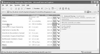
Figure 10-4: Hyperlink fields in a GridView control.
| Tip | When choosing a target for the hyperlinked pages, you can also use any of the following standard targets: _self, _parent, _new. Both Microsoft Internet Explorer and Firefox support _search, which uses a companion Web panel docked at the left edge of the browser's real estate. (See Figure 10-5.)
|
The column types we hitherto considered are nothing new for seasoned ASP.NET 1.x developers. Although renamed, their overall behavior remains very similar to that of analogous column types for DataGrids. The CheckBoxField type, on the other hand, is a new entry in ASP.NET 2.0 and is limited to GridView and other view controls. The simplest way in which you can get a checkbox column in ASP.NET 1.x (or in general for DataGrids) is through templates.
The CheckBoxField column is a relatively simple bound column that displays a check box. You can bind it only to a data field that contains Boolean values. A valid Boolean value is a value taken from a column of type Bit in a SQL Server table (and analogous types in other databases) or a property of type bool if the control is bound to a custom collection. Any other form of binding will result in a parsing exception. In particular, you get an exception if you bind a CheckBoxField column to an integer property, thus implicitly assuming that 0 is false and non-zero values are true.
The ImageField column type represents a field that is displayed as an image in a data-bound control. The cell contains an <img> element, so the underlying field must reference a valid URL. You can compose the URL at will, though. For example, you can use the DataImageUrlField to perform a direct binding where the content of the field fills the Src attribute of the <img> tag. Alternately, you can make the column cells point to an external page (or HTTP handler) that retrieves the bytes of the image from any source and passes them down to the browser. The following code illustrates this approach:
<Columns> <asp:ImageField DataImageUrlField="employeeid" DataImageUrlFormatString="showemployeepicture.aspx?id={0}" DataAlternateTextField="lastname"> <ControlStyle Width="120px" /> </asp:ImageField> <asp:TemplateField headertext="Employee"> <ItemStyle Width="220px" /> <ItemTemplate> <b><%# Eval("titleofcourtesy") + " " + Eval("lastname") + ", " + Eval("firstname") %></b> <br /> <%# Eval("title")%> <hr /> <i><%# Eval("notes")%></i> </ItemTemplate> </asp:templatefield> </Columns> Cells in the ImageField column are filled with the output of the next URL:
ShowEmployeePicture.aspx?id=xxx
Needless to say, xxx is the value in the employeeid field associated with DataImageUrlField. Interestingly enough, the alternate text can also be data bound. You use the DataAlternateTextField property. Figure 10-6 gives a sneak preview of the feature. The page in Figure 10-6 employs a template column to render the employee's information. I'll return to the subject of template columns in a moment.

Figure 10-6: Image fields in a GridView control.
The following code demonstrates the world's simplest page to retrieve and serve an image out of a database table:
void Page_Load(object sender, EventArgs e) { int id = Convert.ToInt32(Request.QueryString["id"]); string connString = "..."; string cmdText = "SELECT photo FROM employees WHERE employeeid=@empID"; using (SqlConnection conn = new SqlConnection(connString)) { SqlCommand cmd = new SqlCommand(cmdText, conn); cmd.Parameters.AddWithValue("@empID", id); byte[] img = null; conn.Open(); try { img = (byte[])cmd.ExecuteScalar(); if (img != null) { Response.ContentType = "image/png"; Response.OutputStream.Write(img, EMP_IMG_OFFSET, img.Length); } } catch { Response.WriteFile("/proaspnet20/images/noimage.gif"); } conn.Close(); } The preceding code serves a standard image if the value of the field specified is null. You can obtain the same result by setting the NullImageUrl property if you're using direct binding that is, not passing through an external page or handler.
| Note | The EMP_IMG_OFFSET constant in the code snippet should normally be just 0. However, given the particular structure of the photo column of the Northwind's Employees database, it has to be 78. But, again, this is required only with that table. |
Figure 10-6 shows a customized column where the values of several fields are combined. This is exactly what you can get by using templates. A TemplateField column gives each row in the grid a personalized user interface that is completely defined by the page developer. You can define templates for various rendering stages, including the default view, in-place editing, the header, and the footer. The supported templates are listed in Table 10-14.
| Template | Description |
|---|---|
| AlternatingItemTemplate | Defines the contents and appearance of alternating rows. If not specified, the ItemTemplate is used. |
| EditItemTemplate | Defines the contents and appearance of the row currently being edited. This template should contain input fields and possibly validators. |
| FooterTemplate | Defines the contents and appearance of the row's footer. |
| HeaderTemplate | Defines the contents and appearance of the row's header. |
| ItemTemplate | Defines the default contents and appearance of the rows. |
A templated view can contain anything that makes sense to the application you're building server controls, literals, and data-bound expressions. Data-bound expressions allow you to insert values contained in the current data row. You can use as many fields as needed in a template. Notice, though, that not all templates support data-bound expressions. The header and footer templates are not data-bound, and any attempt to use expressions will result in an exception.
The following code shows how to define the item template for a product column. The column displays on two lines and includes the name of the product and some information about the packaging. You use data-bound expressions (which are discussed in Chapter 9) to refer to data fields.
<asp:templatefield headertext="Product"> <itemtemplate> <b><%# Eval("productname")%></b> <br /> available in <%# Eval("quantityperunit")%> </itemtemplate> </asp:templatefield> Figure 10-7 demonstrates template fields in action.

Figure 10-7: Template fields in a GridView control.
| Note | The TemplateField class also features an InsertTemplate property. However, this type of template is never used by the GridView control. The InsertTemplate is used by the FormView control instead. As mentioned earlier, in ASP.NET 2.0 view controls share some field classes, such as TemplateField. As a result, TemplateField (and a few more classes) provide a superset of properties that serves the needs of multiple view controls. We'll cover the FormView control in the next chapter. |
The GridView is designed to take advantage of specific capabilities of the underlying data source control. In this way, the grid control can handle common operations on data such as sorting, paging, updating, and deleting. In general, not all data source components support all possible and feasible data operations. Data source components expose Boolean properties (such as the CanSort property) to signal whether they can perform a given operation.
| Important | If a GridView control is bound to its data source through the DataSource property that is, it doesn't leverage data source controls its overall behavior as far as paging and other operations are concerned (for example, sorting and editing) is nearly identical to that of the DataGrid control. In this case, the GridView fires events and expects the binding code in the page to provide instructions and fresh data. In the remainder of this chapter, unless explicitly mentioned, we refer to a GridView bound to a data source control. |
To some extent, the GridView makes transparent for the page developer the implementation of commonly required features such as sorting and paging. In most cases, you need only a fraction of the code you need with the DataGrid; in some cases, no code at all is required. This said, don't forget what one old and wise proverb says not all that glitters is gold. Put another way, be aware that the less code you write, the more you rely on the existing infrastructure to get things done. In doing so, you let the system make important decisions on your behalf. Paging and sorting are key operations in Web applications. You can still accept what the GridView does by default, but if you get to know exactly what happens under the hood, you have a better chance of diagnosing and fixing in a timely manner any performance problems that show up in the lifetime of the application.
The ability to scroll a potentially large set of data is an important but challenging feature for modern, distributed applications. An effective paging mechanism allows customers to interact with a database without holding resources. To enable paging on a GridView control, all you do is set the AllowPaging property to true. When the AllowPaging property is set to true, the grid displays a pager bar and prepares to detect a user's pager button clicks.
When a user clicks to see a new page, the page posts back, but the GridView traps the event and handles it internally. This marks a major difference between GridView and the DataGrid and programming model you might know from ASP.NET 1.x. With the GridView, there's no need to write a handler for the PageIndexChanged event. The event is still exposed (and partnered with PageIndexChanging), but you should handle it only to perform extra actions. The GridView knows how to retrieve and display the requested new page. Let's take a look at the following control declaration:
<asp:GridView runat="server" DataSource AllowPaging="true" />
Any data SqlDataSource1 binds to the grid is immediately pageable. As in Figure 10-8, the control displays a pager with a few predefined links (first, previous, next, and last) and automatically selects the correct subset of rows that fit in the selected page.
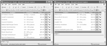
Figure 10-8: Moving through pages in a GridView control.
The default user interface you get with the GridView doesn't include the page number. Adding a page number label is as easy as writing a handler for the PageIndexChanged event:
protected void GridView1_PageIndexChanged(object sender, EventArgs e) { ShowPageIndex(); } private void ShowPageIndex() { CurrentPage.Text = (GridView1.PageIndex + 1).ToString(); } Once again, note that the PageIndexChanged handler is not involved with data binding or page selection as it is with DataGrids. If you don't need any post-paging operation, you can blissfully omit it altogether.
What's the cost of this apparently free (and magical) paging mechanism?
The GridView control doesn't really know how to get a new page. It simply asks the bound data source control to return the rows that fit in the specified page. Paging is ultimately up to the data source control. When a grid is bound to a SqlDataSource control, paging requires that the whole data source be bound to the control. When a grid is bound to an ObjectDataSource control, paging depends on the capabilities of the business object you're connecting to.
Let's tackle SqlDataSource first. It is mandatory that you set DataSourceMode to DataSet (the default setting). This means that the whole dataset is retrieved and only the few records that fit in the current page size are displayed. In an extreme scenario, you might end up downloading 1,000 records for each postback to show only 10. Things go much better if you enable caching on SqlDataSource by setting EnableCaching to true. In this case, the whole data set is downloaded only once and stored in the ASP.NET cache for the specified duration. As long as the data stays cached, any page is displayed almost for free. However, a potentially large chunk of data is stored in memory. This option is therefore recommended only for relatively small sets of records shared by all users.
| Tip | If you want to page records at the database level, the best that you can do is code the desired behavior in a stored procedure and bind the stored procedure to the SelectCommand property of the SqlDataSource control. In this case, turn caching off. |
As we discussed in Chapter 9, the ObjectDataSource control supplies a rather generic interface for paging that heavily relies on the capabilities of the underlying business and data access layers (DALs).
The key point is that you should have a paging-enabled business object. You configure the ObjectDataSource control based on the characteristics of your business object method. Once you have identified the select method, you overload it with a version that takes two extra parameters the page size and start index for the page. In the end, the select method must be able to retrieve pages of records. In the declaration of the ObjectDataSource control, you set the StartRowIndexParameterName and MaximumRowsParameterName properties to the name of the method parameter that denotes the start index and page size, respectively.
One more step is needed to enable the GridView to page the data source provided by the ObjectDataSource control. You also need to set the EnablePaging property of ObjectDataSource to true:
<asp:ObjectDataSource runat="server" EnablePaging="true" TypeName="ProAspNet20.DAL.Customers" StartRowIndexParameterName="firstRow" MaximumRowsParameterName="totalRows" SelectMethod="LoadByCountry"> <SelectParameters> <asp:ControlParameter Name="country" Control PropertyName="SelectedValue" /> </SelectParameters> </asp:ObjectDataSource> <asp:GridView runat="server" AutoGenerateColumns="false" DataSource AllowPaging="true" OnPageIndexChanged="GridView1_PageIndexChanged"> <PagerSettings Mode="NextPreviousFirstLast" /> <Columns> <asp:BoundField DataField="id" HeaderText="ID" /> <asp:BoundField DataField="companyname" HeaderText="Company" /> <asp:BoundField DataField="contactname" HeaderText="Contact" /> </Columns> </asp:GridView> <b>Page: </b><asp:Label runat="server" />
In the preceding code, you explicitly specify only the parameters whose contents are important for the method to work. The two paging-related parameters are left to the GridView to set. The page size parameter is automatically bound to the PageSize property of the GridView; the first index to retrieve is determined by multiplying page size by page index. Here are the prototypes of the LoadByCountry method:
public static CustomerCollection LoadByCountry(string country) { LoadByCountry(country, -1, 0); } public static CustomerCollection LoadByCountry(string country, int totalRows, int firstRow) { // Retrieve the specified subset of records } The mechanics of ObjectDataSource doesn't say much about the effectiveness of the paging algorithm. How the business object actually retrieves the records in the requested page is an implementation- and application-specific detail. In the sample code, LoadByCountry runs the original query and retrieves a data reader to the whole data set. Next, it discards all the records that don't fit in the specified range. This implementation is a good compromise between simplicity and effectiveness. It is not the best solution possible, but it's easy to implement and demonstrate. The memory consumption is limited to one record at a time, but the database returns the whole data set.
The GridView doesn't support the AllowCustomPaging property you find on DataGrids. However, customizing the paging algorithm is definitely possible. At its core, a custom paging algorithm provides a way to extract pages of records that minimizes caching of records. Ideally, you would ask the database to page the results of a particular query. Very few databases, though, support this feature. Several alternative approaches exist, with pros and cons.
A possible strategy entails creating temporary tables to select only the subset of records you really need. You build a stored procedure and pass it parameters to indicate the page size and index. Alternately, you can use nested SELECT commands and the TOP statement to retrieve all the records up to the last record in the requested page, reverse the order, and discard unneeded records. Again, the TOP clause is not common to all databases. Another possible approach based on dynamically built SQL code is discussed in the following blog post: http://weblogs.sqlteam.com/jeffs/archive/2004/03/22/1085.aspx.
If you can collaborate with the database administrator (DBA), you can require that an ad hoc column be added to index the queries. In this case, the DAL must guarantee that the values in the column form a regular succession of values and can be computable. The simplest way of accomplishing this is by giving the column progressive numbers.
When the AllowPaging property is set to true, the grid displays a pager bar. You can control the characteristics of the pager to a large extent, through the <PagerSettings> and <PagerStyle> tags or their equivalent properties. The pager of the GridView control also supports first and last page buttons and lets you assign an image to each button. (This is also possible for DataGrids, but it requires a lot of code.) The pager can work in either of two modes displaying explicit page numbers, or providing a relative navigation system. In the former case, the pager contains numeric links, one representing a page index. In the latter case, buttons are present to navigate to the next or previous page and even to the first or last page. The Mode property rules the user interface of the pager. Available modes are listed in the Table 10-15.
| Mode | Description |
|---|---|
| NextPrevious | Displays next and previous buttons to access the next and previous pages of the grid |
| NextPreviousFirstLast | Displays next and previous buttons plus first and last buttons to directly access first and last pages of the grid |
| Numeric | Displays numeric link buttons corresponding to the pages of the grid |
| NumericFirstLast | Displays numeric link buttons corresponding to the pages of the grid plus first and last buttons to directly access first and last pages of the grid |
Ad hoc pairs of properties xxxPageText and xxxPageImageUrl let you set the labels for these buttons as desired. The xxx stands for any of the following: First, Last, Next, or Previous. Figure 10-9 shows a sample page in action.
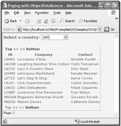
Figure 10-9: A pageable GridView with two pagers.
Depending on the size of the grid, the first and last rows in a grid might not necessarily fit in the screen real estate. To make it easier for users to page regardless of the scrollbar position, you can enable top and bottom pagers for a grid. You do this by setting the Position attribute on the <PagerSettings> element:
<PagerSettings Position="TopAndBottom" />
Other options are to display the pager only at the top or only at the bottom of the grid.
The pager of the GridView control can be entirely replaced with a new one, in case of need. (See Figure 10-10.) You do this by adding the <PagerTemplate> element to the control's declaration. Here's an example:
<PagerTemplate> <asp:Button runat="server" commandname="First" Text="First" /> <asp:Button runat="server" commandname="Prev" Text="<<" /> <asp:Button runat="server" commandname="Next" Text=">>" /> <asp:Button runat="server" commandname="Last" Text="Last" /> </PagerTemplate>
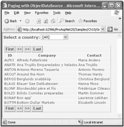
Figure 10-10: A pageable GridView with a custom pager.
To handle clickings on the buttons, you write a RowCommand event handler and set the page index explicitly:
void GridView1_RowCommand(object sender, GridViewCommandEventArgs e) { if (e.CommandName == "Last") GridView1.PageIndex = GridView1.PageCount - 1; if (e.CommandName == "First") GridView1.PageIndex = 0; if (e.CommandName == "Next") GridView1.PageIndex ++; if (e.CommandName == "Prev") GridView1.PageIndex --; } Admittedly, this code is quite simple and should be fleshed out a little bit, at least to make it capable of disabling buttons when the first or last index is reached.
Sorting is a delicate, nonlinear operation that normally is quite expensive if performed on the client. Generally speaking, in fact, the best place to sort records is in the database environment because of the super-optimized code you end up running most of the time. Be aware of this as we examine the sorting infrastructure of the GridView control and data source controls. The GridView doesn't implement a sorting algorithm; instead, it relies on the data source control (or the page, if bound to an enumerable object) to provide sorted data.
To enable the GridView's sorting capabilities, you set the AllowSorting property to true. When sorting is enabled, the GridView gains the ability to render the header text of columns as links. You can associate each column with a sorting expression by using the SortExpression property. A sorting expression is any comma-separated sequence of column names. Each column name can be enriched with an order qualifier such as DESC or ASC. DESC indicates a descending order, while ASC denotes the ascending order. The ASC qualifier is the default; if omitted, the column is sorted ascendingly. The following code sets up the GridView column for sorting on the productname data source column:
<asp:GridView runat="server" DataSource AllowSorting="true" AutoGenerateColumns="false"> <Columns> <asp:BoundField datafield="productname" headertext="Product" sortexpression="productname" /> <asp:BoundField datafield="quantityperunit" headertext="Packaging" /> </Columns> </asp:GridView>
Just as for paging, with a GridView no manually written code is required to make sorting work. Properly configured, the GridView's sorting infrastructure works without further intervention and in a bidirectional way that is, if you click on a column sorted descendingly, it is sorted ascendingly and vice versa. You need to add some custom code only if you want to implement more advanced capabilities such as showing a glyph in the header to indicate the direction. (I'll say more about that in a moment.)
Just as for paging, the main snag with sorting is how the underlying data source control implements it. Let's see what happens when the grid is bound to a SqlDataSource object. Other than setting AllowSorting to true and adding the sort expression to the sortable columns, no other action is required. (See Figure 10-11.)
When the user clicks to sort, the grid asks the SqlDataSource control to return sorted data. As mentioned, the SqlDataSource control returns a DataSet by default. If this is the case, the control retrieves the data, builds a DataView out of it, and calls the DataView's Sort method. This approach works fine, but it's not exactly the fastest way you have to sort. You might still find it to be a good fit for your application, but be aware that sorting is performed using the Web server's memory. Combined with caching, both paging and sorting in memory are a feasible solution for shared and relatively small sets of records.
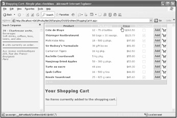
Figure 10-11: A sortable GridView bound to a SqlDataSource control.
Is there any chance to get pre-sorted data from the database server? The first step is to set the DataSourceMode property of the SqlDataSource control to DataReader. If you leave it set to DataSet, sorting will occur in memory. The second step requires you to write a stored procedure to retrieve data. To get data sorted, you also set the SortParameterName property of the data source control to the name of the stored procedure parameter that indicates the sort expression. Obviously, you need the stored procedure to build its command text dynamically to incorporate the proper ORDER BY clause. Here's how to modify the CustOrderHist, Northwind's stored procedure, to make its results sortable at will:
CREATE PROCEDURE CustOrderHistSorted @CustomerID nchar(5), @SortedBy varchar(20)='total' AS SET QUOTED_IDENTIFIER OFF IF @SortedBy = '' BEGIN SET @SortedBy = 'total' END EXEC ( 'SELECT ProductName, Total=SUM(Quantity) ' + 'FROM Products P, [Order Details] OD, Orders O, Customers C ' + 'WHERE C.CustomerID = "' + @CustomerID + '" ' + 'AND C.CustomerID = O.CustomerID AND O.OrderID = OD.OrderID ' + 'AND OD.ProductID = P.ProductID GROUP BY ProductName ' + 'ORDER BY ' + @SortedBy) GO
At this point, the grid is ready to show sorted columns of data and the burden of sorting has moved to the database management system (DBMS):
<asp:SqlDataSource runat="server" DataSourceMode="DataReader" ConnectionString='<%$ ConnectionStrings:LocalNWind %>' SortParameterName="SortedBy" SelectCommand="CustOrderHistSorted" SelectCommandType="StoredProcedure"> <SelectParameters> <asp:ControlParameter Control Name="CustomerID" PropertyName="SelectedValue" /> </SelectParameters> </asp:SqlDataSource>
It is essential to know that sorting data on the database, as shown here, is incompatible with caching. You need to set EnableCaching to false; otherwise, an exception is thrown. As a result, you go back to the database every time the user clicks to sort.
If you use the DataSet mode and enable caching, you initially get data from the database, sorted as expected, but successive sorting operations are resolved in memory. Finally, if you use the DataSet mode and disable caching, you still go down to the database for sorting each time. Note that this option is mentioned only for completeness: the effect is the same as using DataReader, but a data reader is a more efficient approach when caching is not required.
In general, the availability of the SortParameterName property opens up a world of possibility for sorting the contents of other data-bound controls (for example, Repeater and custom controls) that mostly consume data and don't require paging or caching.
What if you use an ObjectDataSource control instead? In this case, the burden of sorting should be moved to the DAL or business layer and exposed to the data source control by the programming interface of the bound business object. Let's modify the LoadByCountry method we considered earlier for paging and add to it a new parameter to indicate the sort expression:
public static CustomerCollection LoadByCountry( string country, int totalRows, int firstRow, string sortExpression) { CustomerCollection coll = new CustomerCollection(); using (SqlConnection conn = new SqlConnection(ConnectionString)) { SqlCommand cmd; cmd = new SqlCommand(cmdLoadByCountry, conn); cmd.Parameters.AddWithValue("@country", country); if (!String.IsNullOrEmpty(sortExpression)) cmd.CommandText += " ORDER BY " + sortExpression; conn.Open(); SqlDataReader reader = cmd.ExecuteReader(); HelperMethods.FillCustomerList(coll, reader, totalRows, firstRow); reader.Close(); conn.Close(); } return coll; } The cmdLoadByCountry constant represents the SQL command or stored procedure we use to retrieve data. As you can see, this implementation of the method simply adds an optional ORDER BY clause to the existing command. This might not be the best approach ever devised, but it certainly fits the bill of having the burden of sorting moved down to the DAL and from there to the database. At this point, you set the SortParameterName on the ObjectDataSource control to the method's parameter that determines the sorting in this case, sortExpression:
<asp:ObjectDataSource runat="server" EnablePaging="true" TypeName="ProAspNet20.DAL.Customers" SortParameterName="sortExpression" StartRowIndexParameterName="firstRow" MaximumRowsParameterName="totalRows" SelectMethod="LoadByCountry"> <SelectParameters> ... </SelectParameters> </asp:ObjectDataSource>
The advantage of this approach is that you take full control of the sorting machinery, and you can decide how, where, and when to implement it. You might have to write some code in your DAL for sorting, but consider that you only write highly focused code. In fact, no infrastructural code is required, as the machinery is set up for you by ASP.NET.
| Note | One more item worth mentioning about sorting on a GridView control is that you can cancel the sorting operation if need be. To do this, you write a handler for the Sorting event, get the event argument data (of type GridViewSortEventArgs), and set its Cancel property to true. |
The GridView control doesn't automatically add any visual element to the output that indicates the direction of the sorting. This is one of the few cases in which some coding is needed to complete sorting:
<script runat="server"> void GridView1_RowCreated (object sender, GridViewRowEventArgs e) { if (e.Row.RowType == DataControlRowType.Header) AddGlyph(MyGridView, e.Row); } void AddGlyph(GridView grid, GridViewRow item) { Label glyph = new Label(); glyph.EnableTheming = false; glyph.Font.Name = "webdings"; glyph.Font.Size = FontUnit.Small; glyph.Text = (grid.SortDirection==SortDirection.Ascending ?"5" :"6"); // Find the column you sorted by for(int i=0; i<grid.Columns.Count; i++) { string colExpr = grid.Columns[i].SortExpression; if (colExpr != "" && colExpr == grid.SortExpression) item.Cells[i].Controls.Add (glyph); } } </script> The idea is that you write a handler for the RowCreated event and look for the moment when the header is created. Next you create a new Label control that represents the glyph you want to add. Where should the Label control be added?
The newly created Label control has font and text adequately set to generate a glyph (typically ? and ?) that indicates the direction of the sorting. (The glyphs correspond to 5 and 6 in the Microsoft Webdings font.) You must add it alongside the header text of the clicked column. The index of the column can be stored to the view state during the Sorting event. Alternately, it can simply be retrieved, comparing the current sort expression the grid's SortExpression property to the column's sort expression. Once you know the index of the column, you retrieve the corresponding table cells and add the Label:
item.Cells[i].Controls.Add (glyph);
The results are shown in Figure 10-12. If your page is based on a theme, the font of the Label control essential for rendering the glyph correctly might be overridden. To avoid that, you should disable theming support for the label control. The EnableTheming property does just that.
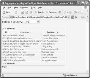
Figure 10-12: Enhancing the sorting capabilities of the GridView control.
Both sorting and paging operations require a postback with subsequent full refresh of the page. In most cases, this is a heavy operation, as the page usually contains lots of graphics. To provide the user with a better experience, wouldn't it be nice if the grid could go down to the Web server, grab the new set of records, and update only a portion of the interface? Thanks to ASP.NET script callbacks (which I cover in greater detail in my other recent book, Programming Microsoft ASP.NET 2.0 Applications: Advanced Topics [Microsoft Press, 2005]), the GridView control is capable of offering this feature. All that you have to do is turn on the Boolean property EnableSortingAndPagingCallbacks.
As mentioned, the feature relies on the services of the ASP.NET script callback engine, which is designed to work also with non-Internet Explorer browsers, including Firefox, Netscape 6.x and newer, Safari 1.2, and the latest Opera browser.
A few considerations will help clarify when to use SqlDataSource and ObjectDataSource controls. First, remember that these data source controls are not the only two choices for developers who want to do sane data binding. By far, though, they are the most popular and commonly used. It is also essential to bear in mind that data binding in ASP.NET 2.0 is in no way limited to using data source controls. This said, SqlDataSource and ObjectDataSource are just tools in the ASP.NET toolbox and should be used if they're right for the job.
As I see things, SqlDataSource is optimized for a disconnected approach to data binding. It works at its best if you retrieve data through a DataSet. Only in this case are paging, sorting, and caching capabilities enabled. Of these three functionalities, only sorting is somehow replicable in data reader mode. If using DataSets is fine for your application, using SqlDataSource is an excellent choice. It gives you ready-made solutions with mostly declarative code that is simple to write, but it's not necessarily effective in a real-world application. Put another way, using SqlDataSource in an application might be good for certain features, but it's hardly sufficient to power the whole DAL.
Should you instead realize that you need more control over paging and sorting operations (such as custom paging or server-side sorting), switching to ObjectDataSource appears to me a sounder idea. In this case, you start by designing and implementing a fully fledged DAL and, optionally, a business layer, too. In this layer, you craft any capabilities you need to be supported from the grid paging, sorting, or even data caching. Note that caching is not supported if you use custom collections instead of ADO.NET container classes, but implementing a personal caching layer is not a hard challenge.
With ObjectDataSource, you make yourself responsible for the implementation of such key features more or less like with DataGrids in ASP.NET 1.x. What's the deal? You don't simply inject sparse code in some code-behind class; you inject logic in the application's DAL. You're still writing code, but the quality of the code you get to write is quite different!
In addition, the ObjectDataSource control fully supports custom entity classes and custom collections. The support for generics in the .NET Framework 2.0 makes writing custom collections a snap, and it significantly reduces the cost of writing a fully custom DAL built on made-to-measure and domain-specific objects.
A major strength of the GridView control which makes up for a major shortcoming of the DataGrid is the ability to handle updates to the data source. The DataGrid control provides only an infrastructure for data editing. It provides the necessary user interface elements and fires appropriate events when the user modifies the value of a certain data field, but it does not submit those changes back to the data source. Developers are left with the disappointing realization that they have to write a huge amount of boilerplate code to really persist changes.
With the GridView control, when the bound data source supports updates, the control can automatically perform this operation, thus providing a truly out-of-the-box solution. The data source control signals its capability to update through the CanUpdate Boolean property.
Much like the DataGrid, the GridView can render a column of command buttons for each row in the grid. These special command columns contain buttons to edit or delete the current record. With the DataGrid, you must explicitly create an edit command column using a special column type the EditCommandColumn class. The GridView simplifies things quite a bit for update and delete operations.
In-place editing refers to the grid's ability to support changes to the currently displayed records. You enable in-place editing on a grid view by turning on the AutoGenerateEditButton Boolean property:
<asp:gridview runat="server" datasource autogeneratecolumns="false" autogenerateeditbutton="true"> ... </asp:gridview>
When the AutoGenerateEditButton property is set to true, the GridView displays an additional column, like that shown in Figure 10-13. By clicking the Edit button, you put the selected row in edit mode and can enter new data at will.
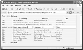
Figure 10-13: A GridView control that supports in-place editing.
To stop editing and lose any changes, users simply click the Cancel button. GridView can handle this click without any external support; the row returns to its original read-only state; and the EditIndex property takes back its -1 default value meaning no row is currently being edited. But what if users click the update link? GridView first fires the RowUpdating event and then internally checks the CanUpdate property on the data source control. If CanUpdate returns false, an exception is thrown. CanUpdate returns false if the data source control has no update command defined.
Suppose your grid is bound to a SqlDataSource object. To persist changes when the user updates, you have to design your code as follows:
<asp:sqldatasource runat="server" ConnectionString="<%$ ConnectionStrings:LocalNWind %>" SelectCommand="SELECT employeeid, firstname, lastname FROM employees" UpdateCommand="UPDATE employees SET firstname=@firstname, lastname=@lastname WHERE employeeid=@original_employeeid"> </asp:sqldatasource> <asp:gridview runat="server" datasource AutoGenerateColumns="false" DataKeyNames="employeeid" AutoGenerateEditButton="true"> <columns> <asp:boundfield datafield="firstname" headertext="First" /> <asp:boundfield datafield="lastname" headertext="Last" /> </columns> </asp:gridview>
The UpdateCommand attribute is set to the SQL command to use to perform updates. When you write the command, you declare as many parameters as needed. However, if you stick with a particular naming convention, parameter values are automatically resolved. Parameters that represent fields to update (such as firstname) must match the name of DataField property of a grid column. The parameter used in the WHERE clause to identify the working record must match the DataKeyNames property the key for the displayed records. The original_XXX format string is required for identity parameters. You can change this scheme through the OldValuesParameterFormatString property on the data source control.
The successful completion of an update command is signaled throughout the grid via the RowUpdated event.
| Note | The GridView collects values from the input fields and populates a dictionary of name/value pairs that indicate the new values for each field of the row. The GridView also exposes a RowUpdating event that allows the programmer to validate the values being passed to the data source object. In addition, the GridView automatically calls Page.IsValid before starting the update operation on the associated data source. If Page.IsValid returns false, the operation is canceled. This is especially useful if you're using a custom template with validators. |
If the grid is bound to an ObjectDataSource control, things go a bit differently. The bound business object must have an update method. This method will receive as many arguments as it needs to work. You can decide to pass parameters individually or grouped in a unique data structure. This second option is preferable if you have a well-done DAL. Here's an example:
<asp:ObjectDataSource runat="server" TypeName="ProAspNet20.DAL.Customers" SelectMethod="LoadAll" UpdateMethod="Save" DataObjectTypeName="ProAspNet20.DAL.Customer"> </asp:ObjectDataSource> <asp:GridView runat="server" DataSource DataKeyNames="id" AutoGenerateColumns="false"> AutoGenerateEditButton="true" <Columns> <asp:BoundField DataField="companyname" HeaderText="Company" /> <asp:BoundField DataField="street" HeaderText="Address" /> <asp:BoundField DataField="city" HeaderText="City" /> </Columns> </asp:GridView>
The Save method can have the following prototype and implementation:
public static void Save(Customer cust) { using (SqlConnection conn = new SqlConnection(ConnectionString)) { SqlCommand cmd = new SqlCommand(cmdSave, conn); cmd.Parameters.AddWithValue("@id", cust.ID); cmd.Parameters.AddWithValue("@companyname", cust.CompanyName); cmd.Parameters.AddWithValue("@city", cust.City); cmd.Parameters.AddWithValue("@address", cust.Street); ... conn.Open(); cmd.ExecuteNonQuery(); conn.Close(); return; } } The physical SQL command (or stored procedure) to run is nothing more than a classic UPDATE statement with a list of SET clauses. The DataObjectTypeName attribute indicates the name of a class that the ObjectDataSource uses for a parameter in a data operation.
| Note | If you set the DataObjectTypeName property, all data methods can either be parameterless or accept an object of the specified type. This happens regardless of whether you declarative fill the parameters collection for the method. The DataObjectTypeName property takes precedence over parameter collections. |
From the GridView's standpoint, deleting records is not much different from updating. In both cases, the GridView takes advantage of a data source ability to perform data operations. You enable record deletion by specifying a value of true for the AutoGenerateDeleteButton property. The GridView renders a column of buttons that, if clicked, invokes the delete command for the row on the bound data source control. The data source method is passed a dictionary of key field name/value pairs that are used to uniquely identify the row to delete:
<asp:sqldatasource runat="server" ConnectionString="<%$ ConnectionStrings:LocalNWind %>" SelectCommand="SELECT employeeid, firstname, lastname FROM employees" UpdateCommand="UPDATE employees SET firstname=@firstname, lastname=@lastname WHERE employeeid=@original_employeeid" DeleteCommand="DELETE employees WHERE employeeid=@original_employeeid" />
The GridView doesn't provide any feedback about the operation that will take place. Before proceeding, it calls Page.IsValid, which is useful if you have a custom template with validators to check. In addition, the RowDeleting event gives you another chance to programmatically control the legitimacy of the operation.
The delete operation fails if the record can't be deleted because of database-specific constraints. For example, the record can't be deleted if child records refer to it through a relationship. In this case, an exception is thrown.
To delete a record through an ObjectDataSource control, you give your business object a couple of methods, as follows:
public static void Delete(Customer cust) { Delete(cust.ID); } public static void Delete(string id) { using (SqlConnection conn = new SqlConnection(ConnectionString)) { SqlCommand cmd = new SqlCommand(cmdDelete, conn); cmd.Parameters.AddWithValue("@id", id); conn.Open(); cmd.ExecuteNonQuery(); conn.Close(); return; } } Overloading the delete method is not mandatory, but it can be useful and certainly make your DAL more flexible and easier to use.
In its current form, the GridView control doesn't support inserting data against a data source object. This omission is a result of the GridView implementation and not the capabilities and characteristics of the underlying data source. In fact, all data source controls support an insert command property. As you'll see in the next chapter, the insertion of new records is a scenario fully supported by the DetailsView and FormView control.
In ASP.NET 1.x, a common practice to make DataGrid controls support record insertions entails that you modify the footer or the pager to make room for empty text boxes and buttons. The GridView supports the same model and makes it slightly simpler through the PagerTemplate property as far as the pager is concerned. Modifying the contents of the footer is possible through the RowCreated event (which I'll say more about in a moment). Note, though, that if the grid is bound to an empty data, the footer bar is hidden. What if you want your users to be able to add a new record to an empty grid? Resort to the EmptyDataTemplate, as follows:
<emptydatatemplate> <asp:label runat="server"> There's no data to show in this view. <asp:Button runat="server" CommandName="AddNew" Text="Add New Record" /> </asp:label> </emptydatatemplate>
To trap the user's clicking on the button, you write a handler for the RowCommand event:
void Gridview1_RowCommand(object sender, GridViewCommandEventArgs e) { if (e.CommandName == "AddNew") { ... } }
To complete the overview of the GridView control, we just need to take a look at a couple of common programming scenarios drill-down and row customization. A grid presents a list of items to the user; in many cases, the user needs to select one of those items and start an operation on it. As discussed earlier, button columns exist to facilitate this task. We'll delve deeper into this topic in a moment. Row customization is another common feature, which gives you a chance to modify the standard rendering of the grid. You can edit the row layout, add or remove cells, or modify visual attributes on a per-row basis so that certain rows show up distinct from others (for example, rows representing negative values).
Let's return to a problem that we briefly mentioned earlier in the chapter while discussing button columns. Imagine you're building an e-commerce application; one of your pages shows a grid of products with buttons for users to add products to their shopping cart. You add a button column and write a handler for the RowCommand event:
void GridView1_RowCommand(object sender, GridViewCommandEventArgs e) { if (e.CommandName.Equals("Add")) { // Get the index of the clicked row int index = Convert.ToInt32(e.CommandArgument); // Create a new shopping item and add it to the cart AddToShoppingCart(index); } } This is where we left off earlier. Let's go one step ahead now and expand the code of AddToShoppingCart. What's the purpose of this method? Typically, it retrieves some information regarding the clicked product and stores that in the data structure that represents the shopping cart. In the sample code, the shopping cart is a custom collection named ShoppingCart :
public class ShoppingCart : List<ShoppingItem> { public ShoppingCart() { } } ShoppingItem is a custom class that describes a bought product. It contains a few properties product ID, product name, price per unit, and quantity bought. The shopping cart is stored in the session state and exposed through a page-wide property named MyShoppingCart:
protected ShoppingCart MyShoppingCart { get { object o = Session["ShoppingCart"]; if (o == null) { InitShoppingCart(); return (ShoppingCart) Session["ShoppingCart"]; } return (ShoppingCart) o; } } private void InitShoppingCart() { ShoppingCart cart = new ShoppingCart(); Session["ShoppingCart"] = cart; } At its core, the goal of AddToShoppingCart is merely that of creating a ShoppingItem object filled with the information of the clicked product. How would you retrieve that information?
As you can see, the GridView stores the index of the clicked row in the CommandArgument property of the GridViewCommandEventArgs structure. This information is necessary but not sufficient for our purposes. We need to translate that index into the key of the product behind the grid's row. Better yet, we need to translate the grid row index into a data set index to retrieve the data item object rendered in the clicked grid's row.
The DataKeyNames property of the GridView indicates the names of the data fields to persist in the view state to be retrieved later during postback events such as RowCommand. Implemented as a string array, DataKeyNames is the GridView's counterpart of the DataKeyField of DataGrid controls. It carries the value of the primary key for a displayed row in a DataGrid and a slew of properties for a GridView:
<asp:GridView runat="server" DataSource DataKeyNames="productid,productname,unitprice" ... />
How many fields should you list in DataKeyNames? Consider that every field you list there takes up some view-state space. On the other hand, if you limit yourself to storing only the primary key field, you need to run a query to retrieve all the data you need. Which approach is better depends on what you really need to do. In our sample scenario, we need to make a copy of a product that is already cached in the Web server's memory. There's no need to run a query to retrieve data we already know. To fill a ShoppingItem object, you need the product ID, name, and unit price:
private void AddToShoppingCart(int rowIndex) { DataKey data = GridView1.DataKeys[rowIndex]; ShoppingItem item = new ShoppingItem(); item.NumberOfItems = 1; item.ProductID = (int) data.Values["productid"]; item.ProductName = data.Values["productname"].ToString(); item.UnitPrice = (decimal) data.Values["unitprice"]; MyShoppingCart.Add(item); ShoppingCartGrid.DataSource = MyShoppingCart; ShoppingCartGrid.DataBind(); } The values of the fields listed in DataKeyNames are packed in the DataKeys array an old acquaintance for DataGrid developers. DataKeys is an array of DataKey objects. DataKey, in turn, is a sort of ordered dictionary. You access the values of the persisted fields through the Values collection, as shown in the preceding code.
For user-interface purposes, the contents of the shopping cart are bound to a second GridView control so that users can see what's in their basket at any time. The binding takes place through the classic DataSource object. Look back to Figure 10-3 for a view of this feature.
| Caution | Each grid row gets bound to a data item a row from the data source only when the control is rendered out. A postback event such as RowCommand fires before this stage is reached. As a result, the DataItem property of the clicked GridViewRow object where the data we need is expected to be is inevitably null if accessed from within the RowCommand handler. That's why you need DataKeyNames and the related DataKeys properties. |
A more general mechanism to select clicked rows can be implemented through a special command button the select button. As with delete and edit buttons, you bring it on by setting the AutoGenerateSelectButton Boolean property. To fully take advantage of the selection feature, it is recommended that you also add a style for selected rows:
<asp:GridView runat="server" ... > <SelectedRowStyle BackColor="cyan" /> ... </asp:GridView>
When users click a select-enabled button, the page receives a more specific SelectedIndexChanged event. Some properties such as SelectedIndex, SelectedRow, and SelectedDataKey are updated too. For completeness, note that when a row is selected the page first receives a RowCommand event, and later it is reached by the SelectedIndexChanged event. When RowCommand fires, though, none of the select properties is updated yet.
The following code shows how to rewrite the previous example to add the product being selected to the cart:
protected void GridView1_SelectedIndexChanged(object sender, EventArgs e) { AddToShoppingCart(); } private void AddToShoppingCart() { DataKey data = GridView1.SelectedDataKey; ShoppingItem item = new ShoppingItem(); item.NumberOfItems = 1; item.ProductID = (int) data.Values["productid"]; item.ProductName = data.Values["productname"].ToString(); item.UnitPrice = (decimal) data.Values["unitprice"]; MyShoppingCart.Add(item); ShoppingCartGrid.DataSource = MyShoppingCart; ShoppingCartGrid.DataBind(); } As you can see, there's no need to pass the row index, as the corresponding DataKey object is served by the SelectedDataKey property. (See Figure 10-14.)
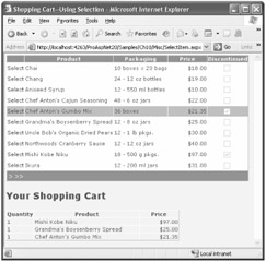
Figure 10-14: Adding the selected item to the shopping cart.
Want a quick example of why it's often important to render grid rows in a customized way? Take a look at Figure 10-14. The user just added to the cart a product that has been discontinued. Wouldn't it be nice if you could disable any rows matching certain criteria or, more simply, customize the row layout according to runtime conditions? Let's see how to do it.
There are two GridView events that are essential for the task RowCreated and RowDataBound. The former is fired when any grid row is being created whether it's a header, footer, item, alternating item, pager, and so on. The latter fires when the newly created row is bound to its data item that is, the corresponding record in the bound data source. The RowDataBound event is not fired for all rows in the grid, but only for those which represent bound items. No event fires for the header, footer, and pager.
As a first example, let's see how to disable the Select link for rows where the Discontinued field returns true. In this case, you need a handler to RowDataBound because the required customization depends on the values on the bound data row. As mentioned, this information is not available yet when RowCreated fires:
void GridView1_RowDataBound(object sender, GridViewRowEventArgs e) { if (e.Row.RowType == DataControlRowType.DataRow) { object dataItem = e.Row.DataItem; bool discontinued = (bool) DataBinder.Eval(dataItem, "discontinued"); e.Row.Enabled = !discontinued; } } In general, you start by checking the type of the row. To be precise, this test is not strictly necessary for a RowDataBound event, which fires only for data rows. The data item that is, the corresponding record is retrieved through the DataItem property of the GridViewRow object. Next, you retrieve the field of interest and apply your logic. You might not know in advance the type of the data object bound to the row. The DataBinder.Eval method is a generic accessor that works through reflection and regardless of the underlying object. If you want to disable the whole row (and contained controls), you can turn off the Enabled property of the grid row object. To access a particular control, you need to find your way in the grid's object model. Here's how to access (and disable) the Select link alone:
((WebControl)e.Row.Cells[0].Controls[0]).Enabled = !discontinued;
This code works because in the sample grid the Select link is always the first control in the first cell of each data row. Figure 10-15 shows the previous product list with discontinued products disabled.
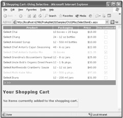
Figure 10-15: The rows corresponding to discontinued products are now disabled.
Once you gain access to the grid row object model, you can do virtually whatever you want.