13.2 Navigation Bars
| Typically, navigation bars are placed within a frameset, and the buttons on the bar are used to switch the content of the main frame. Consider a simple case in which the left-hand frame contains a navigation bar with three buttons. The three buttons display three different pages of information in the main window. (Navigation bars require NN3+ or IE4+ on both Macintosh and Windows.) Figure 13-3. Button with rollover behavior Although you can create a navigation bar by applying the Set Nav Bar Image behavior manually, creating one by using Insert Creating a navigation bar inserts three Set Nav Bar Image actions, each triggered by a different event ( onClick , onMouseOver , or onMouseOut ), as shown in Figure 13-4. These three actions are attached to each button in the navigation bar and the buttons work in concert. Clicking any button in a navigation bar displays its Down image and causes the other buttons to revert to their Up images. Figure 13-4. Three actions implementing the Set Nav Bar Image behavior in the Behaviors panel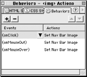 Select one of the buttons in the navigation bar and then double-click one of the actions in the Behaviors panel to open the Set Nav Bar Image behavior parameters dialog box. The Basic tab of this dialog box, shown in Figure 13-5, is similar to the one that appears when creating a navigation bar using the Insert Figure 13-5. The Basic tab of the Set Nav Bar Image dialog box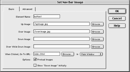 The Advanced tab of the Set Nav Bar Image dialog box is shown in Figure 13-6. This dialog box's options allow you to override or augment the default action taken when a button in the navigation bar is clicked. For example, you might alter the appearance of another image. Images besides the current button are listed in the Also Set Image field of this dialog box. Select an image from this list and specify the replacement image in the To Image File field (images swapped in this manner are indicated by an asterisk, as shown in Figure 13-6). Figure 13-6. The Advanced tab of the Set Nav Bar Image dialog box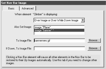 Use the "When Element is Displaying: Over Image or Over While Down Image" option to affect another image while the mouse pointer is over the button. (You can choose two display statesone if the button is Up and another if it is Down.) Use the "When Element is Displaying: Down Image" option to change the display of another image after the user clicks a button.  |
 Interactive Images
EAN: N/A
Pages: 208