| Dreamweaver allows you to work with web-compatible images (GIFs, JPEGs, and PNGs) in a variety of ways, including: 2.3.1 Inserting Images Insert images using Insert  Image or by clicking the Insert Image icon in the Objects panel's Common category. In the Select Image Source dialog box, shown in Figure 2-8, select the file to link to, or enter the image's URL manually. Choose Relative To Document from the pop-up menu to create a URL relative to the current document. Choose Relative To Site Root to create a URL relative to the root folder of the site. To create an absolute URL, specify the entire path , including the server, such as http://www.macromedia.com/images/biplane.gif . Use the Preview Images checkbox to preview both local and remote files. Image or by clicking the Insert Image icon in the Objects panel's Common category. In the Select Image Source dialog box, shown in Figure 2-8, select the file to link to, or enter the image's URL manually. Choose Relative To Document from the pop-up menu to create a URL relative to the current document. Choose Relative To Site Root to create a URL relative to the root folder of the site. To create an absolute URL, specify the entire path , including the server, such as http://www.macromedia.com/images/biplane.gif . Use the Preview Images checkbox to preview both local and remote files. Figure 2-8. The Select Image Source dialog box 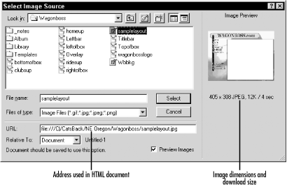 Once an image is inserted, use the Property inspector to set the <img> tag's options. Figure 2-9 shows the Property inspector when an image is selected. Double-clicking an image in the Design view opens the Property inspector and prompts you to reselect an image file for the src attribute of the <img> tag. Figure 2-9. The Property inspector for images 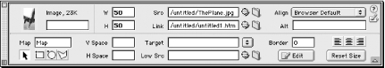 Table 2-5 explains the Property inspector options for images. Table 2-5. Image options | Option | Description | | Name | A name for the image, which is required to reference the image in scripts or in Dreamweaver behaviors. | | W (width) | The width of the image in pixels, which defaults to the image's original width, based on 72 pixels per inch (ppi) on a Macintosh and 96 ppi on Windows. An image formatted for a Windows machine appears smaller on a Macintosh. | | H (height) | The height of the image in pixels, which defaults to the image's original height (based on 72 ppi on the Macintosh and 96 ppi on Windows). | | Src | The absolute or relative URL of the image file. See Table 2-3. | | Link | The absolute or relative URL of the file to open when this image is clicked. | | Align | See details in the section following this table. | | Alt | Provides a text description of the image for web browsers that don't display images. Required for HTML 4.0 compliance. | | V Space | The vertical space to reserve around this image on the page. | | H Space | The horizontal space to reserve around this image on the page. | | Border | Width of the border, in pixels, to apply around the image. Use 0 for no border. | | Map | The name of the <map> element (i.e., the image map) that contains instructions for providing hot links over the image. | | Low Src | The URL of the image to load in low-resolution browsers. Supported by Netscape only. The preferred approach is to use interlaced images, which display at a lower resolution until the graphic is fully downloaded. The Low Src option doesn't appear in the Property inspector if the image was created in Fireworks. |  | Height and Width can be specified in the Property inspector using any supported units, such as percent (%), pixels (px), picas (pc), points (pt), inches (in), millimeters (mm), centimeters (cm), font height (em), and the height of x in the current font (ex). Specify units without an intervening space, such as 50pt to indicate 50 points. Dreamweaver converts the units to pixels. For example, if you specify a dimension of 1in, Dreamweaver will convert it to 96 pixels on Windows or 72 pixels on a Macintosh. | | The ten possible values for the Align option are: - Browser Default
-
The default is usually bottom alignment. - Baseline
-
Aligns the image's bottom with the baseline of the first line of text. - Top
-
Aligns the image's top with the top of the first line of text. - Middle
-
Aligns the image's middle with the baseline of the first line of text. - Bottom
-
Aligns the image's bottom with the baseline of the first line of text. - TextTop
-
Aligns the image's top with the top of the first line of text. - Absolute Middle
-
Aligns the image's middle with the middle of the first line of text. - Absolute Bottom
-
Aligns the image's bottom with the bottom of the first line of text. - Left
-
Aligns the image flush left on the page. Text is shown to its right. - Right
-
Aligns the image flush right on the page. Text is shown to its left. Any image added to a document is automatically added to the Site list of the Assets panel's Images category. Images from the Assets panel can be inserted into other documents as described in Chapter 6. 2.3.2 Client-Side Image Maps A client-side image map uses a <map> tag (see Example 2-1) to define multiple clickable areas, each with a separate link, for a single graphic image. The browser detects which link was clicked before contacting the server to fulfill the request. Each image can be tied to one <map> tag only unless it is controlled by a script. Use the Property inspector's rectangle, oval, and polygon tools to draw hotspots (clickable regions ) for your image map, as shown in Figure 2-10. Figure 2-10. A client-side image map drawn using the Property inspector's hotspot tools 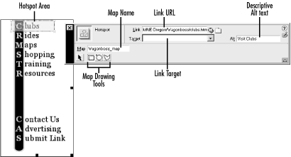 Use View Visual Aids Image Maps to show or hide the hotspot regions (which ordinarily appear in light blue). Enable the Edit Preferences Invisible Elements Client-Side Image Maps checkbox to show a small icon representing the <map> tag. You can specify the following settings for each hotspot: - Map
-
The map name is typically the same for all hotspots on a single image. If your image has multiple states controlled by a script, each state can have a separate <map> tag; otherwise , an image should be referenced by only one <map> tag. - Link
-
The URL of the document linked to this hotspot. - Target
-
The target frame in which the linked document will open. The frame can be any valid document name, such as _blank , _self , _parent , or _top . It defaults to _self . See Section 4.1.3 in Chapter 4. - Alt
-
An alternative text string for web browsers that don't display images and is also displayed before the image downloads (required to comply with the HTML 4.0 and XHTML accessibility standards). Example 2-1 shows a simple image map using the <area> element to define the multiple clickable areas of the image. As usual, you can use Dreamweaver's visual tools while it handles the housekeeping chores for you. Example 2-1. Client-side image map <img src="/images/pagetop.gif" width="400" height="100" align="bottom" border="0" usemap="#cbcmap"> <map name="cbcmap"> <area shape="rect" coords="4,4,55,100" href="logo.html" alt="home page" title="home page"> <area shape="rect" coords="88,9,364,53" href="catsback.html" alt="company info" title="company info"> </map> 2.3.3 Rollover Images and Navigation Bars Dreamweaver can create rollover images and navigation bars without requiring hand coding. Chapter 13 takes a deeper look at rollover images and navigation bars, but this section covers their basic use. 2.3.3.1 Rollover images Rollover images provide a rollover state for your page's buttons and are inserted using Insert Interactive Images Rollover Image. The button's two states are defined in the Insert Rollover Image dialog box, as shown in Figure 2-11. If the mouse is over the image, the Rollover Image graphic is displayed; otherwise, the Original Image graphic is displayed. Rollover images work only in browsers that support JavaScript (see Table 12-1 and Table 12-3). For browsers that don't support JavaScript, or if the user has disabled JavaScript, the browser always displays the Original Image graphic. Figure 2-11. The Insert Rollover Image dialog box 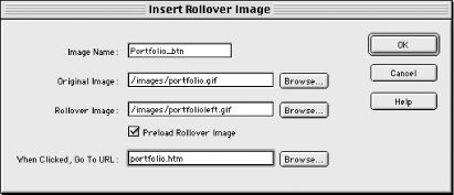 The Insert Rollover Image dialog box has five options, as shown in Table 2-6. Table 2-6. Insert Rollover Image dialog box options | Control | Description | | Image Name | A required text name used to identify the image in JavaScript. | | Original Image | The relative or absolute URL of the image displayed when the mouse is not over the button. | | Rollover Image | The relative or absolute URL of the image displayed when the mouse is over the button. | | Preload Rollover Image | This option preloads the rollover image prior to its display. Enable this option to ensure a smooth rollover transition. | | When Clicked Go To URL | The relative or absolute URL of the destination to which to link. | Both images used in your rollover effect should be the same size; otherwise, the Rollover Image graphic is scaled to fit the area taken up by the Original Image graphic. Chapter 13 explains how to create so-called disjoint rollovers in which rolling over a button changes a separate page element. 2.3.3.2 Navigation bars You can create a navigation bar with multiple buttons, as shown in Figure 2-12, by using Insert Interactive Images Navigation Bar. Figure 2-12. An example navigation bar 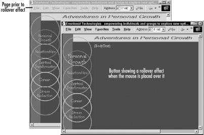 A navigation bar automatically shows the button for the current page in the highlighted (down) state to indicate which page the user is viewing. | | Navigation bars are intended for frames -based sites. Using a navigation bar with a nonframes-based document adds excess JavaScript without the benefit of its page-tracking features. | | In the Insert Navigation Bar dialog box, shown in Figure 2-13, use the plus (+), minus (-), and arrow buttons to add, remove, or rearrange elements (i.e., buttons) in the Nav Bar Elements list. Figure 2-13. The Insert Navigation Bar dialog box 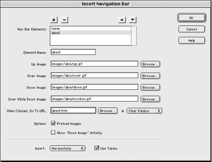 The last two options in the dialog box (and in Table 2-7) apply to the navigation bar as a whole. The rest of the attributes in Table 2-7 pertain to each navigation bar element. Highlight each element in the Nav Bar Elements list to set its attributes. Table 2-7. Navigation bar options for each element | Control | Description | | Element Name | A required text name used to identify the image in JavaScript. | | Up Image | The URL of the image displayed by default when the mouse is not over the button. | | Over Image (optional) | The URL of the image to display when the mouse is over the button. | | Down Image (optional) | The URL of the image to display when the image button is clicked. See the Show "Down Image" Initially option. | | Over While Down Image (optional) | The URL of the image to display when the mouse button was pressed before the mouse was rolled over the image. | | When Clicked, Go To URL . . .in | The URL of the document to open when the button is clicked. Specify an optional target after the . . .in prompt. | | Preload Images | Enable this option to preload the image states for smoother rollovers. | | Show "Down Image" Initially | Enable this option to use the Down Image instead of the Up Image as the initial state for this button. (An asterisk is shown next to Nav Bar Elements for which this option is enabled.) | | Insert horizontally or vertically | This option determines whether the buttons in the navigation bar are arranged horizontally or vertically. | | Use Tables | If enabled, this option uses tables to position the buttons; otherwise, layers are used (appropriate for 4.0+ browsers only). | To modify an existing navigation bar use Modify Navigation Bar, or select Insert Interactive Images Navigation Bar and click OK when asked if you wish to modify the existing navigation bar. Chapter 13 explains additional navigation bar configuration options, including how to access the advanced configuration options shown in Figure 13-6. 2.3.4 Web Photo Album The Web Photo Album option creates a document showing all images stored in a single directory, which is ideal for images from your latest vacation, business convention, or dog show. To create a Web Photo Album, select Commands Create Web Photo Album. | | The Create Web Photo Album option is active only if Fireworks 3 or later is installed. It requires all images to be in a single directory. | | The Create Web Photo Album dialog box is shown in Figure 2-14. Figure 2-14. The Create Web Photo Album dialog box 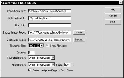 Table 2-8 explains the Create Web Photo Album dialog box's options. Table 2-8. Web Photo Album dialog box options | Control | Description | | Photo Album Title | A title that appears atop your photo album and as the document title. | | Subheading Info | A subheading that appears beneath the title. | | Other Info | This option adds notes, such as a short description of a series of vacation photos, below the subheading. | | Source Images Folder | The location of original images, which must all reside in a single directory. Fireworks can read GIF, JPEG, PNG, PSD (Photoshop), and TIFF. | | Destination Folder | The destination directory for web-compatible versions of photos. | | Thumbnail Size | Maximum dimensions, in pixels, of thumbnails, such as: 36 x 36, 72 x 72, 100 x 100, 144 x 144, or 200 x 200. The aspect ratio is maintained . | | Show Filenames | If checked, the filenames are shown on the thumbnail page of the photo album. | | Columns | The number of columns of thumbnails per page. Figure 2-15 shows 5 columns. | | Thumbnail Format | The graphic format to use for thumbnails (Web Snap 128, Web Snap 256, JPEG-Better Quality, or JPEG-Smaller). | | Photo Format | The graphic format for large photographs (same options as Thumbnail format). The PNG format is not supported. | | Scale | Specifies the percentage of the original photo size to be used for the final photo size. | | Create Navigation Page for Each Photo | If checked, use a separate page for each photo with the title, filename, and previous/next links; otherwise, thumbnails link to plain images. | Fireworks may take a few minutes to process the images. Figure 2-15 displays a completed Web Photo Album showing five columns of 100 x 100 thumbnails. Each thumbnail leads to a larger version of the same image. Figure 2-15. A completed Web Photo Album 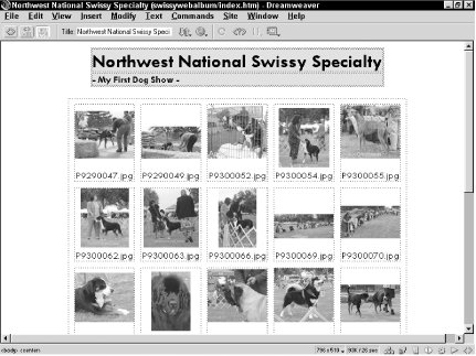 To run the Web Photo Album command, you must have a document from the current site open in the Document window. If successful, the command creates an index.htm file plus three foldersnamed images , pages , and thumbnails in the destination folder you specify. The file extension of the HTML files created by Fireworks is determined by Fireworks' preference settings, not Dreamweaver's preferences. If you intend to change your photo album pages, you should see Chapter 8; templates are easier to update than the static pages created by the Create Navigation Page for Each Photo option.  |