MAKING YOUR OWN FLASH PIXEL FONT
| After using the fonts, you might be inspired to try to make your own typeface. Or maybe you'll want to modify an existing font to suit your project. Take it from me: It's a lot of work, and it's not for impatient types. However, it can also give your project that extra edge. I will take you over my process so that you, too, can become a pixel master. This process involves these steps:
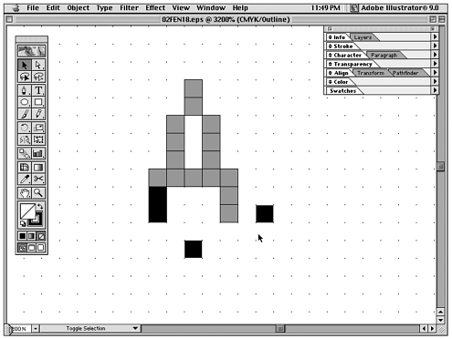
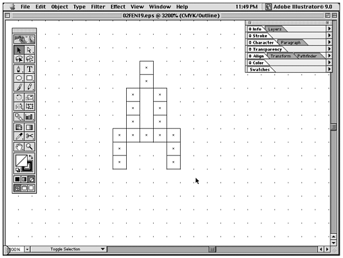
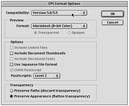
The sections that follow walk you through the steps that are involved in creating your own fonts. Determining Your NeedWhat kind of typeface do you need to build? Based on the project, determining what you need is the most important guide to creating a font that will be usable and aesthetically pleasing. The primary question is what the font is going to be used for. Is the font going to be used for text? Is it for a heading? This will help you determine what size, boldness, and style the type should take. Another big factor when designing for a device is how much room you are going to have for the type to exist on the screen. The line spacing might be one area with which you can experiment to maximize your usable type area. Line spacing, or leading, is the space between baselines in a paragraph (see Figure 4.16). Figure 4.16. Line spacing in a paragraph. Initial SetupAfter you have decided what you want the font to look like, it's time to start building. I build the fonts in Adobe Illustrator 9 because it gives me the capability to quickly change the font design before bringing the final version into a font creation program, such as Macromedia Fontographer. Illustrator 9 also allows you to work in pixels, giving a better sense of what your font will look like as you build. To set up a pixel grid in Illustrator, go to Edit, Preferences, Guides & Grid and change the Gridline Every to 1 px with 1 Subdivision (see Figure 4.17). Figure 4.17. Setting a 1-pixel grid. Then, turn on the Snap to Grid feature under View. This allows you to set the pixels on grid. ConstructionYou need to make the pixel shapes in which you will construct your characters. Select the Rectangle tool. Click on the artboard to bring up the Rectangle tool options. Set the width and height to 1 px (see Figure 4.18). Figure 4.18. Using pixel shapes to build characters. You can start to build out the letterforms by copying the pixel shape repeatedly. Sometimes, it's more efficient to build out the form in Outline mode under View to make sure all the pixel shapes are aligned properly (see Figure 4.19). Figure 4.19. Use outline mode to check shape alignment. This prevents more work later down the line when you are working in Fontographer. Be sure you look at the font at 100% scale for any design decisions. This is the size at which your end user sees the typeface, so it's best to make choices based on real viewing conditions. If possible, view the font on the device to make any final design decisions. Be sure to give your eyes a break once in a while. This allows you to see things in a different light and make better overall choices. After you have your final characters, it's time to save them into a format that Fontographer can easily read. Save the file as an EPS with a compatibility of 5.0/5.5 (see Figure 4.20). This reduces importing errors into Fontographer. Figure 4.20. Illustrator EPS settings. I usually save characters in batches (A M, N Z, a m, a z, 1 9, and so on) to keep them manageable. Unless you have a lot of free time, you definitely do not want to import them one at a time into Fontographer. Determining Font SizeFor your font to display at the right size, you need each pixel to correspond to a certain em value in Fontographer. In my case, I want the font to display properly when set to 8 points in Flash. The fonts are set at 8 points because this is the size at which the fonts work best in Flash, especially when used in paragraphs. As I have mentioned before, Flash not only wants to anti-alias everything and has a problem rendering bitmaps, but it also seems to have trouble dealing with bitmap emulations that are set at sizes larger than 8 points. I stumbled on this fact accidentally as I was noticing how one early font prototype phased in and out of focus at 10 points but was perfectly clear at 8 points. Because I couldn't change how Flash renders type, I decided to make my fonts work uniformly at 8 points (which is fairly convenient when switching between fonts).
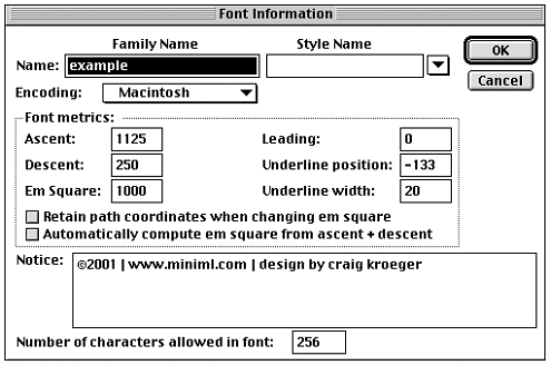
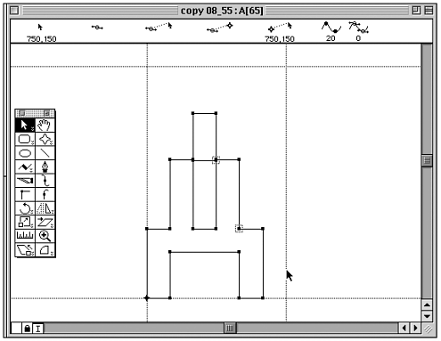
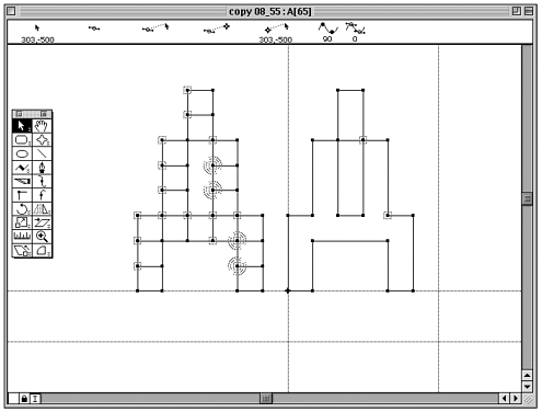
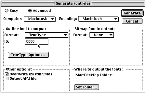
For the font to work at 8 points, each pixel must correspond to 125 em units. This is true when the em square equals 1000 em units. (To figure out the math, 1000 em units divided by 8 equals 125 em units. A 10-point font, for instance, would be equal to 100 em units.) When you import the EPS into Fontographer, it automatically scales up the font to whatever you set the Ascent value under the Element, Font Info option. For instance, if the font you create is 8 pixels tall, you would set the Ascent value to 1000 em units (8x125 em units). If the font is 9 pixels tall, it would be set to 1125 em units (9x125 em units). If you don't, then it will automatically scale the characters to fit whatever Ascent value is set, which creates output problems later. The only other trick is that not all characters are the same height in pixels. For instance, often the Q is one pixel "taller" because it descends below the baseline. In that case, you would want to bring in the "Q" at the right size for that character (125 em units more than the other characters if it was 1 pixel taller). (See Figure 4.21.) Figure 4.21. The Ascent value is based on pixel height. Importing into FontographerNow it's time to transfer the characters you created in Illustrator into Fontographer so that you can make a usable font. To import the outlines into Fontographer, select an empty unused character spot. After the correct Ascent value is set, import the characters under File, Import, EPS and select the appropriate file. Then go into that character spot, select each character, and copy and paste it into its corresponding location. After pasting each character, immediately set the right sidebearing under Set Width. Set that value equal to the width of the character plus 1 pixel of space more so the characters don't touch each other (see Figure 4.22). Figure 4.22. Setting the right sidebearing. If the font were 5 pixels wide, the width would be set to 750 em units ((5+1)x125 em units). Cleaning Up the CharactersAfter you have all the characters in place, you need to remove any extra information to make the font's file size as small as possible. Do this by selecting all the characters and then selecting Element, Remove Overlap. This joins all the individual pixel blocks. This also creates a lot of unnecessary points. You can eliminate these extra points by selecting Element, Clean Up Paths and setting the range to the maximum setting (see Figure 4.23). Figure 4.23. Before and after cleaning up the forms. Eliminating Fill-InThere is one problem with pixel fonts that are created from outlines. When forms meet at points, the computer displays the letterforms with the counters filled in, unless you slightly adjust the form (see Figure 4.24). Figure 4.24. Closed character forms can fill in when there is not enough distinction. You will need to adjust the interior spaces of closed letterforms, such as A, B, D, O, P, Q, and so on, to prevent the forms from filling in. Adjust the interior space by 5 em units until the form is more clearly defined (see Figure 4.25). Figure 4.25. The adjusted shape prevents fill-in. The form, although slightly less of a pure pixel form, will render just fine at the intended size. Generating FontsAfter the characters are cleaned up, you need to make a font. In Fontographer, under File, select Generate Font Files. Select the Computer type and corresponding encoding. Under Format, select TrueType. I use the TrueType type format over PostScript because the fonts are meant for screen use and Flash handles them better. Plus, you can open the fonts without an outside application. Be sure to give the font a unique ID number, especially for PC versions (see Figure 4.26). If the number is the same as an existing font in your system, it won't appear in your menu. Simply change the number to a different value and re-export the font. Figure 4.26. Settings for generating fonts. After the font is generated, you can install it and use it in Flash. Wasn't it worth the effort? |


EAN: N/A
Pages: 178