5.4 The Component Gallery
The Component Gallery
The Component Gallery is a new tool in Visual FoxPro 6.0. It's a companion of the Class Browser. Both share the same display surface (see Figure 14) and you can toggle between the two. The Component Gallery is a very powerful shortcut and hyperlink manager. I like to think of it as my "mission control center for application development." In the past we had many different tools that helped to manage the different kinds of events that occurred when creating an application. The most generic was the Project Manager. It can handle all kinds of items and bind them together in one application, but it has a number of limitations. First of all, the Project Manager can handle only a handful of items properly classes, forms, programs, menus, and the like. The Project Manager ties specific behavior to all these items. Unfortunately, in modern projects there are a number of items the Project Manager is not aware of items like multimedia files, HTML documents, Office documents, ActiveX controls, and others. Of course you could enhance the Project Manager to handle these items as well, but this is not the point. The point is that the list of component types that make up a project is constantly growing. A tool as static as the Project Manager simply isn't flexible enough.
The second big limitation of the Project Manager is that it (obviously) handles a single project at a time. This is fine because that's the Project Manager's purpose. But the world is not that simple. Usually you have to deal with more than one project during your programming career, and ideally (this is one of the main ideas behind object-oriented programming) you can reuse components across projects. For this reason, you need a tool that is not "production oriented," not "results oriented" like the Project Manager (its whole functionality is targeted to build the final result, which is an EXE). A production-oriented tool helps to manage all components in the typical way a programmer uses them every day, rather than focusing on compiling them into the final product.
When creating applications, you must accomplish many more tasks than just modifying classes and source code and compiling an application. Among them are component installation, invoking wizards and builders, reading documentation, searching the Internet, creating documentation, and more. Until now, the only tool FoxPro offered to accomplish these tasks was the System menu, which was not very flexible. Imagine the following situation: You buy a framework from a third party. You install the framework on your system and you begin to explore what you've just purchased. To do so you can either read the manuals (which, as we know, is something no programmer does), or you can explore the contents of your hard drive using the Windows Explorer, the Visual FoxPro Class Browser or similar tools. The framework might even have a menu that can be installed, or a startup program that provides a simple interface to the most important features. This interface might be a dialog that allows you to start an Application Wizard or open existing projects. You might even get an overview of the provided classes and libraries if you want to reuse only certain components.
In any case, this kind of approach is cumbersome unless the provider of your framework spent a tremendous amount of time creating the interface. The Component Gallery offers a better way to accomplish these tasks. The provider of the framework could simply create a Component Gallery catalog (which is basically a library of links) that contains all of this functionality. The catalog could have a Start node that contains links to the most important tools and features, as well as some documentation (like "Getting Started"). The user could double-click those items to start wizards and other tools, and the contents of the node could be dynamic to provide links to the most recently used projects. In other nodes of the catalog, there might be links to all components, in case they should be reused as single components rather than as a framework. The programmer could then simply drag and drop those components into the Visual Class Designer or the Project Manager. Often, reusing a component is not as easy as dragging and dropping the item. Other components might be required, so they also would have to be added to the container object. In this case, instantiating the class wouldn't be enough.
Without the Component Gallery, the programmer would run into an error, have to read the documentation, and a couple of hours later he might be able to make the construction work. With the Component Gallery, the catalog provider can simply associate additional actions to the drag-and-drop operation to make sure all preconditions are satisfied. This could mean that other objects are added, or that some documentation is displayed to tell the programmer what to do if the task cannot be automated. One example is a component I wrote a little while ago. It uses the Microsoft Agent ActiveX control to provide Office Assistant-like help in Visual FoxPro applications. My component is a simple wrapper that makes it easy to handle the Microsoft Agent Server. Of course, the Microsoft Agent control has to be installed on the system for the wrapper to work. Using the Component Gallery, a message could be displayed if the control is not installed on the system, telling the user that he has to install this control. In addition, this message has a hyperlink to Microsoft's Web site, so people can go there and download the necessary software.
Speaking of setup, a Component Gallery catalog could also have a node containing all necessary installation items, as well as those for a clean uninstall.
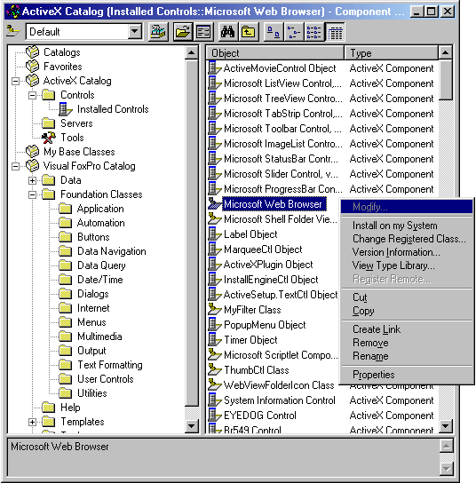
Figure 14. The Component Gallery.
Basic functionality
The Component Gallery looks much like the Windows Explorer. It has a treeview panel on the left-hand side that displays all catalogs with their nodes. On the right, there is a panel of shortcuts and hyperlinks for the selected node. At the bottom, a description for each item is displayed. At the top of the window, there is a toolbar just like in the Class Browser. Figure 15 explains the items of the toolbar.
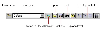
Figure 15. The Component Gallery toolbar.
Just as in the Class Browser, the Move icon can be used to drag and drop items to the screen, a design surface or the Project Manager. You can also right-click it to change the icon. The View Type combobox allows users to switch to different views. (See below for more information about Component Gallery views.) The Open button leads you to an unconventional Open dialog, which is similar to the Open dialog of Internet Explorer, rather than the regular Windows Open dialog (see Figure 16). It has a drop-down combobox with a list of all registered catalogs. If you want to register a new catalog you can simply click the Browse button, select a file, select "Add catalog to current default view" and click the Open button. You can also right-click the Open button of the Component Gallery to get a list of recently used catalogs.
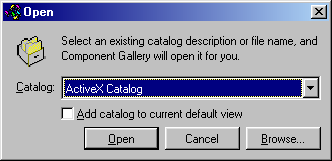
Figure 16. The Open dialog of the Component Gallery.
The Options dialog has three tabs. The options on the Standard tab (see Figure 17) are self-explanatory. The only item that might be confusing is "Advanced editing enabled." If you select this check box, the Component Gallery's Options and Properties dialogs will contain advanced features.
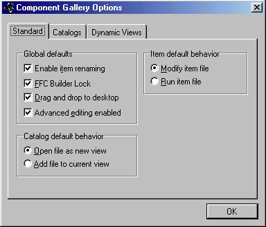
Figure 17
. The Standard tab of the Component Gallery Options dialog.The Catalogs tab allows you to define the list of catalogs (see Figure 18), which is displayed in the Open dialog. Each catalog can be defined as global and/or default. Global catalogs are always open, no matter what other catalogs are currently opened. This is handy for a catalog containing your most standard components, and also for special catalogs such as Favorites, which ships with Visual FoxPro 6.0. Default catalogs are opened initially when the Component Gallery is started. Unlike global catalogs, these catalogs will be closed when others are opened.
For some reason, neither default nor global catalogs are opened when you switch from the Class Browser into Component Gallery mode. I personally don't like this behavior, but I'm told it is by design.
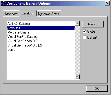
Figure 18. Defining and managing catalogs in the Options dialog.
The Dynamic Views tab shows a list of all custom views (see Figure 19). From here, you can create, modify and delete custom dynamic views.
Finally, the Component Gallery's Find button provides a powerful interface for locating certain components. Surprisingly, the Component Gallery uses dynamic views to search. The results are stored as dynamic views, and the search criteria can be reused and modified.
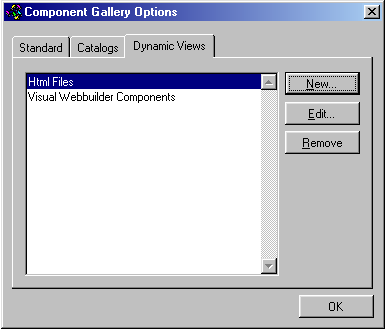
Figure 19
. Managing dynamic views.Creating dynamic views
Dynamic views limit the number of items displayed in the Component Gallery, based on certain search criteria that are evaluated every time you apply a view. You define dynamic views either through the Options dialog or through the Find feature of the Component Gallery. Figure 20 shows the dialog used to define dynamic views.
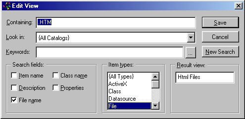
Figure 20. Defining dynamic views.
Figure 20 shows a dynamic view that displays only the files with HTM extensions. You can also specify multiple search strings separated by commas. I specified that all catalogs should be included. Because I checked only for certain file extensions, I limited the search fields to the file name; I could have selected additional items, but this would slow down the process. Also, because I want to see only files, I limit the search to items of the type File. The result view is called Html Files.
The beauty of dynamic views is that I can now add many HTML files to any catalog, and they will show up in this dynamic view because the specified criteria are constantly reevaluated.
You can also search for certain keywords using the keyword entry field. Each Component Gallery item can have specific keywords assigned. The Component Gallery features a special keyword-selection dialog (see Figure 21), which guarantees that you can find existing keywords quickly and easily. You can also add new keywords to the predefined list.
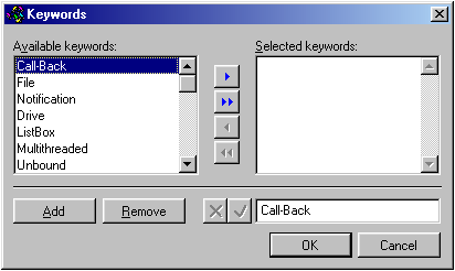
Figure 21. Selecting and managing keywords.
Working with existing catalogs
Catalogs can be used in a number of different ways, depending on what the creator of the catalog wants to implement. Therefore, it is hard to come up with a generic explanation of how to use these catalogs. Nevertheless, most catalogs (and their items) share common features. Typically, all actions associated with catalog items can be accessed through the items' right-click menus. Double-clicking the items also triggers one of those actions (usually the first one in the list). In addition, you can move items via dragging and dropping, in order to add them to projects, forms and container classes. To do so, either use the Move icon (in the top-left corner of the Component Gallery) or drag the item in the listview. In the latter case, OLE Drag and Drop is utilized. The Visual FoxPro online documentation contains a list of all drag-and-drop actions associated with the default items.
EAN: 2147483647
Pages: 113