Controls
Controls and Windows
Controls are the basic elements for user interaction in the user interface. Most of the user interface elements you see are controlsthis includes buttons , menus , views, and most other UI elements. Every control is derived from the abstract base class CCoeControl (defined in the system header file coecntrl.h ), which gives it its fundamental features and capabilities. When it is visible, a control represents a rectangular area of the screen which can accept user input and/or display output. Controls may be nested within other controls to an arbitrary level (although practical considerations will usually limit the extent to which this is sensible ).
A window is a system resource (owned by the Window Server) representing a rectangular area of the screen that contains one or more controls. It provides the mechanism for displaying its controls on screen. Be aware, though, that application UI code does not draw directly to a windowit only draws to controls. A number of overlapping windows can be displayed simultaneously each window has a z-order attribute associated with it to represent its ordinal position (that is, the position between nearest the viewer and furthest away from the viewer). There is a family of classes representing windows, derived from RWindowTreeNode . A control's window can be obtained by calling the CCoeControl::Window() method.
Simple and Compound Controls
Controls are said to be either simple or compound. A simple control is one which does not contain any other controls. In other words, it is solely responsible for drawing to the rectangle which it represents.
A compound control contains one or more other controls. Whereas simple controls take sole responsibility for drawing to an area of the screen, complex controls delegate this responsibility, in part or totally, to one or more subcontrols. The controls contained by a compound control may in turn be either simple or compound.
 | In C++ terms, a compound control object owns other control objects. |
It is a compound control's responsibility to manage the controls it contains and provide access to them. The controls contained by a compound control are known as its component controls.
When you are laying out the screen, compound controls provide more flexibility than simple controls. You can divide the screen into separate component controls and then redraw each control separately when it needs to be updated. This approach has the advantage that only the areas of the screen that have changed need to be redrawn, which can improve efficiency and reduce screen flicker. For these reasons, it is a good idea to place areas of the screen that need to be updated frequently into their own controls, keeping them separate from areas of the screen that change infrequently, or not at all.
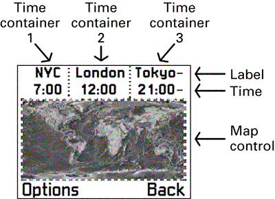
In order to illustrate this, imagine an application that simultaneously displays the local time at various locations around the worldfor example, New York City, London, and Tokyo, as shown in Figure 5-1. Clearly, the area of the screen displaying the times will need to change once a minute. However, the labels containing the city names will not normally need to be updated.
Figure 5-1. A fictitious application that uses compound controls.
Imagine that the application also displays a map of the world, showing roughly the areas currently in daytime or nighttime. As time progressed, the application would need to update the highlighted and darkened areas of the map, but with much less frequency than the times. To summarize, the application therefore has areas on screen that:
-
Do not need updating (the location labels).
-
Need updating frequently (the actual time).
-
Need updating infrequently (the background map).
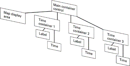
Figure 5-2 shows the hierarchy of controls, contained within a single compound control, which might be used to address this requirement. The system is envisaged with two levels of compound control. First, the screen is split into the map and three "time-container" controls. Each of these time-container controls is then divided into a label (for the city name ) and a control to display the time.
Figure 5-2. A compound control hierarchy.
Keeping the time control separate from its associated label will allow it to be redrawn at regular intervals, without the label needing be redrawn at the same time. The "time-container" compound control that owns them also provides a number of benefits:
-
The behavior of the two controls is now encapsulated into a single, higher-level class, making it easier for developers to reuse.
-
The compound control will determine the relative layout of the two controls, to ensure that all time controls have a consistent look and feel.
-
The compound control also hides the specific drawing code for the two smaller controls. Once this drawing has been optimized (for example, ensuring that the time control is redrawn frequently but the label is not), developers are provided with a single, high-level compound control which they just need to add to their UI, and which will handle all of its own specific drawing requirements.
Series 60 provides a huge number of reusable compound controls which have exactly these benefits: they hide specific and often complicated layout and drawing code from the developer, to produce a simple, encapsulated control that fulfils a particular purpose.
| | A great feature of the control framework is that a developer does not need to know whether a control is simple or compoundthat is an internal implementation detail which is hidden behind the API. This means that any control can be reused in exactly the same way, regardless of how complex it may be. |
Window Ownership
Controls draw onto windows, and so every control must have an associated window. Rather than give each control its own window, however, you can share a window between controls. Controls can be either "window-owning" (having their own window) or "non-window-owning" (sharing a window-owning control's window).
Non-Window-Owning Controls
Because a window is an expensive resource, it is not a good idea for every control to create its own window. You can reduce the number of windows needed by using non-window-owning controls. This reduces the number of resources used, the amount of Client/Server traffic, and the number of process switches. Text editing controls and labels are examples of controls that are usually non-window-owning.
| | Non-window-owning controls are also known as lodger controls, because they "lodge" in another control's window. |
There are, however, some restrictions on the use of non-window-owning controls, as outlined here:
-
They must be positioned so that they do not overlap each other.
-
They must be contained within the extent of their associated window.
-
They must have a container.
In order to construct a non-window-owning control, you need to call the SetContainerWindowL() method, passing the control whose associated window you want to share. For example:
CMyNonWindowOwningControl::ConstructL( const CCoeControl& aControl) { SetContainerWindowL(aControl); // Do other operations needed to construct the control } Window-Owning Controls
Unlike a non-window-owning control, a window-owning control cannot share another control's window. Instead, it has to create its own window when it is constructed . Window-owning controls have the same size and position as the window they create. Window-owning controls can also overlap each other and can be moved anywhere within the boundaries of their parent window.
It is also possible for a window-owning control to be a component of a compound control. In this case, what limits the movements of the control will be the window-owning control's window, not the compound control's window. Dialogs and menus are examples of controls that are usually window-owning.
In order to construct a window-owning control, you need to call the CreateWindowL() methodthis is usually performed in the control's ConstructL() method. For example:
CMyWindowOwningControl::ConstructL() { CreateWindowL(); // Do other operations needed to construct the control } CreateWindowL() will most often be called by the constructor of either a simple control, or of the top-level parent of a complex control. In the case of a simple control, this function provides it with a window over which the control will have exclusive drawing responsibilities. In the case of a complex control, the top-level parent will call this function to provide a window for which it will allocate areas of drawing responsibility to its constituents.
In general it is recommended that controls should be non-window-owning wherever possible, in order to conserve system resources. A control should be window-owning only when it requires the properties of a window, such as being able to overlap other controls.
Creating a Simple Control
This subsection and the next describe how to implement a basic simple and compound control, with reference to the example application Controls . This application defines two controls: a simple control which just draws a red ellipse on the screen, and a compound control which contains two of these simple controls.
Creating a simple control involves the following steps:
- Create a class derived from CCoeControl .
- Implement construction code (typically in a ConstructL() function).
- Override the virtual function Draw() to provide the drawing code for your control.
- Override the virtual function SizeChanged() to layout the control again if its size changes.
All of these steps can be seen in the CSimpleControl class in Controls . The relevant sections of code from this class are shown here.
Creating a simple control class is quite straightforward. Here is the complete declaration of CSimpleControl note that apart from construction and destruction the only functions implemented are the two virtual functions from CCoeControl mentioned above.
class CSimpleControl : public CCoeControl { public: // constructors and destructor static CSimpleControl* NewL(const TRect& aRect, const CCoeControl* aParent); static CSimpleControl* NewLC(const TRect& aRect, const CCoeControl* aParent); ~CSimpleControl(); private: // constructor void ConstructL(const TRect& aRect, const CCoeControl* aParent); private: // from CoeControl void Draw(const TRect& aRect) const; void SizeChanged(); private: // data }; Every control should have a ConstructL() method to carry out its second-phase construction. For most controls this will carry out at least the following basic steps:
- Set the control's window. This can either be a new window (in which case the control becomes window-owning) or an already existing window (in which case the control is non-window-owning).
- Set the control's client rectanglein other words, the area of screen that this control is responsible for drawing to.
- Activate the control. This informs the UI framework that the control is ready to be drawn.
You can see all three of these steps in the ConstructL() of CSimpleControl :
void CSimpleControl::ConstructL(const TRect& aRect, const CCoeControl* aParent) { if (aParent == NULL) { // No parent control, so create as window-owning CreateWindowL(); } else { // Part of a compound control, so just share // the parent's window SetContainerWindowL(*aParent); } SetRect(aRect); ActivateL(); } You will notice that CSimpleControl can behave either as a window-owning or a non-window-owning control. These lines in the ConstructL() are the only ones required to make this distinctionthe rest of the code for the control will be the same. It is good practice to write controls in this way, unless there is a compelling reason for them to be window-owning or not. (A dialog control, for example, will always be window-owning.) Writing controls generally , where possible, allows them to be easily used in different circumstances.
After construction, all that remains is to implement the two virtual functions Draw() and SizeChanged() from CCoeControl . The first of these is shown here:
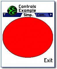
void CSimpleControl::Draw(const TRect& /*aRect*/) const { CWindowGc& gc = SystemGc(); gc.Clear(Rect()); // Set GC pen & brush styles gc.SetPenStyle(CGraphicsContext::ESolidPen); gc.SetPenColor(KRgbBlack); gc.SetBrushStyle(CGraphicsContext::ESolidBrush); gc.SetBrushColor(KRgbRed); gc.DrawEllipse(Rect()); } The parameter to this function, aRect , specifies the area of the control that requires redrawing. This may be the entire control or just be a region of it (for example, if another window appeared over part of the control and has been dismissed). A more complex control may take care just to redraw this part of the control. However, in order to keep the Controls example simple, it is ignored here, and the whole control is redrawn each time.
Drawing is achieved by obtaining a graphics context and using Series 60 graphics APIs to draw to it. This example draws an ellipse, with black outline and red fill, to occupy the full height and width of the control's client rectangle, as shown in Figure 5-3.
Figure 5-3. A simple control.
Finally, you just need to implement the SizeChanged() function to perform any steps required when your control changes size. In this case you will notice that the Draw() method above is entirely dynamicit gets the control's current size using the Rect() method, and all drawing is relative to that. Therefore, no specific handling is required for changes to the control's size, and SizeChanged() is empty:
void CSimpleControl::SizeChanged() { } You will see in the next subsection how SizeChanged() is implemented for a compound control. Further details of the Series 60 graphics APIs can be found in Chapter 11.
Creating a Compound Control
Implementing a compound control starts with the same steps as for a simple control:
- Create a class derived from CCoeControl .
- Implement construction code (typically in a ConstructL() function).
- Override the virtual function Draw() .
- Override the virtual function SizeChanged() .
In addition, you will need to do the following:
- Add component controls to the control, usually as member data of the compound control class.
- Override the virtual functions CountComponentControls() and ComponentControl() to ensure the component controls are drawn.
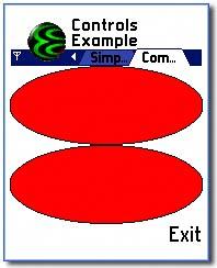
This subsection covers these steps with reference to the CCompoundControl class in the Controls application. This is a compound control which contains two instances of CSimpleControl and draws them in the top and bottom halves of the screen, as shown in Figure 5-4.
Figure 5-4. A compound control.
As before, the first step is to create a control class derived from CCoeControl . Notice that this time the control owns other controls as member data:
class CCompoundControl : public CCoeControl { public: // constructors and destructor static CCompoundControl* NewL(const TRect& aRect, const CCoeControl* aParent); static CCompoundControl* NewLC(const TRect& aRect, const CCoeControl* aParent); ~CCompoundControl(); private: // constructor void ConstructL(const TRect& aRect, const CCoeControl* aParent); private: // from CoeControl TInt CountComponentControls() const; CCoeControl* ComponentControl(TInt aIndex) const; void Draw(const TRect& aRect) const; void SizeChanged(); private: void CalculateRects(); private: // data CSimpleControl* iTop; CSimpleControl* iBottom; TRect iTopRect; TRect iBottomRect; private: // member enum enum TComponentControls { ETop = 0, EBottom, ENumberOfControls }; }; Construction of CCompoundControl looks very similar to that of CSimpleControl , with the addition of some extra code to construct the components controls:
void CCompoundControl::ConstructL(const TRect& aRect, const CCoeControl* aParent) { if (aParent == NULL) { CreateWindowL(); } else { SetContainerWindowL(*aParent); } // Size and construct the two component controls CalculateRects(); iTop = CSimpleControl::NewL(iTopRect, this); iBottom = CSimpleControl::NewL(iBottomRect, this); SetRect(aRect); ActivateL(); } CalculateRects() is a private utility function provided to calculate the client rectangles for the two component controls. It gets the current client rectangle for this control and splits it into two halves, which are stored in the member variables iTopRect and iBottomRect :
void CCompoundControl::CalculateRects() { TRect outerRect = Rect(); // Calculate dimensions of inner rectangles const TInt innerRectWidth = outerRect.Width(); const TInt innerRectHeight = outerRect.Height() / 2; // Set rectangle for top control iTopRect.SetRect(outerRect.iTl, TSize(innerRectWidth, innerRectHeight)); // Set bottom rectangle. Easiest way is to copy the top // rectangle, then move it down by innerRectHeight: iBottomRect = iTopRect; iBottomRect.Move(0, innerRectHeight); } Next you need to think about how your compound control will be drawn. For a compound control this is the joint responsibility of three functions: Draw() , CountComponentControls() and ComponentControl() . It helps at this stage to understand the order of events that occur inside the UI framework when a control is drawn:
-
The compound control's Draw() method is called.
-
The framework then calls CountComponentControls() on the compound control to determine the number of component controls it has.
The framework iterates through each of the component controls by calling ComponentControl() to obtain a pointer to each. For each control it repeats these three steps, eventually stopping when it reaches a control with no component controls. In this way it is able to draw a compound control of arbitrary complexity.
| | This process is the same for all controls, both simple and compound. The difference is that simple controls do not override CountComponentControls() and ComponentControl() . Instead, they inherit the default implementations from CCoeControl , and these return and NULL , respectively, so that the framework knows there are no component controls to draw. |
For a compound control, the Draw() method is often trivial, as usually the real drawing is delegated to component controls. However, it is good practice for a compound control to at least fill its client rectangle with a default color before the component controls are drawn. This ensures that any gaps between the component controls will not be left transparent. This is what CCompoundControl::Draw() does:
void CCompoundControl::Draw(const TRect& aRect) const { CWindowGc& gc = SystemGc(); gc.Clear(aRect); }  | If your container control does no drawing at all, you do not need to override the Draw() method at all. However, if you do not have a Draw() method, you should call the SetBlank() method (inherited from CCoeControl ) during the compound control's construction to ensure its background is filled in. Otherwise the contents of the screen behind the control will not be overdrawn. |
Now you need to implement CountComponentControls() and ComponentControl() appropriately, otherwise your component controls will not be drawn. This is often done with the help of an enum which enumerates the component controls.
In the Controls example this is the TComponentControls enumeration, defined as a private member of the CCompoundControl class. CountComponentControls() is then implemented as follows :
TInt CCompoundControl::CountComponentControls() const { return ENumberOfControls; } And ComponentControl() is implemented as:
CCoeControl* CCompoundControl::ComponentControl(TInt aIndex) const { switch (aIndex) { case ETop: return iTop; case EBottom: return iBottom; default: return NULL; } } The final element that needs adding to make the compound control work properly is the SizeChangedL() function. Unlike CSimpleControl , CCompoundControl requires a non-trivial implementation to ensure its component controls are correctly resized. To achieve this, it re-uses the CalculateRects() function, as shown here:
void CCompoundControl::SizeChanged() { CalculateRects(); iTop->SetRect(iTopRect); iBottom->SetRect(iBottomRect); } This is all that needs to be done. Now when the framework draws the component controls, they will have their client rectangles set correctly and will be drawn appropriately.
 | The Event Handling section of this chapter contains further details on how a compound control should distribute events to its component controls. For the sake of simplicity, the examples in this section have not handled input events at all. |
Establishing Relationships between Controls
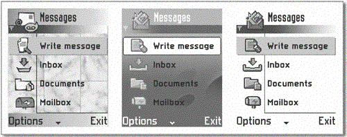
The unique screen layout of Series 60 has an impact on the API design of its UI controls. Consider an application that provides a scrolling listbox of items. In Series 60, such scrollable controls do not own their scrollbar. Instead, the scrollbar appears as part of the dedicated menu pane, as in Figure 5-5 (the inverted triangle is the scroll indicator).
Figure 5-5. Skins.
This requires the application's control to be able to reference the menu pane, in order to update the scrollbaras the user navigates the list, the scrollbar indicator must change to denote relative list position. As you have seen, parent-child relationships already exist between controls due to their implementation, but this doesn't provide a means of establishing communication between controls that do not possess the conventional hierarchical relationship. To satisfy this scenario, and in anticipation of other situations in which unrelated UI controls may need to interact, the MObjectProvider interface has been implemented.
This mechanism provides a relationship between all registered controls and allows a control to request access to others via its parentthe object request is continually passed upward (from child to parent, in an iterative fashion, with parent controls querying their child controls) until the request can be satisfied (or not, as the case may be).
The implementation of this interface for standard controls is provided by the systemthe only thing you need to do to take advantage of it is to call SetMopParent() for your control to establish the child-parent relationship necessary for the scheme to work.
EAN: 2147483647
Pages: 139
- Chapter I e-Search: A Conceptual Framework of Online Consumer Behavior
- Chapter VII Objective and Perceived Complexity and Their Impacts on Internet Communication
- Chapter XII Web Design and E-Commerce
- Chapter XVII Internet Markets and E-Loyalty
- Chapter XVIII Web Systems Design, Litigation, and Online Consumer Behavior