Rendering a Quadratic Bezier Curve
|
|
|
Gradient Checkerboards and Multi-Quadratic Bezier Clip Paths
Consider the gradient checkerboard pattern rendered in Figure 5.2.
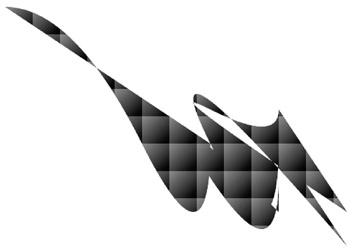
Figure 5.2: A multi-quadratic Bezier-bound gradient checkerboard pattern.
The SVG document in Listing 5.2 demonstrates how to use the SVG path element in order to generate a gradient checkerboard pattern bound by a multi-quadratic Bezier curve.
Listing 5.2 checkerBoardGradientMQBCP1.svg
 |
<?xml version="1.0" encoding="iso-8859-1"?> <!DOCTYPE svg PUBLIC "-//W3C//DTD SVG 20001102//EN" "http://www.w3.org/TR/2000/CR-SVG-20001102/DTD/svg-20001102.dtd"> <svg width="800" height="400"> <defs> <linearGradient x1="0" y1="0" x2="40" y2="40" gradientUnits="userSpaceOnUse"> <stop offset="0%" style="stop-color:#FF0000"/> <stop offset="100%" style="stop-color:#000000"/> </linearGradient> <pattern width="40" height="40" patternUnits="userSpaceOnUse"> <rect fill="url(#gradientDefinition)" style="stroke:white;stroke-width:4;" stroke-dasharray="6 6 6 6" x="0" y="0" width="36" height="36"/> </pattern> <clipPath clipPathUnits="userSpaceOnUse"> <path d="m0,0 Q100,0 200,200 T300,200 m100,100 Q200,100 300,250 T400,250 m100,100 Q200,0 300,200 T400,200 m100,100 Q200,100 300,150 T400,150" style="fill:red;stroke:white;stroke-width:4;"/> </clipPath> </defs> <g transform="translate(50,50)" clip-path="url(#clipPathDefinition)" stroke="black" fill="none"> <rect fill="url(#checkerPattern)" x="0" y="0" width="800" height="400"/> </g> </svg>
|
Remarks
The SVG code in Listing 5.2 contains an SVG defs element that defines a checkerboard pattern using diagonal linear grading shading that ranges from red to black. The SVG defs element also defines a clip path that consists of four connected quadratic Bezier curves as given below:
<path d="m0,0 Q100,0 200,200 T300,200 m100,100 Q200,100 300,250 T400,250 m100,100 Q200,0 300,200 T400,200 m100,100 Q200,100 300,150 T400,150"
The first quadratic Bezier curve is the same as the quadratic Bezier curve defined in Listing 5.1, and the other three Bezier curves are essentially variations of the first Bezier curve. The resultant graphics image is reminiscent of a dragon.
The actual rendering takes place in the SVG g element, which first translates the origin from the point (0,0) to the point (50,50). Notice how the SVG g element also contains the following line that specifies the clip path that is defined in the SVG defs element:
clip-path="url(#clipPathDefinition)" stroke="black" fill="none">
The SVG code contains an SVG rect element that creates a 'wiggly' effect because the width and height attributes are slightly smaller than the corresponding attributes specified in the pattern element in conjunction with the stroke-dasharray attribute, as shown below:
<rect fill="url(#gradientDefinition)" style="stroke:white;stroke-width:4;" stroke-dasharray="6 6 6 6" x="0" y="0" width="36" height="36"/>
|
|
|
EAN: 2147483647
Pages: 362