Creating Cones with Gradient Shading
|
|
|
Creating Cylinders with Gradient Shading
Consider the gradient cylinder rendered in Figure 3.14.
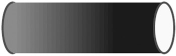
Figure 3.14: A cylinder with linear gradient shading.
The SVG document hGradientCylinder1.svg in Listing 3.14 renders a cylinder with linear gradient shading.
Listing 3.14 hGradientCylinder1.svg
 |
<?xml version="1.0" encoding="iso-8859-1"?> <!DOCTYPE svg PUBLIC "-//W3C//DTD SVG 20001102//EN" "http://www.w3.org/TR/2000/CR-SVG-20001102/DTD/svg-20001102.dtd"> <svg width="100%" height="100%"> <defs> <linearGradient x1="0" y1="0" x2="200" y2="0" gradientUnits="userSpaceOnUse"> <stop offset="0%" style="stop-color:#FF0000"/> <stop offset="100%" style="stop-color:#440000"/> </linearGradient> </defs> <g transform="translate(100,100)"> <ellipse cx="0" cy="50" rx="20" ry="50" stroke="blue" stroke-width="4" style="fill:url(#gradientDefinition1)"/> <rect x="0" y="0" width="300" height="100" style="fill:url(#gradientDefinition1)"/> <ellipse cx="300" cy="50" rx="20" ry="50" stroke="blue" stroke-width="4" style="fill:yellow;"/> </g> </svg>
|
Remarks
A cylinder in the Euclidean plane can be rendered with an ellipse at both ends and a rectangle in the middle, as demonstrated in the SVG code in Listing 3.14. The left-most ellipse and the rectangle are rendered with linear gradient shading, which creates a more realistic visual effect, whereas the right-most ellipse is rendered in yellow. You can also use a combination of radial shading and gradient shading for the rectangle and the ellipse to create many variations of this example. Another variant is to add the dash-strokearray attribute for creating a dashed-line effect. Just as you can create the impression of a spinning cone, you can also create the impression of a spinning cylinder; that is, replace the rectangle with a set of parallel line segments that are rendered by means of weighted shading, and then use JavaScript to update the color of the line segments in order to create a spinning effect.
|
|
|
EAN: 2147483647
Pages: 362