Rotating Rectangles
|
|
|
Counter Rotating Ellipses
Consider the snapshots of the rotating ellipses rendered in Figure 9.5 and Figure 9.6.
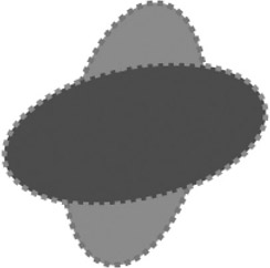
Figure 9.5: A snapshot of rotating ellipses.
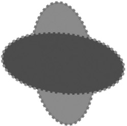
Figure 9.6: Another snap-shot of rotating ellipses.
The SVG document in Listing 9.3 demonstrates how to use the SVG animateTransform element in order to render a pair of rotating ellipses that rotate in opposite directions.
Listing 9.3 rotatingOppositeEllipses1.svg
 |
<?xml version="1.0" encoding="iso-8859-1"?> <!DOCTYPE svg PUBLIC "-//W3C//DTD SVG 20001102//EN" "http://www.w3.org/TR/2000/CR-SVG-20001102/DTD/svg-20001102.dtd"> <svg width="100%" height="100%"> <defs> <ellipse cx="0" cy="0" rx="100" ry="50" style="stroke-width:4;"/> </defs> <g transform="translate(300,200)"> <!-- clockwise rotation --> <g> <animateTransform begin="0s" dur="8s" type="rotate" from="0 0 0" to="360 0 0" attributeName="transform"/> <g transform="translate(0,0)"> <use xlink:href="#ellipseDefinition" x="0" y="0" stroke-dasharray="4 4 4 4" stroke="green" style="fill:red;" transform="rotate(0)"/> </g> <circle cx="100" cy="100" r="12" fill="green" stroke-dasharray="8 8 8 8" style="stroke:blue;stroke-width:4;"/> </g> <!-- counter clockwise rotation --> <g> <animateTransform begin="0s" dur="8s" type="rotate" from="360 0 0" to="0 0 0" attributeName="transform"/> <g transform="translate(0,0)"> <use xlink:href="#ellipseDefinition" x="0" y="0" stroke="red" stroke-dasharray="4 4 4 4" style="fill:blue;" transform="rotate(90)"/> </g> </g> </g> </svg>
|
Remarks
The SVG code in Listing 9.3 contains two SVG g elements, each of which contains a rotating ellipse. The animation of the first ellipse is defined by the following segment:
<animateTransform begin="0s" dur="8s" type="rotate" from="0 0 0" to="360 0 0" attributeName="transform"/>
Notice that both the from attribute and the to attribute for this rotation effect contain three numbers instead of just one number. Specifically, the from attribute has a value of "0 0 0", where the first number represents an angle of 0 and the second and third numbers correspond to the coordinates of the point (0,0) of rotation. The to attribute has a value of "360 0 0", which represents an angle of 360° and the point (0,0) of rotation. Thus, this transformation will result in a clockwise rotation from 0° to 360° about the center point (0,0) for a period of eight seconds.
The animation of the second ellipse is defined by the following segment:
<animateTransform begin="0s" dur="8s" type="rotate" from="360 0 0" to="0 0 0" attributeName="transform"/>
This animation specifies rotations by means of three numbers, where the first number represents an angle and the second and third numbers correspond to the coordinates of the point of rotation. In this case, the rotation is specified in terms of a from attribute with value "360 0 0" and a to attribute with value "0 0 0", which corresponds to a rotation from counterclockwise 360° to 0° about the center point (0,0) for a period of eight seconds. The overall effect is a pair of ellipses rotating in opposite directions.
|
|
|
EAN: 2147483647
Pages: 362