6.1 Form Controls
| The following sections describe every form control included in XForms. The examples show a variety of different binding techniques through the attributes ref, model, and bind, which are explained in Chapter 5. 6.1.1 inputThis form control is quite similar to its HTML forms counterpart, as it permits the entry of any character data. There are some significant improvements, however, such as the ability to use an XML Schema datatype to optimize the user experience of entering the data. Example 6-1 shows sample code for an entry control, and Figure 6-1 shows several different renderings, selected by datatype, of an input control in the open source X-Smiles browser, available at http://www.x-smiles.org. Example 6-1. Sample markup for an input control<input ref="string"> <!-- bound to node with XML Schema type xs:string --> <label>xsd:string</label> </input> <input ref="date"> <!-- bound to node with XML Schema type xs:date --> <label>Ship By:</label> </input> Figure 6-1. Input form controls rendered with X-Smiles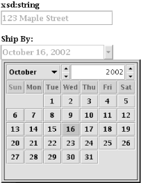
Almost any simpleType can bind to input, except the binary datatypes, like base64Binary, which don't make sense for manual entry and aren't allowed. 6.1.2 secretThis form control is nearly identical to its HTML forms counterpart. It offers only a cursory level of security, since the collected data isn't encrypted in any way, merely obscured for presentation. For end-to-end security, additional measures such as SSL are necessary. Example 6-2 shows sample markup for a secret control, and Figure 6-2 shows the result in the Orbeon OXF processor, available at http://www.orbeon.com/oxf/doc/processors-xforms. Example 6-2. Sample markup for a secret control<secret ref="/session/password"> <label>Password</label> </secret> Figure 6-2. Secret form control rendered with OXF Data binding for this control follows the same rules as input. 6.1.3 textareaThis form control is also very close to its HTML forms counterpart. The main difference between this form control and input is that textarea is optimized for larger, usually multiple line, stretches of text. Example 6-3 shows sample markup for a textarea control, and Figure 6-3 shows the rendering using the IBM XML Forms Package, available at http://www.alphaworks.ibm.com/tech/xmlforms. Example 6-3. Sample markup for a textarea control<textarea ref="/msg:Message/mime:Body"> <label>Message Body:</label> </textarea> Figure 6-3. Textarea form control rendered with the IBM XML Forms Package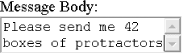 Data binding for this control follows the same rules as input. 6.1.4 outputThis is the only form control that doesn't accept user input, though once developers start using it, they can't imagine life without it. Output renders data from an XForms Model as inline text, normally indistinguishable from other text on the page. The same transformations that apply to text rendered in an input form control apply equally to output so that, for instance, numeric values will be correctly formatted to user expectations. Example 6-4 shows sample markup for an output control. Since the result of an output control is ordinary inline text, screen shots tend to be rather unimpressive. Example 6-4. Sample markup for an output control<output ref="/my:employee/my:name"> <label>Name:</label> </output> <input ref="/my:employee/my:name"> <label>Edit the name here:</label> </input> Figure 6-4 shows an output control alongside an input control, to demonstrate how it operates, running in the Mozquito DENG "Desktop Engine," available at http://mozquito.markuplanguage.net. Figure 6-4. Output form control rendered with DENG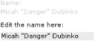 A couple of other design aspects of output stand out. For one, a label element is not required, for situations where only the dynamic content is required. The actual content taken from the instance data is rendered, usually in an inline manner that isn't stylistically distinguishable from surrounding text. In some cases, the value to be displayed doesn't relate directly to an instance data node, but rather needs to be computed. To handle this common case, the attribute value, containing any XPath expression, can be used instead of the ref attribute, which can contain only an XPath path selection expression. This control can bind to any simpleType, although it's not clear how binary items would be supported. Presumably, binary items, such as images, could be rendered as the content of this element. 6.1.5 uploadHTML forms had a limited file upload control, but the XForms version surpasses it in many ways. Example 6-5 shows sample code for an upload control, and Figure 6-5 shows the result rendered in X-Port's FormsPlayer, available at http://www.formsplayer.com. Example 6-5. Sample markup for the upload control<upload bind="attachment1"> <label>Select a file</label> <filename bind="fname1"/> <mediatype bind="mt1"/> </upload> Figure 6-5. Upload form control rendered with FormsPlayer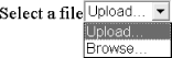 The XForms specification names a number of possible input sources:
Control over what kinds of choices are presented falls to the mediatype attribute, which is a media (or MIME)-type string such as image/png or application/zip. If the specific subtype doesn't matter, it can be specified as the * character, as in audio/*. If this leads to a situation where no input is possible (for instance a request for video/* where there simply aren't any possible ways to generate a video file) the user has to be made aware of this problem rather than silently pretending it doesn't exist. One unique aspect of this form control is that it can bind to the instance data in multiple places; for example, through the child elements mediatype and filename, each of which takes separate binding attributes. The actual media type and filename of the chosen data source, if known, are placed in the instance data. This is a one-way trip these values are placed in the instance and not looked at again, and so are only for the benefit of the server application that processes the form data. Only a binary-based type, such as base64Binary and hexBinary, or a derived datatype, can be used as the target of the uploaded data. Storing large amounts of binary data in XML poses some challenges, which are addressed in Chapter 8. 6.1.6 rangeThis form control wasn't present in HTML forms. It provides an intuitive way to enter a bounded value. The upper and lower bounds are set by the attributes start and end, respectively, and the suggested interval by the attribute step. Visually, this can be rendered as a slider, a rotary control, or a regular edit box with spin controls. Example 6-6 shows sample markup for a range control and Figure 6-6 shows the result in FormsPlayer. Example 6-6. Sample markup for a range control<range start="0" end="10" step="1" ref="quan" model="po"> <label>Quantity</label> </range> Figure 6-6. Range form control rendered with FormsPlayer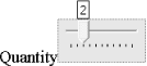 Only datatypes based on a particular list can be used with this form control: xs:duration, xs:date, xs:time, xs:dateTime, xs:gYearMonth, xs:gYear, xs:gMonthDay, xs:gDay, xs:gMonth, xs:float, xs:decimal, xs:double. 6.1.7 triggerThis form control is similar to the HTML element button and in fact was called that in earlier XForms drafts. The final name emphasizes that this form control really is a trigger for XForms Actions a push button is just one possible rendering. Other possibilities include images, hyperlinks, mouse gestures, and voice activation. The rendering of this form control is often similar to the submit element. Example 6-7 shows sample markup for this control. Example 6-7. Sample markup for a trigger control<trigger> <label>Login</label> ... </trigger> Although this form control doesn't directly read or write form data, it takes binding attributes for the purpose of applying model item properties (relevant in particular) to the form control. Thus, it is possible to disable the trigger when needed. This control has no restrictions on data binding. 6.1.8 submitThis form control is a specialization of trigger, with the effect of submitting the form. The submit parameters are taken from the element that matches the IDREF specified on the attribute submission. Example 6-8 shows sample markup for a submit control, and Figure 6-7 shows a rendering of it using Type.a Corp's Xero, available at http://typeasoft.com/product/xero/. Example 6-8. Sample markup for the submit control<submit submission="formdata"> <label>Buy</label> </submit> Figure 6-7. Submit form control rendered with Xero This form control has no restrictions on data binding. 6.1.9 select1This form control represents selection from a list with the intent of enforcing the selection of exactly one item. In XForms, the list controls have a broader interpretation than in HTML forms. Any control that expresses the goal of picking things from a list, including conventional radio buttons and checkboxes fall into this category. Example 6-9 shows sample markup for a select1 control, and Figure 6-8 shows this control rendered with Ripcord Technology's nForms, available at http://www.ripcord.co.nz/. Example 6-9. Sample markup for the select1 control<select1 ref="cpu" appearance="full" accesskey="C"> <label>CPU</label> <item> <label>Pentium 4 2.53Ghz - $220</label> <value>2.5</value> </item> <item> <label>Pentium 4 2.8Ghz - $415</label> <value>2.8</value> </item> <item> <label>Pentium 4 3.06Ghz - $620</label> <value>3.0</value> </item> </select1> Figure 6-8. Select1 form control rendered with nForms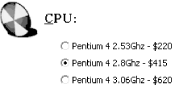 When the initial instance data contains a value (possibly even an empty value) that doesn't match any of the provided values, there will be no visible indication of what the selection is. Unlike the case with select, however, any user selection will replace the value in the instance data. One special option with this form control is when the selection attribute is specified as open. This indicates that "free entry" is allowed, so that the user can either pick from the list or use input-style data entry to enter a value not originally in the list of items. The entered value is still subject to all the validation rules in XForms, including XML Schema datatype validation. Some graphic designers are unnerved about the generality of this form control, and would prefer to explicitly indicate that they want, say, checkboxes instead of a drop-down list. The correct answer is, of course, to use CSS to style the control, as discussed in Chapter 9. In the general case, however, there's no guarantee that CSS (or any other style language) will be available at the point where the form is displayed. This is what the appearance attribute is all about. Because this request happens so often, the XForms specification gives some guidelines on how to indicate at a high level the desired rendering of the form control:
The configuration of select1, as shown previously in this section, binds to any XML Schema simpleContent; that is, to any kind of text whatsoever. Another configuration of the selection controls binds to an entire element plus content for the selection made. 6.1.10 selectThis form control represents selection from a list with the intent of allowing nothing, one thing, or multiple things to be selected. It shares many common features with select1. Example 6-10 shows sample markup for a select control, and Figure 6-9 shows this form control rendered with Novell's XForms Technology Preview, available at http://www.novell.com/xforms/. Example 6-10. Sample markup for the select control<select ref="cctype"> <label>List For Specifying All Card Types</label> <item> <label>Master Card</label> <value>MC</value> </item> <item> <label>Visa Card</label> <value>VI</value> </item> <item> <label>American Express</label> <value>AE</value> </item> <item> <label>Diners Club</label> <value>DC</value> </item> </select> Figure 6-9. Select form control rendered with Novell XForms Technology Preview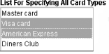 The select form control is the most general kind of list, as it holds no restrictions on how many items the user may select from the list. When used as in the previous example, the resulting selections will be placed in an XML Schema space-separated list, and if any of the values contain whitespace characters, the list won't work as expected, because in the resulting confusion each space-separated token will be treated as a separate selection. In this configuration, any initial data provided to the list needs to be a space-separated list. It is possible for the instance data to not match the values provided (through the initial value, or through direct manipulation of the instance data), in which case the form control is required to somehow notify the user that the data value is "out of range" (described more in Chapter 9). In fact, unless the form control has an "unselect all" affordance, such orphan selections will be more or less stuck in the instance data. Needless to say, this is bad practice in form design, and should be avoided. Like select1, this form control allows authors a measure of control over the rendering through the appearance attribute. The configuration of select, as shown previously in this section, binds to any XML Schema datatype that can hold a space-separated list. Ideally, this would be a list-derived datatype, but many built-in datatypes (such as string) work, too. The following section describes a configuration in which each selection binds to an individual element plus content. 6.1.11 Complex ListsLists as described in the previous two sections always bind to what XML Schema calls simpleContent, or text that (for example) could be in an attribute value. It's also possible to configure a select or select1 so that each selected item corresponds to an element in the instance data, and thus changing the selection has the effect of changing the instance data at a structural level. Before describing how this works, it's necessary to take a brief diversion to see how lists can get their set of possible selections from instance data rather than hard-coded values as shown previously. Instead of individual item elements, it is possible for list controls to obtain the list of things from which to select through an itemset element, which selects multiple instance data nodes and produces a potential selection out of each. This example uses multiple XForms Models: <xforms:model > <xforms:instance> <options> <email desc="work address">mdubinko@example.info</email> <email desc="home address">mdubinko@example.org</email> <email desc="alternate address">nospam@example.net</email> </options> </xforms:instance> <xforms:model> ... <xforms:model > <xforms:instance> <user_selection/> </xforms:instance> </xforms:model> ... <xforms:select ref="." model="form_data"> <xforms:label>Send a copy to the following email addresses</xforms: label<xforms:itemset nodeset="email" model="list_items"> <xforms:label><xforms:output value="concat('Your ', @desc)"/></xforms: label> <xforms:value ref="."/> </xforms:itemset> </xforms:select> The single itemset element is responsible for all of the list choices. In this example, that's three items since the nodeset="email" attribute selects three nodes from the XForms Model list_items. For each node, the child elements of itemset are evaluated in turn, with the node in question as the context node. Thus, the expression concat('Your ', @desc) produces three different labels, which happen to match the labels on the earlier select example. Similarly, the value elements are evaluated and converted into text strings that also match the earlier example. For this to work, the node-set returned by the expression on the nodeset attribute must be homogeneous, that is:
The copy element serves the same purpose as the value element, except that instead of producing a text value to insert into the instance data, it does a "deep copy," including attributes, text, and child elements. Thus, the arrangement of the instance data for the list depends on whether it uses value or copy elements. With the first two items selected, the respective instance data would look like: Instance data with <value>: <user_selection>mdubinko@example.info mdubinko@example.org</user_selection> Instance data with <copy>: <user_selection> <email desc="work address">mdubinko@example.info</email> <email desc="home address">mdubinko@example.org</email> </user_selection> Note that in the second case, even the desc attribute is copied. Overall, the behavior of itemset is very similar to repeat, which is discussed in Section 6.5, later in this chapter. 6.1.12 Common MarkupThere are elements and attributes that appear on many form controls. 6.1.12.1 LabelsLabels on form controls are incredibly useful. In conventional paper forms, labels are nearly always present. One problem with previous generations of web forms, however, was that authors tended to not use explicit labels, instead including text that happened to be visually nearby the form control a practice that makes life more difficult for non-visual users. XForms attacks this problem at the foundation by making the label element required. The content of the label can be text, markup (including images) from the host language, or an output form control. Further, the label can be from an external file (through the src attribute), or text taken from instance data (through the single node binding attributes). Styling a label independently from the form control poses a unique twist, since styles will normally inherit to child elements. Chapter 9 describes the advances in CSS that deal with this challenge. 6.1.12.2 help, hint, and alertAnother form design problem is ensuring that users have the correct expectations for the kind of data they are asked to enter. In XForms, every form control can have a help element, which contains a message that's provided upon an explicit request (such as pushing the Help or F1 key). The help message is delivered in a way that is equivalent to a modeless message, as discussed at Chapter 7. Likewise, form controls can have a hint element, which contains a message that's shown at the discretion of the XForms Processor, for instance, if the user hovers the mouse over a form control for more than a given amount of time. The hint message is equivalent to an ephemeral message, as discussed in Chapter 7. A third kind of element, alert, contains a message to be shown to the user when an error condition (like a form control failing validation) happens. Unlike help and hint, there's no universal way to deliver alert information to the user. This is because when the user tries to submit, there could potentially be several validation errors that come to light at the same time, and it may be advantageous to combine several messages into one. Like label, these elements can also get their contents from an external source (e.g., through the src attribute), or from the instance data (e.g., through ref and the other single-node binding attributes). 6.1.12.3 Navigation orderA critical, but too often overlooked, part of a form design is configuring the navigation order. A Tab or Next key is a standard part of nearly every device these days, and it's important that the default path through a form makes life easier for the form users. The actual mechanism for navigation depends on the host language, although XForms defines a suggested minimum level of performance, based on an attribute that would appear on every form control. The default rules for determining the navigation order are essentially unchanged from HTML forms: each control can have an attribute named navindex, which holds a number between 0 and 32767. (For programming geeks, this upper limit is the largest number that a signed 16-bit integer can hold.) The navigation order starts with 1 and proceeds to progressively higher numbers, and finishes with form controls that don't specify navindex (or equivalently, specify it as 0). In the case of a tie, the navigation follows the order that the form controls appear in the document. Groups, switches, and repeats form local navigation units, which means that all the form controls in that group will be navigated, following the same rules here, before the focus proceeds to other controls outside the group. Through relevant (see Chapter 5), it's possible to have form controls that are no longer effectively part of the navigation sequence. The XForms specification states that even when this is the case, those form controls still have a relative order assigned, even though they are skipped. This means that should the form control become relevant, it will find itself at the right place in the navigation order. XForms doesn't define what happens when either end of the navigation order is reached, though browsers typically cycle back to the other end of the form, with a few stops in between for the browser itself. The host language also might contain various object that can be part of the navigation order. By giving the host language ultimate control, the overall sequence can be one that makes sense in the full context of the document. 6.1.12.4 Keyboard shortcutsOn shorter forms, standard navigation is usually sufficient. Longer or more complex forms, however, are different story. A small thing like a quick keyboard shortcut to get to a form control can dramatically improve the usability of a form. Like navigation order, keyboard shortcuts fall into the domain of the host language. One common approach is to use an attribute named accesskey, which contains a character that is used with a platform-specific modifier key (typically the Alt key on Windows and Linux, and the Control key on Mac) to set focus quickly to a particular form control. A couple of warnings are in order: browsers usually reserve a fair number of keyboard shortcuts for themselves, so try to pick characters that aren't already in use. Some devices, phones in particular, might not have individual letter keys, so a numeric access key might be the best way to go. You should always document within the form what the access keys are this will help the form users to learn about the shortcuts. 6.1.12.5 Coarse-grained appearanceThe section on select discussed the appearance attribute and gave some specific examples from the XForms specification. Actually, the appearance attribute is present on all form controls, and can give general guidelines on the kind of appearance you are aiming for as a form designer. Of course, for detailed control, you'll need CSS (see Chapter 9) or some other style sheet language. 6.1.12.6 Input modeBefore I was exposed to the worldly ways of global computing, I had often pondered idly about how keyboards work for languages with thousands of characters. Just how many keys are on those kinds of keyboards, anyway? The problem of entering a language or script on a different keyboard than one for the native language is accomplished by a piece of software called an Input Method Editor, or IME. Through the inputmode attribute, XForms allows form controls that accept direct keyboard input to give a hint for the appropriate IME to switch to when first entering the form control. The content of this attribute is a space separated list of tokens, which fall into three categories: script tokens (see Table 6-1), modifier tokens (see Table 6-2), and URIs. As a general catch-all, any token not already in the list can be assigned a URI and used like any other token in the inputmode attribute.
Upon seeing the lists in Tables Table 6-1 and Table 6-2, most users wonder why so many choices were included. Since the values are only hints, there's no additional cost associated with a long list, and the additional values might help certain classes of users. The list of the modifiers in Table 6-2 is more generally useful, as it includes options for automatically controlling the case of input text, and other options that are especially useful for phone keypads, such as predictive text or digit-only mode. 6.1.12.7 Event handlersAdditional child elements of each form control, as well as list items, can contain event handlers, as discussed in Chapter 7. |