Chapter 2. Grouping Similar Functions
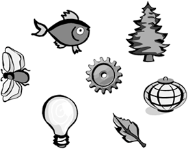
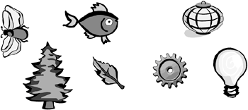
| Grouping is a design technique in which you place similar things next to each other. Take any number of objects, like the set in Figure 2.1. If you arrange them evenly throughout the design space, they look like random objectsnothing less, nothing more. However, if you cluster them, as in Figure 2.2, your eye associates each clump as a unit, and your brain tries to figure out why these particular objects belong to that particular group. Suddenly, where at first you had a bunch of random, meaningless objects, you now have two logical groups: living objects and nonliving objects. The people who come up with I.Q. tests love this sort of thing. Figure 2.1. Take any set of random, meaningless objects.
Figure 2.2. Clump the objects into groups, and your brain associates them logically.
Grouping is easy and intuitive. It works on the principle of guilt by association. It is remarkably effective. And you can use it in Web design. In fact, a Web site is one of the best places for grouping. Why? Look no further than the humble hyperlink, the basic element of the online computer/human interface. The primary way in which your visitors interact with your site is by clicking on hyperlinks. But hyperlinks themselves have at least three different functions. Clicking often causes a new page to load, but not always. Sometimes, clicking a hyperlink causes an email window to open. Other times, clicking launches a JavaScript or a server-side application. It all depends on how you code the link. Forget about email and scripts for the moment. Just consider the primary hyperlink function of loading new pages, and you still find plenty of variation. Sometimes the page loads in the current browser window. Sometimes the page loads in a new browser window. Sometimes the visitor goes to another page on the site. Sometimes the visitor winds up on another site entirely. And the trigger that causes all these diverse effects looks exactly the same, as in Figure 2.3. One of these links causes an email window to open, and the only way you can find it is to guess. Figure 2.3. Quick! Which of these hyperlinks causes an email window to open? You have no way of knowing without clicking, since hyperlinks always look the same regardless of their function.
Fortunately, you have a design technique that lets you associate objects logically, as in Figure 2.4. Notice how grouping makes picking out the email link so much easier, even though all the hyperlinks say the same thing, and they all require the same kind of interactiona single mouse clickto operate. When you have objects that look the same and work the same but perform different kinds of functions, grouping is essential for differentiating them. Figure 2.4. Apply the technique of grouping to this jumble, and you can probably guess that the link on the right opens the email window.
You can leverage the power of grouping to optimize your Web site's interface. Take a look at the nav bar in Figure 2.5. The labels on the buttons may be clear and easy to understand, but the buttons themselves aren't grouped very effectively. Clicking the first four buttons causes new pages to load, while clicking the fifth opens an email window. This interrupts the logic of your design, because your visitors expect a page to load when they click on Contact Us. Figure 2.5. Because of grouping, your visitors assume that all five buttons have the same function. However, clicking on Contact Us opens an email window, while the others load new pages.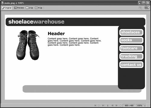
You're better off separating the Contact Us button from the others and moving it somewhere else in the interface, as in Figure 2.6. Better still, change the look of the Contact Us button entirely, as in Figure 2.7. This reinforces the idea that Contact Us has some other function than loading a page. Figure 2.6. Separate the Contact Us button, and you make it clearer to your visitors that Contact Us doesn't have the same function as the other buttons.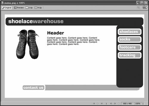 Figure 2.7. By changing the look of the Contact Us button, you reinforce the idea that it's a different kind of thing.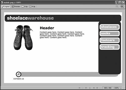 Four buttons remain in the nav bar. What happens if the first three link to pages on the current site, while the fourth opens a new browser window and goes to a different site where your visitors can track their packages? Even though all four buttons load new pages, you probably want to separate the fourth from the other three, simply because it functions slightly differently. But where to put the fourth button? You don't want to group it with the Contact Us button as in Figure 2.8, because your visitors will assume that these buttons have similar functions, which they don't. Figure 2.8. Don't add buttons to the new group if they don't have similar functions. The Tracking button links to a page on another Web site.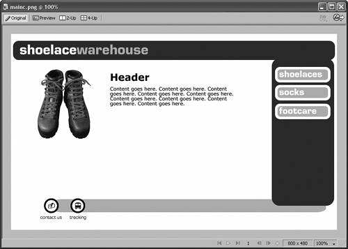
Your best bet is to make room for a new group on your interface, as Figure 2.9 shows. Moreover, by changing the button into a regular hyperlink, which usually links to a new page, you give your visitors a hint about its function. Figure 2.9. Instead, create separate groups for separate functions.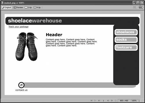 Good grouping doesn't just make life easier for your visitors. It makes life easier for you, the designer. As your site grows, you always know exactly where to add new buttons or links, as in Figure 2.10. This way, your site won't end up looking like Frankenstein's monster. The design itself eliminates the guesswork. Figure 2.10. Thanks to grouping, you always know exactly where to add new buttons or links. The technique of grouping becomes even more important in apps like shopping carts with lots of clickable controls. Remember, usability is the name of the game on the Web. Try muddling your way through the shopping-cart interface in Figure 2.11. The design makes it painful to use. Nothing in the interface is grouped according to function, so your visitors have to read each button to figure out what to do. The more you make them stop and think about what they're doing, the less likely they are to complete the sale. Figure 2.11. This shopping cart is hard for your visitors to use; therefore, they won't use it. Adios, sales.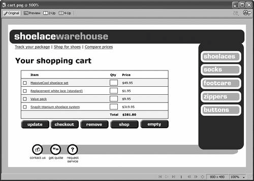 A little grouping improves this interface, as Figure 2.12 shows. Organizing the buttons according to function makes working with the shopping cart easier and more intuitive. And tweaking the designs of the buttons to reinforce the idea of different functions is even better, as in Figure 2.13. Figure 2.12. The shopping cart becomes more intelligible when you organize the buttons by function.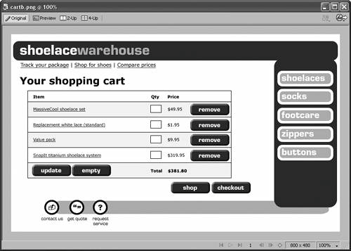 Figure 2.13. Using different designs for different types of buttons is even better.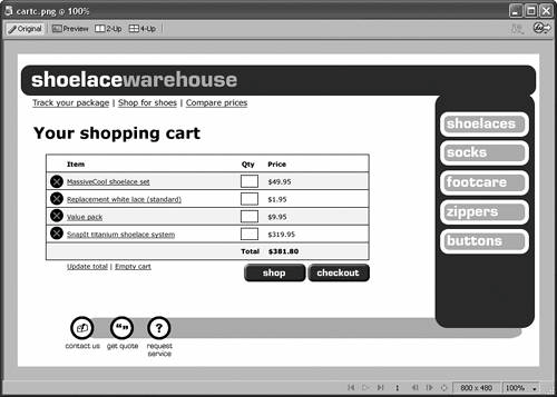 |