Chapter 3. Designing Graphics for Clicks
| Making images into hyperlinks is extremely easy in HTML. Simply nest the image tag between opening and closing anchor tags, like this: <a href="index.htm"><img src="/books/2/30/1/html/2//images/logo.gif"></a> Notice that the browser draws a rectangular border around the hyperlinked image, as in Figure 3.1. The color of the border is the same color as text hyperlinks. Your good old Web browser, always thinking ahead, rightly assumes that you want to give your visitors a visual clue that the image is clickable. The border helps to separate your clickable image from nonclickable images on the page. Figure 3.1. When you make an image into a hyperlink, the browser draws a rectangular border around the image, indicating to your visitors that the image is clickable. Notice how the border sets the hyperlinked image apart from the other, nonlinked images on the page.
But of all the sites you've visited on the Web, how many clickable images have you seen that actually use the built-in border? Not too many. The border is clunky and ugly, and tends to interfere with the visual flow of the page. That's why most Web designers choose to turn off the border, like this: <a href="index.htm"><img src="/books/2/30/1/html/2//images/logo.gif" border="0"></a> Setting the border attribute to 0 solves one problem, but creates another, as Figure 3.2 demonstrates. The hyperlinked image is still clickable, but, without the attention-grabbing border, your visitors have no way of knowing which image is clickable without moving the mouse pointer over all the images. Your visitors won't forgive you for this. Anything that requires them to stop and think is an invitation to leave your site. Figure 3.2. You can turn off the built-in hyperlink border, but then the clickable image looks like any other.
The trick here is to make your clickable images look clickable without resorting to the ugly hyperlink border. Two techniques serve you well in this regard: context and affordances. Putting clickable images in the right context on your page goes a long way toward making them stand out as clickable elements. Consider the layout in Figure 3.3. Of these five images, three are clickable, and two aren't. If you take a couple of seconds to think about which are which, you can probably guess, but your visitors won't be nearly as patient with you. To keep them happily immersed in your site, try providing a more intelligent layout, as in Figure 3.4. By separating the clickable images from the nonclickable ones, you create a mini control-panel interface on the page, which suggests the idea of clickability. Figure 3.3. This layout needs some work. The three clickable images aren't as easy to distinguish from the two nonclickable images. Figure 3.4. Ah, much better. The clickable images stand out in this context.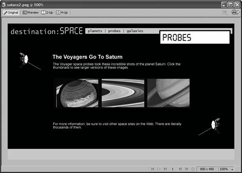
Sometimes, the right context isn't enough, especially when you load your design with images. For situations like these, affordances come in handy. Affordances are visual clues in the design element itself that suggest or hint at the element's function. The browser's built-in hyperlink border may not be very pleasing aesthetically, but it makes an excellent affordance, because it visually suggests to your visitors that the image is hyperlinked. One of the most common affordances on the Web is the button metaphor. It's so common that many designers use the terms button and clickable image interchangeably. By making clickable images look like buttonsobjects that get pressed when they exist in the real worldyou associate the act of pressing with your image. Hence, the image attracts mouse clicks. Watch what happens when you change the thumbnails from the previous example into buttons, as in Figure 3.5. Notice how you effectively remove any lingering doubt about which images are clickable on the page. The design of the buttons helps to set them apart from the nonclickable images, and the telltale button shape encourages clicks. Figure 3.5. Designing clickable images to look like buttons is a sure-fire way to attract clicks.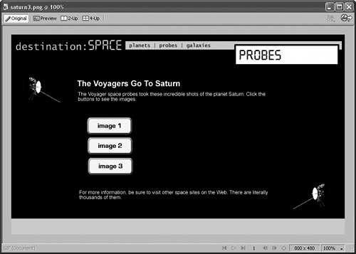
As powerful as buttons are, be careful not to take them for granted. Buttons don't help you much if your visitors can't find them, as in Figure 3.6. Always try to place your buttons conspicuously, as in Figure 3.7. You want your visitors to feel like your interface is at their disposal. Figure 3.6. The visitors are supposed to step through the news stories using arrow buttons. However, their color, design, and proximity to other design elements make the buttons hard to find.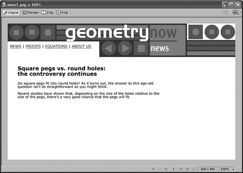 Figure 3.7. Position your buttons carefully. Context makes all the difference, even when you use a powerful affordance like the button metaphor.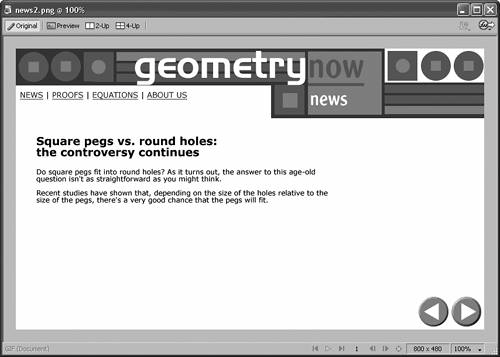 Figure 3.7 also shows that using icons or symbols as clickable images can be another effective affordance. In this design, the arrow icons are more immediate and intuitive than buttons with Previous and Next labels. You'll notice, though, that the icons have something of a buttonish quality. They're 3D-looking, which helps them to stand out on the page.
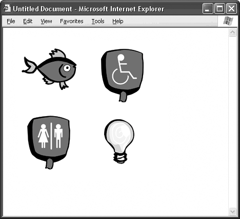
Icons and symbols work best when their meaning is obvious and universal. DVD- or CD-style symbols for functions like Play, Fast Forward, Stop, and the rest are generally pretty safe. So is using a trashcan icon for Delete or a piece of paper with a folded corner for New Document. However, the other icons in Figure 3.8 are more open to interpretation. A pencil icon might mean Create on some sites and Edit on others. A globe icon might mean Go To The Web, but, then again, it might not. Whether icons are effective on your site depends on how you use them, but a good rule of thumb is this: If there is any conceivable doubt about what the icon might mean, don't use it. Figure 3.8. Are the meanings of these icons obvious when you see them out of context? If not, then think twice about using them as clickable images on your site.
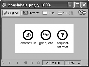
One way to get around the problem of ambiguity is to include a descriptive text label in the icon graphic, as you see in Figure 3.9. This is the Microsoft Windows approach, and it works pretty well as far as usability goes. Everything in Windows has an icon to click, but every icon comes with a nametag, just in case. Experiment with this approach on your Web site if you like, but if your icons only work when accompanied by labels, you're probably better off just using buttons. Computer users have different expectations of images in a productive environment like Windows and a publishing medium like the Web. What plays well in one doesn't always translate to the other. People expect icons to be clickable on their desktops, because that's how Windows works. They might not be expecting clickable icons on a Web site, where images are often for informational purposes only. Figure 3.9. One way to avoid ambiguity is to include a text label on your icon, but this approach plays better in an OS environment. The Web is more about buttons than icons.
|