Using Graphically Created ADO.NET Objects
Web users demand Web pages that are pleasing to the eye and feature interesting content. Because good looks are in the eye of the beholder, you need to be able to format the appearance of your Web controls programmatically based on user input. With run-time control over the formatting of a Web page, users can customize a page until it looks right to them. Allowing users to customize the appearance of controls is one way of engaging visitors so that they stay at a site longer or visit more site pages.
The sample in this section, which appears in the WebForm1.aspx page, has a couple of objectives. First, it shows how to use graphical ADO.NET tools to manage the content appearing on a Web page. By tying the content of a page to a database, you enable the content to automatically adjust whenever the underlying data changes. This approach minimizes transcription errors and reduces the labor needed to keep pages current. Second, the sample code in this section enables users to dynamically format a Web page. In addition, you will see ways of formatting a page that do not require user interaction.
Design and Operation Page Views
Figure 11-3 shows the Design view of the Web page. Notice that the page consists of three Button controls over a DataGrid control. Below the Web page is a tray that holds three ADO.NET objects. The OleDbConnection1 and OleDbDataAdapter1 icons were generated by dragging the VBDotNetShippers table from Server Explorer to the Web page in Design view. After selecting only the OleDbDataAdapter1 icon, you can generate a dataset by right- clicking the variable for the data adapter ( OleDbDataAdapter1 ) and choosing Generate Dataset. If this is your first dataset on the Web page, Visual Studio .NET automatically suggests a New name of DataSet1 . When you click OK, Visual Studio .NET inserts the dataset named DataSet1 in Solution Explorer and the DataSet11 icon appears in the tray below the Web page. The DataSet11 icon represents a variable pointing at the DataSet1 dataset. Your Visual Basic .NET code behind the Web page can refer to any of the objects in the tray below the page.
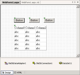
Figure 11-3: A Web page enabling programmatic control over the formatting of a DataGrid control in the Page_Load and click event procedures for three buttons
Figure 11-4 shows a pair of windows demonstrating the formatting after the page initially opens (top window) and after a click to the button on the far left (bottom window). Carefully contrasting the top window in Figure 11-4 with the form s Design view shown in Figure 11-3 reveals several formatting touches. First, the column headers appear in bold. Beyond that, the column headers are right aligned. This is particularly evident in the second column, which has a heading of Phone. The item values in the body of the DataGrid control are also right aligned. The buttons permit two ways of formatting. It is obvious that the Text property was distinctly assigned to each Button control because the controls have different captions, but the Width property of each Button control was set to 75 pixels. Without this assignment of the Width property, the width of buttons would vary depending on the Text property assignment. By assigning the same value to the Width property of each Button control, the application creates a more uniform appearance for the buttons on the Web page.
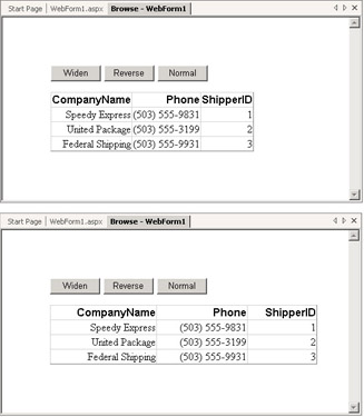
Figure 11-4: Two operational views with different settings for the DataGrid control s Width property
The bottom window in Figure 11-4 reveals one transformation of the page s appearance. This format for the window appears after a click to the Widen button. Clicking the button ( Button1 ) widens the overall DataGrid control to a width of 400 pixels, which is about one-third greater than its initial width. This transformation has the effect of more sharply visually defining the first and second columns in the DataGrid control. In addition, the bottom window makes it evident that all three columns are right aligned.
The second and third buttons on the page s form apply a format and restore a base format. By default, the DataGrid control appears with a black foreground on a white background; this is the base format. Clicking Button2 , which has a Text property of Reverse , flips these settings so that the foreground is white and the background is black. A click of Button3 , which has a Text property of Normal , restores the base format of a black foreground on a white background. The top window in Figure 11-5 shows the DataGrid control on the page after a click to Button2 , revising the foreground and background colors from their appearance in the bottom window of Figure 11-4. Because I clicked Button 2 after clicking Button1 , the DataGrid control is relatively wide. However, the reversal of background and foreground colors occurs independently of the change in the Width property setting for the DataGrid control. Therefore, you can reverse the background and foreground colors with the DataGrid control at its default width or at its expanded width. The bottom window in Figure 11-5 shows the restored black-on-white display of the DataGrid control.
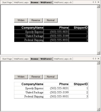
Figure 11-5: A pair of windows with contrasting background and foreground colors for a DataGrid control
The Code Behind the Web Page
The code listing for the module behind the WebForm1 Web page starts with a module-level variable declaration and includes four procedures ”a Page_Load procedure and three click event procedures for Button1 through Button3 . The module-level variable declaration is for a Style object named stl1 , which gets used for different styles in each of the click event procedures. A Style object holds a collection of property settings that can impact the appearance of a Web server control, such as a DataGrid control. As you have learned, you drag a Web server control to a Web page from the Web Forms tab on the Toolbox. To use a Style object, you first define the cluster of property settings in a style. Then, you apply the Style object to the item that you want to reflect the property settings in the Style object.
The Page_Load Procedure
The Page_Load procedure starts with three lines that specify the data for the Web page. These lines draw on the graphically generated ADO.NET objects that appear in the tray at the bottom of Figure 11-3. The first line defines and fills the VBDotNetShippers DataTable object in the Dataset11 dataset. As you can see, the line relies explicitly on the OleDbDataAdapter1 object. This object was added to the tray at the bottom of Figure 11-3 by dragging the VBDotNetShippers table icon from Server Explorer to the Web page. The OleDbDataAdapter1 object depends on the OleDbConnection1 object to collect data from the Northwind database. Filling the VBDotNetShippers DataTable object does not require any control on the Web page to show one or more values from the DataTable object. The second two lines of code enable the DataGrid1 control to display the values in the VBDotNetShippers table. The first of these lines assigns the VBDotNetShippers DataTable object to the DataSource property for the DataGrid1 control. The second line invokes the DataBind method for the control so that the DataTable object appears in the control.
The balance of the Page_Load procedure addresses formatting issues. The first code block following the code handling the data for the page demonstrates the syntax for manipulating the HeaderStyle object for a DataGrid control. The HeaderStyle object acts as a Style object for a segment of the DataGrid control ” namely, the row of column headers defining the control s first row. The code block assigns three settings to the row. First, the code block right-aligns the text within each column. Second, the code assigns an Arial font to the row. This distinguishes the row from those containing the default font, Times New Roman, for the body of the DataGrid control. The code block concludes by setting the font to bold to further distinguish the column headers from the values in the body of the DataGrid control.
The next code block contains just one line. This line applies a single style setting to the body of the DataGrid control. The setting right-aligns the text in the control s body. The line s syntax illustrates how you can use the ItemStyle object for a DataGrid control to accomplish this task. The DataGrid control s ItemStyle object applies to the body of the values in the control just as the HeaderStyle object applies to the row of column headers.
The last two code blocks in the Page_Load procedure apply to the Button controls on the Web page. The first code block simply applies the Text property values for the buttons. The second block demonstrates a new syntax for assigning a width of 75 pixels to each of the buttons. This code block creates a uniform appearance across the buttons regardless of the length of the Text property setting for a button. The Button control exposes its own Width property. Therefore, you do not need a Style object to set a button s Width property. The most important point to note is the syntax for designating a length. The syntax starts with the Unit structure followed by the Pixel method. You set the Value property for the Unit structure by specifying a number in parentheses following the method name expressing the unit of measurement. This number designates the number of units of the specified length to set a property.
˜Instantiate a style Dim stl1 As Style = New Style() Private Sub Page_Load(ByVal sender As System.Object, _ ByVal e As System.EventArgs) Handles MyBase.Load Fill DataSet11 OleDbDataAdapter1.Fill(DataSet11, "VBDotNetShippers") Set DataSource property for data grid control and bind data grid control to data for viewing DataGrid1.DataSource = DataSet11.VBDotNetShippers DataGrid1.DataBind() Format column headers DataGrid1.HeaderStyle.HorizontalAlign = _ HorizontalAlign.Right DataGrid1.HeaderStyle.Font.Name = "Arial" DataGrid1.HeaderStyle.Font.Bold = True Format grid items DataGrid1.ItemStyle.HorizontalAlign = _ HorizontalAlign.Right Assign Text property values Button1.Text = "Widen" Button2.Text = "Reverse" Button3.Text = "Normal" Assign constant Width value so buttons have same width regardless of Text property value Dim int1 As Integer = 75 Button1.Width = Unit.Pixel(int1) Button2.Width = Unit.Pixel(int1) Button3.Width = Unit.Pixel(int1) End Sub
Button Click Event Procedures
Three click event procedures enable application users to dynamically modify the appearance of the Web page with the DataGrid control. It is no secret that users find interactivity an engaging feature. The trick is to make it a no-brainer for developers so that it costs little to nothing to provide the benefit. The Style object might be part of this solution. The click event procedures for Button1 , Button2 , and Button3 illustrate how easy it is to let users change the appearance of a Web page at run time.
The Button1_Click procedure lets users widen the DataGrid control from its default width. The procedure achieves this result with just two lines of code. The first line defines a style that specifies a Width property setting for the Style object. You ll recognize the syntax for specifying the Width property because the Page_Load procedure demonstrated it to specify a width for the buttons on the page s form. Unfortunately, the DataGrid control does not have a Width property, but you can assign a Width property for a Style object and then apply that Style object to the DataGrid control with the ApplyStyle method. In addition to the Width property, you can set the BackColor , BorderColor , BorderStyle , BorderWidth , ForeColor , and Height for a Style object. You can also designate a FontInfo object through the Font property that nests within a Style object and then assign properties for the FontInfo object, such as Name , Size , Italic , Bold , and Underline .
The Button2_Click and Button3_Click procedures show you how to toggle the background and foreground colors for displaying a DataGrid control. Visual Basic .NET offers a wide selection of colors through the Color structure of the System.Drawing namespace. You can assign any of these colors to the ForeColor and BackColor properties of a Style object. After making an assignment for the Style object properties, your application can show its effect by invoking the ApplyStyle method for a control, which is DataGrid1 in this sample. The top and bottom windows in Figure 11-5 hint at the dramatic effects you can achieve by manipulating color in your applications.
Private Sub Button1_Click(ByVal sender As System.Object, _ ByVal e As System.EventArgs) Handles Button1.Click Set to fixed width of 400 pixels stl1.Width = Unit.Pixel(400) Apply a style to the control DataGrid1.ApplyStyle(stl1) End Sub Private Sub Button2_Click(ByVal sender As System.Object, _ ByVal e As System.EventArgs) Handles Button2.Click Designate reverse contrast for fonts stl1.ForeColor = System.Drawing.Color.White stl1.BackColor = System.Drawing.Color.Black Apply a style to the control DataGrid1.ApplyStyle(stl1) End Sub Private Sub Button3_Click(ByVal sender As System.Object, _ ByVal e As System.EventArgs) Handles Button3.Click Designate black-on-white appearance stl1.ForeColor = System.Drawing.Color.Black stl1.BackColor = System.Drawing.Color.White Apply a style to the control DataGrid1.ApplyStyle(stl1) End Sub
EAN: 2147483647
Pages: 111