User-Defined Controls
The .NET Framework allows you to create custom controls. These custom controls appear in the user's Toolbox and can be added to Forms, Panels or GroupBoxes in the same way that we add Buttons, Labels and other predefined controls. The simplest way to create a custom control is to derive a class from an existing control, such as a Label. This is useful if you want to add functionality to an existing control, rather than having to reimplement the existing control to include the desired functionality. For example, you can create a new type of Label that behaves like a normal Label but has a different appearance. You accomplish this by inheriting from class Label and overriding method OnPaint.
All controls contain method OnPaint, which the system calls when a component must be redrawn (such as when the component is resized). Method OnPaint is passed a PaintEventArgs object, which contains graphics informationproperty Graphics is the graphics object used to draw, and property ClipRectangle defines the rectangular boundary of the control. Whenever the system raises the Paint event, our control's base class catches the event. Through polymorphism, our control's OnPaint method is called. Our base class's OnPaint implementation is not called, so we must call it explicitly from our OnPaint implementation before we execute our custom-paint code. In most cases, you want to do this to ensure that the original painting code executes in addition to the code you define in the custom control's class. Alternately, if we do not wish to let the base class OnPaint method execute, we do not call it.
To create a new control composed of existing controls, use class UserControl. Controls added to a custom control are called constituent controls. For example, a programmer could create a UserControl composed of a Button, a Label and a TextBox, each associated with some functionality (for example, the Button setting the Label's text to that contained in the TextBox). The UserControl acts as a container for the controls added to it. The UserControl contains constituent controls, so it does not determine how these constituent controls are displayed. Method OnPaint of the UserControl cannot be overridden. To control the appearance of each constituent control, you must handle each control's Paint event. The Paint event handler is passed a PaintEventArgs object, which can be used to draw graphics (lines, rectangles, etc.) on the constituent controls.
Using another technique, a programmer can create a brand new control by inheriting from class Control. This class does not define any specific behavior; that task is left to you. Instead, class Control handles the items associated with all controls, such as events and sizing handles. Method OnPaint should contain a call to the base class's OnPaint method, which calls the Paint event handlers. You must then add code that draws custom graphics inside the overridden OnPaint method when drawing the control. This technique allows for the greatest flexibility, but also requires the most planning. All three approaches are summarized in Fig. 14.48.
|
Custom control techniques and PaintEventArgs properties |
Description |
|---|---|
|
Custom Control Techniques |
|
|
Inherit from Windows Forms control |
You can do this to add functionality to a pre-existing control. If you override method OnPaint, call the base class's OnPaint method. Note that you only can add to the original control's appearance, not redesign it. |
|
Create a UserControl |
You can create a UserControl composed of multiple pre-existing controls (e.g., to combine their functionality). Note that you cannot override the OnPaint methods of custom controls. Instead, you must place drawing code in a Paint event handler. Again, note that you only can add to the original control's appearance, not redesign it |
|
Inherit from class Control |
Define a brand new control. Override method OnPaint, then call base class method OnPaint and include methods to draw the control. With this method you can customize control appearance and functionality. |
|
PaintEventArgs Properties |
|
|
Graphics |
The graphics object of the control. It is used to draw on the control. |
|
ClipRectangle |
Specifies the rectangle indicating the boundary of the control. |
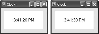
We create a "clock" control in Fig. 14.49. This is a UserControl composed of a Label and a Timerwhenever the Timer raises an event, the Label is updated to reflect the current time.
Figure 14.49. UserControl-defined clock.
(This item is displayed on page 708 in the print version)
 1 // Fig. 14.49: ClockUserControl.cs
 2 // User-defined control with a timer and a Label.
 3 using System;
 4 using System.Windows.Forms;
 5
 6 // UserControl that displays the time on a Label
 7 public partial class ClockUserControl : UserControl
 8 {
 9 // default constructor
10 public ClockUserControl()
11 {
12 InitializeComponent();
13 } // end constructor
14
15 // update Label at every tick
16 private void clockTimer_Tick(object sender, EventArgs e)
17 {
18 // get current time (Now), convert to string
19 displayLabel.Text = DateTime.Now.ToLongTimeString();
20 } // end method clockTimer_Tick
21 } // end class ClockUserControl
|
Timers (System.Windows.Forms namespace) are invisible components that reside on a Form, generating Tick events at a set interval. This interval is set by the Timer's Interval property, which defines the number of milliseconds (thousandths of a second) between events. By default, timers are disabled and do not generate events.
This application contains a user control (ClockUserControl) and a Form that displays the user control. We begin by creating a Windows application. Next, we create a UserControl class for the project by selecting Project > Add User Control.... This displays a dialog from which we can select the type of control to adduser controls are already selected. We then name the file (and the class) ClockUserControl. Our empty ClockUserControl is displayed as a grey rectangle.
You can treat this control like a Windows Form, meaning that you can add controls using the ToolBox and set properties using the Properties window. However, instead of creating an application, you are simply creating a new control composed of other controls. Add a Label (displayLabel) and a Timer (clockTimer) to the UserControl. Set the Timer interval to 1000 milliseconds and set displayLabel's text with each event (lines 1620). To generate events, clockTimer must be enabled by setting property Enabled to true in the Properties window.
Structure DateTime (namespace System) contains property Now, which is the current time. Method ToLongTimeString converts Now to a string containing the current hour, minute and second (along with AM or PM). We use this to set the time in displayLabel in line 19.
Once created, our clock control appears as an item on the ToolBox. You may need to switch to the application's Form before the item appears in the ToolBox. To use the control, simply drag it to the Form and run the Windows application. We gave the ClockUserControl object a white background to make it stand out in the Form. Figure 14.49 shows the output of ClockForm, which contains our ClockUserControl. There are no event handlers in ClockForm, so we show only the code for ClockUserControl.
Visual Studio allows you to share custom controls with other developers. To create a UserControl that can be exported to other solutions, do the following:
|
1. |
Create a new Class Library project. |
|
2. |
Delete Class1.cs, initially provided with the application. |
|
3. |
Right click the project in the Solution Explorer and select Add > User Control.... In the dialog that appears, name the user control file and click Add. |
|
4. |
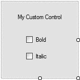
Inside the project, add controls and functionality to the UserControl (Fig. 14.50). Figure 14.50. Custom-control creation.
|
|
5. |
Build the project. Visual Studio creates a .dll file for the UserControl in the output directory (bin/Release). The file is not executable; class libraries are used to define classes that are reused in other executable applications. |
|
6. |
Create a new Windows application. |
|
7. |
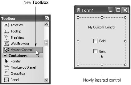
In the new Windows application, right click the ToolBox and select Choose Items.... In the Choose Toolbox Items dialog that appears, click Browse.... Browse for the .dll file from the class library created in Steps 15. The item will then appear in the Choose Toolbox Items dialog (Fig. 14.51). If it is not already checked, check this item. Click OK to add the item to the Toolbox. This control can now be added to the Form as if it were any other control (Fig. 14.52). Figure 14.51. Custom control added to the ToolBox. (This item is displayed on page 710 in the print version) 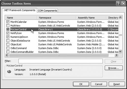
Figure 14.52. Custom control added to a Form. (This item is displayed on page 710 in the print version)
|
Preface
Index
Introduction to Computers, the Internet and Visual C#
- Introduction
- What Is a Computer?
- Computer Organization
- Early Operating Systems
- Personal Computing, Distributed Computing and Client/Server Computing
- Hardware Trends
- Microsofts Windows® Operating System
- Machine Languages, Assembly Languages and High-Level Languages
- C#
- C, C++, Java and Visual Basic
- Other High-Level Languages
- The Internet and the World Wide Web
- Extensible Markup Language (XML)
- Microsofts .NET
- The .NET Framework and the Common Language Runtime
- Test-Driving a C# Application
- Software Engineering Case Study: Introduction to Object Technology and the UML
- Wrap-Up
- Web Resources
- Summary
- Terminology
- Self-Review Exercises
- Exercises
Introduction to the Visual C# 2005 Express Edition IDE
- Introduction
- Overview of the Visual Studio 2005 IDE
- Menu Bar and Toolbar
- Navigating the Visual Studio 2005 IDE
- Using Help
- Using Visual Programming to Create a Simple Program Displaying Text and an Image
- Wrap-Up
- Web Resources
- Summary
- Terminology
- Self-Review Exercises
- Exercises
Introduction to C# Applications
- Introduction
- A Simple C# Application: Displaying a Line of Text
- Creating Your Simple Application in Visual C# Express
- Modifying Your Simple C# Application
- Formatting Text with Console.Write and Console.WriteLine
- Another C# Application: Adding Integers
- Memory Concepts
- Arithmetic
- Decision Making: Equality and Relational Operators
- (Optional) Software Engineering Case Study: Examining the ATM Requirements Document
- Wrap-Up
- Summary
- Terminology
- Self-Review Exercises
- Exercises
Introduction to Classes and Objects
- Introduction
- Classes, Objects, Methods, Properties and Instance Variables
- Declaring a Class with a Method and Instantiating an Object of a Class
- Declaring a Method with a Parameter
- Instance Variables and Properties
- UML Class Diagram with a Property
- Software Engineering with Properties and set and get Accessors
- Value Types vs. Reference Types
- Initializing Objects with Constructors
- Floating-Point Numbers and Type decimal
- (Optional) Software Engineering Case Study: Identifying the Classes in the ATM Requirements Document
- Wrap-Up
- Summary
- Terminology
- Self-Review Exercises
- Exercises
Control Statements: Part 1
- Introduction
- Algorithms
- Pseudocode
- Control Structures
- if Single-Selection Statement
- if...else Double-Selection Statement
- while Repetition Statement
- Formulating Algorithms: Counter-Controlled Repetition
- Formulating Algorithms: Sentinel-Controlled Repetition
- Formulating Algorithms: Nested Control Statements
- Compound Assignment Operators
- Increment and Decrement Operators
- Simple Types
- (Optional) Software Engineering Case Study: Identifying Class Attributes in the ATM System
- Wrap-Up
- Summary
- Terminology
- Self-Review Exercises
- Exercises
Control Statements: Part 2
- Introduction
- Essentials of Counter-Controlled Repetition
- for Repetition Statement
- Examples Using the for Statement
- do...while Repetition Statement
- switch Multiple-Selection Statement
- break and continue Statements
- Logical Operators
- Structured Programming Summary
- (Optional) Software Engineering Case Study: Identifying Objects States and Activities in the ATM System
- Wrap-Up
- Summary
- Terminology
- Self-Review Exercises
- Exercises
Methods: A Deeper Look
- Introduction
- Packaging Code in C#
- static Methods, static Variables and Class Math
- Declaring Methods with Multiple Parameters
- Notes on Declaring and Using Methods
- Method Call Stack and Activation Records
- Argument Promotion and Casting
- The Framework Class Library
- Case Study: Random-Number Generation
- Case Study: A Game of Chance (Introducing Enumerations)
- Scope of Declarations
- Method Overloading
- Recursion
- Passing Arguments: Pass-by-Value vs. Pass-by-Reference
- (Optional) Software Engineering Case Study: Identifying Class Operations in the ATM System
- Wrap-Up
- Summary
- Terminology
- Self-Review Exercises
- Exercises
Arrays
- Introduction
- Arrays
- Declaring and Creating Arrays
- Examples Using Arrays
- Case Study: Card Shuffling and Dealing Simulation
- foreach Statement
- Passing Arrays and Array Elements to Methods
- Passing Arrays by Value and by Reference
- Case Study: Class GradeBook Using an Array to Store Grades
- Multidimensional Arrays
- Case Study: Class GradeBook Using a Rectangular Array
- Variable-Length Argument Lists
- Using Command-Line Arguments
- (Optional) Software Engineering Case Study: Collaboration Among Objects in the ATM System
- Wrap-Up
- Summary
- Terminology
- Self-Review Exercises
- Exercises
- Special Section: Building Your Own Computer
Classes and Objects: A Deeper Look
- Introduction
- Time Class Case Study
- Controlling Access to Members
- Referring to the Current Objects Members with the this Reference
- Indexers
- Time Class Case Study: Overloaded Constructors
- Default and Parameterless Constructors
- Composition
- Garbage Collection and Destructors
- static Class Members
- readonly Instance Variables
- Software Reusability
- Data Abstraction and Encapsulation
- Time Class Case Study: Creating Class Libraries
- internal Access
- Class View and Object Browser
- (Optional) Software Engineering Case Study: Starting to Program the Classes of the ATM System
- Wrap-Up
- Summary
- Terminology
- Self-Review Exercises
- Exercises
Object-Oriented Programming: Inheritance
- Introduction
- Base Classes and Derived Classes
- protected Members
- Relationship between Base Classes and Derived Classes
- Constructors in Derived Classes
- Software Engineering with Inheritance
- Class object
- Wrap-Up
- Summary
- Terminology
- Self-Review Exercises
- Exercises
Polymorphism, Interfaces & Operator Overloading
- Introduction
- Polymorphism Examples
- Demonstrating Polymorphic Behavior
- Abstract Classes and Methods
- Case Study: Payroll System Using Polymorphism
- sealed Methods and Classes
- Case Study: Creating and Using Interfaces
- Operator Overloading
- (Optional) Software Engineering Case Study: Incorporating Inheritance and Polymorphism into the ATM System
- Wrap-Up
- Summary
- Terminology
- Self-Review Exercises
- Exercises
Exception Handling
- Introduction
- Exception Handling Overview
- Example: Divide by Zero Without Exception Handling
- Example: Handling DivideByZeroExceptions and FormatExceptions
- .NET Exception Hierarchy
- finally Block
- Exception Properties
- User-Defined Exception Classes
- Wrap-Up
- Summary
- Terminology
- Self-Review Exercises
- Exercises
Graphical User Interface Concepts: Part 1
- Introduction
- Windows Forms
- Event Handling
- Control Properties and Layout
- Labels, TextBoxes and Buttons
- GroupBoxes and Panels
- CheckBoxes and RadioButtons
- PictureBoxes
- ToolTips
- NumericUpDown Control
- Mouse-Event Handling
- Keyboard-Event Handling
- Wrap-Up
- Summary
- Terminology
- Self-Review Exercises
- Answers To Self-Review Exercises
- Exercises
Graphical User Interface Concepts: Part 2
- Introduction
- Menus
- MonthCalendar Control
- DateTimePicker Control
- LinkLabel Control
- ListBox Control
- CheckedListBox Control
- ComboBox Control
- TreeView Control
- ListView Control
- TabControl Control
- Multiple Document Interface (MDI) Windows
- Visual Inheritance
- User-Defined Controls
- Wrap-Up
- Summary
- Terminology
- Self-Review Exercises
- Exercises
Multithreading
- Introduction
- Thread States: Life Cycle of a Thread
- Thread Priorities and Thread Scheduling
- Creating and Executing Threads
- Thread Synchronization and Class Monitor
- Producer/Consumer Relationship without Thread Synchronization
- Producer/Consumer Relationship with Thread Synchronization
- Producer/Consumer Relationship: Circular Buffer
- Multithreading with GUIs
- Wrap-Up
- Summary
- Terminology
- Self-Review Exercises
- Exercises
Strings, Characters and Regular Expressions
- Introduction
- Fundamentals of Characters and Strings
- string Constructors
- string Indexer, Length Property and CopyTo Method
- Comparing strings
- Locating Characters and Substrings in strings
- Extracting Substrings from strings
- Concatenating strings
- Miscellaneous string Methods
- Class StringBuilder
- Length and Capacity Properties, EnsureCapacity Method and Indexer of Class StringBuilder
- Append and AppendFormat Methods of Class StringBuilder
- Insert, Remove and Replace Methods of Class StringBuilder
- Char Methods
- Card Shuffling and Dealing Simulation
- Regular Expressions and Class Regex
- Wrap-Up
- Summary
- Terminology
- Self-Review Exercises
- Exercises
Graphics and Multimedia
- Introduction
- Drawing Classes and the Coordinate System
- Graphics Contexts and Graphics Objects
- Color Control
- Font Control
- Drawing Lines, Rectangles and Ovals
- Drawing Arcs
- Drawing Polygons and Polylines
- Advanced Graphics Capabilities
- Introduction to Multimedia
- Loading, Displaying and Scaling Images
- Animating a Series of Images
- Windows Media Player
- Microsoft Agent
- Wrap-Up
- Summary
- Terminology
- Self-Review Exercises
- Exercises
Files and Streams
- Introduction
- Data Hierarchy
- Files and Streams
- Classes File and Directory
- Creating a Sequential-Access Text File
- Reading Data from a Sequential-Access Text File
- Serialization
- Creating a Sequential-Access File Using Object Serialization
- Reading and Deserializing Data from a Sequential-Access Text File
- Wrap-Up
- Summary
- Terminology
- Self-Review Exercises
- Exercises
Extensible Markup Language (XML)
- Introduction
- XML Basics
- Structuring Data
- XML Namespaces
- Document Type Definitions (DTDs)
- W3C XML Schema Documents
- (Optional) Extensible Stylesheet Language and XSL Transformations
- (Optional) Document Object Model (DOM)
- (Optional) Schema Validation with Class XmlReader
- (Optional) XSLT with Class XslCompiledTransform
- Wrap-Up
- Web Resources
- Summary
- Terminology
- Self-Review Exercises
- Exercises
Database, SQL and ADO.NET
- Introduction
- Relational Databases
- Relational Database Overview: Books Database
- SQL
- ADO.NET Object Model
- Programming with ADO.NET: Extracting Information from a Database
- Querying the Books Database
- Programming with ADO.NET: Address Book Case Study
- Using a DataSet to Read and Write XML
- Wrap-Up
- Web Resources
- Summary
- Terminology
- Self-Review Exercises
- Exercises
ASP.NET 2.0, Web Forms and Web Controls
- Introduction
- Simple HTTP Transactions
- Multitier Application Architecture
- Creating and Running a Simple Web-Form Example
- Web Controls
- Session Tracking
- Case Study: Connecting to a Database in ASP.NET
- Case Study: Secure Books Database Application
- Wrap-Up
- Web Resources
- Summary
- Terminology
- Self-Review Exercises
- Exercises
Web Services
- Introduction
- .NET Web Services Basics
- Simple Object Access Protocol (SOAP)
- Publishing and Consuming Web Services
- Session Tracking in Web Services
- Using Web Forms and Web Services
- User-Defined Types in Web Services
- Wrap-Up
- Web Resources
- Summary
- Terminology
- Self-Review Exercises
- Exercises
Networking: Streams-Based Sockets and Datagrams
- Introduction
- Connection-Oriented vs. Connectionless Communication
- Protocols for Transporting Data
- Establishing a Simple TCP Server (Using Stream Sockets)
- Establishing a Simple TCP Client (Using Stream Sockets)
- Client/Server Interaction with Stream-Socket Connections
- Connectionless Client/Server Interaction with Datagrams
- Client/Server Tic-Tac-Toe Using a Multithreaded Server
- WebBrowser Control
- .NET Remoting
- Wrap-Up
- Summary
- Terminology
- Self-Review Exercises
- Exercises
Searching and Sorting
- Introduction
- Searching Algorithms
- Sorting Algorithms
- Wrap-Up
- Summary
- Terminology
- Self-Review Exercises
- Exercises
Data Structures
- Introduction
- Simple-Type structs, Boxing and Unboxing
- Self-Referential Classes
- Linked Lists
- Stacks
- Queues
- Trees
- Wrap-Up
- Summary
- Terminology
- Self-Review Exercises
- Exercises
Generics
- Introduction
- Motivation for Generic Methods
- Generic Method Implementation
- Type Constraints
- Overloading Generic Methods
- Generic Classes
- Notes on Generics and Inheritance
- Wrap-Up
- Summary
- Terminology
- Self-Review Exercises
- Exercises
Collections
- Introduction
- Collections Overview
- Class Array and Enumerators
- Non-Generic Collections
- Generic Collections
- Synchronized Collections
- Wrap-Up
- Summary
- Terminology
- Self-Review Exercises
- Exercises
Appendix A. Operator Precedence Chart
Appendix B. Number Systems
- B.1. Introduction
- B.2. Abbreviating Binary Numbers as Octal and Hexadecimal Numbers
- B.3. Converting Octal and Hexadecimal Numbers to Binary Numbers
- B.4. Converting from Binary, Octal or Hexadecimal to Decimal
- B.5. Converting from Decimal to Binary, Octal or Hexadecimal
- B.6. Negative Binary Numbers: Twos Complement Notation
- Summary
- Terminology
- Self-Review Exercises
- Exercises
Appendix C. Using the Visual Studio 2005 Debugger
- C.1. Introduction
- C.2. Breakpoints and the Continue Command
- C.3. The Locals and Watch Windows
- C.4. Controlling Execution Using the Step Into, Step Over, Step Out and Continue Commands
- C.5. Other Features
- C.6. Wrap-Up
- Summary
- Terminology
- Self-Review Exercises
Appendix D. ASCII Character Set
Appendix E. Unicode®
- E.1. Introduction
- E.2. Unicode Transformation Formats
- E.3. Characters and Glyphs
- E.4. Advantages/Disadvantages of Unicode
- E.5. Using Unicode
- E.6. Character Ranges
- Summary
- Terminology
- Self-Review Exercises
- Answers to Self-Review exercises
- Exercises
Appendix F. Introduction to XHTML: Part 1
- F.1. Introduction
- F.2. Editing XHTML
- F.3. First XHTML Example
- F.4. W3C XHTML Validation Service
- F.5. Headers
- F.6. Linking
- F.7. Images
- F.8. Special Characters and More Line Breaks
- F.9. Unordered Lists
- F.10. Nested and Ordered Lists
- F.11. Web Resources
Appendix G. Introduction to XHTML: Part 2
- G.1. Introduction
- G.2. Basic XHTML Tables
- G.3. Intermediate XHTML Tables and Formatting
- G.4. Basic XHTML Forms
- G.5. More Complex XHTML Forms
- G.6. Internal Linking
- G.7. Creating and Using Image Maps
- G.8. meta Elements
- G.9. frameset Element
- G.10. Nested framesets
- G.11. Web Resources
Appendix H. HTML/XHTML Special Characters
Appendix I. HTML/XHTML Colors
Appendix J. ATM Case Study Code
- Appendix J. ATM Case Study Code
- J.1. ATM Case Study Implementation
- J.2. Class ATM
- J.3. Class Screen
- J.4. Class Keypad
- J.5. Class CashDispenser
- J.6. Class DepositSlot
- J.7. Class Account
- J.8. Class BankDatabase
- J.9. Class Transaction
- J.10. Class BalanceInquiry
- J.11. Class Withdrawal
- J.12. Class Deposit
- J.13. Class ATMCaseStudy
- J.14. Wrap-Up
Appendix K. UML 2: Additional Diagram Types
Appendix L. Simple Types
Index
EAN: 2147483647
Pages: 600
