Specialized Reports
As mentioned earlier, there are some specialized report tools. In the first example, we are going to look at adding a chart to the report, and in the second, we are going to look at mailing labels.
Charts
You can easily add a chart to a report. Admittedly, our little bookstore has only a few customers, and their purchases are located in the tblPurchases table. Let’s assume we want to create a report of their purchases and then append a chart at the end of the report in the report footer.
Let’s begin by using AutoReport for tblPurchases, and then open the report in Design View. Once there, select Insert | Chart. If you bring your mouse pointer down to the Report Footer area, you should see the chart icon attached to the mouse pointer. Just click in the footer area. This should open a new wizard, as shown in Figure 13-9.
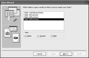
Figure 13-9: Chart Wizard
As you can see in the first screen of the wizard, tblPurchases is selected. You also could have based the chart on a query. After selecting Next, you decide what fields you want to use. In this case, we want txtNumber and curPurchasePrice, as shown in Figure 13-10. After selecting Next, you need to select the type of chart. The wizard gives you a choice of many different kinds of charts, but will automatically select one that seems appropriate. In this case, a 3-D column chart is selected, and this works well.
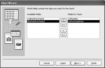
Figure 13-10: Fields selected for chart
Select Next again, and the Chart Wizard brings you to the chart layout screen. As seen in Figure 13-11, Access made some default decisions. It decided to place the txtNumber field in the category, or x, axis and a calculated field, sumOfcurPurchases, in the value, or y, axis. For purposes of this example, we’ll leave it at that.
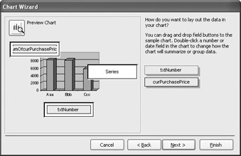
Figure 13-11: Chart layout screen
The next screen will only be applicable when the chart needs to be regenerated for each new record. As an example, you may want to have a chart showing the total for each customer. In this case, however, we are using it just to summarize the data at the end of the report. For that reason, turn off the two field selections by selecting the <no field> option. The screen should look like Figure 13-12.
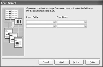
Figure 13-12: Field selection screen
Since the total is a separate object inserted into the report, you have to give it a name. After selecting Next, you are taken to a screen to name the object, as shown in Figure 13-13. Once again, the name you enter here—Total of Purchases in the example—is the name that goes on the chart. Note also that the chart’s legend is turned on. Now when you select Finish, you will see the Design View with the chart, as in Figure 13-14.
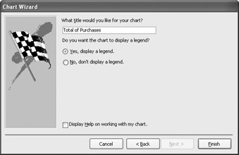
Figure 13-13: Object name screen
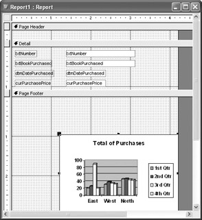
Figure 13-14: Report design with chart
As mentioned in Chapter 10 with regard to naming the controls located in a form, it is also a good idea to rename the controls in the report. This is good programming practice and prevents possible errors when VBA needs to call those controls.
Don’t worry if you see generic data in Design View. This is not the actual data yet. If you switch to Report View, it should look something like Figure 13-15. Of course, you can go back to Design View and fine-tune the position of the chart.
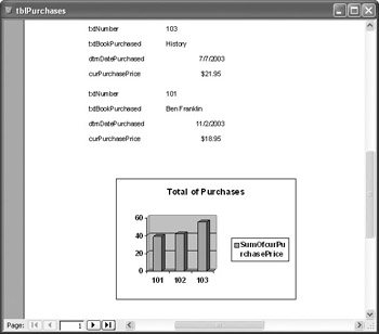
Figure 13-15: Finished report
Mailing Labels
Another specialized feature of Access is the ability to write reports formatted for the various Avery label numbers. Again, like charts, Access walks you through the process with the help of a wizard.
You can access the Label Wizard through the Reports Objects window. Once there, you begin by selecting New. You are taken to the first step, as shown in Figure 13-16. Here, the wizard is selected, with tblCustomer as the data source. After selecting OK, you are taken to a screen that allows you to pick the label type you want to use. You will be able to choose from the common Avery labels that come on sheets with three across.
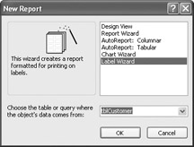
Figure 13-16: First step in Label Wizard
After selecting Next, you are taken to a screen allowing you to select the text and font properties. For purposes of this example, we will leave it at the default settings (you may find a font size of 12 a little easier to read) and select Next.
The next screen is a little tricky if you have never worked with the Label Wizard before. Let’s use Figure 13-17 as a guide. You not only transfer the columns you want to use on your labels, but you also need to position them exactly as you want them in the label. For example, you want a space between txtCustFirstname and txtCustLastName. The column txtAddress is on the next line. Finally, txtCity is followed by a comma and a space. Finish off the label with txtState, space, and txtZipCode.
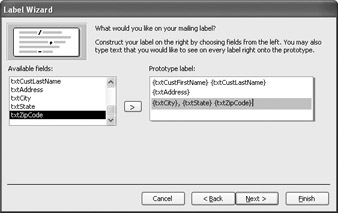
Figure 13-17: Label construction screen
The next screen asks you to decide the sort order. In this example, I am going to do the post office a favor and sort by txtZipCode. The final screen asks you to name your report. I selected rptLabelsCustomers.
Now open the report in preview mode, which, depending on how much data you have, will look something like Figure 13-18. As you can see, the entries are perfectly formatted to print on the Avery 5160 label sheet.
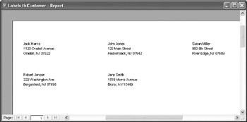
Figure 13-18: Mailing label report
EAN: 2147483647
Pages: 214