Recipe 4.3. Choosing Type Sizes for Display and Body Text
ProblemYou need to make sure that the text on your web pages displays readably, with headlines, subheads, body text, and other content appropriately sized relative to one another. SolutionUse a stylesheet rule to define a base type size: <style type="text/css"> <!-- body { font-size: 100%; } --> </style> Then add rules for headings (<h1>, <h2>, etc.), paragraphs (<p>), and other block elements that will contain text to increase or decrease their size relative to the base size: h1 { font-size: 2em; } h2 { font-size: 1.5em; } p { font-size: 1em; }
DiscussionWeb pages that display written content need a scheme for organizing and displaying different types of text so visitors can quickly determine if the page they're looking at has the information they're seeking. Generally speaking, web page content falls into two broad categories: display copysuch as headlines, subheads, captions, and other short scannable text blurbsand the body copy, which constitutes the bulk of rest of the text on the page. Web designers that make no distinction among these two categories of content on their pages are setting up their visitors for frustration (see Figures 4-1 and 4-2). Figure 4-1. A page that doesn't distinguish one type of content from another can frustrate visitors to your site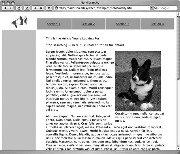 Figure 4-2. Using varying sizes and colors for display and body copy makes for a more user-friendly page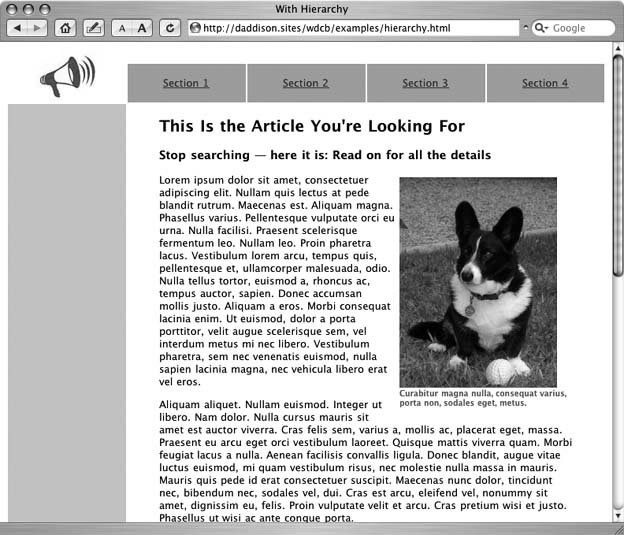 HTML offers a variety of methods for specifying type size on a web page. In the early days of the Web, heading tags (<h1> through <h6>) and <font> tags were the common approach for specifying type size. With these tags, web designers could alter the weight and size of text on the page between 50 and 200 percent (or more, depending on the browser) of a visitor's default text size. CSS are now the preferredand far more powerfulmethod for setting type sizes. Heading tags remain an integral partner in CSS-enabled web sites, but <font> tags are out, having been officially deprecatedretired from useby the W3C in its most recent HTML and XHTML specifications (see Recipe 4.1). CSS introduces a much finer level of control over type size and a smorgasbord of unit choices that promise something for everyone. With CSS you can size type in pixels, points, or picas, millimeters, centimeters, or inches, by percentage, or in ems or exs. Using points or pixels, however, leads us back into the land of browser inconsistencies. Even though <font> tags add extra weight to web page file sizes and make site-wide design changes difficult, they had one thing going for them: Web surfers could use their browser's built-in commands to enlarge or reduce on-screen type sized with a <font> tag to a size they could read. Not so with pixel-or point-based CSS rules, especially in Internet Explorer for Windows. The world's most popular web browser will not enlarge or reduce the type size of page elements given fixed point-or pixel-size rules in a style sheet. For that reason, avoid absolute type sized in pixel or point in favor of relative type sized using percentages and ems for text elements on your web page. You might be wondering why it mattersaren't all browsers set to display web pages at 72 pixels, or dots per inch (dpi)? If only it were that easy! The original Mac came closest, with its 72 dpi display neatly mimicking a WYSIWYG display for graphic designers accustomed to 72 points in a vertical inch of printed type. Internet Explorer, on the other hand, wants to display web pages at 96 dpi. But the wide variety of computer monitor sizes and screen resolutions means that neither 72 dpi nor 96 dpi resolutions are guaranteed. For example, my 19-inch CRT display set to a resolution of 1600x1200 pixels for my Mac yields almost 115 dpi. On my Windows XP box hooked up to the same monitorand set to 800x600 pixels for testingdisplays at only 58 dpi. I have to increase the resolution in Windows XP to 1280x1024 to get 96 dpi in Internet Explorer. The wide variety in actual screen resolutions is one reason why the type in some sites designed on a Mac look huge on Windows and the type in sites designed on Windows looks tiny on a Mac. Not to mention the fact that users can tweak their default font size in their browser, from say, medium to smaller in Internet Explorer, or from 12 point to 10 point or 14 point in Mozilla. In the end, determining the right size relationships among body copy, headlines, subheads, captions, and other type particular to your site requires not just a well thought-out design decision, but a process of experimenting with various permutations and testing them in the browsers commonly used by your site's visitors. Fortunately, someone has done a lot of that testing for you. A couple of years ago, a tenacious web designer named Owen Briggs set about to discover what base percentage yields the most consistent type sizes among various browsers, new and old, Mac and Windows.
Borrowing from Briggs' method, a sample stylesheet might set the base type size for a web page at, say, 76 percent, and then add a rule making headlines (<h1>) two times larger, subheads (<h2>) one and a half times larger, and body copy (<p>) equal to the default size: <style type="text/css"> <!-- body { font-size: 76%; } h1 { font-size: 2em; } h2 { font-size: 1.5em; } p { font-size: 1em; } --> </style> With this stylesheet, you can add rules for other elements and adjust the size of everything on the page by changing just the base percentage. See AlsoFor more information and screenshots about Owen Briggs' quest for consistent cross-browser type sizing, see his article, "Sane CSS Typography" athttp://www.thenoodleincident.com/tutorials/typography/. For even better choices and font control, check out the Scalable Inman Flash Replacement, which allows web designers to use any typeface with no web standards or accessibility compromises (see http://www.mikeindustries.com/blog/archive/2004/08/sifr). |

EAN: 2147483647
Pages: 144