Other Task Views
|
|
Task views all have one thing in common: You can use them to enter project tasks. Some of the task views lend themselves to a particular level of detail in task entry. For example, you could create a simple project in Calendar view by entering each task and its duration. As you learned in Chapter 7, however, more complex projects require additional detail that may be easier to enter in another view. This section focuses on uses and formatting options for task views other than Calendar.
| Tip | In all task views, you can access an entry form for editing the selected task by clicking WindowØSplit. The entry form appears at the bottom of the window. Drag the horizontal divider to make the entry form smaller or larger. |
Gantt Chart View
Gantt Chart view is the default view you see when you open Project. In this view, you can work with task information in both text and bar graphics format. The left side of the window shows the Project fields for entering and modifying task names, durations, start and finish dates, and so on. The right side of the window graphically displays each task, its duration, and sequence relative to the other tasks.
Display more of the existing fields in the task list by dragging the window divider to the right, effectively shrinking the size of the Gantt chart window. Widen the graphical portion of the window by dragging in the opposite direction.
Gantt Chart view is most typically used for entering tasks and all details associated with a task, such as duration, priority, assigned resources, predecessors, constraints, percent completed, and more. Chapter 7 has detailed information about entering and editing tasks and task properties.
| Tip | All of Project’s sheet views let you set variable row height. Use this feature to provide visual space between the rows in the task sheet (and, therefore, the bars in the Gantt chart). For example, you might want extra space between summary tasks, but no extra space between the subtasks within each summary task. Simply place your mouse pointer below the row header you want to heighten and then drag down. Adjust multiple rows by selecting them first (click and drag the row headers) and then dragging any selected row. |
Just as you did with the calendar, you can format the bars in Gantt Chart view so that certain types of information stand out. For instance, you might want to highlight bars corresponding to tasks that are behind schedule; or maybe you want to italicize all summary tasks in the task list. There are numerous options for formatting both the list and graphical portions of this view.
Formatting the Bars
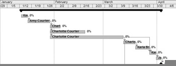
In this example, we’ve formatted the Gantt chart bars so that on normal tasks, the resource name is displayed inside the bar with the percent completed displayed to the right of the bar. We omitted progress lines and formatted the bars to gray, rather than the blue default.
To apply this formatting, make sure you’re in Gantt Chart view; then click FormatØBar Styles to open the Bar Styles dialog box, shown in Figure 16.3.
| Tip | You can also double-click any bar in the Gantt chart to open the Bar Styles dialog box. |
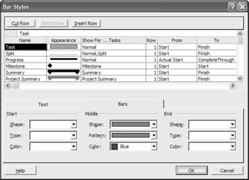
Figure 16.3: The Bar Styles dialog box for Gantt Chart view
The fields of data displayed are listed in the Name column of the dialog box. To delete information from the Gantt chart, click one of the fields listed in the Name column and then click the Cut Row button at the top of the dialog box. Add data fields in the blank rows at the bottom of the list. If you want to add the field in the middle of the list, click in the row below where you want the new field added and then click the Insert Row button. Type the name of the field in the Name column; then, choose one of the Show For options from the drop-down list that appears when you click in the third column. Choose the bar formatting you want for the field by using the drop-down lists shown on the Bars tab of the dialog box. The Start and End settings are optional; use them if you want to display a symbol at the start or end of the bar, representing the field you’re formatting.
Display any Project field as text by choosing the field on the Text tab of the Bar Styles dia-log box. Decide where you want the text positioned relative to the bar: left, right, top, bottom, or inside. Click beside that position to activate a drop-down list, and choose a field name from the list.
| Tip | If you want to make a number of formatting changes to the Gantt chart, or you want to design your own Gantt chart, the Gantt Chart Wizard walks you step-by-step through a variety of formatting options for tasks, links, and fields. To access the Gantt Chart Wizard from Gantt Chart view, click Format Ø Gantt Chart Wizard. |
Configuring the Gantt Timescale
Earlier in this chapter, you learned how to format the timescale in Calendar view. Gantt Chart view also contains features to format timescale. Once again, choose FormatØTimescale (from Gantt Chart view this time). If you prefer, you can double-click the existing timescale to open this dialog box.
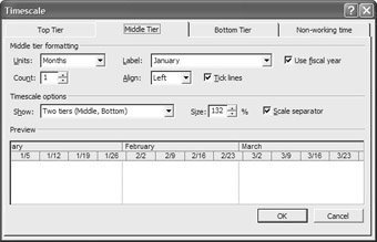
There are three tiers to consider when formatting the timescale, each with its own tab in the Timescale dialog box. (There’s a fourth tab for formatting the appearance of non-working time.) The top tier (turned off by default) is typically used for displaying years or quarters. The middle tier is typically used for displaying weeks or months. The bottom tier is typically used for displaying individual days or hours.
To format the timescale, follow these steps:
-
In any of the first three tabs, pull down the Show list in the Timescale Options section, and select how many tiers you want to display.
-
Select the tab for the first tier you want to display.
-
Choose a unit of time for the scale.
Tip Remember to check the Preview pane at the bottom of the dialog box to confirm that you’re actually making the modifications you intend to make!
-
Choose a label for each unit.
-
Select an alignment option for the label, and disable the Tick Lines feature if you don’t want divider lines between each unit on the scale.
-
Adjust the Count spin box to determine the interval between unit labels on the scale. For instance, if the unit is weeks, and the count is 2, you’ll see a label every two weeks.
-
Repeat steps 2ñ6 for the other tiers you want to display.
-
From any of the first three tabs, configure the remaining Timescale Options features. Change the Size spin box to make the scale larger or smaller, thereby showing less or more time in the same amount of space. Disable the Scale Separator if you don’t want to see the horizontal line between the major and minor scales.
-
If you want to adjust the appearance of the nonworking time on the Gantt chart, click the Non-working Time tab of the Timescale dialog box and then choose your options there. Click OK when you’re finished.
Tip To hide nonworking time on the Gantt chart, select the Non-working Time tab and then choose Do Not Draw from the Formatting Options.
Adjusting Gridline Settings
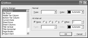
The appropriate placement of gridlines can be a big help in viewing information displayed across rows and down columns. By default, the Gantt chart does not show horizontal gridlines—unless you count the horizontal separator between the Major and Minor timescales at the top of the chart. Adjust gridlines for different Gantt chart components by selecting Format Ø Gridlines to open the Gridlines dialog box.
Follow these steps to change the gridlines:
-
Select the line you want to change from the list on the left. Gantt Rows correspond to the numbered rows in the task list. Major Columns correspond to the Major timescale, and Minor Columns correspond to the Minor timescale.
-
In the Normal section of the dialog box, select the type and pattern for the gridline.
-
If you want to get rid of an existing gridline, select it from the Line to Change list and then click the blank area in the Type drop-down list.
-
Certain gridlines appear repeatedly, so you can apply contrasting gridlines at specific intervals. Select an interval, line type, and line color. If those options are disabled, it’s because you have selected a line type that does not repeat. To skip a gridline at certain intervals, click the blank area on the Type list in the At Interval settings.
Formatting Text in the Task List
It makes sense to spend a few minutes formatting text, even for projects with relatively small task lists. At minimum, you’ll want some type of formatting on summary tasks so they stand out from others in the list. For larger projects, you may want to format milestones, critical tasks, external tasks, or even your timescale.
You access Project’s text formatting options by selecting Format Ø Text Styles to open the Text Styles dialog box.
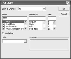
Select the part of the view you want to format by choosing an item from the Item to Change list; then choose a font, font style, font size, and color. Enable the Underline feature, if you want. Repeat the process for each additional item you want to format, and click OK when you’re finished.
Network Diagram View
Project’s Network Diagram view (View Ø Network Diagram) presents tasks in a PERT-like flowchart format with each task displayed in its own node. Tasks are arranged vertically to reflect the hierarchy of tasks in the outline, and arranged horizontally to show relationships between tasks. By default, tasks in progress are displayed with one diagonal line through them, and completed tasks are displayed with crossed diagonal lines. You can enter and edit tasks in Network Diagram view, and examine their relationships. Use this view to focus on small groups of tasks while fine-tuning their settings and relationships. Figure 16.4 shows a small portion of Network Diagram view for the Decentralization project.
| Note | For more about creating and using PERT, see Chapter 13. |
Unless you have a large-screen monitor to view the diagram, it’s quite possible to become utterly lost while scrolling through the task nodes. To keep from becoming too confused, Zoom options can help you find your way around the diagram.
You can zoom way out to see a larger portion of the project. Click the Zoom Out button on the Standard toolbar (the magnifier with the minus sign), or click View Ø Zoom and choose a setting from the list of options in the Zoom dialog box.
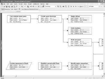
Figure 16.4: Network Diagram view
The problem is that as soon as you zoom out enough to see a meaningful piece of the project, the task nodes are too small to see the text in them. Did we mention that navigating this view can be confusing? Actually, you can point to any task node, and hover for a minute to enlarge the node and view task information. When you find the tasks on which you want to focus, click to select one of them and then zoom back in using the Zoom In button (with the plus sign), or click View Ø Zoom and then select a higher zoom setting.
Keep in mind that you’re limited to zoom settings between 25% and 400%. Even if you select the Entire Project setting in the Zoom dialog box, you can’t get smaller than 25%, so it’s unlikely that you will be able to see all nodes in a project, unless it has only a few tasks.
| Tip | Task nodes are attached horizontally to their predecessors, so if you can’t find a particular task in this view, find it in the task list ( from Gantt Chart view) and determine its predecessor. Look for the predecessor and you’ll find the successor task. |
You can edit the details of an existing task by double-clicking it to bring up the Task Information dialog box, previously discussed in Chapter 7. Delete a task by selecting its node (with a single click) and then pressing Delete on the keyboard. You can also right-click a task node, and choose Task Information or Delete Task from the shortcut menu depending, of course, on which action you want to take. Use the Outlining symbols (+ and -) adjacent to summary tasks to collapse or expand their subtasks.
As you might expect, you can format the nodes so that certain types of tasks stand out. By default, critical tasks are displayed in nodes bordered in red. Configure the node settings by clicking Format Ø Box Styles to open the Box Styles dialog box.
| Note | If you right-click a single task node and choose Format Box from the shortcut menu, you’ll have a similar set of formatting options, but they apply to the selected box only. |
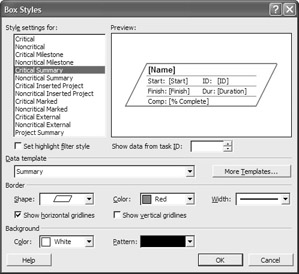
The Box Styles dialog box works the same way as the Bar Styles dialog boxes we explored in Calendar and Gantt Chart views. Select the type of task from the Style Settings For list on the left; then configure the Border and Background settings. You’ll like the unique preview feature of this dialog box. You can actually choose the task you want to use in the Preview by adjusting the Show Data From Task ID field.
Because each node’s formatting is based on a template (called a Box Template), you also have the option for accessing templates for other types of nodes. If additional templates have been imported or created on your computer, they’ll show up on the Data Templates drop-down list.
To create a new template, click the More Templates button to open the Data Templates dialog box; then choose New to open the Data Template Definition dialog box shown in Figure 16.5. After you’ve accessed the dialog box, do the following:
-
Enter a name for the template in the Template Name field.
-
Click the Cell Layout button to choose the number of rows and columns you want in the node. Change the Cell Width setting if you want the cells in the new template to be larger or smaller than the cells of the Standard template. You probably want to keep the Merge Blank Cells With Cells to the Left option; otherwise, the Task Name displayed in Figure 16.5 would be cut off. As long as the cell to the right is blank, why not let the data spill over?
-
After you configure cell layout settings, choose the data fields you want to display in each cell. Click a cell in the Choose Cells area of the dialog box to enable a drop-down list of Project fields. Select a field from the list.
Tip You don’t have to use every cell in each row. In some cases, it makes sense to leave a cell blank so that lengthy data from the cell to the left can spill over, if needed.
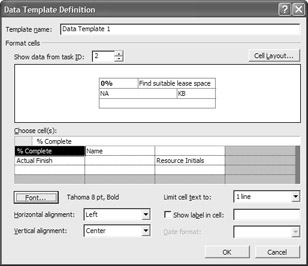
Figure 16.5: Create a new look for the nodes in Network Diagram view. -
Choose a font for each cell of the node. When you click the Font button, the settings you choose are applied to the selected cell(s). It’s easy to bold one field (Percent Complete in Figure 16.5) and leave the rest of the data in the default font (Arial 8 pt.). To make all cells the same font, select them all from the Choose Fields area of the dialog box, click Font, and choose Settings.
-
Select a Limit Cell Text To setting for each cell. In Figure 16.5, it makes sense to make the Name cell two lines (or more), but you wouldn’t need that much space for a field such as Resource Initials.
-
Choose a Horizontal and Vertical alignment setting for each cell. Enable the Show Label in Cell field if you want the field name to precede the data in each cell. (You’ll need relatively large cells to do this; otherwise, most of the data winds up out of view.)
-
If the selected cell is a date field, you can choose a date format from the drop-down list of the same name.
-
Click OK to return to the Data Templates dialog box. Click Close to return to Box Styles, click OK, and you’re done!
You can apply this new template to any type of task in Network Diagram view. Simply open the Box Styles dialog box (Format Ø Box Styles), select the type of task from the list at the left, and select the template from the Data Template drop-down list. You can then change border and background settings for the task type displayed in this template.
Task Usage View
Task Usage view focuses on how much work each resource has completed over time. Use this view to compare actual work and costs to budgeted work and costs. Select View Ø Task Usage to display the two-paned window shown in Figure 16.6.
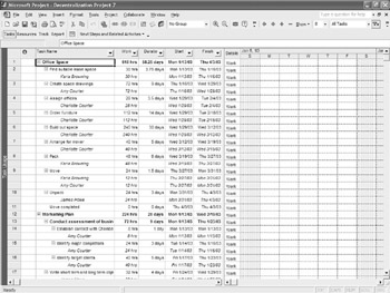
Figure 16.6: Task Usage view
The pane on the left of Figure 16.6 (the sheet portion) shows tasks with the assigned resource indented below. The fields displayed on this side of the window focus on the task by default, but you can customize it to display other data by applying a different table. (See “Examining Data with Tables” later in this chapter).
The right portion of the window (the timeline pane) displays information related to the resource.
By default, the timeline pane describes Work (total person-hours) for each task. Add another Detail field by right-clicking any cell in the Details column, or by clicking Format Ø Details on the menu and then choosing another field.
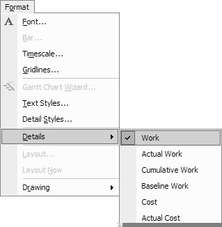
Right-click again to deselect Detail fields you don’t want to view. If the field you want to detail isn’t on the menu, you can gain access to additional fields by choosing Detail Styles from the shortcut menu to open the Detail Styles dialog box. (Alternately, you can click Format Ø Detail Styles.)
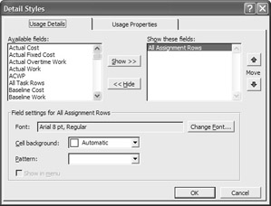
Fields currently being displayed are shown in the list on the right side of the dialog box. In this example, we’re displaying Work and Cost. Notice that All Assignment Rows appears in the Show These Fields list. This simply means that we’re looking at data on all tasks that have been assigned to resources as opposed to, say, tasks over 15 hours in duration. (We’ll show you how to create this type of constraint in “Sorting, Filtering, and Grouping “ later in this chapter.)
Add a field to the Details column by selecting it from the Available Fields list on the left and then clicking the Show button. When you add a field to the view, the Show In Menu feature is enabled by default. This allows you to right-click and deselect that field, rather than going all the way into the Detail Styles dialog box. After a non-default menu item is removed from the view, however, it no longer shows up on the menu unless you add it again using the dialog box.
Select any field in the Show These Fields list, and format it by manipulating the Font, Cell Background and Pattern choices in the Detail Styles dialog box. Remove fields from the Details column by selecting them (one at a time, or with Ctrl and Shift to select more than one) and then clicking the Hide button.
Tracking Gantt View
Tracking Gantt view is similar to the traditional Gantt Chart view, but it compares baseline start and finished dates to scheduled start and finish dates or the percentage of work that has already been completed. As you might expect, you can use this view to do any of the things you would ordinarily do in regular Gantt Chart view: enter tasks and their details, assign resources, and link tasks, to name a few.
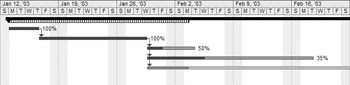
Tracking Gantt view displays a single bar for each task; the percent completed is displayed in a solid color while the percent of the task remaining is in a shaded color. Click and hold either side of the bar to get a summary of what that bar is showing. The right side (percent uncompleted) part of the bar shows the start and finish dates pulled from the project baseline. The left side (percent completed) upper bar shows different data, depending on the status of the task. You’ll see the following:
-
Scheduled start and finish dates, if the task hasn’t begun yet (that is, the Percent Complete = 0)
-
Actual start and completed through dates, if the task is in progress
-
Actual start and finish dates, if the task is complete
Change the format of Gantt Tracking view just as you would in regular Gantt Chart view: Click Format Ø Text Styles to change the way tasks are displayed in the task list at the left of the split window. Click Format Ø Bar Styles to choose a new look for the bars displayed in the graphical portion of the window. Choose Format Ø Timescale or Format Ø Gridlines to change those settings in the Gantt chart.
|
|
EAN: 2147483647
Pages: 241