Working with OLAP Data
After you’ve connected to an OLAP data source, you can use Excel data analysis features to make faster and more informed business decisions based on the OLAP data. In general, the summarizations created in the OLAP database give you varied perspectives on the data that matters the most.
For example, with a large number of individual data records that are not summarized, you can’t easily spot trends or business anomalies. Subtotals and worksheet functions help by grouping and summarizing data records in a more useful manner. But as you learned in earlier chapters, creating or revising subtotal groupings and worksheet functions can be a time-consuming process. To quickly spot trends and data anomalies, as well as quickly switch data analysis perspectives, you can instruct Excel to use PivotTable reports and PivotChart reports to summarize data records. When it comes to OLAP data, because the data is already summarized, less data needs to be retrieved by Excel when you create or change an OLAP-based PivotTable report or PivotChart report. Using Excel to analyze OLAP data lets you work with much larger amounts of data much more quickly than you could if the data was organized in a nonrelational or relational data source. Additionally, OLAP dimensions and levels such as Fiscal Year, Fiscal Quarter, West Region, Sales District, and so on, can be used to hierarchically organize and analyze summarized business data better than less intuitive field names in a flat series of data records. Hierarchical data allows you to ask more sophisticated questions of your data, enabling more complex business decisions in less time.
Earlier in this chapter you learned how to create a database query that results in a PivotTable report. You can also use the PivotTable And PivotChart wizard to do the same thing. Whether you choose the earlier approach or use the PivotTable And PivotChart wizard is up to you; it’s simply a matter of preference. The following exercise demonstrates how to use the PivotTable And PivotChart wizard to connect to an OLAP data source, build a meaningful report, and analyze the results.
Your Turn
In this exercise, you will use Excel 2002 to connect to an offline cube file (CarSales.cub) and create a PivotTable report based on the data.
-
In Excel, with a blank workbook open, click PivotTable And PivotChart Report on the Data menu.
-
Click the External Data Source option, and then click Next.
-
Click Get Data.
-
Click the OLAP Cubes tab, click New Data Source, and then click OK.
-
In the What Name Do You Want To Give Your Data Source box, type Car Sales Cube.
-
In the Select An OLAP Provider For The Database You Want To Access list, click Microsoft OLE DB Provider For OLAP Services 8.0, and then click Connect.
-
Click the Cube File option.
-
Click the browse button (the button with the three dots), and then locate and select the
 CarSales.cub file in the Chap08 folder. Click Open.
 -
Click Finish to close the Multidimensional Connection dialog box.
-
Click OK to close the Create Data Source dialog box, and then click OK to close the Choose Data Source dialog box.
-
Click Finish to close the PivotTable And PivotChart wizard and display the PivotTable report.
Now, create a PivotTable report to get an idea of what data is available for analysis.
-
From the PivotTable field list, drag the Time icon to the Drop Page Fields Here area of the PivotTable report. Drag the Sales Geography icon to the Drop Row Fields Here area, drag the Sales Staff icon to the right of the Customer Sales Region field, and drag the Sum Of Price icon to the Drop Data Items Here area.
-
Next, format the sales figures as currency: double-click the Sum Of Price field in cell A3, click Number, click Currency, type a zero (0) in the Decimal Places list, and click OK twice. Compare your results to Figure 8-3.
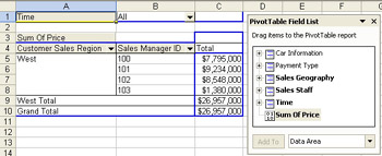
Figure 8-3: Completed PivotTable report based on the CarSales.cub file.
Now, with the PivotTable constructed, we can do some analysis. Let’s display the first quarter’s car sales in Washington State for 2001 and 2002 combined, for all sales managers, and see if we can spot any trends.
-
In the Time field, click the arrow, select the Select Multiple Items check box, and then click the plus sign (+) next to the All check box.
-
Click the plus signs next to the 2001 and 2002 check boxes, and then clear the check boxes except for those with the number 1 next to them. Compare your results to Figure 8-4, and then click OK.
These check boxes show you the power of using PivotTable reports to analyze hierarchical data: Excel can translate the dimensions and levels of an OLAP cube into a series of nested check boxes mimicking the relationship of years to quarters to months to days defined in the OLAP cube.
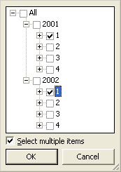
Figure 8-4: Check boxes for the Time field. -
Click the arrow in the Customer Sales Region field, click the plus sign next to the West check box, and then select the WA check box. Compare your results to Figure 8-5, click OK, and then compare your results to Figure 8-6.
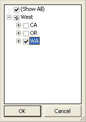
Figure 8-5: Check boxes for the Customer Sales Region field.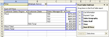
Figure 8-6: PivotTable report displaying car sales for the first quarter of both 2001 and 2002 for Washington State, for all sales managers.
The report doesn’t currently tell us much, other than sales manager 103 had the least sales, and sales managers 101 and 102 had similar sales. Let’s try to find out why sales manager 103 had the least sales by looking at the sales of each salesperson who reports to the managers.
-
Click the arrow in the Sales Manager ID field, and then click each of the four check boxes corresponding to the sales managers (100, 101, 102, and 103). The check symbol turns into a double-check symbol in each check box, signifying that one or more nested check boxes are also checked. (In this case, it means that all of the nested check boxes are checked.)
-
Click OK. You can quickly spot one possible reason why sales manager 103 had the least amount of sales—only one salesperson reports to sales manager 103, while the other sales managers each have three salespeople reporting to them. (Of course, this is not the only possible reason, but it’s a good start.)
EAN: 2147483647
Pages: 137