Postures for the Desktop
Desktop applications fit into four categories of posture: sovereign, transient, daemonic, and auxiliary. Because each describes a different set of behavioral attributes, each also describes a different type of user interaction. More importantly, these categories give the designer a point of departure for designing an interface. A sovereign posture program, for example, won't feel right unless it behaves in a "sovereign" way. Web and other non-desktop applications have their own variations of posture, which we will discuss at the end of this chapter.
Sovereign posture
Programs that are best used full-screen, monopolizing the user's attention for long periods of time, are sovereign posture application. Sovereign applications offer a large set of related functions and features, and users tend to keep them up and running continuously. Good examples of this type of application are word processors, spreadsheets, and e-mail applications. Many vertical applications are also sovereign applications because they often deploy on the screen for long periods of time, and interaction with them can be very complex and involved. Users working with sovereign programs often find themselves in a state of flow. Sovereign programs are usually used maximized (we'll talk more about window states in Chapter 25). For example, it is hard to imagine using Outlook in a 3×4 inch window—at that size it's not really appropriate for its main job: creating and viewing e-mail and appointments (see Figure 8-1).
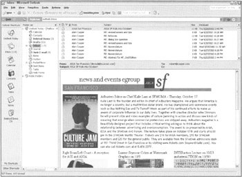
Figure 8-1: Microsoft Outlook is a classic example of a sovereign posture application. It stays on screen interacting with the user for long, uninterrupted periods, and with its multiple adjacent panes for navigation and supporting information, it begs to take up the full screen.
Sovereign programs are characteristically used for long, continuous stretches of time. A sovereign program dominates a user's workflow as his primary tool. PowerPoint, for example, is open full screen while you create a presentation from start to finish. Even if other programs are used for support tasks, PowerPoint maintains its sovereign stance.
| AXIOM | Users of sovereign applications are perpetual intermediates. |
The implications of sovereign behavior are subtle, but quite clear after you think about them. The most important implication is that users of sovereign programs are intermediate users, as discussed in Chapter 3. Each user spends time as a novice, but only a short period of time relative to the amount of time he will eventually spend using the product. Certainly a new user has to get over the painful hump of an initial learning curve, but seen from the perspective of the entire relationship of the user with the application, the time he spends getting acquainted with the program is small.
From the designer's point of view, this means that the program should be designed for optimal use by perpetual intermediates and not be aimed primarily for beginners (or experts). Sacrificing speed and power in favor of a clumsier but easier-to-learn idiom is out of place here, as is providing only nerdy power tools. Of course, if you can offer easier idioms without compromising the interaction for intermediate users; that is always best.
Between first-time users and intermediate users there are many people who use sovereign applications only on occasion. These infrequent users cannot be ignored. However, the success of a sovereign application is still dependent on its intermediate, frequent users until someone else satisfies both them and inexperienced users. WordStar, an early word processing program, is a good example. It dominated the word processing marketplace in the late 70s and early 80s because it served its intermediate users exceedingly well, even though it was extremely difficult for infrequent and first-time users. WordStar Corporation thrived until its competition offered the same power for intermediate users while simultaneously making it much less painful for infrequent users. WordStar, unable to keep up with the competition, rapidly dwindled to insignificance.
TAKE THE PIXELS
Because the user's interaction with a sovereign program dominates his session at the computer, the program shouldn't be afraid to take as much screen real estate as possible. No other program will be competing with yours, so expect to take advantage of it all. Don't waste space, but don't be shy about taking what you need to do the job. If you need four toolbars to cover the bases, use four toolbars. In a program of a different posture, four toolbars may be overly complex, but the sovereign posture has a defensible claim on the pixels.
In most instances, sovereign programs run maximized. In the absence of explicit instructions from the user, your sovereign application should default to maximized (full-screen) presentation. The program needs to be fully resizable and must work reasonably well in other screen configurations, but it must optimize its interface for full-screen instead of the less likely cases.
| DESIGN TIP | Optimize sovereign applications for full-screen use. |
Because the user will stare at a sovereign application for long periods, you should take care to mute the colors and texture of the visual presentation. Keep the color palette narrow and conservative. Big colorful controls may look really cool to newcomers, but they seem garish after a couple of weeks of daily use. Tiny dots or accents of color will have more effect in the long run than big splashes, and they enable you to pack controls together more tightly than you could otherwise.
| DESIGN TIP | Sovereign interfaces should use conservative visual style. |
Your user will stare at the same palettes, menus, and toolbars for many hours, gaining an innate sense of where things are from sheer familiarity. This gives you, the designer, freedom to do more with fewer pixels. Toolbars and their controls can be smaller than normal. Auxiliary controls like screen-splitters, rulers, and scroll bars can be smaller and more closely spaced.
RICH VISUAL FEEDBACK
Sovereign applications are great platforms for creating an environment rich in visual feedback for the user. You can productively add extra little bits of information into the interface. The status bar at the bottom of the screen, the ends of the space normally occupied by scroll bars, the title bar, and other dusty corners of the program's visible extents can be filled with visual indications of the program's status, the status of the data, the state of the system, and hints for more productive user actions. However, be careful: While enriching the visual feedback, you must be careful not to create an interface that is hopelessly cluttered.
The first-time user won't even notice such artifacts, let alone understand them, because of the subtle way they are shown on the screen. After a couple of months of steady use, however, he will begin to see them, wonder about their meaning, and experimentally explore them. At this point, the user will be willing to expend a little effort to learn more. If you provide an easy means for him to find out what the artifacts are, he will become not only a better user, but a more satisfied user, as his power over the program grows with his understanding. Adding such richness to the interface is like adding a variety of ingredients to a meat stock—it enhances the entire meal. We discuss this idea of rich modeless visual feedback in Chapter 34.
RICH INPUT
Sovereign programs similarly benefit from rich input. Every frequently used aspect of the program should be controllable in several ways. Direct manipulation, dialog boxes, keyboard mnemonics, and keyboard accelerators are all appropriate. You can make more aggressive demands on the user's fine motor skills with direct-manipulation idioms. Sensitive areas on the screen can be just a couple of pixels across because you can assume that the user is established comfortably in his chair, arm positioned in a stable way on his desk, rolling his mouse firmly across a resilient mouse pad.
| DESIGN TIP | Sovereign applications can exploit rich input. |
Go ahead and use the corners and edges of the program's window for controls. In a jet cockpit, the most frequently used controls are situated directly in front of the pilot; those needed only occasionally or in an emergency are found on the armrests, overhead, and on the side panels. In Word, Microsoft has put the most frequently used functions on the two main toolbars (see Figure 8-2). They put the frequently used but visually dislocating functions on small controls to the left of the horizontal scroll bar near the bottom of the screen. These controls change the appearance of the entire visual display—Normal view, Page Layout view and Outline view. Neophytes do not often use them and, if accidentally triggered, they can be confusing. By placing them near the bottom of the screen, they become almost invisible to the new user. Their segregated positioning subtly and silently indicates that caution should be taken in their use. More experienced users, with more confidence in their understanding and control of the program, will begin to notice these controls and wonder about their purpose. They can experimentally select them when they feel fully prepared for their consequence. This is a very accurate and useful mapping of control placement to usage.
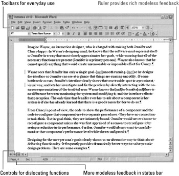
Figure 8-2: Microsoft Word has placed controls at both the top and the bottom of the application. Those at the top are more benign than those at the bottom. The latter are segregated because they can cause significant visual dislocation.
The user won't appreciate interactions that cause a delay. Like a grain of sand in your shoe, a one- or two-second delay gets painful after a few repetitions. It is perfectly acceptable for functions to take time, but they should not be frequent or repeated procedures during the normal use of the product. If, for example, it takes more than a fraction of a second to save the user's work to disk, the user quickly comes to view that delay as unreasonable. On the other hand, inverting a matrix or changing the entire formatting style of a document can take a few seconds without causing irritation because the user can plainly see what a big job it is. Besides, he won't invoke it very often.
DOCUMENT-CENTRIC APPLICATIONS
The dictum that sovereign programs should fill the screen is also true of document windows within the program itself. Child windows containing documents should always be maximized inside the program unless the user explicitly instructs otherwise.
| DESIGN TIP | Maximize document views within sovereign applications. |
Many sovereign programs are also document-centric (their primary functions involve the creation and viewing of documents containing rich data), making it easy to confuse the two, but they are not the same. Most of the documents we work with are 8½-by-11 inches and won't fit on a standard computer screen (the authors still wonder why portrait displays never caught on). We strain to show as much of them as possible, which naturally demands a full-screen stance. If the document under construction were a 32×32 pixel icon, for example, a document-centric program wouldn't need to take the full screen. The sovereignty of a program does not come from its document-centricity nor from the size of the document—it comes from the nature of the program's use.
If a program manipulates a document but only performs some very simple, single function, like scanning in a graphic, it isn't a sovereign application and shouldn't exhibit sovereign behavior. Such single-function applications have a posture of their own, the transient posture.
Transient posture
A transient posture program comes and goes, presenting a single, high-relief function with a tightly restricted set of accompanying controls. The program is called when needed, appears, performs its job, and then quickly leaves, letting the user continue his more normal activity, usually with a sovereign application.
The salient characteristic of transient programs is their temporary nature. Because they don't stay on the screen for extended periods of time, the user doesn't get the chance to become very familiar with them. Consequently, the program's user interface needs to be unsubtle, presenting its controls clearly and boldly with no possibility of mistakes. The interface must spell out what it does: This is not the place for artistic-but-ambiguous images or icons—it is the place for big buttons with precise legends spelled out in a slightly oversized, easy-to-read typeface.
| DESIGN TIP | Transient applications must be simple, clear, and to the point. |
Although a transient program can certainly operate alone on your desktop, it usually acts in a supporting role to a sovereign application. For example, calling up the Explorer to locate and open a file while editing another with Word is a typical transient scenario. So is setting your speaker volume (see Figure 8-3). Because the transient program borrows space at the expense of the sovereign, it must respect the sovereign by not taking more space on screen than is absolutely necessary. Where the sovereign can dig a hole and pour a concrete foundation for itself, the transient program is just on a weekend campout. It cannot deploy itself on screen either graphically or temporally. It is the taxicab of the software world.
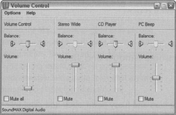
Figure 8-3: The Windows Volume Control is a typical example of a transient application, used briefly and infrequently in the service of some more sovereign activity, and then dismissed. Microsoft could have done a bit more to reinforce this panel's transient stature by conserving white space a bit more, enlarging its controls, and using a more colorful palette to differentiate it from the sovereign application that it is likely launched on top of.
BRIGHT AND CLEAR
Whereas a transient program must conserve the total amount of screen real estate it consumes, the controls on its surface can be proportionally larger than those on a sovereign application. Where such heavy-handed visual design on a sovereign program would pall within a few weeks, the transient program isn't on screen long enough for it to bother the user. On the contrary, the bolder graphics help the user to orient himself more quickly when the program pops up. The program shouldn't restrict itself to a drab palette, but should instead paint itself in brighter colors to help differentiate it from the hosting sovereign, which will be more appropriately shaded in muted hues. Transient programs should use their brighter colors and bold graphics to clearly convey their purpose—the user needs big, bright, reflective road signs to keep him from making the wrong turn at 100 kilometers per hour.
Transient programs should have instructions built into their surface. The user may only see the program once a month and will likely forget the meanings of the choices presented. Instead of a button captioned Setup, it might be better to make the button large enough to caption it Setup User Preferences. The meaning is clearer, and the button more reassuring. Likewise, nothing should be abbreviated on a transient program—everything should be spelled out to avoid confusion. The user should be able to see without difficulty that the printer is busy, for example, or that the audio is five seconds long.
KEEP IT SIMPLE
After the user summons a transient program, all the information and facilities he needs should be right there on the surface of the program's single window. Keep the user's focus of attention on that window and never force him into supporting subwindows or dialog boxes to take care of the main function of the program. If you find yourself adding a dialog box or second view to a transient application, that's a key sign that your design needs a review.
| DESIGN TIP | Keep transient applications to a single window and view. |
Transient programs are not the place for tiny scroll bars and fussy point-click-and-drag interfaces. You want to keep the demands here on the user's fine motor skills down to a minimum. Simple push-buttons for simple functions are better. Anything directly manipulable must be big enough to move to easily: at least twenty pixels square. Keep controls off the borders of the window. Don't use the window bottoms, status bars, or sides in transient programs. Instead, position the controls up close and personal in the main part of the window.
You should definitely provide a keyboard interface, but it must be a simple one (see Figure 8-4). It shouldn't be more complex than Enter, Escape, and Tab. You might add the arrow keys, too, but that's about it.
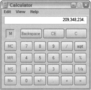
Figure 8-4: The Calculator accessory in Windows and on the Mac is another good example of a transient application, with large, obvious buttons and functions. The program can also be operated using the key-board, which is good, because the hardware-style buttons are somewhat awkward, though acceptable for infrequent use.
Of course, there are exceptions to the monothematic nature of transient programs, although they are rare. If a transient program performs more than just a single function, the interface should communicate this visually. For example, if the program imports and exports graphics, the interface should be evenly and visually split into two halves by bold coloration or other graphics. One half could contain the controls for importing and the other half the controls for exporting. The two halves must be labeled unambiguously. Whatever you do, don't add more windows or dialogs.
Keep in mind that any given transient program may be called upon to assist in the management of some aspect of a sovereign program. This means that the transient program, as it positions itself on top of the sovereign, may obscure the very information that it is chartered to work on. This implies that the transient program must be movable, which means it must have a title bar.
It is vital to keep the amount of management overhead as low as possible with transient programs. All the user wants to do is call the program up, request a function, and then end the program. It is completely unreasonable to force the user to add non-productive window-management tasks to this interaction.
REMEMBERING STATE
The most appropriate way to help the user with both transient and sovereign apps is to give the program a memory. If the transient program remembers where it was the last time it was used, the chances are excellent that the same size and placement will be appropriate next time, too. It will almost always be more apt than any default setting might chance to be. Whatever shape and position the user morphed the program into is the shape and position the program should reappear in when it is next summoned. Of course, this holds true for its logical settings, too.
On the other hand, if the use of the program is really simple and single-minded, go ahead and specify its shape—omit the frame, the directly resizable window border. Save yourself the work and remove the complexity from the program (be careful, though, as this can certainly be abused). The goal here is not to save the programmer work—that's just a collateral benefit—but to keep the user aware of as few complexities as possible. If the program's functions don't demand resizing and the overall size of the program is small, the principle that simpler is better takes on more importance than usual. The calculator accessory in Windows and on the Mac, for example, isn't resizable. It is always the correct size and shape.
No doubt you have already realized that almost all dialog boxes are really transient programs. You can see that all the preceding guidelines for transient programs apply equally well to the design of dialog boxes (for more on dialog boxes, see Chapters 30 and 31).
Daemonic posture
Programs that do not normally interact with the user are daemonic posture programs. These programs serve quietly and invisibly in the background, performing possibly vital tasks without the need for human intervention. A printer driver is an excellent example.
As you might expect, any discussion of the user interface of daemonic programs is necessarily short. Too frequently, though, programmers give daemonic programs full-screen control panels that are better suited to sovereign programs. Designing your fax manager in the image of Excel, for example, is a fatal mistake. At the other end of the spectrum, daemonic programs are, too frequently, unreachable by the user, causing no end of frustration when adjustments need to be made.
Where a transient program controls the execution of a function, daemonic programs usually manage processes. Your heartbeat isn't a function that must be consciously controlled; rather, it is a process that proceeds autonomously in the background. Like the processes that regulate your heartbeat, daemonic programs generally remain completely invisible, competently performing their process as long as your computer is turned on. Unlike your heart, however, daemonic programs must occasionally be installed and removed and, also occasionally, they must be adjusted to deal with changing circumstances. It is at these times that the daemon talks to the user. Without exception, the interaction between the user and a daemonic program is transient in nature, and all the imperatives of transient program design hold true here also.
The principles of transient design that are concerned with keeping the user informed of the purpose of the program and of the scope and meaning of the user's available choices become even more critical with daemonic programs. In many cases, the user will not even be consciously (or unconsciously) aware of the existence of the daemonic program. If you recognize that, it becomes obvious that reports about status from that program can be quite dislocating if not presented in an appropriate context. Because many of these programs perform esoteric functions—like printer drivers or communications concentrators—the messages from them must take particular care not to confuse the user or lead to misunderstandings.
A question that is often taken for granted with programs of other postures becomes very significant with daemonic programs: If the program is normally invisible, how should the user interface be summoned on those rare occasions when it is needed? One of the most frequently used methods is to represent the daemon with an on-screen program icon found either in the status area (system tray) in Windows or in the far right of the Mac OS menu bar. Putting the icon so boldly in the user's face when it is almost never needed is a real affront, like pasting an advertisement on the windshield of somebody's car. If your daemon needs configuring no more than once a day, get it off of the main screen. Windows XP now hides daemonic icons that are not actively being used. Daemonic icons should only be employed permanently if they provide continuous, useful status information.
Microsoft makes a bit of a compromise here by setting aside an area on the far-right side of the taskbar as a status area wherein icons belonging to daemonic posture programs may reside. This area, also known as the system tray, has been abused by programmers, who often use it as a quick launch area for sovereign applications. As of Windows XP, Microsoft set the standard that only status icons are to appear in the status area (a quick launch area is supported next to the Start button on the taskbar), and unless the user chooses otherwise, only icons actively reporting status changes will be displayed. Any others will be hidden. These decisions are very appropriate handling of transient programs (see Figure 8-5).
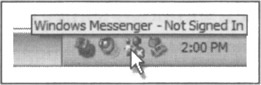
Figure 8-5: The status area of the taskbar in Windows XP. The mouse cursor is pointed at an icon representing a daemonic process that monitors the connection to Windows Messenger. The icon provides modeless visual status and also provides a launch-point for the Windows Messenger application. It is a variation on the axiom: Allow input wherever you have output (Chapter 10).
An effective approach for configuring daemonic programs is employed by both the Mac and Windows: control panels, which are transient programs that run as launchable applications to configure daemons. These give the user a consistent place to go for access to such process-centric applications.
Auxiliary posture
Programs that blend the characteristics of sovereign and transient programs exhibit auxiliary posture. The auxiliary program is continuously present like a sovereign, but it performs only a supporting role. It is small and is usually superimposed on another application the way a transient is. The Windows taskbar, clock programs, performance monitors on many Unix platforms, and Stickies on the Mac are all good examples of auxiliary programs. People who continuously use instant messaging applications are also using them in an auxiliary manner. In Windows XP's version of Internet Explorer, Microsoft has recognized the auxiliary role that streaming audio can play while the user is browsing the Web. It has integrated its audio player into a side pane in the browser (see Figure 8-6).
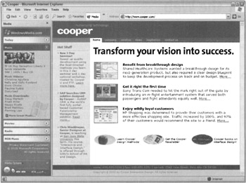
Figure 8-6: Microsoft has recognized the potential auxiliary role of streaming audio to Web browsing, and has integrated its audio player into a collapsible side panel in Internet Explorer. The audio controls themselves can also be popped out of the browser window as a standalone window.
Auxiliary programs are typically silent reporters of ongoing processes, although some, like Stickies or stock tickers, are for displaying other data the user is interested in. In some cases, this reporting may be a function that they perform in addition to actually managing processes, but this is not necessarily true. An auxiliary application may, for example, monitor the amount of system resources either in use or available. The program constantly displays a small bar chart reflecting the current resource availability.
A process-reporting auxiliary program must be simple and often bold in reporting its information. It must be very respectful of the pre-eminence of sovereign programs and should be quick to move out of the way when necessary.
Auxiliary programs are not the locus of the user's attention; that distinction belongs to the host application. For example, take an automatic call distribution (ACD) program. An ACD is used to evenly distribute incoming calls to teams of customer-service representatives trained either to take orders, provide support, or both. Each representative uses a computer running an application specific to his or her job. This application, the primary reason for the system's purchase, is a sovereign posture application; the ACD program is an auxiliary application on top of it. For example, a sales agent fields calls from prospective buyers on an incoming toll-free number. The representative's order entry program is the sovereign, whereas the ACD program is the auxiliary application, riding on top to feed incoming calls to the agent. The ACD program must be very conservative in its use of pixels because it always obscures some of the underlying sovereign application. It can afford to have small features because it is on the screen for long periods of time. In other words, the controls on the auxiliary application can be designed to a sovereign's sensibilities.
|
|
EAN: N/A
Pages: 263