Menu Item Conventions and Variants
This section describes some of the conventions used in displaying and structuring items within menus and when they are best used.
Disabling menu items
A common menu standard is to disable (make non-functional) menu items when they are not relevant to the selected data object or item. (The disabled status is indicated by graying out the item on the menu). Menus have facilities that make it easy to disable them when their corresponding function is not valid, and you should take every advantage of this. The user is well served by the knowledge that the enabling and disabling of menu items reflects their appropriate use. This function helps the menu become an even better teaching tool.
| DESIGN TIP | Disable menu items when they are inapplicable. |
It is important that each menu item clearly show when it is or isn't applicable to fulfill its role as a teacher. Don't omit this detail.
Checkmark menu items
Checkmarks next to menu items, an idiom quickly grasped by users, is probably best used in programs with fairly simple menu structures. They are usually used for indicating and toggling attributes of the program's interface (such as turning toolbars on and off) or attributes related to the display of data objects (such as wire frame versus fully rendered images). The latter attributes could very easily be summed up on a dialog box that would allow a grouping of more powerful tools, while simultaneously freeing up valuable space on the menu itself. If the program is a complex application, the menu space will be sorely needed. If the attributes are frequently toggled, they should also be accessible from a toolbar.
Flip-flop menu items
You might consider the following trick for saving menu space. You have a function with two states. One is called, for example, Display Status Bar and the other is called Hide Status Bar. You could create a single flip-flop menu item that alternates between the two states, always showing the one currently not chosen.
This technique does save space, because otherwise it might require two menu items with mutually exclusive checkmarks. But, since instructional clarity is the goal for menus, anything that obscures understanding is undesirable. Flip-flop menus are very confusing for one simple reason: You can't tell if it is offering a choice or describing a state. If it says Display Toolbar, does that mean tools are now being displayed or does it mean that by selecting the option you can begin displaying them? By making use of a single checkmark menu item instead (Status Bar is either checked or unchecked), you can make the meaning unambiguous.
Icons on menus
Visual symbols next to text items help the user to differentiate between them without having to read, so their function is understood faster. Because of this, adding small graphics to menu items can really speed users up. They also provide a helpful visual connection to other controls that do the same task. In particular, a menu item should show the same icon as the corresponding toolbar butcon.
| DESIGN TIP | Use parallel visual symbols on parallel command vectors. |
Windows provides powerful tools for putting graphics in menus. Too few programs take full advantage of this opportunity for providing an easy, visual learning trick. For example, the applications in Microsoft's Office suite all use an icon depicting a blank sheet of paper to indicate the New Document function on its toolbar. Microsoft puts that same icon in the File menu to the left of the New → Blank Document cascade menu item. The user soon makes the connection, probably without even thinking about it.
Microsoft Office applications have done an excellent job incorporating teaching graphics into their menus, as shown in Figure 28-4.
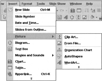
Figure 28-4: Microsoft PowerPoint offers us a regular smorgasbord of menu idioms. The Insert menu shows us separators, cascading menus, mnemonics, accelerators, and menu icons. As you can see, the icons are the same as those on butcons that perform the identical tasks. What a wonderful way to build learning into the interface without seeming pedantic or intrusive!
Accelerators
Accelerators provide an additional, optional way to invoke a function from the keyboard. Accelerators are the keystrokes, which usually are a function key (like F9) or activated with a Ctrl, Alt or Shift prefix, that are shown to the right of drop-down menu items. They are a defined standard on Windows and other platforms, but their implementation is up to the individual designer, and they are often forgotten.
There are three tips for successfully creating good accelerators:
-
Follow standards.
-
Provide for their daily use.
-
Show how to access them.
Where standard accelerators exist, use them. In particular, this refers to the standard editing set as shown on the Edit menu. Users quickly learn how much easier it is to type Ctrl+C and Ctrl+V than it is to remove their mouse hands from the home row to pull down the Edit menu, select Copy, then pull it down again and select Paste. Don't disappoint them when they use your program. Don't forget standards like Ctrl+P for print and Ctrl+S for save.
Identifying the set of commands that will comprise those needed for daily use is the tricky part. You must select the functions likely to be used frequently and assure that those menu items are given accelerators. The good news is that this set won't be large. The bad news is that it can vary significantly from user to user.
The best approach is to perform a triage operation on the available functions. Divide them into three groups: Those that are definitely part of everyone's daily use; those that are definitely not part of anyone's daily use; and everything else. The first group must have accelerators and the second group must not. The final group will be the toughest to configure, and it will inevitably be the largest. You can perform a subsequent triage on this group and assign the best accelerators, like F2, F3, F4 and so on to the winners in this group. More obscure accelerators, like Alt+7 should go to those least likely to be part of someone's everyday commands.
Don't forget to show the accelerator in the menu. An accelerator isn't going to do anyone any good if they have to go to the manual or online help to find it. Put it to the right of the corresponding menu item, where it belongs. Users won't notice it at first, but eventually they will find it, and they will be happy to make the discovery as perpetual intermediates (see Chapter 3). It will give them a sense of accomplishment and a feeling of being an insider. These are both feelings well worth encouraging in your customers.
Some programs offer user-configurable accelerators, and there are many instances where this is a good idea, and even a necessity, especially for expert users. Allowing users to customize accelerators on the sovereign applications that they use most of the time really lets them adapt the software to their own style of working. Be sure to include a Return to Defaults control along with any customization tools.
Mnemonics
Mnemonics are another Windows standard (also seen in some Unix GUIs) for adding keystroke commands in parallel to the direct manipulation of menus and dialogs.
The Microsoft style guide covers both mnemonics (which Microsoft now calls access keys) and accelerators in detail, so we will simply stress that they should not be overlooked. Mnemonics are accessed using the ALT key, arrow keys, and the underlined letter in a menu item or title. Pressing the ALT key places the application into mnemonic mode, and the arrow keys can be used to navigate to the appropriate menu. After it opens, pressing the appropriate letter key executes the function. The main purpose of mnemonics is to provide a keyboard equivalent of each menu command. For this reason, mnemonics should be complete, particularly for text-oriented programs. Don't think of them as a convenience so much as a pipeline to the keyboard. Keep in mind that your most experienced users will rely heavily on their keyboards; so to keep them loyal, assure that the mnemonics are consistent and thoroughly thought-out. Mnemonics are not optional.
For those designers among you who don't use mnemonics themselves (the authors do not), it is easy to put in bad mnemonics; to have non-unique characters within a menu, or to use inappropriate and difficult-to-remember characters (thus creating, by definition, non-mnemonic mnemonics). Make sure that someone on the development or design team tests and refines the mnemonics.
|
|
 The Essentials of Interaction Design")
EAN: N/A
Pages: 263