front door design

The central challenge of front door design is to communicate very quickly and clearly who you are. What kind of site is this? What can I do here? These are the immediate questions that users have upon arriving at your site.

But so many sites leave these questions unanswered. "As silly as it sounds, a lot of sites don't put their primary purpose on their homepage," said Mark Hurst, founder of consulting firm Creative Good. "Or it's there but it's obscured."

"On an insurance site, let's say, the great majority of customers who come there just want to get a quote," he explained. "But what does the homepage have? Oh, it's got the logo, and it's got the slogan, and it's got recent news, and it's got this new feature they just launched."

"Somewhere on a nav bar, on a secondary level, in a link that's not even underlined (because that would break the graphic design paradigm) there's something that says 'QuoteMaker™'. And that's the problem."

"The best counter example of this is Google," Hurst continued. "It puts its primary purpose first...What's Google? It's a search site. And I don't have to tell you that, because it's kind of hard to miss."

You have to quickly and clearly tell people who you are. But there are different ways to get the point across.


Indeed, there's not a lot of room for subtlety on a website's front door. You have to explain who you are quickly, and in a very small space. But there are different ways to get the point across. You can choose a straightforward name and URL, or you can add a line of text that explains what you do. You can put your functionality front and center, or you can express your identity through images, color, or sound. Often, sites will combine methods to get the idea across.

6 ways to tell users who you are:

  1. Name and URL. The name of your site or company is the first clue users have to your identity. Sites like partyplanning.com or HinckleyforHouse.com are readily understood. But if your name lacks intrinsic meaning (or if its meaning is unrelated to what you do, like "Amazon") you'll have to work harder to help people understand.

  2. Tagline. The simplest way to let people know who you are is to tell them: It's smart to include a short tagline or introductory sentence that succinctly explains who you are and what you do. Many sites err in one direction or the other: either offering no explanation when one would be helpful, or writing a long mission statement, which no one will read.

  3. Navigation. The way you divide your site and the names of the sections within it can communicate a lot about what your site offers and how it works.

  4. Functionality. Rather than just telling users who you are, you can show them by displaying the tools or features they can use on your site.

  5. Color. People respond on an emotional level to the colors in their environment, and the colors you choose go a long way toward both defining your brand and setting the mood for your site.

  6. Images. On the web, pictures aren't quite worth a thousand words because they don't communicate as clearly. But they can help users understand who you are by setting the mood, illustrating a point, or displaying a particular product.

Google has one of the simplest front doors on the web, and it works perfectly for them. It communicates who Google is by offering a search box, and not much more than a search box. The message sent? "We're a company that's focused on one thing: search." The playful logo (which occasionally changes) communicates "But we're not above having a little fun."

graphics/141fig01.gif

Animation Express relies heavily on its clear name to explain its purpose. But the site's identity is also made clear by the prominence of the animation itself and by the navigation choices, which explain to visitors how the site can be used.

graphics/141fig02.jpg

Herman Miller a design-oriented furniture company lets visitors know who they are through a simple tagline, describing what the company does. But the company also communicates through the site's design (sleek and spare), its product categories "Work Environments" and "Modern Classics" and by highlighting the Aeron chair (top), for which they're well-known.

graphics/142fig01.gif

Mountain Travel Sobek gives visitors a clear picture of who they are: The name and tagline ("The Adventure Company") are both clear. The travel photo sets the scene (although the site pays for this in speed). And the search feature pulls users into the site, while also explaining more about the company.

graphics/142fig02.gif


8 design tips for non-designers

If you find yourself in the position of designing your site even though you know perfectly well that you're not a designer, these simple suggestions will keep you from doing too much damage.

  1. create templates for pages

    Rather than design each page individually, it's best both for you and the user if you create a few templates and base each page on one of them. This saves you time, because you don't have to approach each page as a brand-new design challenge. And it makes your site easier to use: When all the pages follow the same basic structure, people can move more fluidly around your site.

  2. create a grid for each page

    Most successful designs are based on an underlying (invisible) grid that gives the page structure. So don't just put things down willy-nilly. Plan out each placement based on a logical grid. (A pad of graph paper is a fun way to get started.) But try not to get too complex. The more rigid your design, the harder it is to actually build it using HTML.

  3. pay attention to placement

    Whether or not you realize it whether or not they realize it people draw a lot of meaning out of the arrangement of elements on your site. Make sure you're mindful of where you've placed each item and why. Similar things should be grouped together. Dissimilar things should be somewhat separate. And also pay attention to alignment: Everything on your site should sit on the grid lines (Remember the grid you're creating for each page?) to make sure the layout is easily navigable with the eye.

  4. be consistent

    Consistency is one of the keys to a usable site. As visitors move from page to page, they expect things to remain in more or less the same place. So don't move your navigation or page elements around. Pick a system, and stick with it.

  5. emphasize what's most important

    Before you start designing, you should decide which elements of your site are most important. There are techniques for getting these things seen. You can make them bigger. You can make them bolder. You can make them a brighter or darker color (more saturated colors are more visible). You can make them move (with animation). You can put them in the center of the page or the top-right corner. All of these things will help them grab attention.

  6. carefully choose colors

    Unlike most print projects, where color is expensive, web sites can use unlimited colors for free. This is liberating, but dangerous. It's hard to use a lot of colors well. The best approach is to keep it simple. Choose color combinations you've seen before (and know you like). And don't choose too many: 1 3 colors can go a long way. See color on the web, p. 146.

  7. go easy on the fonts

    Type choice is limited online, and that's a blessing in disguise: It keeps people from making too many mistakes. Amateur designers inevitably go font-crazy with their first designs. The rule of thumb in any graphic design is to limit yourself to two fonts: One serif font, one sans-serif font, and maybe maybe one accent font. See typography on the web, p. 150.

  8. watch out for line length

    It's hard to control line length on the web. But keep this in mind: When lines of text are too long, they become unreadable because it's too difficult to find the next line. The rule of thumb is that a line of text shouldn't be longer than two alphabets (or 52 characters). See typography on the web, p. 150.


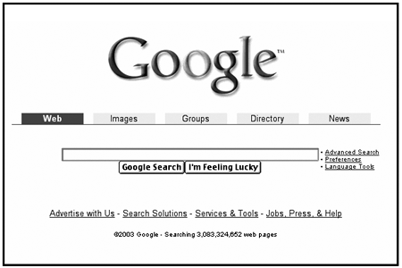
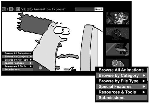
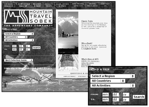
5 raging debates in web design

1. to splash or not to splash?

A splash page is the introductory page usually animated that precedes the real front door to a web site. The animation plays, and then the user is automatically "pushed" to the next page (the real front door).

The debate: Designers are divided over when and if the splash page is a good idea. Proponents view splash pages as a chance to grab users when you have their full attention and submerge them in the world of your site (without bogging them down with all the navigation and practical functions of the front door). Detractors view splash pages as a poor imitation of TV and a huge waste of bandwidth and time.

A balanced perspective: "I like the theory of having a foyer an entryway that provides a transition and establishes where you've arrived," says Nadav Savio, a principal at Giant Ant Design. "But not that many web sites can afford that transition. In the majority of cases, the purpose of a web site is to connect people to some kind of information, and a splash is often going to get in the way of that."

2. to flash or not to flash?

Macromedia Flash is a plug-in technology that brings animation and interactivity to a web page. When a large portion of the page is smoothly animated, Flash is usually involved.

The debate: It's hard for designers to reach an agreement about Flash, because it's enabled some of the most exquisite work on the web, and some of the most excruciating. At its worst, Flash promotes poor navigation, non-standard interfaces, annoying gratuitous promotions, and inaccessible content. At its best, Flash is used to create entertaining animations, wondrous art, engaging multimedia presentations, and interactive navigation systems that wouldn't be possible with regular HTML.

A balanced perspective: Like any technology, Flash should be used where it makes sense and where it best solves a problem: to animate, to show motion, to incorporate sound, and possibly to facilitate complex transactions within a single screen.

The site for Def Poetry Jam decided to splash and Flash: This animation executed in Flash introduced the site when Def Poetry Jam's Broadway show opened in 2002.

graphics/144fig01.jpg

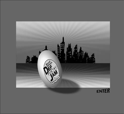
3. scrolling vs. paging

Frequently, you'll have more information to put on a single page than can possibly fit. Should you put all the information on one page and make users scroll down, or should you divide the content into multiple pages and make them click through?

The debate: There's a lot of disagreement about this question: How deep or long should a web page be? How far down should a reader be expected to scroll?

Some take the stance that pages can be endlessly long: That the goal is to minimize the number of downloads, and it's better to cram a lot of information on one page than to require users to click again (because users "hate to click"). Go ahead and pile it on: Let the users decide when they're tired of scrolling.

Another perspective favors shorter, more concise pages and multiple opportunities to click onward (because "users hate to scroll"). These page breaks are psychological as well as practical they help mark users' progress and provide a needed mental and visual break.

A balanced perspective: As is so often the case, the best approach probably lies in the middle. Users will continue to click and scroll, so long as they're finding what they're looking for. A number of studies have shown, however, that users prefer to click. When given a choice, for example, between 10 search results per page and 50 they'll choose 10.

4. to clutter or not to clutter?

Many web sites have a problem with clutter: More things need to go on the front door than can comfortably fit. Is it OK to clutter, or should you pare down?

The debate: Most graphic designers love white space. They like to leave breathing room around elements on a page. And the web-wide inclination to pile things on a site's front door runs counter to their best judgment.

"It's my opinion that most sites are just trying to cram too much on the page, too high above the fold," says Doug Bowman. "I think that's actually been to the detriment of the web."

"There's no white space on the web anymore," he continues. "Real estate is at such a premium that people don't think about using space to help set off certain elements."

But some site owners will tell you that clutter's effective even if it is ugly. "We have this constant debate about clutter," says Adam Berliant, a group manager with Microsoft who has overseen both MSN.com and the WindowsMedia sites. "Less clutter is easier to look at. It's easier on the eyes. But that forces the web producer to try to come up with clever ways to make content available through fewer links."

"Suddenly, I need something that says 'Entertainment' to represent everything from games to entertainment news to radio," he says. "But if I just link directly to games, news, and radio, guess what? More people click. So while clutter is certainly not as attractive, it often means more usage. And that's why this web site exists. It exists to be used. It doesn't exist to be pretty."

A balanced perspective: The appropriate level of clutter seems to depend a lot on the site. One way to find the right balance is to test what happens on your site when you're pared down vs. cluttered up. Does your site use go up? Then it's probably a good thing. Does it plummet? Well, then, it's probably not a great idea.


5. pop-up windows: friend or foe?

Pop-up windows are the small windows that pop up alongside the main browser window.

The debate: Pop-ups inspire strong feelings, largely due to the ads that normally appear in them. But they have other uses as well: help systems, maps, calendars, and notifications, to name a few.

A balanced perspective: "I think pop-ups can be used very effectively," says Wendy Owen. "And I get annoyed with people who say, 'No pop-ups ever.'"


The Unusually Useful Web Book
ISBN: 0735712069
EAN: 2147483647
Year: 2006
Pages: 195
Authors: June Cohen

flylib.com © 2008-2017.
If you may any questions please contact us: flylib@qtcs.net