Chapter 18. HTML Forms
 | CONTENTS |  |
|
Topics in This Chapter
-
Sending data from forms
-
The FORM element
-
Text controls
-
Push buttons
-
Check boxes and radio buttons
-
Combo boxes and list boxes
-
File upload controls
-
Server-side image maps
-
Hidden fields
-
Grouping controls
-
Tab ordering
Up to this point, our discussion has focused on desktop Java (applications) and client-side Java (applets). Another very important use of Java is for middleware on a Web server. The two main technologies for Java middleware, servlets and JavaServer Pages, are discussed in Chapters 19 and 20. However, before you can understand how to process data on the server, you need to be able to collect and transmit data to those server-side programs.
This chapter discusses the use of HTML forms as front ends to servlets or other server-side programs such as CGI scripts. These forms provide simple and reliable user interface controls to collect data from the user and to transmit it to the servlet.
18.1 How HTML Forms Transmit Data
HTML forms let you create a variety of user interface controls to collect input on a Web page. Each of the controls typically has a name and a value; the name is specified in the HTML, and the value comes either from the HTML or from user input. The entire form is associated with the URL of a program that will process the data. When the user submits the form (usually by pressing a button), the names and values of the controls are sent to the designated URL as a string of the form
Name1=Value1&Name2=Value2...NameN=ValueN
This string can be sent to the designated program in one of two ways. The first, which uses the HTTP GET method, appends the string to the end of the specified URL, after a question mark. The second way data can be sent is by the HTTP POST method. Here, the POST request line, the HTTP request headers, and a blank line are first sent to the server, then the data string is sent on the following line.
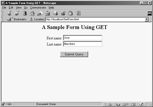
For example, Listing 18.1 (HTML code) and Figure 18-1 (typical result) show a simple form with two textfields. The HTML elements that make up this form are discussed in detail in the rest of this chapter, but for now note a couple of things. First, observe that one textfield has a name of firstName and the other has a name of lastName. Second, note that the GUI controls are considered text-level (inline) elements, so you need to use explicit HTML formatting to make sure that the controls appear next to the text describing them. Finally, notice that the FORM element designates http://localhost:8088/SomeProgram as the URL to which the data will be sent.
Figure 18-1. Initial result of GetForm.html.
Listing 18.1 GetForm.html
<!DOCTYPE HTML PUBLIC "-//W3C//DTD HTML 4.0 Transitional//EN"> <HTML> <HEAD> <TITLE>A Sample Form Using GET</TITLE> </HEAD> <BODY BGCOLOR="#FDF5E6"> <H2 ALIGN="CENTER">A Sample Form Using GET</H2> <FORM ACTION="http://localhost:8088/SomeProgram"> <CENTER> First name: <INPUT TYPE="TEXT" id="firstName" VALUE="Joe"><BR> Last name: <INPUT TYPE="TEXT" id="lastName" VALUE="Hacker"><P> <INPUT TYPE="SUBMIT"> <!-- Press this button to submit form --> </CENTER> </FORM> </BODY> </HTML>
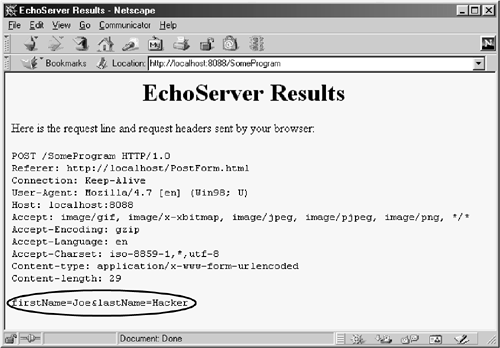
Before submitting the form, we start a server program called EchoServer on port 8088 of the local machine. EchoServer, shown in Section 17.8 (Example: A Simple HTTP Server), is a mini "Web server" used for debugging. No matter what URL is specified and what data is sent to it, EchoServer merely returns a Web page showing all the HTTP information sent by the browser. As shown in Figure 18-2, when the form is submitted with Joe in the first textfield and Hacker in the second, the browser simply requests the URL http://localhost:8088/SomeProgram?firstid=Joe&lastid=Hacker. Listing 18.2 (HTML code) and Figure 18-3 (typical result) show a variation that uses POST instead of GET. As shown in Figure 18-4, submitting the form with textfield values of Joe and Hacker results in the line firstid=Joe&lastid=Hacker being sent to the server on a separate line after the HTTP request headers and a blank line.
Figure 18-2. HTTP request sent by Netscape 4.7 when submitting GetForm.html.
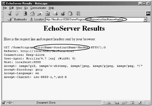
Figure 18-3. Initial result of PostForm.html.
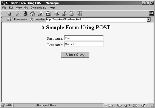
Figure 18-4. HTTP request sent by Netscape 4.7 when submitting PostForm.html.
That's the general idea behind HTML forms: GUI controls gather data from the user, each control has a name and a value, and a string containing all the name/value pairs is sent to the server when the form is submitted. Extracting the names and values on the server is covered in Section 19.6 (The Client Request: Form Data). The remainder of this chapter covers options in setting up forms and the various GUI controls you can put in them.
Listing 18.2 PostForm.html
<!DOCTYPE HTML PUBLIC "-//W3C//DTD HTML 4.0 Transitional//EN"> <HTML> <HEAD> <TITLE>A Sample Form Using POST</TITLE> </HEAD> <BODY BGCOLOR="#FDF5E6"> <H2 ALIGN="CENTER">A Sample Form Using POST</H2> <FORM ACTION="http://localhost:8088/SomeProgram" METHOD="POST"> <CENTER> First name: <INPUT TYPE="TEXT" id="firstName" VALUE="Joe"><BR> Last name: <INPUT TYPE="TEXT" id="lastName" VALUE="Hacker"><P> <INPUT TYPE="SUBMIT"> </CENTER> </FORM> </BODY> </HTML> 18.2 The FORM Element
HTML forms allow you to create a set of data input elements associated with a particular URL. Each of these elements is typically given a name and has a value based on the original HTML or user input. When the form is submitted, the names and values of all active elements are collected into a string with and equal sign (=) between each name and value and with an ampersand (&) between each name/value pair. This string is then transmitted to the URL designated by the FORM element. The string is either appended to the URL after a question mark or sent on a separate line after the HTTP request headers and a blank line, depending on whether GET or POST is used as the submission method. This section covers the FORM element itself, used primarily to designate the URL and to choose the submission method. The following sections cover the various user interface controls that can be used within forms.
| HTML Element: | <FORM ACTION="URL" ...> ... </FORM> |
| Attributes: | ACTION (required), METHOD, ENCTYPE, TARGET, ONSUBMIT, ONRESET, ACCEPT, ACCEPT-CHARSET |
The FORM element creates an area for data input elements and designates the URL to which any collected data will be transmitted. For example:
<FORM ACTION="http://some.isp.com/servlet/SomeServlet"> FORM input elements and regular HTML </FORM> The rest of this section explains the attributes that apply to the FORM element: ACTION, METHOD, ENCTYPE, TARGET, ONSUBMIT, ONRESET, ACCEPT, and ACCEPT-CHARSET. Note that we are not discussing attributes like STYLE, CLASS, and LANG that apply to general HTML elements, but only those that are specific to the FORM element.
ACTION The ACTION attribute specifies the URL of the servlet or CGI program that will process the FORM data (e.g., http://cgi.whitehouse.gov/bin/schedule-fund-raiser) or an email address which the FORM data will be sent (e.g., mailto:audit@irs.gov). Some ISPs do not allow ordinary users to create servlets or CGI programs, or they charge extra for this privilege. In such a case, sending the data by email is a convenient option when you create pages that need to collect data but not return results (e.g., accepting orders for products). You must use the POST method (see METHOD in the following subsection) when using a mailto URL.
METHOD The METHOD attribute specifies how the data will be transmitted to the HTTP server. When GET is used, the data is appended to the end of the designated URL after a question mark. For an example, see Section 18.1 (How HTML Forms Transmit Data). GET is the default and is also the method that is used when a browser requests a normal URL. When POST is used, the data is sent on a separate line.
The advantages of using the GET method are twofold: the method is simple; and with server-side programs that use GET, users can access those programs for testing and debugging without creating a form, simply by using a URL with the proper data appended. On the other hand, owing to URL size restrictions on some browsers, GET requests have limits on the amount of data that can be appended, whereas POST requests do not. Another disadvantage of GET is that most browsers show the URL, including the attached data string, in an address field at the top of the browser. This display makes GET inappropriate for sending sensitive data if your computer is in a relatively public place.
ENCTYPE This attribute specifies the way in which the data will be encoded before being transmitted. The default is application/x-www-form-urlencoded, which means that the client converts each space into a plus sign (+) and every other nonalphanumeric character into a percent sign (%) followed by the two hexadecimal digits representing that character (e.g., in ASCII or ISO Latin-1). Those transformations are in addition to placing an equal sign (=) between entry names and values and an ampersand (&) between entries.
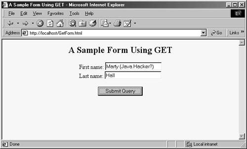
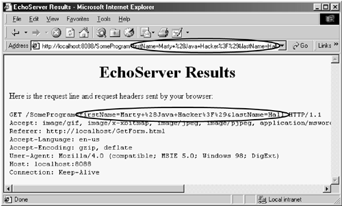
For example, Figure 18-5 shows a version of the GetForm.html page (Listing 18.1) where "Marty (Java Hacker?)" is entered for the first name. As can be seen in Figure 18-6, this entry gets sent as "Marty+%28Java+Hacker%3F%29". That's because spaces become plus signs, 28 is the ASCII value (in hex) for a left parenthesis, 3F is the ASCII value of a question mark, and 29 is a right parenthesis.
Figure 18-5. Customized result of GetForm.html.
Figure 18-6. HTTP request sent by Internet Explorer 5.0 when submitting GetForm.html with the data shown in Figure 18-5.
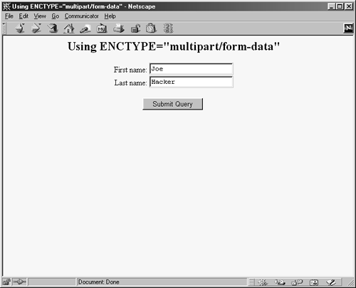
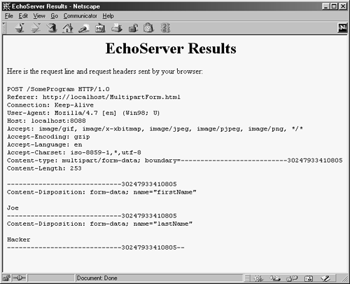
Most recent browsers support an additional ENCTYPE of multipart/ form-data. This encoding transmits each of the fields as separate parts of a MIME-compatible document and automatically uses POST to submit them. This encoding sometimes makes it easier for the server-side program to handle complex data and is required when file upload controls are used to send entire documents (see Section 18.7). For example, Listing 18.3 shows a form that differs from GetForm.html (Listing 18.1) only in that
<FORM ACTION="http://localhost:8088/SomeProgram">has been changed to
<FORM ACTION="http://localhost:8088/SomeProgram" ENCTYPE="multipart/form-data">Figures18-7 and 18-8 show the results.
Figure 18-7. Initial result of MultipartForm.html.
Figure 18-8. HTTP request sent by Netscape 4.7 when submitting MultipartForm.html.
Listing 18.3 MultipartForm.html
<!DOCTYPE HTML PUBLIC "-//W3C//DTD HTML 4.0 Transitional//EN"> <HTML> <HEAD> <TITLE>Using ENCTYPE="multipart/form-data"</TITLE> </HEAD> <BODY BGCOLOR="#FDF5E6"> <H2 ALIGN="CENTER">Using ENCTYPE="multipart/form-data"</H2> <FORM ACTION="http://localhost:8088/SomeProgram" ENCTYPE="multipart/form-data"> <CENTER> First name: <INPUT TYPE="TEXT" id="firstName" VALUE="Joe"><BR> Last name: <INPUT TYPE="TEXT" id="lastName" VALUE="Hacker"><P> <INPUT TYPE="SUBMIT"> </CENTER> </FORM> </BODY> </HTML> TARGET The TARGET attribute is used by frame-capable browsers to determine which frame cell should be used to display the results of the servlet or other program handling the form submission. The default is to display the results in whatever frame contains the form being submitted.
ONSUBMIT and ONRESET These attributes are used by JavaScript to attach code that should be evaluated when the form is submitted or reset. For ONSUBMIT, if the expression evaluates to false, the form is not submitted. This case lets you invoke JavaScript code on the client to check the format of the form field values before they are submitted, prompting the user for missing or illegal entries.
ACCEPT and ACCEPT-CHARSET These attributes are new in HTML 4.0 and specify the MIME types (ACCEPT) and character encodings (ACCEPT-CHARSET) that must be accepted by the servlet or other program processing the form data. The MIME types listed in ACCEPT could also be used by the client to limit the file types that are displayed to the user for file upload elements.
18.3 Text Controls
HTML supports three types of text-input elements: textfields, password fields, and text areas. Each is given a name, and the value is taken from the content of the control. The name and value are sent to the server when the form is submitted, which is typically done by means of a submit button (see Section 18.4).
Textfields
| HTML Element: | <INPUT TYPE="TEXT" id="..." ...> (No End Tag) |
| Attributes: | NAME (required), VALUE, SIZE, MAXLENGTH, DISABLED, READONLY, ONCHANGE, ONSELECT, ONFOCUS, ONBLUR, ONKEYDOWN, ONKEYPRESS, ONKEYUP |
This element creates a single-line input field where the user can enter text, as illustrated earlier in Listings 18.1, 18.2, and 18.3. For multiline fields, see TEXTAREA in the following subsection. TEXT is the default TYPE in INPUT forms, although it is recommended that TEXT be supplied explicitly. You should remember that the normal browser word wrapping applies inside FORM elements, so be careful to make sure the browser will not separate the descriptive text from the associated textfield.
Core Approach
 | Use explicit HTML constructs to group textfields with their descriptive text. |
Some browsers submit the form when the user presses Enter when the cursor is in a textfield, but you should not depend on this behavior since it is not standard. For instance, Netscape submits the form when the user types a carriage return only if the current form has a single textfield, regardless of the number of forms on the page. Internet Explorer submits the form on Enter only when the page holds only a single form, regardless of the number of textfields in the form. Mosaic submits the form on Enter only when the cursor is in the last textfield on the entire page.
Core Warning
| | Don't rely on the browser submitting the form when the user presses Enter when in a textfield. Always include a button or image map that submits the form explicitly. |
The following subsections describe the attributes that apply specifically to textfields. Attributes that apply to general HTML elements (e.g., STYLE, CLASS, ID) are not discussed. The TABINDEX attribute, which applies to all form elements, is discussed in Section 18.11 (Tab Order Control).
NAME The NAME attribute identifies the textfield when the form is submitted. In standard HTML the attribute is required. Because data is always sent to the server in the form of name/value pairs, no data is sent from form controls that have no NAME.
VALUE A VALUE attribute, if supplied, specifies the initial contents of the textfield. When the form is submitted, the current contents are sent; these can reflect user input. If the textfield is empty when the form is submitted, the form data simply consists of the name and an equal sign (e.g., other-data&textfieldname=&other-data).
SIZE This attribute specifies the width of the textfield, based on the average character width of the font being used. If text beyond this size is entered, the textfield scrolls to accommodate it. This overflow could occur if the user enters more characters than the SIZE or enters SIZE number of wide characters (e.g., capital W) when a proportional-width font is being used. Netscape automatically uses a proportional font in textfields. Internet Explorer, unfortunately, does not, and you cannot change the font by embedding the INPUT element in a FONT or CODE element.
MAXLENGTH MAXLENGTH gives the maximum number of allowable characters. This number is in contrast to the number of visible characters, which is specified by SIZE.
DISABLED, READONLY These attributes let you completely disable a textfield or make it read-only. A disabled textfield cannot be edited, receive the input focus, be tabbed to, or be part of a form submission. A read-only textfield cannot be edited but can receive the input focus, be tabbed to, and be part of a form submission. Although these attributes are officially part of HTML 4.0, they are not supported by Netscape 4.x.
ONCHANGE, ONSELECT, ONFOCUS, ONBLUR, ONKEYDOWN, ONKEYPRESS, and ONKEYUP These attributes are used only by browsers that support JavaScript. They specify the action to take when the mouse leaves the textfield after a change has occurred, when the user selects text in the textfield, when the textfield gets the input focus, when it loses the input focus, and when individual keys are pressed.
Password Fields
| HTML Element: | <INPUT TYPE="PASSWORD" id="..." ...> (No End Tag) |
| Attributes: | NAME (required), VALUE, SIZE, MAXLENGTH, DISABLED, READONLY, ONCHANGE, ONSELECT, ONFOCUS, ONBLUR, ONKEYDOWN, ONKEYPRESS, ONKEYUP |
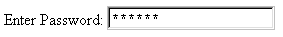
Password fields are created and used just like textfields, except that when the user enters text, the input is not echoed, but instead some obscuring character, usually an asterisk, is displayed (see Figure 18-9). Obscured input is useful for collecting data such as credit card numbers or passwords that the user would not want shown to people who may be near his computer. The regular, unobscured text is transmitted as the value of the field when the form is submitted. Since GET data is appended to the URL after a question mark, you will want to use the POST method when using a password field so that a bystander cannot read the unobscured password from the URL display at the top of the browser.
Figure 18-9. A password field created by means of <INPUT TYPE="PASSWORD" ...>.
Core Approach
| | To protect the user's privacy, always use POST when creating forms with password fields. |
NAME, VALUE, SIZE, MAXLENGTH, DISABLED, READONLY, ONCHANGE, ONSELECT, ONFOCUS, ONBLUR, ONKEYDOWN, ONKEYPRESS, and ONKEYUP Attributes for password fields are used in exactly the same manner as with textfields.
Text Areas
| HTML Element: | <TEXTAREA id="..." ROWS=xxx COLS=yyy> ... </TEXTAREA> |
| Attributes: | NAME (required), ROWS (required), COLS (required), WRAP (nonstandard), DISABLED, READONLY, ONCHANGE, ONSELECT, ONFOCUS, ONBLUR, ONKEYDOWN, ONKEYPRESS, ONKEYUP |
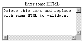
The TEXTAREA element creates a multiline text area; see Figure 18-10. There is no VALUE attribute; instead, text between the start and end tags is used as the initial content of the text area. The initial text between <TEXTAREA ...> and </TEXTAREA> is treated similarly to text inside the now-obsolete XMP element. That is, white space in this initial text is maintained and HTML markup between the start and end tags is taken literally, except for character entities such as <, ©, and so forth, which are interpreted normally. Unless a custom ENCTYPE is used in the form (see Section 18.2, "The FORM Element"), characters, including those generated from character entities, are URL-encoded before being transmitted. That is, spaces become plus signs and other nonalphanumeric characters become %XX, where XX is the numeric value of the character in hex.
Figure 18-10. A text area.
NAME This attribute specifies the name that will be sent to the server.
ROWS ROWS specifies the number of visible lines of text. If more lines of text are entered, a vertical scrollbar will be added to the text area.
COLS COLS specifies the visible width of the text area, based on the average width of characters in the font being used. If the text on a single line contains more characters than the specified width allows, the result is browser dependent. In Netscape, horizontal scrollbars are added (but see the WRAP attribute, described next, to change this behavior). In Internet Explorer, the word wraps around to the next line.
WRAP The Netscape-specific WRAP attribute specifies what to do with lines that are longer than the size specified by COLS. A value of OFF disables word wrap and is the default. The user can still enter explicit line breaks in such a case. A value of HARD causes words to wrap in the text area and the associated line breaks to be transmitted when the form is submitted. Finally, a value of SOFT causes the words to wrap in the text area but no extra line breaks to be transmitted when the form is submitted.
DISABLED, READONLY These attributes let you completely disable a text area or make it read-only. A disabled text area cannot be edited, receive the input focus, be tabbed to, or be part of a form submission. A read-only text area cannot be edited but can receive the input focus, be tabbed to, and be part of a form submission. The status of these attributes can be changed dynamically with JavaScript. Although officially part of HTML 4.0, these attributes are not supported by Netscape 4.x.
ONCHANGE, ONSELECT, ONFOCUS, ONBLUR, ONKEYDOWN, ONKEYPRESS, and ONKEYUP These attributes apply only to browsers that support JavaScript; they specify code to be executed when certain conditions arise. ONCHANGE handles the situation when the input focus leaves the text area after it has changed, ONSELECT describes what to do when text in the text area is selected by the user, ONFOCUS and ONBLUR specify what to do when the text area acquires or loses the input focus, and the remaining attributes determine what to do when individual keys are typed.
The following example creates a text area with 5 visible rows that can hold about 30 characters per row. The result is shown in Figure 18-10.
<CENTER> <P> Enter some HTML:<BR> <TEXTAREA id="HTML" ROWS=5 COLS=30> Delete this text and replace with some HTML to validate. </TEXTAREA> <CENTER>
18.4 Push Buttons
Push buttons are used for two main purposes in HTML forms: to submit forms and to reset the controls to the values specified in the original HTML document. Browsers that use JavaScript can also use buttons for a third purpose: to trigger arbitrary JavaScript code.
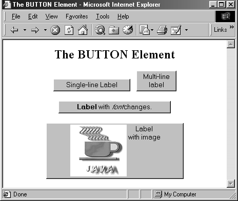
Traditionally, buttons have been created by the INPUT element used with a TYPE attribute of SUBMIT, RESET, or BUTTON. In HTML 4.0, the BUTTON element was introduced but is currently supported only by Internet Explorer. This new element lets you create buttons with multiline labels, images, font changes, and the like, so is preferred if you are sure your users will all be using browsers that support it (e.g., in a corporate intranet). Since the element is not supported by Netscape, at least as of Netscape version 4.7, for now you should reserve BUTTON for intranets that use Internet Explorer exclusively.
Core Warning
| | Netscape does not support the BUTTON element. |
Submit Buttons
| HTML Element: | <INPUT TYPE="SUBMIT" ...> (No End Tag) |
| Attributes: | NAME, VALUE, DISABLED, ONCLICK, ONDBLCLICK, ONFOCUS, ONBLUR |
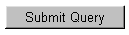
When a submit button is clicked, the form is sent to the servlet or other server-side program designated by the ACTION parameter of the FORM. Although the action can be triggered other ways, such as the user clicking on an image map, most forms have at least one submit button. Submit buttons, like other form controls, adopt the look and feel of the client operating system, so will look slightly different on different platforms. Figure 18-11 shows a submit button on Windows 98, created by
Figure 18-11. A submit button with the default label.
<INPUT TYPE="SUBMIT">
NAME and VALUE Most input elements have a name and an associated value. When the form is submitted, the names and values of active elements are concatenated to form the data string. If a submit button is used simply to initiate the submission of the form, its name can be omitted. In that case, the name does not contribute to the data string that is sent. If a name is supplied, then only the name and value of the button that was actually clicked are sent. The label is used as the value that is transmitted.
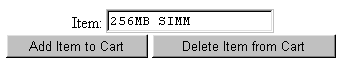
Supplying an explicit VALUE will change the default label. For instance, the following code snippet creates a textfield and two submit buttons, shown in Figure 18-12. If, for example, the first button is selected, the data string sent to the server would be Item=256MB+SIMM&Add=Add+Item+to+Cart.
Figure 18-12. Submit buttons with user-defined labels.
<CENTER> Item: <INPUT TYPE="TEXT" id="Item" VALUE="256MB SIMM"><BR> <INPUT TYPE="SUBMIT" id="Add" VALUE="Add Item to Cart"> <INPUT TYPE="SUBMIT" id="Delete" VALUE="Delete Item from Cart"> </CENTER>DISABLED This attribute lets you completely disable a button. A disabled button cannot receive the input focus, be tabbed to, or be part of a form submission. The status of this attribute can be changed dynamically through the use of JavaScript. Although officially part of HTML 4.0, DISABLED is not supported by Netscape 4.x.
ONCLICK, ONDBLCLICK, ONFOCUS, and ONBLUR These nonstandard attributes are used by JavaScript-capable browsers to associate JavaScript code with the button. The ONCLICK and ONDBLCLICK code is executed when the button is pressed, the ONFOCUS code when the button gets the input focus, and the ONBLUR code when the button loses the focus. If the code attached to a button returns false, the submission of the form is suppressed. HTML attributes are not case sensitive, and these attributes are traditionally called onClick, onDblClick, onFocus, and onBlur by JavaScript programmers.
| HTML Element: | <BUTTON TYPE="SUBMIT" ...> HTML Markup </BUTTON> |
| Attributes: | NAME, VALUE, DISABLED, ONCLICK, ONDBLCLICK, ONFOCUS, ONBLUR |
This alternative way of creating submit buttons, supported only by Internet Explorer, lets you use arbitrary HTML markup for the content of the button. This element lets you have multiline button labels, button labels with font changes, image buttons, and so forth. Listing 18.4 gives a few examples, with results shown in Figure 18-13.
Figure 18-13. Submit buttons created with the BUTTON element.
NAME, VALUE, DISABLED, ONCLICK, ONDBLCLICK, ONFOCUS, and ONBLUR These attributes are used in the same way as with <INPUT TYPE="SUBMIT" ...>.
Listing 18.4 ButtonElement.html
<!DOCTYPE HTML PUBLIC "-//W3C//DTD HTML 4.0 Transitional//EN"> <HTML> <HEAD> <TITLE>The BUTTON Element</TITLE> </HEAD> <BODY BGCOLOR="WHITE"> <H2 ALIGN="CENTER">The BUTTON Element</H2> <FORM ACTION="http://localhost:8088/SomeProgram"> <CENTER> <BUTTON TYPE="SUBMIT">Single-line Label</BUTTON> <BUTTON TYPE="SUBMIT">Multi-line<BR>label</BUTTON> <P> <BUTTON TYPE="SUBMIT"> <B>Label</B> with <I>font</I> changes. </BUTTON> <P> <BUTTON TYPE="SUBMIT"> <IMG SRC="images/Java-Logo.gif" WIDTH=110 HEIGHT=101 ALIGN="LEFT" ALT="Java Cup Logo"> Label<BR>with image </BUTTON> </CENTER> </FORM> </BODY> </HTML>
Reset Buttons
| HTML Element: | <INPUT TYPE="RESET" ...> (No End Tag) |
| Attributes: | VALUE, NAME, DISABLED, ONCLICK, ONDBLCLICK, ONFOCUS, ONBLUR |
Reset buttons serve to reset the values of all items in the FORM to those specified in the original VALUE parameters. Their value is never transmitted as part of the form's contents.
VALUE The VALUE attribute specifies the button label; "Reset" is the default.
NAME Because reset buttons do not contribute to the data string transmitted when the form is submitted, they are not named in standard HTML. However, JavaScript permits a NAME attribute to be used to simplify reference to the element.
DISABLED This attribute lets you completely disable a button. A disabled button cannot receive the input focus, be tabbed to, or be part of a form submission. The status of this attribute can be changed dynamically with JavaScript. Although officially part of HTML 4.0, DISABLED is not supported by Netscape 4.x.
ONCLICK, ONDBLCLICK, ONFOCUS, and ONBLUR These nonstandard attributes are used by JavaScript-capable browsers to associate JavaScript code with the button. The ONCLICK and ONDBLCLICK code is executed when the button is pressed, the ONFOCUS code when the button gets the input focus, and the ONBLUR code when it loses the focus. HTML attributes are not case sensitive, and these attributes are traditionally called onClick, onDblClick, onFocus, and onBlur by JavaScript programmers.
| HTML Element: | <BUTTON TYPE="RESET" ...> HTML Markup </BUTTON> |
| Attributes: | VALUE, NAME, DISABLED, ONCLICK, ONDBLCLICK, ONFOCUS, ONBLUR |
This alternative way of creating reset buttons, supported only by Internet Explorer, lets you use arbitrary HTML markup for the content of the button. All attributes are used identically to those in <INPUT TYPE="RESET" ...>.
JavaScript Buttons
| HTML Element: | <INPUT TYPE="BUTTON" ...> (No End Tag) |
| Attributes: | NAME, VALUE, DISABLED, ONCLICK, ONDBLCLICK, ONFOCUS, ONBLUR |
The BUTTON element is recognized only by browsers that support JavaScript. It creates a button with the same visual appearance as a SUBMIT or RESET button and allows the author to attach JavaScript code to the ONCLICK, ONDBLCLICK, ONFOCUS, or ONBLUR attributes. The name/value pair associated with a JavaScript button is not transmitted as part of the data when the form is submitted. Arbitrary code can be associated with the button, but one of the most common uses is to verify that all input elements are in the proper format before the form is submitted to the server. For instance, the following would create a button where the user-defined validateForm function would be called whenever the button is activated.
<INPUT TYPE="BUTTON" VALUE="Check Values" onClick="validateForm()">
| HTML Element: | <BUTTON TYPE="BUTTON" ...> HTML Markup </BUTTON> |
| Attributes: | NAME, VALUE, DISABLED, ONCLICK, ONDBLCLICK, ONFOCUS, ONBLUR |
This alternative way of creating JavaScript buttons, supported only by Internet Explorer, lets you use arbitrary HTML markup for the content of the button. All attributes are used identically to those in <INPUT TYPE="BUTTON" ...>.
18.5 Check Boxes and Radio Buttons
Check boxes and radio buttons are useful controls for allowing the user to select among a set of predefined choices. While each individual check box can be selected or deselected individually, radio buttons can be grouped so that only a single member of the group can be selected at a time.
Check Boxes
| HTML Element: | <INPUT TYPE="CHECKBOX" id="..." ...> (No End Tag) |
| Attributes: | NAME (required), VALUE, CHECKED, DISABLED, READONLY, ONCLICK, ONFOCUS, ONBLUR |
This input element creates a check box whose name/value pair is transmitted only if the check box is checked when the form is submitted. For instance, the following code results in the check box shown in Figure 18-14.
Figure 18-14. An HTML check box.
<P> <INPUT TYPE="CHECKBOX" id="noEmail" CHECKED> Check here if you do <I>not</I> want to get our email newsletter
Note that the descriptive text associated with the check box is normal HTML; developers should take care to guarantee that it appears next to the check box. Thus, the <P> in the preceding example ensures that the check box isn't part of the previous paragraph.
Core Approach
| | Paragraphs inside a FORM are filled and wrapped just like regular paragraphs. So, be sure to insert explicit HTML markup to keep input elements with the text that describes them. |
NAME This attribute supplies the name that is sent to the server. It is required for standard HTML check boxes but optional when used with JavaScript.
VALUE The VALUE attribute is optional and defaults to on. Recall that the name and value are only sent to the server if the check box is checked when the form is submitted. For instance, in the preceding example, noEmail=on would be added to the data string since the box is checked, but nothing would be added if the box was unchecked. As a result, servlets or CGI programs often check only for the existence of the check box name, ignoring its value.
CHECKED If the CHECKED attribute is supplied, then the check box is initially checked when the associated Web page is loaded. Otherwise, it is initially unchecked.
DISABLED, READONLY These attributes let you completely disable a check box or make it read-only. Although officially part of HTML 4.0, these attributes are not supported by Netscape 4.x.
ONCLICK, ONFOCUS, and ONBLUR These attributes supply JavaScript code to be executed when the button is clicked, receives the input focus, and loses the focus, respectively.
Radio Buttons
| HTML Element: | <INPUT TYPE="RADIO" id="..." VALUE="..." ...> (No End Tag) |
| Attributes: | NAME (required), VALUE (required), CHECKED, DISABLED, READONLY, ONCLICK, ONFOCUS, ONBLUR |
Radio buttons differ from check boxes in that only a single radio button in a given group can be selected at any one time. You indicate a group of radio buttons by providing all of them with the same NAME. Only one button in a group can be depressed at a time; selecting a new button when one is already selected results in the previous choice becoming deselected. The value of the one selected is sent when the form is submitted. Although radio buttons technically need not appear near each other, this proximity is almost always recommended.
An example of a radio button group follows. Because input elements are wrapped as part of normal paragraphs, a DL list is used to make sure that the buttons appear under each other in the resultant page and are indented from the heading above them. Figure 18-15 shows the result. In this case, creditCard=java would get sent as part of the form data when the form is submitted.
Figure 18-15. Radio buttons in HTML.
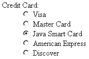
<DL> <DT>Credit Card: <DD><INPUT TYPE="RADIO" id="creditCard" VALUE="visa"> Visa <DD><INPUT TYPE="RADIO" id="creditCard" VALUE="mastercard"> Master Card <DD><INPUT TYPE="RADIO" id="creditCard" VALUE="java" CHECKED> Java Smart Card <DD><INPUT TYPE="RADIO" id="creditCard" VALUE="amex"> American Express <DD><INPUT TYPE="RADIO" id="creditCard" VALUE="discover"> Discover </DL>
NAME Unlike the NAME attribute of most input elements, this NAME is shared by multiple elements. All radio buttons associated with the same name are grouped logically so that no more than one can be selected at any given time. Note that attribute values are case sensitive, so the following would result in two radio buttons that are not logically connected.
<INPUT TYPE="RADIO" id="Foo" VALUE="Value1"> <INPUT TYPE="RADIO" id="FOO" VALUE="Value2">
Core Warning
| | Be sure the NAME of each radio button in a logical group matches exactly. |
VALUE The VALUE attribute supplies the value that gets transmitted with the NAME when the form is submitted. It doesn't affect the appearance of the radio button. Instead, normal text and HTML markup are placed around the radio button, just as with check boxes.
CHECKED If the CHECKED attribute is supplied, then the radio button is initially checked when the associated Web page is loaded. Otherwise, it is initially unchecked.
DISABLED, READONLY These attributes let you completely disable a radio button or make it read-only. Although these attributes are officially part of HTML 4.0, they are not supported by Netscape 4.x.
ONCLICK, ONFOCUS, and ONBLUR These attributes supply JavaScript code to be executed when the button is clicked, receives the input focus, and loses the focus, respectively.
18.6 Combo Boxes and List Boxes
A SELECT element presents a set of options to the user. If only a single entry can be selected and no visible size has been specified, the options are presented in a combo box (drop-down menu); list boxes are used when multiple selections are permitted or a specific visible size has been specified. The choices themselves are specified by OPTION entries embedded in the SELECT element. The typical format is as follows:
<SELECT id="Name" ...> <OPTION VALUE="Value1">Choice 1 Text <OPTION VALUE="Value2">Choice 2 Text ... <OPTION VALUE="ValueN">Choice N Text </SELECT>
The HTML 4.0 specification suggests the use of OPTGROUP (with a single attribute of LABEL) to enclose OPTION elements to create cascading menus, but neither Netscape nor Internet Explorer supports this element.
| HTML Element: | <SELECT id="..." ...> ... </SELECT> |
| Attributes: | NAME (required), SIZE, MULTIPLE, DISABLED, ONCLICK, ONFOCUS, ONBLUR, ONCHANGE |
SELECT creates a combo box or list box for selecting among choices. You specify each choice with an OPTION element enclosed between <SELECT ...> and </SELECT>.
NAME NAME identifies the form to the servlet or CGI program.
SIZE SIZE gives the number of visible rows. If SIZE is used, the SELECT menu is usually represented as a list box instead of a combo box. A combo box is the normal representation when neither SIZE nor MULTIPLE is supplied.
MULTIPLE The MULTIPLE attribute specifies that multiple entries can be selected simultaneously. If MULTIPLE is omitted, only a single selection is permitted.
DISABLED This attribute let you completely disable a combo box. Although officially part of HTML 4.0, it is not supported by Netscape 4.x.
ONCLICK, ONFOCUS, ONBLUR, and ONCHANGE These nonstandard attributes are supported by browsers that understand JavaScript. They indicate code to be executed when the entry is clicked on, gains the input focus, loses the input focus, and loses the focus after having been changed, respectively.
| HTML Element: | <OPTION ...> (End Tag Optional) |
| Attributes: | SELECTED, VALUE, DISABLED |
Only valid inside a SELECT element, this element specifies the menu choices.
SELECTED If present, SELECTED specifies that the particular menu item shown is selected when the page is first loaded.
VALUE VALUE gives the value to be transmitted with the NAME of the SELECT menu if the current option is selected. This is not the text that is displayed to the user; that text is specified separately, listed after the OPTION tag.
DISABLED This attribute lets you completely disable an entry in a combo box. Although officially part of HTML 4.0, it is not supported by Netscape 4.x.
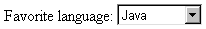
The following example creates a menu of programming language choices. Because only a single selection is allowed and no visible SIZE is specified, the menu is displayed as a combo box. Figures18-16 and 18-17 show the initial appearance and the appearance after the user activates the menu by clicking on it. If the entry Java is active when the form is submitted, then language=java is sent to the server-side program. Notice that it is the VALUE attribute, not the descriptive text, that is transmitted.
Figure 18-16. A SELECT element displayed as a combo box (drop-down menu).
Figure 18-17. Choosing options from a SELECT menu.
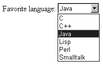
Favorite language: <SELECT id="language"> <OPTION VALUE="c">C <OPTION VALUE="c++">C++ <OPTION VALUE="java" SELECTED>Java <OPTION VALUE="lisp">Lisp <OPTION VALUE="perl">Perl <OPTION VALUE="smalltalk">Smalltalk </SELECT>
The second example shows a SELECT element rendered as a list box. If more than one entry is active when the form is submitted, then more than one value is sent, listed as separate entries (repeating the NAME). For instance, in the example shown in Figure 18-18, language=java&language=perl is added to the data being sent to the server. Multiple entries that share the same name is the reason servlet authors need be familiar with the getParameterValues method of HttpServletRequest in addition to the more common getParameter method. See Section 19.6 (The Client Request: Form Data) for details.
Figure 18-18. A SELECT element that specifies MULTIPLE or SIZE results in a list box.
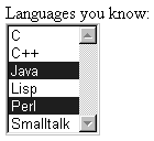
Languages you know:<BR> <SELECT id="language" MULTIPLE> <OPTION VALUE="c">C <OPTION VALUE="c++">C++ <OPTION VALUE="java" SELECTED>Java <OPTION VALUE="lisp">Lisp <OPTION VALUE="perl" SELECTED>Perl <OPTION VALUE="smalltalk">Smalltalk </SELECT> 18.7 File Upload Controls
| HTML Element: | <INPUT TYPE="FILE" ...> (No End Tag) |
| Attributes: | NAME (required), VALUE (ignored), SIZE, MAXLENGTH, ACCEPT, DISABLED, READONLY, ONCHANGE, ONSELECT, ONFOCUS, ONBLUR (nonstandard) |
This element results in a filename textfield next to a Browse button. Users can enter a path directly in the textfield or click on the button to open a file selection dialog that lets them interactively choose the path to a file. When the form is submitted, the contents of the file are transmitted as long as an ENCTYPE of multipart/form-data was specified in the initial FORM declaration. This element provides a convenient way to make user-support pages, where the user sends a description of the problem along with any associated data or configuration files.
Core Tip
| | Always specify ENCTYPE="multipart/form-data" in forms with file upload controls. |
NAME The NAME attribute identifies the textfield when the form is submitted.
VALUE For security reasons, this attribute is ignored. Only the end user can specify a filename.
SIZE and MAXLENGTH The SIZE and MAXLENGTH attributes are used the same way as in textfields, specifying the number of visible and maximum allowable characters, respectively.
ACCEPT The ACCEPT attribute is a comma-separated list of MIME types intended to restrict the available filenames. However, very few browsers support this attribute.
DISABLED, READONLY These attributes let you completely disable an upload control or make it read-only. Although officially part of HTML 4.0, these attributes are not supported by Netscape 4.x.
ONCHANGE, ONSELECT, ONFOCUS, and ONBLUR These attributes are used by browsers that support JavaScript to specify the action to take when the mouse leaves the textfield after a change has occurred, when the user selects text in the textfield, when the textfield gets the input focus, and when it loses the input focus, respectively.
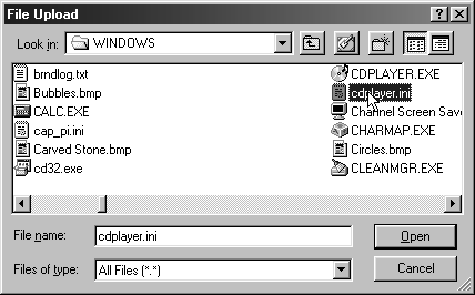
For example, the following code creates a file upload control. Figure 18-19 shows the initial result, and Figure 18-20 shows a typical pop-up window that results when the Browse button is activated.
Figure 18-19. Initial look of a file upload control.
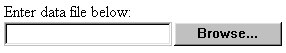
Figure 18-20. A file chooser resulting from the user clicking on Browse in a file upload control.
<FORM ACTION="http://localhost:8088/SomeProgram" ENCTYPE="multipart/form-data"> Enter data file below:<BR> <INPUT TYPE="FILE" id="fileName"> </FORM>
18.8 Server-Side Image Maps
In HTML, an element called MAP lets you associate URLs with various regions of an image; then, when the image is clicked in one of the designated regions, the browser loads the appropriate URL. This form of mapping is known as a client-side image map, since the determination of which URL to contact is made on the client and no server-side program is involved. HTML also supports server-side image maps that can be used within HTML forms. With such maps, an image is drawn, and when the user clicks on it, the coordinates of the click are sent to a server-side program.
Client-side image maps are simpler and more efficient than server-side ones; use them when all you want to do is associate a fixed set of URLs with some predefined image regions. However, server-side image maps are appropriate if the URL needs to be computed (e.g., for weather maps), the regions change frequently, or other form data needs to be included with the request. This section discusses two approaches to server-side image maps.
IMAGE Standard Server-Side Image Maps
The usual way to create server-side image maps is by means of an <INPUT TYPE="IMAGE" ...> element inside a form.
| HTML Element: | <INPUT TYPE="IMAGE" ...> (No End Tag) |
| Attributes: | NAME (required), SRC, ALIGN, DISABLED |
This element displays an image that, when clicked, sends the form to the servlet or other server-side program specified by the enclosing form's ACTION. The name itself is not sent; instead, name.x=xpos and name.y=ypos are transmitted, where xpos and ypos are the coordinates of the mouse click relative to the upper-left corner of the image.
NAME The NAME attribute identifies the textfield when the form is submitted.
SRC SRC designates the URL of the associated image.
ALIGN The ALIGN attribute has the same options (TOP, MIDDLE, BOTTOM, LEFT, RIGHT) and default (BOTTOM) as the ALIGN attribute of the IMG element and is used in the same way.
DISABLED This attribute lets you completely disable an image map. Although the attribute is officially part of HTML 4.0, it is not supported by Netscape 4.x.
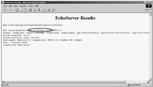
Listing 18.5 shows a simple example which the form's ACTION specifies the EchoServer developed in Section 17.8 (Example: A Simple HTTP Server). Figures18-21 and 18-22 show the results before and after the image is clicked.
Figure 18-21. An IMAGE input control with id="map".
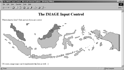
Figure 18-22. Clicking on the image at (305, 280) submits the form and adds map.x=305&map.y=280 to the form data.
Listing 18.5 ImageMap.html
<!DOCTYPE HTML PUBLIC "-//W3C//DTD HTML 4.0 Transitional//EN"> <HTML> <HEAD> <TITLE>The IMAGE Input Control</TITLE> </HEAD> <BODY> <H1 ALIGN="CENTER">The IMAGE Input Control</H1> Which island is Java? Click and see if you are correct. <FORM ACTION="http://localhost:8088/GeographyTester"> <INPUT TYPE="IMAGE" id="map" SRC="images/indonesia.gif"> </FORM> Of course, image maps can be implemented <B>in</B> Java as well. :-) </BODY> </HTML> ISMAP Alternative Server-Side Image Maps
ISMAP is an optional attribute of the IMG element and can be used similarly to the <INPUT TYPE="IMAGE" ...> FORM entry. ISMAP is not actually a FORM element at all but can still be used for simple connections to servlets or CGI programs. If an image with ISMAP is inside a hypertext link, then clicking on the image results in the coordinates of the click being sent to the specified URL. Coordinates are separated by commas and are specified in pixels relative to the top-left corner of the image.
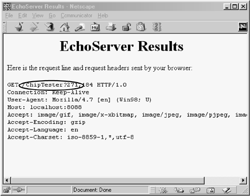
For instance, Listing 18.6 embeds an image that uses the ISMAP attribute inside a hypertext link to http://localhost:8088/ChipTester, which is answered by the mini HTTP server developed in Section 17.8. Figure 18-23 shows the initial result, which is identical to what would have been shown had the ISMAP attribute been omitted. However, when the mouse button is pressed 271 pixels to the right and 184 pixels below the top-left corner of the image, the browser requests the URL http://localhost:8088/ChipTester?271,184 (as shown in Figure 18-24).
Figure 18-23. Setting the ISMAP attribute of an IMG element inside a hypertext link changes what happens when the image is selected.
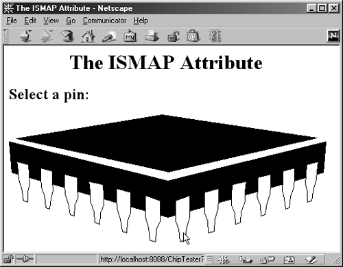
Figure 18-24. When an ISMAP image is selected, the coordinates of the selection are transmitted with the URL.
If a server-side image map is used simply to select among a static set of destination URLs, then a client-side MAP element is a much better option because the server doesn't have to be contacted just to decide which URL applies. If the image map is intended to be mixed with other input elements, then the IMAGE input type is preferred instead. However, for a stand-alone image map where the URL associated with a region changes frequently or requires calculation, an image with ISMAP is a reasonable choice.
Listing 18.6 IsMap.html
<!DOCTYPE HTML PUBLIC "-//W3C//DTD HTML 4.0 Transitional//EN"> <HTML> <HEAD> <TITLE>The ISMAP Attribute</TITLE> </HEAD> <BODY> <H1 ALIGN="CENTER">The ISMAP Attribute</H1> <H2>Select a pin:</H2> <A HREF="http://localhost:8088/ChipTester"> <IMG SRC="images/chip.gif" WIDTH=495 HEIGHT=200 ALT="Chip" BORDER=0 ISMAP></A> </BODY> </HTML>
18.9 Hidden Fields
Hidden fields do not affect the appearance of the page that is presented to the user. Instead, they store fixed names and values that are sent unchanged to the server, regardless of user input. Hidden fields are typically used for three purposes.
First, they are one method of tracking users as they move around within a site. Servlet authors typically rely on the servlet session tracking API (Section 19.12) rather than attempting to implement session tracking at this low level.
Second, hidden fields provide predefined input to a server-side program when a variety of static HTML pages act as front ends to the same program on the server. For example, an on-line store might pay commissions to people who refer customers to their site. In this scenario, the referring page could let visitors search the store's catalog by means of a form but would embed a hidden field listing its referral ID.
Third, hidden fields store contextual information in pages that are dynamically generated. For example, an on-line store might use hidden fields to store the current user's customer ID or the current discount rate.
| HTML Element: | <INPUT TYPE="HIDDEN" id="..." VALUE="..."> (No End Tag) |
| Attributes: | NAME (required), VALUE |
This element stores a name and a value, but no graphical element is created in the browser. The name/value pair is added to the form data when the form is submitted. For instance, with the following example, itemid=hall001 will always be sent with the form data.
<INPUT TYPE="HIDDEN" id="itemID" VALUE="hall001">
Note that the term "hidden" does not mean that the field cannot be discovered by the user, since it is clearly visible in the HTML source. Because there is no reliable way to "hide" the HTML that generates a page, authors are cautioned not to use hidden fields to embed passwords or other sensitive information.
18.10 Grouping Controls
HTML 4.0 defines the FIELDSET element, with an associated LEGEND, that visually groups controls within a form. This capability is quite useful but is supported only by Internet Explorer. It is likely that Netscape version 6 will add support for this element. In the meantime, you should reserve use of this element to intranet applications where all your users are using Internet Explorer.
Core Warning
| | As of version 4.7, Netscape does not support the FIELDSET element. |
| HTML Element: | <FIELDSET> ... </FIELDSET> |
| Attributes: | None |
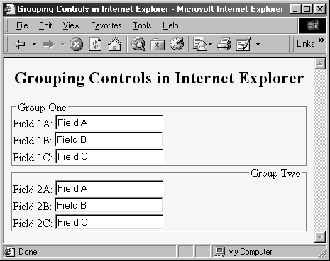
This element is used as a container to enclose controls and, optionally, a LEGEND element. It has no attributes beyond the universal ones for style sheets, language, and so forth. Listing 18.7 gives an example, with the result shown in Figure 18-25.
Figure 18-25. The FIELDSET element lets you visually group related controls.
Listing 18.7 Fieldset.html
<!DOCTYPE HTML PUBLIC "-//W3C//DTD HTML 4.0 Transitional//EN"> <HTML> <HEAD> <TITLE>Grouping Controls in Internet Explorer</TITLE> </HEAD> <BODY BGCOLOR="#FDF5E6"> <H2 ALIGN="CENTER">Grouping Controls in Internet Explorer</H2> <FORM ACTION="http://localhost:8088/SomeProgram"> <FIELDSET> <LEGEND>Group One</LEGEND> Field 1A: <INPUT TYPE="TEXT" id="field1A" VALUE="Field A"><BR> Field 1B: <INPUT TYPE="TEXT" id="field1B" VALUE="Field B"><BR> Field 1C: <INPUT TYPE="TEXT" id="field1C" VALUE="Field C"><BR> </FIELDSET> <FIELDSET> <LEGEND ALIGN="RIGHT">Group Two</LEGEND> Field 2A: <INPUT TYPE="TEXT" id="field2A" VALUE="Field A"><BR> Field 2B: <INPUT TYPE="TEXT" id="field2B" VALUE="Field B"><BR> Field 2C: <INPUT TYPE="TEXT" id="field2C" VALUE="Field C"><BR> </FIELDSET> </FORM> </BODY> </HTML>
| HTML Element: | <LEGEND> ... </LEGEND> |
| Attributes: | ALIGN |
This element, legal only within an enclosing FIELDSET, places a label on the etched border that is drawn around the group of controls.
ALIGN This attribute controls the position of the label. Legal values are TOP (the default), BOTTOM, LEFT, and RIGHT. In Figure 18-25, the first group has the default legend alignment, and the second group stipulates ALIGN="RIGHT". In HTML, style sheets are often a better way to control element alignment, since they permit a single change to be propagated to multiple places.
18.11 Tab Order Control
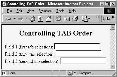
HTML 4.0 defines a TABINDEX attribute that can be used in any of the visual HTML elements. Its value is an integer, and it controls the order in which elements receive the input focus when the TAB key is pressed. Unfortunately, however, it is supported only by Internet Explorer. Nevertheless, you can use TABINDEX even for pages that will be viewed by multiple browsers, as long as the designated tabbing order is a convenience to the user, not a necessity for proper operation of the page. Listing 18.8 gives an example, with the results shown in Figure 18-26.
Figure 18-26. In Internet Explorer, repeatedly pressing the TAB key cycles the input focus among the first, third, and second textfields, in that order (as dictated by TABINDEX). In Netscape, the input focus would cycle among the first, second, and third fields, in that order (based on the order in which the elements appear on the page).
Core Warning
| | As of version 4.7, Netscape does not support the TABINDEX attribute. |
Listing 18.8 Tabindex.html
<!DOCTYPE HTML PUBLIC "-//W3C//DTD HTML 4.0 Transitional//EN"> <HTML> <HEAD> <TITLE>Controlling TAB Order</TITLE> </HEAD> <BODY BGCOLOR="#FDF5E6"> <H2 ALIGN="CENTER">Controlling TAB Order</H2> <FORM ACTION="http://localhost:8088/SomeProgram"> Field 1 (first tab selection): <INPUT TYPE="TEXT" id="field1" TABINDEX=1><BR> Field 2 (third tab selection): <INPUT TYPE="TEXT" id="field2" TABINDEX=3><BR> Field 3 (second tab selection): <INPUT TYPE="TEXT" id="field3" TABINDEX=2><BR> </FORM> </BODY> </HTML>
18.12 Summary
HTML forms generally consist of two main parts: a FORM element that designates the URL that processes the data and INPUT elements that gather the data. The INPUT elements have a NAME specified in HTML and a value either specified in HTML or supplied by the end user. The name/value pairs are sent to the server either attached to the end of the main URL (with GET requests) or on a separate line (with POST requests).
Gathering data is all well and good. But processing data is the really interesting part. That's the subject of the next two chapters.
| CONTENTS | |
EAN: 2147483647
Pages: 31