Working with Different Chart Types

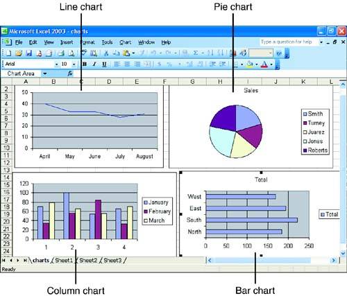
With Excel, you can create many types of charts . Some common chart types are shown in Figure 15.1. The chart type you choose depends on the kind of data you're trying to chart and on how you want to present that data. The following are the major chart types and their purposes:

  • Pie Use this chart type to show the relationship among parts of a whole.

  • Bar Use this chart type to compare values at a given point in time.

  • Column Similar to the bar chart; use this chart type to emphasize the difference between items.

  • Line Use this chart type to emphasize trends and the change of values over time.

  • Scatter Similar to a line chart; use this chart type to emphasize the difference between two sets of values.

  • Area Similar to the line chart; use this chart type to emphasize the amount of change in values over time.

Figure 15.1. Excel chart types enable you to analyze and present your data.

graphics/72fig01.jpg

Most of these basic chart types also come in three-dimensional varieties. In addition to looking more professional than the standard flat charts, 3D charts can often help your audience distinguish between different sets of data.


Microsoft Office 2003 All-in-One
ISBN: B005HKSHB2
EAN: N/A
Year: 2002
Pages: 660
Authors: Joe Habraken

flylib.com © 2008-2017.
If you may any questions please contact us: flylib@qtcs.net