When to Test
|
Since usability testing is best at seeing how people perform specific tasks, it should be used to examine the functionality of individual features and the way they're presented to the intended user. It is better used to highlight potential misunderstanding or errors inherent in the way features are implemented rather than to evaluate the entire user experience. During the early to middle parts of a development cycle, usability testing can play a key role in guiding the direction of functionality as features are defined and developed. Once the functionality of a feature is locked in and its interaction with other features has been determined, however, it's often too late to make any fundamental changes. Testing at that point is more an investment in the next version than in the current one.
Moreover, unlike some of the other techniques mentioned throughout this book, usability testing is almost never a one-time event in a development cycle for a product, and should not be seen as such. Every round of testing can focus on a small set of features (usually no more than five), so a series of tests is used to test a whole interface or fine-tune a specific set of features.
The first thing the development team needs to do is decide on the target audience and the feature set to examine.
This means that a good time to start usability testing is when the development cycle is somewhat under way, but not so late that testing prevents the implementation of extensive changes if it points to their necessity. Occasionally, usability testing reveals problems that require a lot of work to correct, so the team should be prepared to rethink and reimplement (and, ideally, retest) features if need be. In the Web world, this generally takes a couple of weeks, which is why iterative usability testing is often done in two-week intervals.
| Warning | Completely open-ended testing, or "fishing," is rarely valuable. When you go fishing during a round of user research—often prompted by someone saying, "let's test the whole thing"—the results are neither particularly clear nor insightful. Know why you're testing before you begin. |
A solid usability testing program will include iterative usability testing of every major feature, with tests scheduled throughout the development process, reinforcing and deepening knowledge about people's behavior and ensuring that designs become more effective as they develop.
Example of an Iterative Testing Process: Webmonkey 2.0 Global Navigation
Webmonkey is a cutting-edge Web development magazine that uses the technologies and techniques it covers. During a redesign cycle, they decided that they wanted to create something entirely new for the main interface. Since much of the 1.0 interface had been extensively tested and was being carried through to the new design, they wanted to concentrate their testing and development efforts on the new features.
The most ambitious and problematic of the new elements being considered was a DHTML global navigational panel that gave access to the whole site (see Figures 10.1 and 10.2), but didn't permanently use screen real estate. Instead, it would slide on and off the screen when the user needed it. Webmonkey's previous navigation scheme worked well, but analysis by the team determined that it was not used often enough to justify the amount of space it was taking up. They didn't want to add emphasis to it (it was, after all, secondary to the site's content), so they decided to minimize its use of screen real estate, instead of attempting to increase its use. Their initial design was a traditional vertical navigation bar, identical to that found in the left margin of the 1.0 site, but in its own panel. The panel was hidden most of the time, but would reveal its contents when an arrow at the top of a striped bar on the left side was clicked. The target audience of Web developers would hopefully notice the striped bar and arrow, and click on it out of curiosity.
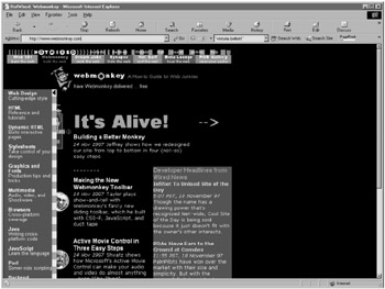
Figure 10.1: The Webmonkey 2.0 Navigation Panel design (open).
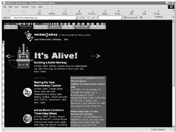
Figure 10.2: The Webmonkey 2.0 Navigation Panel design (closed).
Webmonkey developed on an iterative development cycle, so Web developers and sophisticated users were invited to a series of tests, with each test phase being followed by a design phase to incorporate the findings of the test. Although the purpose of the test was to examine the participants' entire user experience, the developers paid special attention to the sliding panel. In the first round of testing, none of the six evaluators opened the panel. When asked whether they had seen the bar and the arrow, most said they had, but they took the striped bar to be a graphical element and the arrow to be decoration.
Two weeks later, the visual design had not changed much, but the designers changed the panel from being closed by default to being open when the page first loaded. During testing, the evaluators naturally noticed the panel and understood what it was for, but they consistently had trouble closing it in order to see the content that it obscured. Some tried dragging it like a window; others tried to click inside it. Most had seen the arrow, but they didn't know how it related to the panel and so they never tried clicking it. Further questioning revealed that they didn't realize that the panel was a piece of the window that slid open and closed. Thus, there were two interrelated problems: people didn't know how the panel functioned, and they didn't know that the arrow was a functional element.
A third design attempted to solve the problem by providing an example of the panel's function as the first experience on the page: a short pause after the page loaded, the panel opened and closed by itself. The designers hoped that showing the panel in action would make the panel's function clearer. It did, and in the next round of testing, the evaluators described both its content and its function correctly. However, none were able to open the panel again. The new design still did not solve the problem with the arrow, and most people tried to click and drag in the striped bar to get at the panel. Having observed this behavior, and (after some debate) realizing that they could not technically implement a dragging mechanism for the panel, the designers made the entire colored bar clickable, so that whenever someone clicked anywhere in it, the panel slid out (or back, if it was already open).
In the end, people still didn't know what the arrow was for, but when they clicked in the striped panel to slide it open, it did, which was sufficient to make the feature usable, and none of the people observed using it had any trouble opening or closing the panel thereafter.
|
EAN: 2147483647
Pages: 144