Section 8.1. The Application
8.1. The ApplicationThe application in this chapter provides an example, not an easily reusable application. Much of the design depends on the data, and an application like this is easier to build from scratch than to customize. The design and concepts, however, are reusable and the application can serve as a starting point for custom development. The application operates on data from a workflow with five queues. The work arrives as images. They could be incoming faxes or scanned paper documents. The first queue feeds a fully automated process that attempts to handle the work via optical character recognition (OCR). The work starts in a queue named OCR, and if the OCR process is successful then the work is complete and leaves the system. If the OCR process it is unsuccessful, the document is routed to a manual queue named MAN. Any document that can only be partially processed and requires research is routed to the partially processed queue named PAR. For documents that require extensive research there is a separate queue named EXT. Finally, in some cases the work results in a refund. Refunds also have their own queue named REF. Documents are in one of three statuses:
Once a document is complete it leaves the queuing system, and might be used by an application like the one in Chapter 7. The main display in Figure 8-1 shows these queues as one continuous workflow. Figure 8-1. The application's main display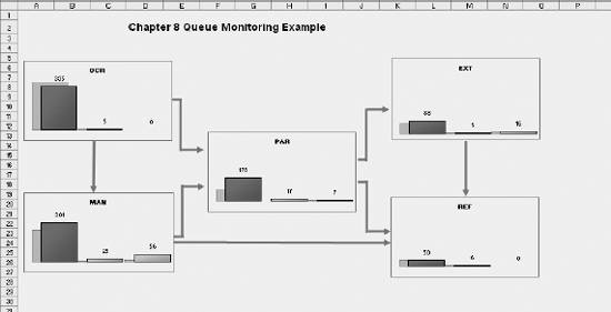 The display is basically a flow diagram of the operation. The design elements are charts containing information about each queue, and the flow is represented by arrows. This metaphor is easily understood and can be used for almost any multi-step process. Figure 8-2 shows one of the charts in detail. This is a standard bar chart created with Excel's chart tool. It shows the EXT queue, and there are 88 unprocessed documents represented by the red bar, Item 1. Item 2 is the smaller green bar and it represents documents currently being worked on. The yellow bar, Item 3, is the documents on hold. These have been assigned to an agent but cannot be completed without additional information. The chart's information is updated periodically and it is helpful to know how things are changing. The gray bars behind the colored bars, Item 4, show where each bar was at the previous update. Figure 8-2. Chart detail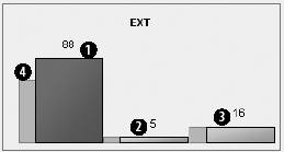 So, we can see there are now 88 items in the queue and that the queue has grown since the previous update. The colored bars were formatted separately using the Format Data Point dialog box . The color of the red bar is set as shown in Figure 8-3. Figure 8-3. Setting the color of the red bar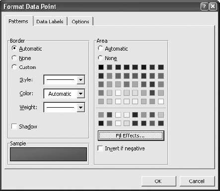 I selected red for the area and black for a thin border. The shadowing effect was created using the Fill Effects button, which brings up the dialog shown in Figure 8-4. Figure 8-4. Add a fill effect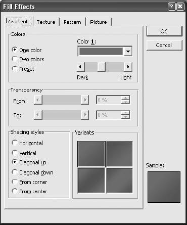 The gray bars were formatted together using the Format Data Series dialog box . The color is set to light gray with a darker gray border. This dialog's Options tab, shown in Figure 8-5, allowed me to offset the bars by choosing an Overlap setting of 75%. This puts the gray bars partly behind the colored ones. The chart was finished by deleting the horizontal and vertical axis, removing grid lines, and filling the chart area with the same background color as the sheet. There is a macro associated with each chart, allowing the charts to function as buttons. Clicking on the PAR queue chart brings up the display in Figure 8-6. This is a report showing each item in the partially processed queue with summary information at the top. This report is rebuilt each time a chart is clicked. The original work document is an image file and its name is in the file column. If the user selects a row by clicking on a row number, the document on that row is displayed. Figure 8-5. Offsetting the gray bars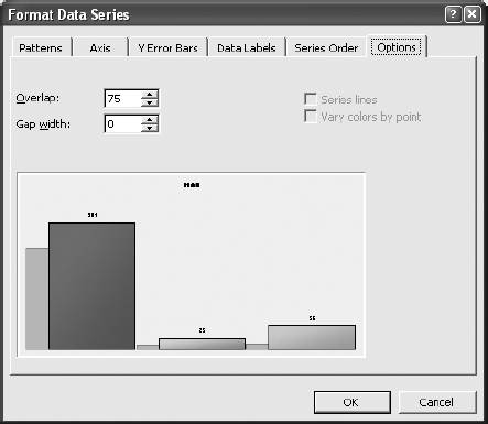 Figure 8-6. Detail report for the partially processed documents queue |
EAN: 2147483647
Pages: 101