Table Tips
It's too bad that tables came out before CSS. Designers who are used to pixel-level placement can be frustrated by HTML's lack of control. Some pioneers, including David Siegel, [1] with his single-pixel GIF trick, realized they could use tables as a crude layout device. The use of tables subsequently exploded.
Intended for tabular data, the overuse of tables has polluted the web with unnecessary presentation in billions of pages. With the advent of modern standards-compliant browsers, there is a better way: CSS2. But, because this is the table section, I suppose that I should talk about some techniques you can use to speed up their display.
Complex Tables=Slow Rendering Speed
Using tables to lay out complex pages is usually a recipe for disaster. Cramming three or four columns ' worth of content into a device originally designed to hold scientific data is not the W3C's idea of an optimal solution. What designers and WYSIWYG HTML editors typically do is lay out the page using one large table, placing content within this framework. Often, that content uses other tables, which can contain even more tables. The problem is that table size calculations are dynamic and interrelated.
All this complexity must be parsed and unwound by your browser. That's why many sites are so slow to load, even on high-bandwidth connections. The more complex your table structure, the slower your page displays. This is especially true when numerous images size and fill tables, each taking one HTTP request, further slowing down your page.
The way to speed up your tables is to give browsers as much information as possible about their structure and content, and reduce their complexity. Try to simplify, unwind, and layer your tables for speed. Use CSS to style tables, substitute background colors for background images, and use the fixed table layout option where possible to speed display. Or, ideally , you can transform your code to get rid of tables altogether and use div s and CSS2. But that's a story for another chapter (see Chapter 8, "Advanced CSS Optimization"). Let's start optimizing tables by helping the browser.
Enable Incremental Display
Given enough information, HTML tables are designed to render incrementally as table rows arrive , instead of waiting for all the data before beginning to render. If you want a browser to format a table in one pass, you need to tell the browser the number of columns in the table and their widths. You give browsers this information using the colgroup and col elements. If there are any columns with relative widths, you also must specify the table's width, which defaults to 100 percent. Without this explicit column information, browsers use a two-pass auto-sizing algorithm, finding the number of columns on the first pass. By giving the browser structural information ahead of time, you can speed up the rendering of your tables. [2]
You can group rows and columns in tables to format them as a group . For standards-compliant browserslike Internet Explorer 5 on the Mac, Internet Explorer 6, Netscape 6, and Opera 6this can mean big savings from attribute consolidation. The frame, rules, and border attributes can then control how a table's external frame and internal rules appear.
Row Groups
You can group table rows into table head, foot , and body sections by using the thead , tfoot , and tbody elements, respectively. You can format these groups separately and use them for printing longer, multi-page tables when you want header and/or footer information to print on each page.
For example:
<table frame="border" rules="groups"> <thead> <tr> ...header information... <tfoot> <tr> ...footer information... <tbody> <tr> ...first row of block one data... <tr> ...second row of block one data... <tbody> <tr> ...first row of block two data... <tr> ...second row of block two data... <tr> ...third row of block two data... </table>
The tfoot element must appear before the tbody tag so that the browser can render the foot before receiving all the rows of data. "This is an optimization shared with CALS [3] for dealing with very long tables. It allows the foot to be rendered without having to wait for the entire table to be processed ." [4] More important for our purposes is the ability to group and specify the attributes of columns.
Column Groups
Column groups allow you to break up tables structurally and style columns with style sheets or the rules attribute of the table element.
A table contains either a single implicit column group (no colgroup specified) or one or more explicit column groups, each delimited by a colgroup element.
The col element allows you to assign attributes to one or more columns, using the span attribute for multiple columns. [5]
You can specify the width attribute of columns either by using the span attribute of the colgroup element or by including it in each col element. Specifying multiple identically sized columns using a span is more efficient:
<colgroup span="10" width="60"> </colgroup>
In contrast, here's the alternative:
<colgroup> <col width="60"> <col width="60"> ...a total of 10 col elements... </colgroup>
Calculating the Number of Columns
In HTML 4.01, you can determine the number of columns in a table in two ways:
-
By using the col or colgroup elements (in that order)
-
If no column elements exist, by determining the number of columns required by the rows
The number of columns in a table is equal to the row with the most cells , including span s. By specifying the column data beforehand, browsers can save themselves a pass inside your table to find how many columns are required.
Calculating the Width of Columns
Once the browser finds the number of columns, it calculates the width of each column. You can specify column widths in three ways:
-
Pixel A fixed width (that is, width="125" pixels ) enables incremental rendering.
-
Percentage Percentage widths (for example, width="33%" ) are based on the percentage of the horizontal space available to the table. Percentage widths enable incremental rendering.
-
Relative Relative widths (such as, width="2*" ) are based on the horizontal space required by a table. If you give the table a fixed width, browsers may still render the table incrementally. If the table does not have a fixed width, however, browsers must receive all the data before they can size the table. [6]
[6] Ibid.
By specifying the number and width of the columns in your tables, you can enable incremental rendering and speed their display. Otherwise, browsers have to wait until the table data arrives in order to allot space. Listing 4.1 shows an example.
<table width="100%"> <colgroup> <col width="33%"> <col width="67%"> </colgroup> <tr> <td colspan="2"> <p>top navigation bar (branding and advertising)</p> </td> </tr> <tr> <td> <p>left navigation bar</p> </td> <td> <p>main content area</p> </td> </tr> <table>
Fixed or percentage widths enable incremental rendering. In the same way that authors have no control over users adjusting table and font size, relying on fixed widths can be risky, unless the content is of a known size.
Consolidate Table Attributes
You can save space by using defaults wherever possible and consolidating attributes from the specific to the global. Use one <tr align="center"> instead of many occurrences of <td align="center"> to align rows of cells. Even better, use a row group like thead or tbody to style entire blocks of rows. Listing 4.2 shows an example.
<table width="100%" frame="border"> <colgroup> <col width="33%"> <col width="67%"> </colgroup> <tr> <td colspan="2"> <p>top navigation bar (branding and advertising)</p> </td> </tr> <tbody align="center"> <tr> <td> <p>left navigation bar</p> </td> <td> <p>main content area</p> </td> </tr> </tbody> </table>
The closing tags for row group elements and col are optional in HTML ( </thead> , </tbody> , </tfoot> , and </col> ), but required in XHTML. Note that some versions of Netscape 4 mistake the closing </colgroup> element for a div and can cause unexpected rendering behavior. Similarly, you can use colgroup to align one or more columns instead of aligning each individual cell .
For example, use this to align one column:
<colgroup align="center">
Or use this to align a group of three columns:
<colgroup align="center" span="3">
This technique works for standards-compliant browsers and degrades gracefully (left aligned) for older browsers. Of course, you can use CSS instead to style your col s and colgroup s (see Listing 4.3).
<style type="text/css"> <!-- table#skel {width:100%;} col#left {width:33%;} col#right {width:67%;} tbody#main {text-align:center;} --> </style> </head> <body> <table id="skel" frame="border"> <colgroup> <col id="left"> <col id="right"> </colgroup> <tr> <td colspan="2"> <p>top navigation bar (branding and advertising)</p> </td> </tr> <tbody id="main"> <tr> <td> <p>left navigation bar</p> </td> <td> <p>main content area</p> </td> </tr> </tbody> </table> Let's put it all together and throw in one more table turbocharger.
Fast Table Rendering
With browsers that support CSS2, [7] such as IE6 and NS6, tables can get a big speed boost with the new table-layout property. The table-layout property lets authors control the algorithm browsers use to lay out the table cells, rows, and columns.
Fixed Table Layout
With the faster fixed table-layout algorithm, the browser sizes the table horizontally not based on cell contents, but on the width of the table and columns and any borders and spacing. This layout algorithm is faster because the horizontal layout of the table does not depend on every cell's contents; instead, it depends only on specified or default column and table widths. Thus, the browser renders your table in one pass and doesn't have to wait for the rest of the table to load. This can be especially helpful for longer tables.
Here's how fixed table layouts work. For each column, the first cell whose width is not set to auto sets the width for that column. Subsequent cells in each column are set to that width, regardless of their content. Make sure that the first cell is each column is the widest when using the fixed algorithm.
There are three possible values to the table-layout property:
-
auto (the default)
-
fixed
-
inherit
For example:
table { table-layout: fixed } col.sum { width: 10em } The default of auto can be inefficient, requiring up to two passes to size the table properly because it needs to access all the content within the table.
When you set the table-layout property to fixed , you are fixing the column widths (and optionally the column heights) for the entire table. Column widths are based on non-auto col element widths or, if these are not present, on the first cell in each column. Without col elements, the browser can begin to lay out the table after it receives the first row. With col elements, even that step is unnecessary. Cells in subsequent rows do not affect column widths.
For CSS2-compliant browsers, this setting greatly increases the parsing and display performance of tables. Microsoft claims a 100-fold speed improvement using the fixed layout option for Internet Explorer 6+. The fixed algorithm allows the table to be rendered progressively to the screen, one row at a time. Listing 4.4 shows an example.
<style type="text/css"> <!-- table#skel {table-layout:fixed;width:100%;} col#left {width:33%;} col#right {width:67%;} tbody#main {text-align:center;} --> </style> </head> <body> <table id="skel" frame="border"> <colgroup> <col id="left"> <col id="right"> </colgroup> <tr> <td colspan="2"> <p>top navigation bar (branding and advertising)</p> </td> </tr> <tbody id="main"> <tr> <td> <p>left navigation bar</p> </td> <td> <p>main content area</p> </td> </tr> </tbody> </table> Overflow Control
To be safe, make sure that the first row's cells are the widest in each column. If the contents of a cell exceed the fixed width of a column, the content is wrapped or, if this isn't possible, it is clipped. The CSS2 overflow property allows authors to control the behavior of content that exceeds the width of any block element, including td . Here's an example:
<style type="text/css"> <!-- table#fixed {table-layout:fixed;width:100%;overflow:hidden;} --> </style> </head> <body> <table id="fixed"> There are four possible values for the overflow property:
-
visible Displays the content that exceeds the containing block (the default value).
-
scroll Inserts a scrollbar to the block regardless of overflow.
-
hidden Clips the overflowed content with the containing block.
-
auto Clips overflowed content and adds a scrollbar only when necessary.
Real-World Fixed Table Layout Example
I tried the fixed table-layout algorithm on Webreference.com's home page with mixed results. Listing 4.5 shows an excerpt from the source.
<style type="text/css"> ... TABLE#f{table-layout:fixed;width:100%} COL#a{width:9px;} COL#b{width:134px;} COL#c{width:9px;} COL#d{width:65%;} COL#e{width:8px;} COL#f{width:1px;} COL#g{width:125px;} </style> ... <TABLE id=f WIDTH="100%" BORDER=0 CELLSPACING=0 CELLPADDING=0> <colgroup><col id=a><col id=b><col id=c><col id=d><col id=e><col id=f><col id=g></  colgroup> <TR VALIGN=TOP><TD WIDTH=9 BGCOLOR="#FFCC00"><IMG SRC="/t.gif" WIDTH=9 HEIGHT=1 ALT=""></ TD> ... 134 px TD follows ...
 After sizing the initial cells properly, the tables flew onto the screen. However, I noticed two problems. Embedded tables sometimes moved down with unsized ads, and increasing to larger fonts caused overflow in NS6.x. Adding a valign="top" to the containing <tr> solved the first problem. The second was more of a challenge.
Increasing fonts to a larger size in Netscape 6.x sometimes overflowed the text in fixed columns, although reloading corrected most of these problems. IE5 Mac and IE6 for the PC seem to handle larger font sizes better. You can tweak the overflow attribute to control this behavior, although it had no effect in NS6.x. When you use a strict DOCTYPE , the overflow attribute applies to the entire HTML object.
Figure 4.1 shows what happens in Netscape 6.2 when you use the fixed table-layout algorithm and then increase the font size.
Increasing the initial cell size would solve some of these problems. However, Netscape 7 fixed the reflow problem with larger fonts and the fixed table-layout algorithm (see Figure 4.2).
With fixed-width contents like graphics, use the fixed algorithm. When your content can vary in width, make sure that you test your table at larger font sizes.
I had better luck specifying widths as col attributes. Here's an example from Webreference.com's home page:
<table id=f width="100%" border=0 cellspacing=0 cellpadding=0> <colgroup><col width=9><col width=134><col width=9><col width="65%"><col width=8><col
Rather than using style sheets:
table#f{table-layout:fixed;width:100%} table#f{overflow:auto;} col#a{width:9px;} col#b{width:134px;} col#c{width:*;} col#d{width:8px;} col#e{width:1px;} col#f{width:126px;} A happy medium would be to conditionally include the fixed and overflow styles for CSS2-compliant browsers like IE6+ and Netscape 7+, which is based on Mozilla 1.0. Use the colgroup and col elements for longer tables and use table-layout and overflow styles where possible.
Setting the row height can further improve rendering speed, because the browser's parser can begin to render the row without examining the content of each cell in the row to determine row height.
Simplify
In those self-improvement seminars , the speakers always seem to be touting simplicity. Simplify your life; remove everything that's non-essential. Reduce your stress level. Take Echinacea. Breathe! The same advice holds for tables (except maybe the breathing and Echinacea parts ).
Browsers usually parse tables in stages. First, they look in cells to size what's inside. Then they back out of your table(s), dynamically sizing table cells along the way until the entire thing is rendered. By making your content simpler and easier to "digest," you can speed up your tables. Try removing everything that's non-essential. Take out all those cross-promo buttons you agreed to last year. Yank out those affiliate and advertising links you're not making any money on. Rip out that slow-loading Java news ticker. There, isn't that better?
Leave in only what's new and maybe some decks. I'll even let you leave in a logo for branding. Now your tables will really fly. You can put back in only what your users want, or better yet, let them decide. Removing excess is one of the most effective ways to speed up tablesor pages, for that matter.
Unwind
The deeper you nest tables, the slower they'll display. Even after they've downloaded, browsers must perform numerous calculations to size tables properly. Complex nested tables can tax the CPUs of your users' computers, especially slower machines. Because browsers must render the deepest tables first and then back out, calculating cell sizes as they go, the trick is to unwind your tables by coding more intelligently to reduce their number and depth.
Layer
Many sites use one table to lay out their entire page. In many cases, this means the browser displays the table only after everything is downloaded and sized properly, delaying page display. The trick is to break up your tables into separate tables, like a layer cake.
Perceived Speed
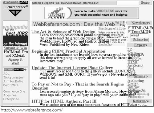
Use a simple fast-loading table at the top and an above-the-fold table underneath. Include useful contentsuch as a search box or navigation barin your first table so that users can navigate quickly. Browsers render tables sequentially, so first give your users something to look at, while the rest of your page loads. This makes your pages feel faster, even though they may load slower overall. Figure 4.3 shows an example from CNET.com's home page.

Your first table literally pops onto the screen, giving users something to work with instantly. In Chapter 1, you learned that feedback is important. When some useful content instantly appears, users are rewarded for clicking your link. Figure 4.4 shows an example from Webreference.com's home page.
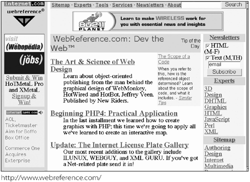
On the other hand, popping up useless content can annoy users. Showing them your logo or an ad quickly doesn't give them useful content and let them navigate your site. Figure 4.5 shows an example.

Three-Panel Layout
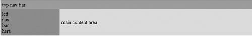
A similar strategy involves rearranging tables to raise relevance along with perceived rendering speed. A typical three-panel layout has the branding and advertising in the top row, navigation in the left column, and content on the right. For an example, see Listing 4.6.
<table> <tr> <td colspan="2"> <p>top navigation bar (branding and advertising)</p> </td> </tr> <tr> <td> <p>left navigation bar</p> </td> <td> <p>main content area</p> </td> </tr> </table>
Fortunately, a simple addition to the table element provides an alternative. Ever since Netscape 2, authors have had the ability to align tables, similar to images and modern div s. This feature allows you to align tables next to each other. Let's break up this table into three parts (see Listing 4.7).
<table> <tr> <td colspan="2"> <p>top navigation bar (branding and advertising)</p> </td> </tr> </table> <table> <tr> <td> <p>left navigation bar</p> </td> </tr> </table> <table> <tr> <td> <p>main content area</p> </td> </tr> </table>
The tables will now load individually as the HTML byte stream downloads. Now instead of waiting for one large table, the user sees the first table pop onto the screen, while the other tables load sequentially. Even though the markup may be larger, the page feels faster. Sharp-eyed readers will notice that this technique is a simulation of div s. You can achieve the same effect more efficiently with div s, but I will save that discussion for Chapter 8, "Advanced CSS Optimization."
I discovered two problems with this technique. The left table (at least in IE5 Mac) has a gap above it. You can eliminate this gap by setting cellspacing to 0. Also, because they're not part of the same table, the left and right tables can have different heights. By using the same background color as your body element for the right main content table cell, you can lessen the impact of this problem.
The Table Trick to Increase Relevance
The problem with these layout approaches is that your main content is buried below navigation and branding. Search engines typically look at the first 2K or 3K of your page, and give higher relevance to content toward the top of your page. There are two ways to raise your content higher in your markup: the rowspan trick and CSS2.
You can move your main content cell above your navigation by using the following markup (see Listing 4.8).
<html> <head> <title>The Table Rowspan Trick</title> </head> <body> <table> <tr> <td colspan="2"> <p>top navigation bar (branding and advertising)</p> </td> </tr> <tr> <td><!-- leave me empty --></td> <td rowspan="2"> <p>main content area</p> </td> </tr> <tr> <td> <p>left navigation bar</p> </td> </tr> </table> </body> </html>
The trick is the empty td in the second row and the rowspan="2" in the cell next to it. The table displays the left navigation bar with the main content on the right as before, but the main content cell appears before the navigation in the markup, raising its relevance to search engines (see Figure 4.6).
Optional Closing Tags
In theory, you can omit the closing table data ( </td> ) and table row ( </tr> ) tags from your tables, because HTML 4.01 does not require them. Netscape 3 can choke on this technique, however. You could dynamically include closing </td> and </tr> tags for Netscape 3 only, and all others could receive the more streamlined and valid table. XHTML requires these closing tags, however. For example:
<table> <tr><td>The<td>emperor <tr><td>has no<td>close </table>
Tables and Returns
Netscape 3 (and possibly earlier versions) can add extra space to your table cells if you put a return after a <td> . You can ensure that won't happen, while saving additional bytes, by removing returns after <td> tags, and removing other whitespace from your page. So instead of this:
<table> <tr> <td bgcolor="#ffcc00" align=center> <a href="/r/ex"><b>Experts</b></a> </td> </tr> <tr> <td> <a href="/3d/">3D</a><br> <a href="/dlab/">Design</a><br> ...
Do this:
<table><tr><td bgcolor="#ffcc00" align=center><a href="/r/ex"><b>Experts</b></a></td></
Colored Cells
By replacing background images with background colors, you can save space and a trip to the server. For example:
<table> <tr><td bgcolor="#ffcc00">...
This can, of course, also be done with style sheets for version 4+ browsers:
<style type="text/css"> <!-- .dark {background-color:#ffcc00;} --> </style></head> <body> <table> <tr><td class="dark"> Even better, optimize the style sheet like this:
<style type="text/css"> <!-- .d{background:#fc0;} --> </style></head> <body> <table> <tr><td class="d"> For simpler two- or even three-column layouts, you can use CSS2. You learn how this technique can save you space in Chapter 8.
![Speed Up Your Site[c] Web Site Optimization](/icons/blank_book.jpg "Speed Up Your Site[c] Web Site Optimization")
EAN: N/A
Pages: 135
- Chapter VI Web Site Quality and Usability in E-Commerce
- Chapter VIII Personalization Systems and Their Deployment as Web Site Interface Design Decisions
- Chapter X Converting Browsers to Buyers: Key Considerations in Designing Business-to-Consumer Web Sites
- Chapter XII Web Design and E-Commerce
- Chapter XVIII Web Systems Design, Litigation, and Online Consumer Behavior