| SOMETIMES A GREAT BLACK-AND-WHITE IMAGE IS ALREADY SITTING THERE WAITING FOR YOU TO CLICK ON IT The best way to create a stunning black-and-white photo is to start with a color photo and then convert it to black and white using Photoshop. If you've ever converted a color image to black and white by going under the Image menu, under Mode, and choosing Grayscale, you've probably thought "this looks so flatthere's got to be a better way." There isuse channels. It's what the pros rely on to create those amazing high-contrast, thick, rich, black-and-white images that we're all longing for. Okay, longing is probably a bit strong. How about "striving" for. Yeah, that's better. The first technique we're going to look at has been around for quite a while, but people still use it because it's so darn easy. You're basically going to look at the three color channels (in black and white), and see if one of them is better than a standard Grayscale mode conversion, and usually one of them is. However, once you've found the "one," there's usually at least one more step. Here's what to do. Step 1. | OPEN A COLOR PHOTO, THEN DUPLICATE THE IMAGE BY CHOOSING DUPLICATE FROM THE IMAGE MENU
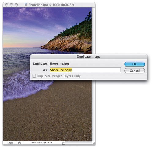
First, open the color photo you want to convert to black and white, then go under the Image menu and choose Duplicate. When the dialog appears (shown here), click OK to create a duplicate of your original document. Position this new document onscreen so you can see both the original document and the duplicate you just made (put them side-by-side if they're vertical images, or one showing above the other if they're horizontal).
 ©SCOTT KELBY | | | Step 2. | CONVERT THE ORIGINAL TO GRAYSCALE BY CHOOSING GRAYSCALE FROM THE IMAGE MENU, UNDER MODE
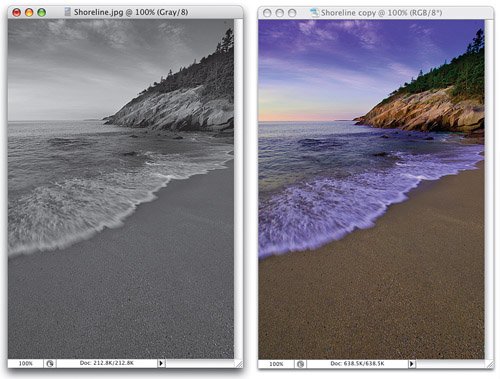
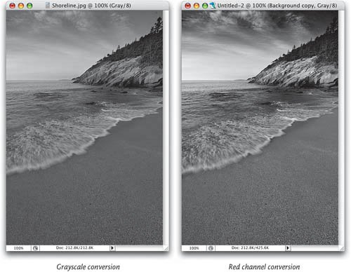
Now go back to your original document (the one on the left), go under the Image menu, under Mode, and choose Grayscale. Click OK when asked if you want to discard the color information. You're doing this so you can see what the default grayscale conversion would be, and usually it looks pretty flat. You're doing this just as your reference photothis is the photo you want your black-and-white conversion to beat. In other words, you want to make your black-and-white conversion look better than the photo on the left.
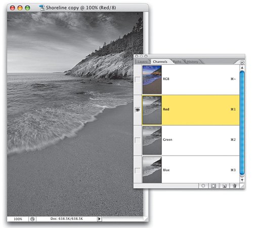
 | Step 3. | CLICK ON THE DUPLICATE IMAGE, THEN GO TO THE CHANNELS PALETTE AND CLICK ON THE RED CHANNEL
Now switch over to the duplicate image you created a few moments ago (the color one, on the right in the previous step). You're going to look at each color channel individually and see if any of these channels, as is, are better than the conversion you just did to the original image. Start by looking at the Red channelpress Command-1 (PC: Control-1) to see just that color. The channel will appear as a grayscale image (if it doesn't, go to Photoshop's Preferences [under the Photoshop menu on a Mac or the Edit menu on a PC], under Display & Cursors, and turn off Display Color Channels in Color). In this image, the Red channel looks pretty goodin fact I think the sky looks greatvery contrasty. So we're off to a good start.
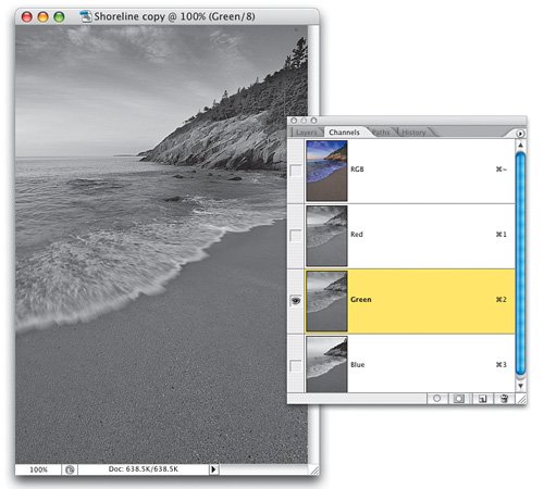
 | | | Step 4. | NOW TAKE A LOOK AT THE GREEN CHANNEL. WOULD IT MAKE A GOOD BLACK-AND-WHITE IMAGE?
Now press Command-2 (PC: Control-2) to view just the Green channel. Not bad. Good detail, but the sand looks kind of flat (to me anyway). The sky looks okay, but not as dramatic as the Red channel. The detail in the trees seems to look good (which makes sense, since it's the Green channel and the trees are green), but overall, it's not thrilling me (as you can see, creating black-and-white conversions is pretty subjective. You might be looking at this Green channel and be thinking to yourself, "That's the one I would choose," and that's perfectly fineyou have to choose the channel that looks best to you, not the one that looks best to me).
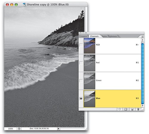
 | Step 5. | HOW ABOUT THE BLUE CHANNEL? LOOK AT IT TOO, BUT I THINK THE RED LOOKS BEST SO FAR
Lastly, here's the Blue channel. Press Command-3 (PC: Control-3) to switch to it. The sky's pretty blown out here, and the green trees on the rocks are pretty dark. The only thing I like here at all is the sand, which looks nice and dark. The water's really not too bad either. What would be great would be a combination of the sky from the Red channel, the rocks from the Green channel, and the sand and water from the Blue channel (and you'll learn how to do exactly that later in this chapter, but for now, we're just going to pick one channel for a quick and easy "beat the default" black-and-white conversion). If I had to pick one, it would be the Red channel.
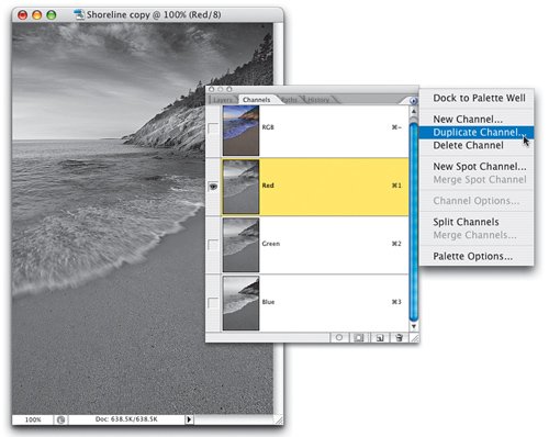
 | | | Step 6. | ONCE YOU FIND THE BEST-LOOKING CHANNEL, CLICK ON IT, THEN CHOOSE DUPLICATE CHANNEL
Okay, so let's say (for the sake of this tutorial) that we (you, me, us, they, them, etc.) like the Red channel best (I do), so click on the Red channel. Now you're going to duplicate that channel into its own separate document. That way we can treat it like it's a full image by itself, and not just a channel inside another image. To do that, go to the Channels palette, and from the palette's flyout menu, choose Duplicate Channel (as shown here).
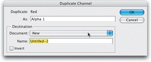
 | Step 7. | CHOOSE TO HAVE THIS DUPLICATE APPEAR IN ITS OWN SEPARATE DOCUMENT
This brings up the Duplicate Channel dialog (shown here). In this dialog, you can name your channel (don'tit's not necessary for this tutorial), but do skip down to the Destination section. By default, it assumes that when you duplicate a channel, you want the duplicate to appear in the same document you're currently using. However, we want the duplicate to appear in its own separate document (at the same size and resolution), so choose New from the Document pop-up menu (as shown here), then click OK.
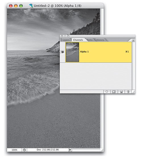
 | | | Step 8. | IT APPEARS IN MULTICHANNEL MODE, SO YOU'LL NEED TO CONVERT IT TO GRAYSCALE MODE
This creates a new document, and your channel appears in it as Alpha 1 in the Channels palette (as shown here). Now, take a look at the document's title bar at the top of the image. See how it says "(Alpha 1/8)" just to the right of the 100% magnification amount? That's basically telling you you're not in RGB mode, you're not in Grayscale mode, you're in Multichannel mode (which we'll talk about later in this book). Since we'll need to add a layer in the next step, you'll need to convert this document to a mode that accepts layers (like Grayscale mode), so go under the Image menu, under Mode, and choose Grayscale.
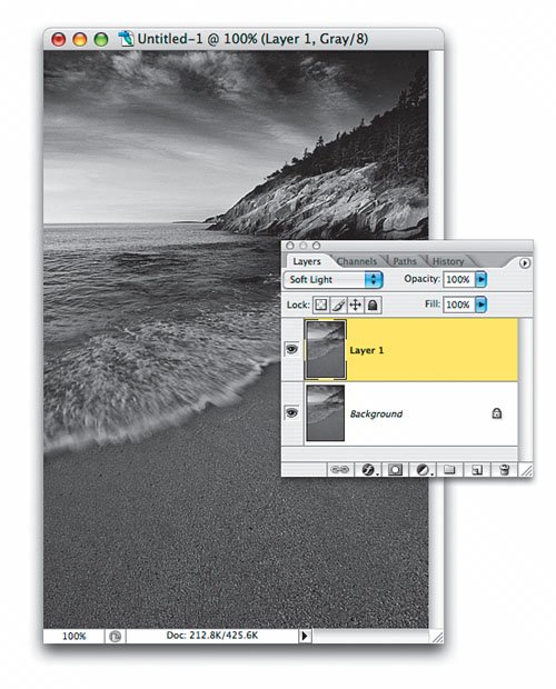
 | Step 9. | NOW DUPLICATE THE BACKGROUND LAYER AND CHANGE TO SOFT LIGHT MODE TO ADD MORE CONTRAST
Now that you're in Grayscale mode, we can use layers to give us a richer black-and-white image. Press Command-J (PC: Control-J) to duplicate the Background layer. Then change the layer blend mode (at the top left corner of the Layers palette) from Normal to Soft Light. This blends the two layers together giving us a more contrasty sand and water, while leaving details in the rocks and sky. Okay, so why did I choose Soft Light? Because I tried all of the other modes and this one looked the best. I know that sounds pretty simplistic, but it's the truth. I just went through them all, and Soft Light happened to look best for this particular photo. On another photo, Overlay or Multiply might look better.
 | | | Step 10. | BEFORE & AFTER: REGULAR GRAYSCALE CONVERSION ON THE LEFT, OUR "BEST OF THREE" ON RIGHT
Lastly, press Command-E (PC: Control-E) to merge the two layers together and complete your process of picking the best of the three color channels as the basis for your black-and-white conversion. Here's a before and after, and to me, the image on the right looks much better than the default grayscale conversion on the left. I like the sand, water, rocks, and sky better in the shot on the right. It hasn't even been sharpened yet, but it just looks sharper because of the added contrast.
 |
|