Customizing the Background
| I don't want to say the background is as important as the photo, but it's important enough that if you don't use one that complements the photo, it can pretty much wreck your slide show. Luckily, Lightroom gives you lots of control over how the Backdrop (that's what Lightroom calls it) behind your photos looks. Unfortunately, it doesn't come with a built-in "good taste" button, but if you stick with classic backgrounds (like black, white, or gray), you can have your Backdrop support and complement your photos, instead of competing with them. Step OneThe background on our slide is black (because we started customizing a slide by using the EXIF Metadata template as our starting place). But you can change that to any color you'd like (like a nice gray perhaps) by going to the Backdrop Settings panel and clicking on the black color swatch to the right of the Set Backdrop Color checkbox (as shown here). This brings up the Colors panel where you can choose which color you'd like (for a light gray, just drag the slider up above the center, as shown here). Now hide the margin guides to see how things look. 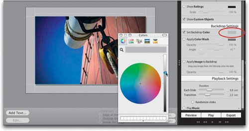 Step TwoAnother built-in background choice found in the Backdrop Settings panel is the Color Wash. When you turn on the Apply Color Wash checkbox (as shown here), it applies a diagonal gradient as your background. Luckily, you have lots of control over how that gradient is applied, as well as the color of the gradient (as you'll see in the next step). 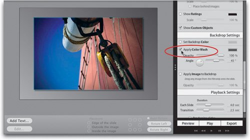 Step ThreeThe colors that appear in this gradient come from two places: (1) the first color comes from the current color chosen as your Backdrop color in the Backdrop Settings panel (look at the first small color swatch), and (2) the color set as your Color Wash color (which by default is set to a dark gray). So when you first apply this Color Wash, you get a gradient that goes from a light gray to a dark gray. If you want to change the light gray color to say...red, then click on the tiny color swatch next to the Set Backdrop Color checkbox, choose a red from the Colors panel, then close the panel by clicking on the round red button in the top-left corner. As you can see, this red-to-gray color gradient looks really awful. Luckily, it's not permanent. 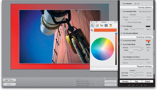 Step FourTo change the gray part of the gradient, click on the gray color swatch to the right of the Apply Color Wash checkbox and when the Colors panel appears, pick a more suitable color to go with red. I picked white here, but what this really tells us is that red to white makes a pretty stinky background gradient. You'll certainly want to pick two colors that don't get in the way of your photography (which is why the gray gradients work so well). You can also change the angle of the gradient by using either the Angle slider or the Angle wheel (they're tied together, so it doesn't matter which one you choose). Here I moved the angle so the white is on the left, and it graduates over to the red. Yecch! 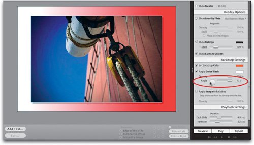 Step FiveBesides the solid color Backdrop and the Color Wash, you can also add an image as the background for your slides by turning on the Apply Image to Backdrop checkbox (circled in red here). For example, I imported two wedding photos into Lightroom: a photo of the bride and groom, and a close-up photo of a rose that I want to use as a Backdrop image. You can see them both in the filmstrip at the bottom of the Slideshow window. ©STOCKPHOTO/SANDRA O'CLAIRE AND ROB SYLVAN 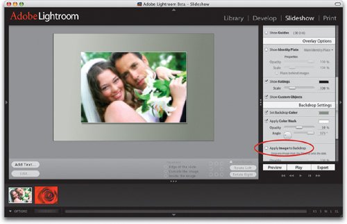 Step SixNow all you do is click-and-drag the rose photo from the filmstrip and drop it on the gray background that's currently surrounding the photo (as shown here), and that photo becomes the Backdrop. My only problem with what you see here (besides the total cliché cheesiness) is that the background photo tends to overwhelm the subject. It should be a background element not competing with the foreground, but luckily there are two ways to have it take a step back from the front of the stage. 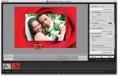 Step SevenThe first is to lower the Opacity setting of the Backdrop image using the slider at the bottom of the Backdrop Settings panel (as shown here, where I lowered it to 30%). This kind of fades the Backdrop photo a bit, and lets the main image stand out more. But there's another method I like even better, and that's to create a backscreened effect (as shown in the next step). 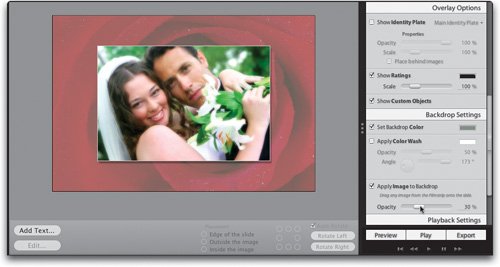 Step EightTo create the backscreen effect, click on the Set Backdrop Color swatch, and when the Colors panel appears, choose white, and then close the panel. Use the Opacity slider (at the bottom of the Backdrop Settings panel) to lower the opacity of the Backdrop image to 50%. You can see how much different this looks, as opposed to just lowering the opacity of the Backdrop image itself. A third option is to use the Color Wash, and lower the opacity of it, so your tinted Backdrop image graduates from one color to the other (it looks better than it sounds. Unless you pick red and white, of course). Now let's look at adding and editing a drop shadow behind your photo. 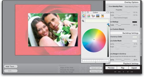 |
EAN: N/A
Pages: 71