Converting to Black and White, and Split Toning
| Since Lightroom is an application just for photographers, you knew it had to have a great way to convert color images to black and white. Luckily, not only does Lightroom have a powerful conversion tool, it takes things one step further with its built-in split toning. This lets you add subtle tints to your black-and-white highlights and shadows to give your converted photos even more depth. Here's how they both work. Step OneIf you don't want to mess with anything, and get a pretty darn good conversion to black and white, move your cursor over to the Presets Browser panel on the left side of the Develop module. Then, just hover your cursor over Grayscale Conversion (which is graphic designer speak for Black-and-White Conversion. I have no idea why, in a program for photographers, they don't just call it Black-and-White Conversion, but... well...don't get me started). In a few seconds, you'll see a preview (the thumbnail just above the Presets Browser panel) of how your converted photo will look. ©SCOTT KELBY 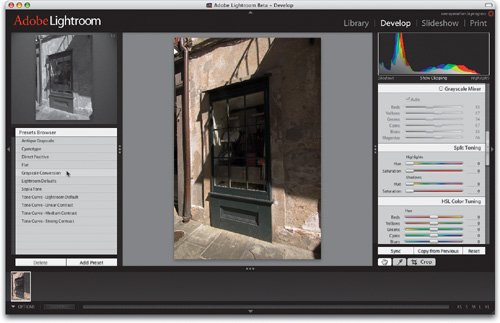 Step TwoThe reason this preset conversion usually looks good is because (and this will only make sense if you're a fairly advanced Photoshop user) it creates a conversion that's similar to using the Lightness channel of a color image in Lab mode (see, I told you you'd need to be advanced in Photoshop to get that). If you're not, just understand that it does a good quality conversion for you. To actually apply that conversion to your image, click on the Grayscale Conversion preset (as shown). 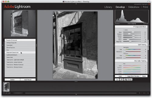 Step ThreeEven if you don't want to use this one-click Preset Browser method, I recommend that you do it at least once (how about now?), and then look over in the Grayscale Mixer panel, on the right side of the Lightroom window. This is where you'd go to manually create a grayscale (black-and-white) conversion. When you click the Grayscale Conversion preset it moves the Grayscale Mixer sliders into a position that would make a nice grayscale conversion (one similar to Photoshop's Lab conversion, which is very popular with photographers). If you want to tweak the image further, just grab a Grayscale Mixer slider and start-a-tweakin'. So, now you know another methodthe one-click preset, and honestly, it ain't bad. 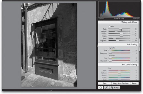 Step FourAs you can see, turning on the Auto checkbox in the Grayscale Mixer panel gives you a different conversion, which in some cases will look better, but again it's up to you to decide if you like it better or not. But here's the thing: with one click (clicking the Grayscale Conversion preset) you get a pretty good black-and-white conversion. Click once more (the Auto checkbox in the Grayscale Mixer) and you get a different version, so now you can choose between the two and decide which you like best. 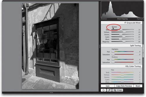 Step FiveTo further fine-tune your black-and-white conversion, of course you can drag the Grayscale Mixer sliders (to the right to make that color channel lighter, and to the left to make it darker), or use the Exposure and Blacks sliders in the Basic panel. For a quick way to see your photo with some subtle tone changes, scroll back up to the White Balance pop-up menu in the Basic panel and try different white balance settings. Even though your image is now black and white, you can still effect subtle changes in tone by choosing different White Balance settings from the pop-up menu (as shown here). 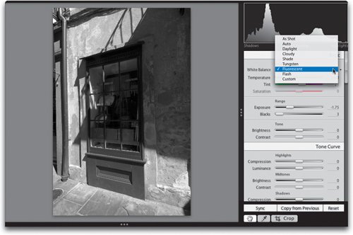 Step SixThere's one more control that can come in real handy for getting those nice high-contrast black-and-white conversions (after you've done all the other things I've just outlined). Go back to the Basic panel and increase the overall contrast by dragging the Contrast slider to the right. I know, that probably seems obvious (dragging the Contrast slider to add more contrast), but sometimes the most obvious things get overlooked because we think to ourselves, "This must be complicated." Take a look at our black-and-white conversion now, after I dragged the Contrast slider to the right (as shown here). So now you've got a number of different ways to convert to black and white, or you can stack them one on top of another, trying one method, then adding the next one, and then the next, etc. 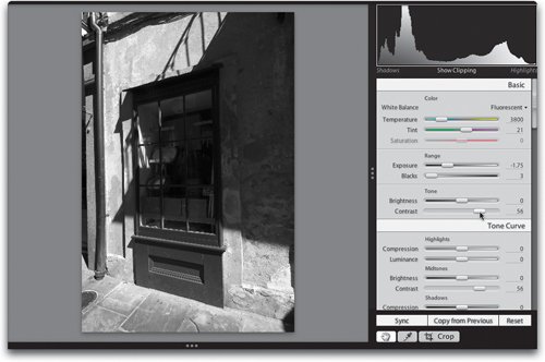 Step SevenNow that you've got a black-and-white photo, you can add a split toning effect (if you like). With split toning, you apply one tint to the highlight areas of your photo and a different tint to the shadows, and if done right (in other words, subtly), it can add some nice depth to your photos. You start by going to the Split Toning panel. If you drag the Highlights Hue slider to the right (as shown here), not a dang thing happens. That's because you also have to increase the Saturation amount (on the slider directly below Hue) or you don't see anything onscreen, because the Saturation slider is set to 0 (zero). 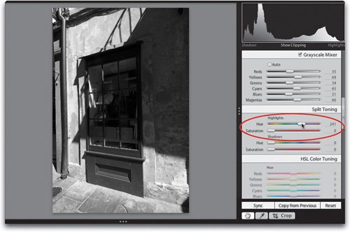 Step EightBecause you need two different sliders to make this work, you'll want to know about this trick that makes the Hue slider work. If you press-and-hold the Option key while you drag the Hue slider, it temporarily shows you the tint color as if the Saturation amount was set to 100%. Now, I have to tell you, this makes everything look too colorful (as shown here), and the key to this effect is subtlety, but it beats the heck out of guessing, or having to use two sliders to see one tint. 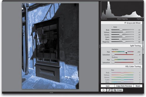 Step NineOnce you find your tint, here's what you have to do next: release the Option key and your photo returns to a regular black-and-white photo, but your Hue slider is in the right position. Now you just slowly drag the Saturation slider to the right to bring in the tint in the highlights. Again, this should be subtle (notice the subtle blue tint in the photo shown here). 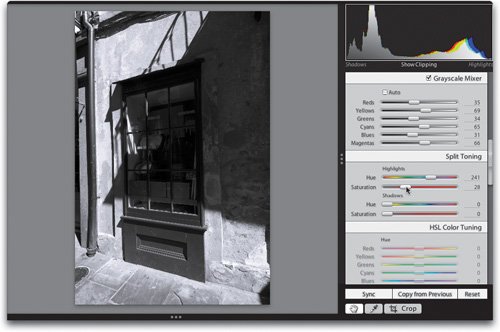 Step TenSince you used the Hue slider in the Highlights section, you've just affected the highlights in your image, and split toning is about two tintsone in the highlights and one in the shadows, so now you're going to do the same thing in the Shadows section of the Split Toning panel. Press-and-hold the Option key and drag the Shadows Hue slider to choose the tint you want for your shadow areas (in this case, I chose kind of a sepia tone). Again, your color will look too intense (as shown here), but don't forget, this is just because it's simulating what the hue would look like if the saturation was set at 100%. 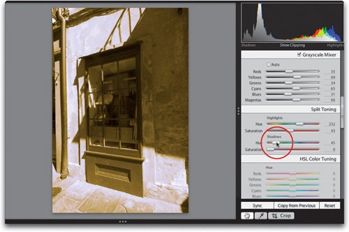 Step ElevenRelease the Option key and, again, your photo returns to black and white, but your Hue slider is set at the tint you wanted. Now slowly drag the Saturation slider to the right to bring the tint into the shadow areas (as shown here). 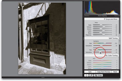 Tip If you're not going to be using the Presets Browser panel on the left side of Lightroom's interface, then you might as well tuck it out of sight, which gives you a much larger Preview area for your photo (especially when the photo is in landscape orientation). Just click anywhere along the far-left edge of Lightroom's interface and that panel and its options will be tucked away. To bring it back, just move your cursor back over that area. Step TwelveNow, in our example, we used blue for the highlights and a sepia tone for the shadows, but you can just as easily switch the two and apply blue to the shadows (as shown here) by dragging the Shadows Hue slider to the blue area of the slider and dragging the Highlights Hue slider to the sepia tone color. Other popular split toning combinations are to use cyan in the highlights and blue in the shadows; yellow in the highlights and green in the shadows; or red in the highlights and yellow in the shadows. It's worth trying at least a few of these combinations to find out which work best with your photo. 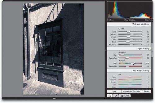 |
EAN: N/A
Pages: 71