GET SUPER-CLEAN TYPE FOR THE WEB
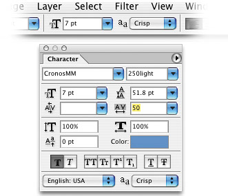
| If you've been faced with having to create small type on the Web (usually 12 points or below), you know the smaller you go, the blurrier your type gets. That's because of the anti-aliasing that's automatically applied to the type, which works fine at larger sizes but tends to run together at smaller sizes, making your type look fuzzy. You can adjust the amount of aliasing (from the Options Bar), but here's a tip that many Web designers feel works even better: Once you get below 12 points, start adding positive tracking to your type (anywhere between 20 to 50 points) in the Character palette. This increases the amount of space between letters and, therefore, decreases the amount of blurriness. Increasing the space between your letters this way minimizes the effects of anti-aliasing and makes your type cleaner and more readable at smaller sizes. As a general rulethe smaller the type, the larger the tracking amount.
|
EAN: 2147483647
Pages: 429