Building a GUI: Components, Containers, and Layout Managers
Building a GUI: Components , Containers, and Layout ManagersIn the first phase of the GUI building process, the focus is on the look of a GUI. To achieve this look, you'll work with the windowing toolkit's components, containers, and layout managers. However, before exploring these entities, you should have a basic understanding of the system toolkit and peers. Exploring the System ToolkitThe windowing toolkit (along with the rest of the AWT) interacts with the system toolkit to carry out windowing system-specific tasks on its behalf . Tasks range from acquiring system-specific details (such as system color model, system clipboard, system event queue, screen size , font metrics, print jobs, and so on) to beeping the speaker and getting images. The system toolkit is represented by an object created from a subclass of the abstract Toolkit class (located in the java.awt package). Call Toolkit 's getDefaultToolkit method to obtain this object. (You can also retrieve the system toolkit by calling any component object's getToolkit method.) To show some of the system toolkit's features, the source code to an application called SystemInfo is presented in Listing 14.1. This application retrieves the system toolkit and then calls some of its methods . Listing 14.1 The SystemInfo Application Source Code // SystemInfo.java import java.awt.*; class SystemInfo { public static void main (String [] args) { Toolkit tk = Toolkit.getDefaultToolkit (); System.out.println ("Color model = " + tk.getColorModel ()); System.out.println ("Menu shortcut key mask = " + tk.getMenuShortcutKeyMask ()); System.out.println ("AWT.control = " + tk.getProperty ("AWT.control", "")); System.out.println ("Screen resolution = " + tk.getScreenResolution ()); Dimension d = tk.getScreenSize (); System.out.println ("Screen width = " + d.width); System.out.println ("Screen height = " + d.height); System.out.println ("System clipboard = " + tk.getSystemClipboard ()); System.out.println ("System event queue = " + tk.getSystemEventQueue ()); tk.beep (); System.exit (0); } } Note SystemInfo concludes by calling System.exit. Without this method call, SystemInfo would appear to "hang." In other words, it would not return to its caller. The reason for this strange behavior is as follows : The system toolkit is created when getDefaultToolkit is called. During toolkit creation, the windowing system-specific AWT library is loaded and a pair of threads is created to manage this library. (One of these threads handles events and the other thread handles screen maintenance.) Both threads enter infinite loops . Because neither thread is a daemon thread, SystemInfo will not terminate when the thread that executes its main method terminates. However, by calling System.exit, all threads (including AWT threads) are forced to terminate. SystemInfo exits! System toolkit methods are called either directly or behind the scenes. One of these methods (often called by JFC applications) is getImage. Because a JFC application cannot call Applet 's getImage methods, it must call Toolkit 's getImage methods as shown in the previous chapter. (For more information on Toolkit, check out the SDK documentation.) Exploring Peers, Heavyweights, and LightweightsComponents and containers are managed by objects on the AWT "side of the fence" and peers (native code and data) on the host operating system/windowing system side. In other words, each component and container is the integration of an object and its peer. The relationship between these entities is managed by the windowing toolkit, and is illustrated in Figure 14.3 by way of a Button object (created from the Button class, which is located in the java.awt package) and its corresponding peer. Figure 14.3. A button component consists of a Button object and its button peer. When Java is ported to a new windowing system, a special set of classes is included in the port. These classes are known as peer classes because their methods communicate directly (by way of the Java Native Interface, JNI) with windowing system peers. Each peer class implements a peer interface (located in the java.awt.peer package). This interface identifies those methods that a peer class is obligated to implement, and that a component object will call to do its work. For example, the Button class contains a setLabel method for setting a button's label. When this method is called via a Button object, setLabel calls ”via a peer object ”the setLabel method (as specified by the ButtonPeer interface) that's implemented in Button 's peer class. In turn , the peer class' setLabel method uses JNI to call into the windowing system so that this label is displayed on the button peer. A component that has its own peer, with an opaque native window (another name for drawing surface), is known as a heavyweight component . For example, when you create a visible button, what you see on the screen is the peer's opaque native window. The windowing system is responsible for creating and maintaining (such as painting) this window. (All windowing toolkit components are heavyweight.) There are a couple of problems with heavyweight components:
In contrast, a lightweight component is a component that reuses the opaque native window of its closest heavyweight ancestor . For example, if you create a class that inherits from the Component class, and then create an object from this subclass, you've created a lightweight component. This component will reuse the opaque native window of Component 's peer class ”its closest heavyweight ancestor ”and will perform all drawing on this window. Note The AWT does not include any lightweight components. Therefore, you'll need to create your own (if you're in need of such components). Sun provides an example of a lightweight round button component, by creating a RoundButton class that inherits from the Component class. This example is part of an article called "Java AWT: Lightweight UI Framework" ”located at http://java.sun.com/products//jdk/1.2/docs/guide/awt/designspec/lightweights.html. Lightweight components solve a heavyweight component's problems:
It is usually not a good idea to mix heavyweight and lightweight components, because the heavyweight component is always displayed on top of the lightweight component when these components overlap. This can lead to confusing problems, especially if you mix heavyweight AWT components with lightweight Swing components. Note If you would like more information on heavyweight versus lightweight components, and mixing these components, please read The Swing Connection's "Mixing heavy and light components" article ”located at http://java.sun.com/products/jfc/tsc/articles/mixing/index.html. Exploring ComponentsChoosing appropriate components is the first step in building a GUI. You should explore the windowing toolkit's components and find out what they have to offer, before making these choices. The abstract Component class (located in the java.awt package) is the ultimate parent class of nonmenu component classes. Getting to know Component requires a fair bit of studying because it offers more than 160 methods! However, you'll discover that many of these methods are designed to be used by the windowing toolkit and not by you. As a result, you only need to become familiar with some of these methods. This study begins by examining those methods that govern a component's color, cursor (an icon that identifies the appearance of the mouse pointer), font, and locale (a combination of region, country, and language codes). Table 14.1 presents these methods. Table 14.1. Component 's color, cursor, font, and locale Methods
As you work your way through Table 14.1, you'll come across a few references to a component's parent. This parent is the container that contains the component. To retrieve this parent, call Component 's getParent method. The appearance of a mouse pointer depends on the cursor assigned to the component over which the mouse pointer is hovering . As Table 14.1 indicates, Component 's setCursor method can be called to set the component's cursor and its getCursor method can be called to return the component's cursor. These methods work with objects, created from the Cursor class, that represent cursors . The Cursor class (located in the java.awt package) identifies a variety of predefined cursors by way of various constants. For example, Cursor.HAND_CURSOR identifies a hand-shaped (or equivalent) cursor, whereas Cursor.WAIT_CURSOR identifies an hourglass-shaped (or equivalent) cursor. Call Cursor.getPredefinedCursor to retrieve one of these cursors. You can then pass this cursor to setCursor for a given component object. When the mouse pointer moves over the object's peer, the appearance of this pointer will change to the cursor's icon. This is demonstrated in the following code fragment, by way of a Button object: Button b = new Button ("Hand Cursor"); b.setCursor (Cursor.getPredefinedCursor (Cursor.HAND_CURSOR)); In addition to color, cursor, font, and locale methods, Component provides methods for positioning and sizing a component. Many of these methods are called by the windowing toolkit (behind the scenes) when working with a layout manager to lay out components. (With the exception of getSize, you wouldn't normally call any of these methods, unless you are creating your own layout manager.) Table 14.2 presents some of Component 's positioning and sizing methods. Table 14.2. Component 's Positioning and Sizing Methods
To be useful, a component might need pixels rendered on its drawing surface. Rendering is a two-step process (because a component is a combination of a peer and an object). First, the peer renders its own pixels. This presents the unadorned component. After the peer is finished, the windowing system notifies the AWT. Second, the AWT's windowing toolkit calls the object's paint method. Code placed in this method calls the methods of its Graphics argument to render a layer of pixels on top of the peer's pixels, customizing the component for the Java program's own use. Consider the following example. A button peer will render its pixels when first made visible, resized, or it sustains damage. (Damage occurs when a container that partially or completely obscured a component is removed so that the hidden portion of the component is now exposed.) It's possible to subclass the button's Button class and override its paint method. As a result, a layer of pixels can be rendered on top of the button peer's pixels. To see how this is done, Listing 14.2 presents source code to the MangledButtonDemo application. This application draws pixels on top of a button peer's pixels. Note Don't worry about those portions of the program that have not yet been explained. (They are explained in later sections of this chapter.) What's important is to see how a layer of pixels can be rendered on top of a peer's existing pixels. Listing 14.2 The MangledButtonDemo Application Source Code // MangledButtonDemo.java import java.awt.*; import java.awt.event.*; class MangledButtonDemo extends Frame { MangledButtonDemo (String title) { super (title); addWindowListener (new WindowAdapter () { public void windowClosing (WindowEvent e) { System.exit (0); } }); add (new MangledButton ("OK")); setSize (200, 100); setVisible (true); } public static void main (String [] args) { new MangledButtonDemo ("Mangled Button"); } } class MangledButton extends Button { MangledButton (String label) { super (label); } public void paint (Graphics g) { g.setColor (Color.red); int w = getSize ().width - 1; int h = getSize ().height - 1; g.drawLine (0, 0, w, 0); g.drawLine (w, 0, w, h); g.drawLine (w, h, 0, h); g.drawLine (0, h, 0, 0); g.drawLine (0, 0, w, h); g.drawLine (w, 0, 0, h); } } When you run MangledButtonDemo, you'll see some red lines drawn over the button peer's pixels. The button is first rendered by the peer. In response to a notification from the windowing system, the windowing toolkit calls paint to render a layer of pixels (consisting of diagonal lines) over the peer's pixels. The result is shown in Figure 14.4. Figure 14.4. Combining peer and object drawing results in a mangled button. The paint, repaint, and related methods originate in the Component class and form the basis of the windowing toolkit's painting model. Table 14.3 presents some of these methods. Table 14.3. Component 's Painting Model Methods
It's necessary to distinguish between system-triggered painting and application-triggered painting, to understand the painting model. System-triggered painting occurs when the system requests a component to render a layer of pixels on its drawing surface. This is accomplished by the screen maintenance thread calling the component's paint method. System-triggered painting occurs when a component is first made visible, a component is resized, or a component has sustained damage that must be repaired. In contrast, application-triggered painting occurs when an application (or applet) "asks" the windowing toolkit to render a layer of content. In other words, the application/applet initiates the painting request. This is accomplished by the program calling one of the component's overloaded repaint methods. In response, the screen maintenance thread calls the component's update method at its earliest convenience. Application-triggered painting occurs when the program has "decided" to update a component's drawing surface due to a change in the component's internal state. The default implementation of update first clears a component's drawing surface (if the component is a canvas, dialog, frame, panel, or window) and then calls paint. Regardless of paint being called by the system or by update, its Graphics argument is initialized to a current color that is obtained from the component's foreground color, a current font that is obtained from the component's font, and a clipping rectangle that is calculated to encompass the area of the component that needs to be rendered. Tip It is usually not a good idea to place rendering code in any method apart from paint or update. The reason is that this code might be called at inappropriate times. For example, it could be called prior to a component becoming visible or prior to it having access to a valid graphics context. If you need to update a component from some method apart from paint or update, call one of the component's repaint methods. The update method is a hook that a program can use to handle the application-triggered painting request differently from a system-triggered painting request. Whereas a program assumes that a call to paint implies damage to the component's drawing surface, this assumption cannot be made when update is called. As a result, a program can perform incremental painting (the capability to render graphics in a sequence of steps). This is useful when only rendering newly generated graphics (for performance reasons) and keeping existing graphics displayed. Incremental painting can be demonstrated by the IncPaintDemo applet. Its source code is presented in Listing 14.3. Listing 14.3 The IncPaintDemo Applet Source Code // IncPaintDemo.java import java.awt.*; import java.util.*; import java.applet.Applet; public class IncPaintDemo extends Applet implements Runnable { private Thread animator; private int pointsPainted; private Vector v = new Vector (); public void start () { if (animator == null) { animator = new Thread (this); animator.start (); } } public void stop () { animator = null; } public void run () { int w = getSize ().width; int h = getSize ().height; Thread cur = Thread.currentThread (); while (cur == animator) { v.add (new Point ((int) (Math.random () * w), (int) (Math.random () * h))); repaint (); try { Thread.sleep (15); } catch (InterruptedException e) { } } } public void paint (Graphics g) { int np = v.size (); pointsPainted = 0; for (int i = 0; i < np; i++) draw (g, i); } public void update (Graphics g) { for (int i = pointsPainted; i < v.size (); i++) draw (g, i); } private void draw (Graphics g, int index) { Point p = (Point) v.elementAt (index); g.drawLine (p.x, p.y, p.x, p.y); pointsPainted++; } } IncPaintDemo uses a background thread to create Point objects and add them to a Vector data structure. This thread calls repaint every 15 milliseconds . In response, the screen maintenance thread calls update to render only the most recently added point (or points if several points are created before update gets called). It's important to note that only new points are rendered by update. If a user moves a window over IncPaintDemo 's drawing surface, the windowing toolkit calls the paint method. In response, paint renders all points. A component exists in one or more states. These states include valid, visible, showing, and enabled. To be valid , the windowing system must know the component's size. If the component is a container, its layout manager must be aware of all components that belong to the container and these components must already have been laid out. If a component's size has changed since the last time it was displayed, it becomes invalid. If the component is a container and any of its components become invalid, the container also becomes invalid. To be visible , a component must be added to a container (whether or not the container is visible). To be showing , the component must be seen by a user. (A component is showing after it and its container are visible.) Finally, to be enabled , the component must be able to accept input from a user. Table 14.4 presents some of Component 's state methods. Table 14.4. Component 's State Methods
When you are creating dialogs, the concept of focus (the ability to receive keyboard input) becomes important. You need to be able to determine which component has the current focus and how to transfer this focus from one component to another. Table 14.5 presents Component 's focus methods. Table 14.5. Component 's Focus Methods
To wind up this investigation, Component provides several useful methods ( ranging from pop-up menu support to debugging) that fall into a miscellaneous category. Table 14.6 presents some of these methods. Table 14.6. Component 's Miscellaneous Methods
Although quite a few methods have been presented, there are still many other methods provided by Component. Keep this in mind when examining its subclasses. If you cannot find a method in one of these subclasses, there's a good chance this method is located in Component. The abstract MenuComponent class (located in the java.awt package) is the ultimate parent class of menu component classes (such as PopupMenu ). These components range from simple pop-up menus to menu bars with drop-down menus. ( MenuComponent does not inherit from Component. ) Unlike Component, MenuComponent has far fewer methods. These methods include getFont and setFont for getting and setting the font used to display menu text, as well as methods dedicated to event handling. If you need to obtain the menu component's parent, you can call MenuComponent 's getParent method. (For more information on MenuComponent, check out the SDK documentation.) Now that you've been introduced to Component and MenuComponent, it's time to explore their subclasses. The windowing toolkit organizes these subclasses in a hierarchical fashion as shown in Figure 14.5. ( Component and MenuComponent are shown in gray because they are abstract classes.) Figure 14.5. The windowing toolkit organizes component classes into a hierarchy. Before exploring the classes that belong to this hierarchy, take a look at Figure 14.6. This figure shows the Windows 98 peers associated with the objects created from these classes. (Menu short cuts and separators are also shown. These concepts will be explained when menus are discussed.) Figure 14.6. The windowing toolkit provides a gallery of components. ButtonsOf all the various components, buttons are probably the most familiar. For example, dialog boxes often contain OK and Cancel buttons. These buttons give users the ability to close a dialog box with changes either saved (when OK is clicked) or discarded (when Cancel is clicked). Objects created from the Button class (located in the java.awt package) represent buttons. Call the Button () constructor to create a button with no label. If you want a button to be created with a label, call the Button (String label) constructor. The label argument contains the characters that will appear on the button peer's label. At any time, you can add a label by calling setLabel or retrieve the current label by calling getLabel. To see some of Button 's methods in action, check out the following code fragment: Button b1 = new Button ("OK"); Button b2 = new Button (); // some time later in the program b2.setLabel ("Cancel"); System.out.println (b1.getLabel ()); Although events have not yet been discussed, Button provides a pair of methods that are used in conjunction with event handling: setActionCommand and getActionCommand. Call setActionCommand to assign a string-based command identifier to a button. This identifier uniquely identifies that button. When a button-related event occurs, call getActionCommand to return the identifier assigned to the button that triggered the event. (If setActionCommand is not called for some button, getActionCommand returns the button's label instead of an identifier.) Tip In an internationalized program, a button's label consists of text obtained from a user's locale. For example, when run in a French locale, the button's text consists of French characters. In contrast, this text consists of German characters when run in a German locale. If setActionCommand is not called to assign an arbitrary identifier, getActionCommand returns this locale-dependent text. Complex decision logic is required to differentiate between a pair of buttons when locale-dependent text is involved. For example, you would need to compare a button's German text with an embedded string of German text (when your code detects that German is the current locale), French text with an embedded string of French text (if a French locale is detected ), and so on. When setActionCommand is used, you can detect a button with a single comparison against the previously assigned identifier. CanvasesDown through the centuries, impressionists and other artists have expressed their creativity by applying paint to canvas. Although computer art has replaced paint with light, the canvas concept is still prevalent . Therefore, it's not surprising to discover that the windowing toolkit provides a Canvas class (located in the java.awt package) for modeling canvases. You will never work directly with Canvas because its paint method is inherited from Component and does nothing. You must subclass Canvas and override paint to achieve something interesting. When you create this subclass, you will also override getPreferredSize (inherited from Component ) to specify the dimensions of your canvas. The following code fragment shows how you would declare a subclass that represents a more useful canvas: class Surface extends Canvas { public Dimension getPreferredSize () { return new Dimension (100, 100); } public void paint (Graphics g) { Dimension d = getSize (); g.setColor (Color.red); g.drawLine (0, 0, d.width, d.height); g.drawLine (d.width, 0, 0, d.height); } } Objects created from the Surface class represent specialized canvases. The following code fragment creates a Surface object: Surface s = new Surface (); A Surface canvas occupies a region with dimensions of 100 100 pixels. These dimensions are used behind the scenes, by a layout manager, to ensure that at least this much room is reserved for this component. Check Boxes and Check Box GroupsGUIs use check box components to give users a choice between two possibilities. When the user clicks a check box, either a check mark appears to indicate a Boolean true state (the item represented by the check box has been chosen) or the check mark vanishes to indicate a Boolean false state (the item is no longer chosen ). Check boxes are often associated with labels (displayed beside them) to identify the items they represent. Objects created from the Checkbox class (located in the java.awt package) represent check boxes. Call the Checkbox () constructor to create a check box with no label. The initial state of this component is false and no check mark is displayed. If you want to provide a label when creating a check box, call the Checkbox (String label) constructor. As with the previous constructor, no check mark is displayed. Finally, if you want to display a label and a check mark during check box creation, call the Checkbox (String label, boolean state) constructor. Passing true as the state argument's value causes a check mark to be displayed. You can specify a label by calling setLabel and retrieve the current label by calling getLabel. Furthermore, you can set the check box state by calling setState and retrieve its current state by calling getState. The following code fragment shows how to create check boxes and call some of these methods: Checkbox cb1 = new Checkbox ("Married"); Checkbox cb2 = new Checkbox (); System.out.println (cb1.getState ()); cb2.setLabel ("Single"); cb2.setState (true); At times, you want to group multiple check boxes to achieve a this-or-that scenario. In effect, you want to create a group of radio buttons . Only one of the buttons in this group can be selected at any point in time. The CheckboxGroup class (located in the java.awt package) works with Checkbox to achieve the effect of radio buttons. You call the CheckboxGroup () constructor to create a grouping object and then add Checkbox objects to this group. However, only check boxes created by calling a Checkbox constructor with a CheckboxGroup argument can be placed in a group. The following code fragment demonstrates grouping three check boxes into one group: CheckboxGroup cbg = new CheckboxGroup (); Checkbox cb1 = new Checkbox ("Left justify", true, cbg); Checkbox cb2 = new Checkbox ("Center justify", false, cbg); Checkbox cb3 = new Checkbox ("Right justify", false, cbg); Any check box belonging to a group can be selected by calling CheckboxGroup 's setSelectedCheckbox method. If you want to know which check box is currently selected, call getSelectedCheckbox. The following code fragment builds on the previous fragment to illustrate these methods: if (cbg.getSelectedCheckbox () == cb1) cbg.setSelectedCheckbox (cb2); ChoicesChoices are drop-down lists of textual items. One of these items is displayed along with a down arrow button. When this button is clicked, a scrollable window appears from which a user can make a choice. This window disappears after an item has been selected. As a result, choices conserve GUI space. Objects created from the Choice class (located in the java.awt package) represent choices. Call the Choice () constructor to create a choice with an initially empty list. To add items to a choice, call either of Choice 's add or insert methods. The add method appends an item to the end of a choice's list whereas insert adds an item at a specified position in this list. In contrast, you can remove an item by calling either of Choice 's two overloaded remove methods. If you want to remove all items, call removeAll. Each item is associated with a zero-based integer index. You can retrieve an item at a specified index by calling getItem. You can find out how many items are currently maintained in the choice's list by calling its getItemCount method. Furthermore, you can specify which item is currently selected by calling either of two overloaded select methods. One of these methods requires the index of the item to be selected. When a selection event originates from a choice, you can find out which item was selected by calling getSelectedItem. This method returns null if there are no items in the choice's list. If you are more concerned about the selected item's index, call getSelectedIndex. This method returns -1 if there are no items in the choice's list. The following code fragment shows how to create a Choice object and demonstrates calls to some of its methods: Choice countries = new Choice (); countries.add ("Albania"); countries.add ("Algeria"); countries.add ("Bahrain"); countries.add ("China"); // and so on ... System.out.println (countries.getItemCount ()); countries.insert ("Canada", 2); // Canada precedes China in AZ order. To perform an insert, the index passed to the insert method must be the index of an item that immediately precedes the item being inserted. ( Bahrain is assigned index 2 and immediately precedes Canada. ) Caution If you don't use care when specifying indexes, an IllegalArgumentException object will be thrown. Valid indexes range from zero through one less than getItemCount 's return value. LabelsLabels exist to identify the purposes of other components. For example, a label can be used to identify a text field as a place to enter a person's name. Without this label, would the text field refer to a name or an address, or something else? You've already seen two kinds of dedicated labels: button labels and check box labels. However, the Label class (located in the java.awt package) makes it possible to create generic labels that identify any kind of component. Label declares three read-only class fields called LEFT, CENTER, and RIGHT. These fields are useful for aligning a label's text against the left-hand side, center, or right-hand side of its window. (The default alignment is LEFT. ) Call the Label () constructor to create a label with no text and a default LEFT alignment. To create a label with predefined text, call the Label (String text) constructor. Once again, LEFT alignment is the default. Finally, to specify a label's text and alignment during construction, call the Label (String text, int alignment) constructor. You can change a label's text by calling setText and you can retrieve this text by calling getText. A label's alignment can be changed by calling setAlignment and retrieved by calling getAlignment. The following code fragment shows how to create Label objects and demonstrates these text and alignment methods: Label l1 = new Label (); Label l2 = new Label ("Center aligned", Label.CENTER); l1.setText ("Right aligned"); l1.setAlignment (Label.RIGHT); System.out.println (l1.getAlignment ()); System.out.println (l2.getText ()); ListsLists and choices are similar components. They give a user the ability to select textual items from a scrollable window. However, unlike a choice, a list's window does not drop down. Instead, it displays items in a certain number of onscreen rows (one item per row). If there are more items than onscreen rows, a scrollbar is displayed to allow a user to scroll non-displayed items into view. Furthermore, a list allows users to select multiple items (which is not possible with choices). This capability is governed by a list's selection mode: single selection (only one item can be selected at a time) or multiple selection (more than one item can be selected at a time). The List class (located in the java.awt package) creates objects that represent lists. Call the List () constructor to create a list that displays four visible rows of items and does not allow multiple items to be selected. You can increase the number of visible rows by calling the List (int rows) constructor. As with the previous constructor, multiple items cannot be selected. If you want control over both the number of visible rows and whether or not the user can select multiple items, call the List (int rows, boolean multipleMode) constructor. Passing a true value as the multipleMode argument will allow a user to select multiple items. Note You can determine if a list is operating in multiple selection mode by calling the isMultipleMode method; you can change a list from single selection mode to multiple selection mode by calling setMultipleMode. After you've created a List object, call either of its two overloaded add methods to add items either to the end of the list or at some position in the list. You can also remove an item by calling either of List 's two overloaded remove methods. To remove all items, call removeAll. As with choices, each list item is associated with a zero-based integer index. Given a valid index, the getItem method retrieves an item at this index. If you want to know how many items are currently maintained by a list, call getItemCount. You can select one or more items (depending on the selection mode) by calling the select method. To deselect an item, call deselect. If you want to know whether an item has been selected, call the isIndexSelected method. When a selection event originates from a list, you can find out which item was selected by calling getSelectedItem. If there are no items in the list, this method returns null. If you are more concerned about the selected item's index, call getSelectedIndex. This method returns -1 if there are no items in the list. (These methods assume that the list is operating in single selection mode. In multiple selection mode, you would call getSelectedItems and getSelectedIndexes. ) The following code fragment shows how to create a List object and demonstrates calls to some of its methods: List magazines = new List (); magazines.add ("Byte"); magazines.add ("Dr. Dobbs"); magazines.add ("Javaworld"); // and so on ... System.out.println (magazines.getItemCount ()); magazines.setMultipleMode (true); MenusThe windowing toolkit supports the creation of menu-driven GUIs. These GUIs have a menu bar situated at the top of a window with a list of menu names appearing on this bar. Selecting one of these names causes a menu to drop down. This menu consists of one or more menu items that are text-based commands for handling tasks. Some of these menu items can be checked to represent state. For example, a ruler menu item might be checked to indicate that a ruler should be displayed in a word processor program. A special keystroke combination can be assigned to a menu item to speed up access. This keystroke combination is known as a menu shortcut . The following classes (all located in the java.awt package) work together to implement menus:
The MenuBar class creates objects that represent menu bars. Call the MenuBar () constructor to create a menu bar. Menus are added to a menu bar by calling MenuBar 's add method and removed by calling either of its two overloaded remove methods. To obtain a specific menu, call getMenu. If you need to know how many menus have been added, call getMenuCount. Menu bars typically display a special Help menu on their extreme right. Call setHelpMenu to designate the Help menu. To find out which menu is the Help menu, call getHelpMenu. MenuBar provides a shortcuts method that conveniently enumerates all menu shortcuts assigned to menu items. Given a menu shortcut, you can obtain the associated menu item by calling MenuBar 's getShortcutMenuItem method. If you want to remove a shortcut, call deleteShortcut. A menu bar doesn't accomplish very much without menus. Menus are represented by objects created from the Menu class. Call the Menu () constructor to create a menu without a label. Caution If a label is not specified and the menu is added to a menu bar, the menu will not appear on the bar. However, in Windows, the menu can still be accessed by pressing F10 to activate the menu bar and using the left- and right-arrow keys to navigate. In most cases, you'll want to assign a label (such as File, Edit, View, and so on) to a menu. This can be accomplished by calling the Menu (String label) constructor. After you have a menu, you need to add menu items. This is done by calling the add (String label) method, with the menu item's text specified by label. If the menu item is a checked menu item, call the add (MenuItem mi) method to add menu item mi to the menu. (This method is called because a checked menu item is created from the CheckboxMenuItem class and you cannot pass a CheckboxMenuItem object to the add (String label) method.) Both add methods append the menu item to the end of a menu. If you need to insert a menu item between existing menu items, call either of two overloaded insert methods. When you want to remove a menu item, call either of Menu 's two overloaded remove methods. Sometimes, you want to separate menu items into logical groups. This can be accomplished by adding separators (horizontal lines that divide menu items into visible groups) to menus. Call addSeparator to append a separator to a menu or insertSeparator to insert a separator between two menu items. When you are dynamically creating menus, you'll probably call getItem to obtain a menu item and getItemCount to find out how many menu items have been added to a menu. To create menu items, you'll need to work with the MenuItem class. Objects created from the MenuItem class represent menu items. Call the MenuItem () constructor to create an object with no label or menu shortcut. If you want a label (which is normally the case), call MenuItem (String label). To specify both a label and a menu shortcut, call MenuItem (String label, MenuShortcut s). You can assign a label at a later time by calling setLabel and you can assign a menu shortcut by calling setShortcut. To retrieve the current label, call getLabel. To retrieve the current menu shortcut, call getShortcut. Menu items can be enabled or disabled. When disabled, they appear grayed out and don't respond to keyboard/mouse input. Call setEnabled with an appropriate Boolean argument value to control this state. If you want to determine a menu item's current state, call isEnabled. As with buttons, call setActionCommand to assign a string-based command identifier to a menu item. This identifier uniquely identifies that menu item. When a menu-related event occurs, call getActionCommand to return the identifier assigned to the menu item that triggered the event. (If setActionCommand is not called for some menu item, getActionCommand returns the menu item's label instead of an identifier.) Objects created from the CheckboxMenuItem class represent check box menu items. Call the CheckboxMenuItem () constructor to create a check box menu item without a label and a state that is initially unchecked. To specify a label, call CheckboxMenuItem (String label). If you also want to specify an initial checked state, call CheckboxMenuItem (String label, boolean checked) and pass a true value as the checked argument. You can change a check box's label or retrieve its current label by calling the setLabel and getLabel methods, respectively. These methods are inherited from MenuItem. You can also change the checked state by calling setState and you can retrieve this state by calling getState. Objects created from the MenuShortcut class represent menu shortcuts. Call the MenuShortcut (int key) constructor to create a menu shortcut using the specified key. (Key constants can be found in the KeyEvent class.) Alternatively, call MenuShortcut (int key, boolean useShiftModifier) to create a menu shortcut that uses a combination of a Shift key along with key. (This modifier is only chosen if useShiftModifier is true. ) The shortcut key can be returned by calling getKey and the shift modifier state can be returned by calling usesShiftModifier. The following code fragment demonstrates the use of these classes in setting up the menu shown earlier in Figure 14.6 (the last line calls the setMenuBar method, which adds a menu bar to a container): Menu file = new Menu ("File"); MenuItem mi = new MenuItem ("Open...", new MenuShortcut (KeyEvent.VK_O)); file.add (mi); mi = new MenuItem ("Save...", new MenuShortcut (KeyEvent.VK_S)); file.add (mi); file.addSeparator (); mi = new CheckboxMenuItem ("Autosave", true); file.add (mi); file.addSeparator (); mi = new MenuItem ("Exit"); file.add (mi); MenuBar mb = new MenuBar (); mb.add (file); setMenuBar (mb); Pop-Up MenusAWT applets do not support menu bars. Therefore, the previously discussed menu capabilities can only be used by AWT applications. However, it is possible to incorporate the windowing toolkit's pop-up menu support into either AWT applets or AWT applications. Objects created from the PopupMenu class (located in the java.awt package) represent pop-up menus. Call the PopupMenu () constructor to create a pop-up menu. Because PopupMenu inherits from Menu, you have access to all of Menu 's methods, including its add methods for adding menu items to the pop-up menu. When it comes times to show the pop-up menu, call PopupMenu 's show (Component origin, int x, int y) method. This method shows a pop-up menu at the ( x, y ) position relative to the coordinates of the origin component. ( origin and its parent must both be showing for this method to work.) Pop-up menus are meant to be used in conjunction with events and listeners. Therefore, an example of creating and using a pop-up menu will be deferred until these entities are discussed. ScrollbarsScrollbars are used with containers to select a portion of a large component for display. For example, a user can adjust a scrollbar to view a portion of a large image that is displayed in a component created from a subclass of Canvas. Scrollbars are also used (by themselves ) to select a specific value from a large range of values. For example, three scrollbars can be used to allow a user to choose the red, green, and blue components of a color. Scrollbars come in two flavors: horizontal and vertical. Figure 14.7 illustrates both kinds of scrollbars. Figure 14.7. Scrollbars come in two flavors: horizontal and vertical. Objects created from the Scrollbar class (located in the java.awt package) represent scrollbars. Call Scrollbar (int orientation) to create either a horizontal or a vertical scrollbar. You can choose either of Scrollbar 's HORIZONTAL or VERTICAL constants as the orientation argument's value. A scrollbar has a minimum position, a maximum position, and a current position that is indicated by a slider. Furthermore, the width of this slider can be specified. To create a more customized scrollbar that incorporates this information, call the Scrollbar (int orientation, int value, int visible, int minimum, int maximum) constructor. The value argument specifies the current position of the slider, whereas visible specifies the slider's width. The minimum and maximum arguments specify the minimum and maximum range, represented by the scrollbar. You can change a scrollbar's orientation by calling setOrientation. The scrollbar's current slider value can be set by calling setValue and its width set by calling setVisibleAmount. Also, the minimum and maximum values can be set by calling setMinimum and setMaximum. To reduce the number of method calls, the scrollbar's current value, width, minimum, and maximum can be specified in a single call to setValues. Note Conversely, you can call getOrientation to retrieve the current orientation, getValue to retrieve the current value, getVisibleAmount to retrieve the current width, getMinimum to retrieve the current minimum value, and getMaximum to retrieve the current maximum value. The following code fragment shows how to create a Scrollbar object and demonstrates calling some of its methods: Scrollbar sb = new Scrollbar (Scrollbar.HORIZONTAL, 0, 1, 0, 50); System.out.println (sb.getOrientation ()); System.out.println (sb.getValue ()); System.out.println (sb.getVisibleAmount ()); System.out.println (sb.getMinimum ()); System.out.println (sb.getMaximum ()); Scrollbar sb2 = new Scrollbar (Scrollbar.VERTICAL); sb2.setValues (0, 1, 0, 50); TextGUIs often require users to enter one or more lines of text. To accomplish these tasks, the windowing toolkit provides text field and text area components. (A single line of text is entered in a text field component and multiple lines are entered in a text area component.) Because these components share much in common, the windowing toolkit has factored this commonality into an abstract class called TextComponent (located in the java.awt package). TextComponent provides methods for getting and setting a text component's text ( getText and setText ), getting and setting the background color used in the display of this text ( getBackground and setBackground ), getting and setting the caret ”text input indicator ”( getCaretPosition and setCaretPosition ), getting and setting a region of selected text ( getSelectionEnd, getSelectionStart, setSelectionEnd, and setSelectionStart ), and getting and setting the editable state of the component ( isEditable and setEditable ). These methods are inherited by the TextField and TextArea classes (both located in the java.awt package). Caution You cannot call setCaretPosition until the text component is showing. Prior to this moment, an IllegalComponentStateException object is thrown. Objects created from the TextField class represent text fields. Call TextField (int columns ) to create an initially empty text field that can display at least columns characters using the average character width of the current font. Call TextField (String text) to display text in the text field and choose an appropriate number of columns. You can also call TextField (String text, int columns) to initialize the text field to text and its displayable width to columns characters. Text fields are designed with passwords in mind. Instead of displaying a password's characters, a different character (such as an asterisk) is echoed to the screen for each password character that is typed. To take advantage of this feature, call setEchoChar to set the echo character and getEchoChar to retrieve this character. To determine if echoing is in effect, call echoCharIsSet. TextField overrides its inherited getText and setText methods. You can call these methods to get or set a text field's text. Also, if you want to get or set the number of displayable columns, call getColumns and setColumns. The following code fragment shows the creation of two TextField objects along with calls to some of their methods: TextField t = new TextField ("Enter a name.", 20); t.setBackground (Color.cyan); System.out.println (t.getText ()); TextField password = new TextField (20); password.setEchoChar ('*'); Objects created from the TextArea class represent text areas. Call TextArea (int rows, int columns) to create an initially empty text area that can display at least rows by columns characters. Scrollbars are automatically displayed. To initialize a text area with some text, call TextArea (String text). (An appropriate number of rows and columns is selected. Scrollbars are also displayed.) You can also call TextArea (String text, int rows, int columns) to initialize the text area to text and a displayable area capable of displaying at least rows columns characters. Scrollbars are automatically displayed. Finally, if you want to control whether or not scrollbars are displayed, call the TextArea (String text, int rows, int columns, int scrollbars) constructor. Note One of TextArea 's SCROLLBARS_BOTH, SCROLLBARS_HORIZONTAL_ONLY, SCROLLBARS_VERTICAL_ONLY, or SCROLLBARS_NONE constants can be passed as the scrollbars value. To change the current number of displayable rows and columns, call setRows and setColumns. You can also obtain the current number of rows by calling getRows and the current number of columns by calling getColumns. If you need to know what scrollbars are in use, call getScrollbarVisibility. Text can be appended by calling the append method and inserted by calling insert. If you want to replace a range of text, call replaceRange. The following code fragment shows how to create a TextArea object and demonstrates calls to some of its methods: TextArea ta = new TextArea (5, 5); // Rows/columns passed to constructor subject to the container's size. ta.setText ("Initial text"); ta.insert ("ized", 7); // Insert ized after the l in Initial. ta.setSelectionStart (4); // Highlight text in positions 4 and 5 only. ta.setSelectionEnd (6); Exploring ContainersChoosing appropriate containers is the second step in building a GUI. Before making a choice, you need to explore the windowing toolkit's containers and find out what they have to offer. The Container class (located in the java.awt package) is the ultimate parent class for all containers. The windowing toolkit extends Container with subclasses that represent specific containers. Frame and Dialog, which represent frames and dialog boxes, are examples of these subclasses. When added to a container, components are stored in an internal data structure ”in a front-to-back tab order (the order in which components receive the focus when the Tab key is pressed). The component at the head of the data structure is first in tab order, whereas the component at the tail of this data structure is last in tab order. Some of Container 's methods are presented in Table 14.7. Except for getInsets and validate, you call these methods when working with containers. Table 14.7. Container 's Methods
Troubleshooting Tip Suppose you need to create a GUI with several windows of similar components, but you don't want a lot of peers (which consume native system resources) to be created. You would really like to create a few components that can be reused on different windows of your GUI. Is there some way to dynamically add and remove components? The answer is yes. For more information, check out "Dynamically Adding and Removing Components" in the "Troubleshooting" section at the end of this chapter. Containers support the concept of insets (margins ”measured in pixels ”that occupy the top, bottom, right, and left sides of a container). These insets are taken into account by many (but not all) layout managers when components are being laid out. The idea is to provide a border area between the container's borders and its components. The windowing toolkit provides an Insets class (located in the java.awt package) that encapsulates these four margins as integer values. When you create your own container (by extending an existing container's class), you can choose to override its inherited getInsets method and return an object, created from Insets, that describes these margins. The following code fragment demonstrates creation of a container subclass along with overriding its inherited getInsets method to create a margin of 5 pixels around each side: class myContainer extends Container { public void Insets getInsets () { return new Insets (5, 5, 5, 5); } } Now that you've been introduced to Container, it's time to explore its subclasses. The windowing toolkit organizes these subclasses in a hierarchical fashion and Figure 14.8 illustrates this hierarchy. Component is shown in gray because it's an abstract class. Furthermore, because Component is shown as the parent class of Container, this illustration reinforces the fact that each container is also a component. Figure 14.8. The windowing toolkit organizes container classes into a hierarchy. The windowing toolkit offers five kinds of containers: dialogs, frames, panels, scroll panes, and windows. Dialogs are the basis for user interaction, frames serve as top-level windows for AWT applications (and contain title bars, menu bars, and various adornments), panels are the simplest of all containers and are used by AWT applets, scroll panes make it possible to scroll the contents of a container, and windows are designed to be used if the other containers do not meet a program's requirements (which is hard to imagine). DialogsA dialog implements a pop-up window. This window displays a message along with button (and possibly other) components to a user, and allows this user to interact with these components. The window displays a title bar along with minimize, maximize, and close buttons. Dialogs are useful for entering or editing data. These windows normally contain a button labeled OK that is clicked to save changes and a button labeled Cancel that is clicked to discard changes. Dialogs exist in two flavors: modal and modeless. A modal dialog forces a user to close the dialog before she can interact with the rest of the GUI. It does not display minimize and maximize buttons. A dialog that forces a user to finish entering configuration information before this user can interact with the rest of the GUI is an example of a modal dialog. In contrast, a modeless dialog allows a user to continue working with a GUI while interacting with the dialog. It displays minimize and maximize buttons. An example of a modeless dialog is a search dialog. While searching for a particular piece of text, a user can make adjustments to each found occurrence while the search dialog is still displayed. Dialogs are represented by objects created from the Dialog class (located in the java.awt package). This class provides several constructors for creating these objects. Call the Dialog (Frame parent, String title) constructor to create an initially invisible modeless dialog whose title bar will display title (when the dialog is visible). This dialog is owned by the parent frame. If you want to create a modal dialog, call Dialog (Frame parent, String title, boolean modal). Pass a true value in the modal argument to force this dialog to be modal. After a dialog has been created, either its inherited add (Component c, Object const) method can be called to add a component (identified by c ) to the dialog (subject to the constraints that are specified by const ) or its inherited add (Component c) method can be called to add a component (identified by c ) to the dialog (subject to a default constraint). The following code fragment demonstrates creating a dialog and adding three buttons to this container: Dialog d = new Dialog (this, "Are you sure?", true); d.add (new Button ("Yes"), "West"); d.add (new Button ("No")); d.add (new Button ("Don't know"), "East"); This code fragment assumes that the current container is a frame. The reserved word this is passed to the dialog's constructor to represent this frame as the dialog's parent. The "West" and "East" literal strings identify constraints that constrain the OK button to the western area of the dialog and the Cancel button to the eastern area. If no literal string is specified, "Center" is assumed. This literal string means that its associated component should be constrained to the center area. You can call setTitle to set the text that appears in a dialog's title bar and retrieve this text by calling getTitle. You can also change a dialog's modality (after being created) by calling setModal. To find out if the dialog is currently modal, call isModal. Dialogs default to being resizable. You can change this policy by calling setResizable. To find out if a dialog is resizable, call its isResizable method. After a dialog has been created and added to a container, you can call its show method to make it visible. This call will not return until either the dialog's hide method or its dispose method is called. The following code fragment continues from the previous code fragment to display a dialog: d.show (); To see what a dialog looks like, check out the source code to DialogDemo in Listing 14.4. (Press Ctrl+C, or the equivalent, to terminate this program.) Listing 14.4 The DialogDemo Application Source Code // DialogDemo.java import java.awt.*; class DialogDemo { public static void main (String [] args) { Frame f = new Frame ("Dialog Demo"); f.setSize (200, 100); f.setVisible (true); Dialog d = new Dialog (f, "Is the sky blue?", true); Panel p = new Panel (); p.add (new Button ("Yes")); p.add (new Button ("No")); d.add (p); d.setSize (200, 100); d.setResizable (false); d.show (); } } Figure 14.9 shows the frame and dialog that are displayed when DialogDemo is run. Figure 14.9. DialogDemo presents a dialog with Yes and No buttons. You can create dialogs by using the approach presented in Listing 14.4, or you can subclass Dialog and create a dialog from the subclass. This is shown in the following code fragment: class YesNo extends Dialog { YesNo (Frame f, String title) { super (f, title); Panel p = new Panel (); p.add (new Button ("Yes")); p.add (new Button ("No")); add (p); setSize (200, 100); setResizable (false); } } // In some other method ... Frame f = new Frame (); YesNo yn = new yesNo (f, "Is the sky blue?"); yn.show (); To remove a dialog, call its dispose method in response to an event ”which is typically a button press event. (You'll see how to dispose of a dialog when events and listeners are discussed.) Dialog serves as the parent to the FileDialog class (located in the java.awt package). Objects created from this class represent dialogs for selecting files in response to an open or save operation. However, you must provide the actual open/save code. Furthermore, because files are involved, FileDialog can only be used with AWT applications. (For security reasons, AWT applets are not allowed to work with files.) FileDialog contains two constants that indicate the mode in which a file dialog is being used. These constants are LOAD and SAVE. The LOAD constant " tells " FileDialog to select appropriate load text that will appear on the file dialog's load button. (The same idea holds for SAVE, except that appropriate save text is selected to appear on the save button.) LOAD and SAVE also discriminate between mode-specific operations. For example, in load mode, the file dialog might not allow a filename to be chosen if the file does not exist. Furthermore, in save mode, the file dialog might prompt to choose if an existing file should be replaced. Call FileDialog (Frame parent) to create a file dialog that is owned by parent. This dialog defaults to load mode and it displays no text in its title bar. To display a title, call FileDialog (Frame parent, String title). As before, load mode is the default. To control the mode in addition to specifying a title, call FileDialog (Frame parent, String title, int mode) and pass either LOAD or SAVE as the value of the mode argument. (You can call getMode to retrieve the current mode and setMode to change this mode.) Before the file dialog is displayed, call setDirectory to specify the initial directory, setFile to specify the default file, and setFileNameFilter to specify the current filter (an object that identifies the types of files that are visible, such as .jpg, .bmp, .doc, and so on). After the file dialog is closed, you can call getDirectory to retrieve the file dialog's current directory, getFile to retrieve the current file selection (which is null if the Cancel button was pressed), and getFileNameFilter to return the current filter choices. The following code fragment demonstrates creating a file dialog to be used in load mode, displaying this file: FileDialog file = new FileDialog (new Frame (), "Open file", FileDialog.LOAD); file.show (); System.out.println (file.getFile ()); System.out.println (file.getDirectory ()); For more information on FileDialog, consult the SDK documentation. FramesA frame serves as an AWT application's top-level container. Unlike a window, a frame has a title bar, a menu bar, and various adornments (such as maximize, minimize, and close buttons). Frames are represented by objects created from the Frame class (located in the java.awt package). Call the Frame (String title) constructor to create a frame that displays title in its title bar. After a frame has been created, its inherited add (Component c, Object const) method can be called to add a component (identified by c ) to the frame, subject to the constraints that are specified by const. The following code fragment demonstrates creating a frame and adding a pair of buttons to this frame: Frame f = new Frame ("Demo"); f.add (new Button ("Hello"), BorderLayout.WEST); f.add (new Button ("Goodbye"), BorderLayout.EAST); The BorderLayout class provides several constants that are used to constrain the location of a button. In the code fragment, WEST constrains one button to the western area of the frame and EAST constrains the other button to eastern area. You can change a frame's title by calling setTitle and retrieve its current title by calling getTitle. Furthermore, a frame can be associated with a menu bar. Call setMenuBar to set its menu bar and getMenuBar to retrieve the current menu bar. (You can remove this menu bar either by calling remove or by passing null to setMenuBar. ) Frame declares two constants that represent its state: ICONIFIED (the frame has been minimized) and NORMAL (the frame is displayed at its regular size). Call setState to set the frame's state and getState to retrieve the current state. You can associate an icon image with a frame. This image is displayed when the frame is minimized. Call setIconImage to set this icon's image and getIconImage to retrieve the current icon. It is possible to create either a resizable or a nonresizable frame. A nonresizable frame prevents a user from wreaking havoc with an otherwise nice-looking layout. Call setResizable with a Boolean true value if the frame can be resized or a false value if the frame has a fixed size. (The default is resizable.) If you want to know if a frame is resizable, call isResizable. Listing 14.5 presents source code to a FrameDemo1 application: It serves as a template for creating a frame-based GUI. (Press Ctrl+C, or the equivalent, to terminate this program.) Listing 14.5 The FrameDemo1 Application Source Code // FrameDemo1.java import java.awt.*; class FrameDemo1 extends Frame { FrameDemo1 (String title) { super (title); // Pass the title to the Frame layer. Button b = new Button ("Hello"); add (b, BorderLayout.WEST); b = new Button ("Goodbye"); add (b, BorderLayout.EAST); pack (); setResizable (false); setVisible (true); } public static void main (String [] args) { new FrameDemo1 ("Frame Demo 1"); } } FrameDemo1 adds a pair of buttons to its GUI. It calls pack (inherited from Window ) to resize the frame to the preferred size of these buttons, ensures that the frame is not resizable, and displays the frame. The resulting GUI is shown in Figure 14.10. Figure 14.10. FrameDemo1 's GUI consists of a pair of buttons. A frame can incorporate panels for controlling the size of its components. Without panels, these components would occupy the entire frame. (More will be said about panels very shortly.) Listing 14.6 presents source code to FrameDemo2 that demonstrates this situation. (Press Ctrl+C, or the equivalent, to terminate this program.) Listing 14.6 The FrameDemo2 Application Source Code // FrameDemo2.java import java.awt.*; class FrameDemo2 extends Frame { FrameDemo2 (String title, boolean usePanel) { super (title); // Pass the title to the Frame layer. Button b1 = new Button ("Hello"); Button b2 = new Button ("Goodbye"); if (usePanel) { Panel p = new Panel (); p.add (b1); p.add (b2); add (p); } else { add (b1, BorderLayout.WEST); add (b2, BorderLayout.EAST); } setSize (100, 100); setResizable (false); setVisible (true); } public static void main (String [] args) { boolean usePanel = (args.length == 1) ? true : false; new FrameDemo2 ("Frame Demo 2", usePanel); } } FrameDemo2 builds on FrameDemo1, but allows you to choose between panels or no panels (via the presence or absence of one or more command line arguments, respectively). Furthermore, instead of calling pack to resize the frame, FrameDemo2 calls its inherited setVisible method. Figure 14.11 shows FrameDemo2 's GUI when no arguments are specified. Figure 14.11. FrameDemo2 's GUI shows enlarged buttons. When a component (such as a button) is added directly to a frame, the frame's default layout manager tends to "grow" this component so that it occupies as much of the frame as it can. (This is subject to the component's constraints.) However, if you add the component to a panel and then add the panel to a frame, the component will be displayed using a more natural size. The reason is that the panel's default layout manager will work in concert with the frame's layout manager to achieve this size. Figure 14.12 shows the difference that a panel makes. Figure 14.12. FrameDemo2 's GUI shows normal- sized buttons. PanelsA panel is often used by other containers (and applets) to arrange components. Panels do not have visible borders and are represented by objects created from the Panel class (located in the java.awt package) by calling the Panel () constructor. After a panel has been created, its inherited add (Component c) method can be called to add a component (identified by c ) to the panel. The following code fragment demonstrates creating a panel and adding a button to this panel. Panel p = new Panel (); p.add (new Button ("Cancel")); When you study the SDK documentation, you'll discover that Applet extends the Panel class. In other words, every applet is also a panel. This implies that you can use this panel as both a drawing surface and a container in which to add components. To see how this works, check out the source code to the PanelDemo1 applet in Listing 14.7. Listing 14.7 The PanelDemo1 Applet Source Code // PanelDemo1.java import java.awt.*; import java.applet.Applet; public class PanelDemo1 extends Applet { public void init () { Button b = new Button ("Ok"); add (b); } public void paint (Graphics g) { int width = getSize ().width; int height = getSize ().height; g.setColor (Color.red); g.drawLine (0, 0, width 1, height 1); g.drawLine (0, height 1, width 1, 0); } } As you read through PanelDemo1 's source code, you'll notice that a button is created in its init method. This is the perfect place to create an applet's GUI. However, there is also a problem with this GUI: The button can hide part of the graphics that are rendered on the applet's panel. This is shown in Figure 14.13. Figure 14.13. PanelDemo1 's GUI shows a button hiding graphics. Note If you compile PanelDemo1 and run this program with AppletViewer, you will need to resize AppletViewer, to demonstrate the button hiding the line. The problem stems from using a panel as a place for simultaneously rendering pixels and storing a component. A solution to this problem is to render graphics on a canvas and add this canvas (along with the button) to the applet's panel. PanelDemo2 provides a demonstration. Check out its source code in Listing 14.8. Listing 14.8 The PanelDemo2 Applet Source Code // PanelDemo2.java import java.awt.*; import java.applet.Applet; public class PanelDemo2 extends Applet { public void init () { Button b = new Button ("Ok"); add (b); add (new Surface ()); } } class Surface extends Canvas { public Dimension getPreferredSize () { return new Dimension (50, 50); } public void paint (Graphics g) { int width = getSize ().width; int height = getSize ().height; g.setColor (Color.red); g.drawLine (0, 0, width 1, height 1); g.drawLine (0, height 1, width 1, 0); } } The canvas is guaranteed to occupy no more than 50 pixels by 50 pixels. You can resize PanelDemo2 all you want and the button will never hide the graphics drawn on the canvas. Figure 14.14 shows the result of using this canvas. (If you are creating an applet and only plan to draw, you can go ahead and draw on the panel.) Figure 14.14. PanelDemo2 's GUI shows a canvas containing graphics that cannot be hidden. Scroll PanesA scroll pane makes it possible to scroll a very large component (such as a canvas displaying a large image) in a container. Only one component can be placed in a scroll pane. However, this component can be a container that holds several other components. Scroll panes use policies that determine whether scrollbars will be displayed. These policies are represented by three constants that are found in the ScrollPane class (located in the java.awt package). The SCROLLBARS_ALWAYS constant forces scrollbars to always be displayed, even if the component stored in the scroll pane does not require scrollbars. The SCROLLBARS_AS_NEEDED constant only allows horizontal/vertical scrollbars to be displayed if the component's size exceeds the scroll pane's size in one or both directions. Finally, SCROLLBARS_NEVER prevents scrollbars from being displayed, even if they are needed. To create a scroll pane with an "as needed" policy, call the ScrollPane () constructor. To create a scroll pane and specify a policy, call ScrollPane (int policy) and pass one of the previously discussed policy constants as the policy argument. After a scroll pane has been created, its inherited add (Component c) method can be called to add component c to the scroll pane. The following code fragment demonstrates creating a scroll pane and adding a panel of buttons to this scroll pane: ScrollPane sp = new ScrollPane (); Panel p = new Panel (); for (int i = 0; i < 5; i++) p.add (new Button ("Button" + i)); sp.add (p); You can scroll the scroll pane by calling one of two overloaded setScrollPosition methods and you can return the current scroll position by calling getScrollPosition. There are several other methods that can be called to obtain status information (such as scrollbar width or height and view port size). (For more information, check out the SDK documentation.) Listing 14.9 presents source code to the ScrollPaneDemo application. This application adds a canvas ”displaying an image of the International Space Station ”to a scroll pane, and automatically displays scrollbars using the as needed policy. (Press Ctrl+C, or the equivalent, to terminate this program.) Listing 14.9 The ScrollPaneDemo Application Source Code // ScrollPaneDemo.java import java.awt.*; class ScrollPaneDemo extends Frame { ScrollPaneDemo (String title) { super (title); // Create a MediaTracker object to track image loading. MediaTracker mt = new MediaTracker (this); // Applications require a Toolkit for image loading. Toolkit tk = Toolkit.getDefaultToolkit (); // Get the next image. Image im = tk.getImage ("iss.jpg"); // Add image to MediaTracker object. mt.addImage (im, 0); // Force image to load. try { mt.waitForID (0); } catch (InterruptedException e) { } // Create a scroll pane container. ScrollPane sp = new ScrollPane (); // Create picture component. Picture pic = new Picture (); // Add picture to scroll pane. sp.add (pic); // Draw image. pic.draw (im); // Add scroll pane to frame (in center of its border layout). add (sp); // Set frame background (around scroll pane component/container) // to light gray. setBackground (Color.lightGray); // Set frame size to 400 by 400 pixels. setSize (400, 400); // Ensure that frame is visible. setVisible (true); } public static void main (String [] args) { new ScrollPaneDemo ("Scroll Pane Demo"); } } class Picture extends Canvas { private Image image; // The current image. public void draw (Image image) { this.image = image; // Save the current image. repaint (); // Draw the image (update is called). } public Dimension getPreferredSize () { // When the layout manager calls picture's getPreferredSize () // method, this method will return a Dimension object that // tells the layout manager how much room to reserve for the // picture component. Because the iss image is 640481, // these dimensions are returned. return new Dimension (640, 481); } public void paint (Graphics g) { // Determine the upper-left image corner (x, y) coordinates so // that the image will be centered. int x = (getSize ().width - image.getWidth (this)) / 2; int y = (getSize ().height - image.getHeight (this)) / 2; // Draw the image. g.drawImage (image, x, y, this); } } Figure 14.15 shows ScrollPaneDemo's output ”the International Space Station in all its glory . Try moving the scrollbars, and see different parts of this space station. Figure 14.15. ScrollPaneDemo presents a scroll pane that contains an image of the International Space Station. Tip You could also cheat and see the entire image, by clicking the maximize button on the frame's title bar. WindowsA window is a generic container that serves as the parent for dialogs, file dialogs, and frames. It encapsulates the commonality between these containers. Although surrounded by a visible border, a window has no title bar, menu bar, or minimize, maximize, and close buttons. In AWT 1.0, windows were used to implement pop-up menus. This is no longer necessary because AWT 1.1 introduced pop-up menu support. A window is represented by an object created from the Window class (located in the java.awt package). This object is created by calling the Window (Frame parent) constructor, which implies that a window belongs to another container ”a frame. This frame is the window's parent. The Window class provides several useful methods that are inherited by its Frame and Dialog subclasses. These methods include pack (resize the container to the preferred size of its components and then validate the container), dispose (release the container's resources and hide/remove the container's peer), toFront (bring the container's peer to the foreground), toBack (bring the container's peer to the background), and isShowing (determine whether the container's peer is visible). Exploring Layout ManagersThe third step in building a GUI is to choose appropriate layout managers. This is probably the hardest step in the five-step building process. After all, choosing an appropriate layout manager often requires quite a bit of trial and error. Sometimes, multiple layout managers must be combined to produce the right effect. Although this process sounds intimidating, it is actually not that difficult, after you gain some experience. Layout managers are closely associated with containers (with the sole exception of a scroll pane, which doesn't use a layout manager). Although each container (except for scroll pane) has a default layout manager, a new layout manager can be specified by calling the container's setLayout method. (Attempting to call this method on a scroll pane causes an AWTError object ”containing the message ScrollPane controls layout ”to be thrown.) After a layout manager has been specified (or the default is being used), Container 's add methods are called to add components to the container. (Depending on the layout manager, some of these methods are more appropriate than others.) Note Each add method works in harmony with the current layout manager (except in the case of scroll pane) to ensure that it lays out the component as specified by the layout manager's constraints (restrictions that govern where a component might appear and what its size will be when displayed). Suppose there was no layout manager. In this case, you would be forced to lay out components by specifying your own positions and sizes. Listing 14.10 presents source code to an NLDemo application that demonstrates absolute positioning and sizing. (Press Ctrl+C, or the equivalent, to terminate this program.) Listing 14.10 The NLDemo Application Source Code // NLDemo.java import java.awt.*; class NLDemo extends Frame { NLDemo (String title) { super (title); setLayout (null); Label l = new Label ("Enter your name:"); add (l); l.setBounds (new Rectangle (10, 40, 100, 40)); TextField t = new TextField (30); add (t); t.setBounds (new Rectangle (10, 80, 120, 30)); setSize (250, 120); setVisible (true); } public static void main (String [] args) { new NLDemo ("No layout manager demo"); } } Passing null to setLayout specifies no layout manager. After this is done, the setBounds method must be called to perform positioning and sizing. However, it's not a good idea to perform your own positioning and sizing, because your GUI will not be portable to different windowing systems and video resolutions . With one exception, all the windowing toolkit's layout manager classes support the concept of horizontal and vertical gaps (reserved regions that surround a component and separate it from surrounding components). Each gap is measured in pixels. You can retrieve these hori zontal and vertical gaps by calling the layout manager's getHgap and getVgap methods. You can also set the gaps, either in a call to a layout manager constructor or by calling its setHgap and setVgap methods. BordersA border layout manager divides its container into five regions: north, south, east, west, and center. One and only one component can be placed in each region. However, this limitation can be overcome by adding a container ”with multiple components ”to the region. The last component added to a region will appear in that region. The border layout manager is the default layout manager for dialog, file dialog, frame, and window containers. Objects created from the BorderLayout class (located in the java.awt package) represent border layout managers. Call the BorderLayout () constructor to create a border layout manager that does not allow horizontal or vertical gaps to appear between regions. However, if you want the layout manager to use gaps, call BorderLayout (int hgap, int vgap). The following code fragment shows how to create and establish a border layout manager as a panel's default layout manager: Panel p = new Panel (); p.setLayout (new BorderLayout ()); Now that you've assigned a newly created border layout manager to a container, you need to add components. If you recall, Table 14.7 presented several of Container 's add methods for adding components to a container. When working with a border layout manager, you can call add (Component c) to add component c to the container and notify the border layout manager that this component is to be laid out in its center (the default). Conversely, you can call add (Component c, Object const) to add component c to the container, subject to const ”the border layout manager's north, south, east, west, and center constraints. The following code fragment shows how this is done, assuming the previous code fragment has just been executed: add (new Button ("OK")); // Add button to the center (default). add (new Button ("Cancel"), "North"); // Add button to the north. add (new Label ("Press me"), BorderLayout.WEST); // Add label to the west. As you can see, there are two ways to specify constraints. You can either use the literal strings ” "North", "South", "East", "West", and "Center" ” or use the BorderLayout constants ” NORTH, SOUTH, EAST, WEST, and CENTER. Caution The "North", "South", "East", "West", and "Center" literal strings are case-sensitive. Attempting to specify "NORTH", "center", or some other case mangling will result in an IllegalArgumentException object being thrown from the add method. There is one other way to specify constraints. This way involves calling Container 's add (String name, Component comp) method, as demonstrated by the following code fragment: add ("North", new Choice ()); The SDK documentation advises against this form of the add method because it is being phased out. Therefore, get into the habit of calling the alternate versions of add. (You might come across this form of add in some of the program listings that appear in an earlier chapter.) Listing 14.11 presents source code to the BLDemo application that demonstrates the border layout manager. (Press Ctrl+C, or the equivalent, to terminate this program.) Listing 14.11 The BLDemo Application Source Code // BLDemo.java import java.awt.*; class BLDemo extends Frame { final static int NOGAPS = 0; final static int GAPS = 1; BLDemo (String title, int gapsOption) { super (title); if (gapsOption == GAPS) setLayout (new BorderLayout (10, 10)); else setLayout (new BorderLayout ()); add (new Button ("North"), "North"); add (new Button ("South"), BorderLayout.SOUTH); add (new Button ("Center"), "Center"); add (new Button ("West"), BorderLayout.WEST); add (new Button ("East"), "East"); setSize (250, 250); setVisible (true); } public static void main (String [] args) { int option = NOGAPS; for (int i = 0; i < args.length; i++) if (args [i].equalsIgnoreCase ("GAPS")) option = GAPS; else if (args [i].equalsIgnoreCase ("NOGAPS")) option = NOGAPS; new BLDemo ("BorderLayout Demo", option); } } BLDemo can be run without any command arguments. If none are specified, it assumes that no gaps will appear between buttons. However, if you specify gaps when running this program (as in java BLDemo gaps ), you'll see space between each button. Figure 14.16 shows BLDemo 's output when gaps are specified. Figure 14.16. BLDemo lays out its components in five separate regions. CardsA card layout manager differs from the other layout managers in that it treats a container as a series of cards ”similar to tabs in a tabbed dialog. Only one component can be placed on a card. However, it's possible to add a container (containing multiple components) to a card, so this really isn't a limitation. Objects created from the CardLayout class (located in the java.awt package) represent card layout managers. Call the CardLayout () constructor to create a card layout manager that does not allow horizontal or vertical gaps to appear between the currently displayed component and the borders of its container. If you prefer, you can specify gaps by calling CardLayout (int hgap, int vgap). The following code fragment shows how to create and establish a card layout manager as a frame's default layout manager: Frame f = new Frame (); f.setLayout (new CardLayout ()); Card layout managers require a name to be specified when adding a component to a container. This name identifies the card on which a component appears. To add a component, call Container 's add (Component c, Object const) method. The component is identified by c and the card's name is identified by const. (Constraints are very versatile.) The following code fragment demonstrates adding a button to a card called Card1. The previously created frame is assumed: f.add (new Button ("OK"), "Card1"); You can specify the card on which a component is currently displayed by calling the card layout manager's show method. For example, you could call ((CardLayout) getLayout ()).show (f, "Card1"); to show the Card1 card using the previous frame. You can also call the first, last, next, and previous methods to navigate from card to card. Each method requires an argument that identifies the layout manager's container. If the container does not use a card layout manager, an IllegalArgumentException object is thrown. CardLayout 's navigation methods are presented in Table 14.8. (In all cases, parent refers to the container whose layout manager was set to the card layout manager.) Table 14.8. CardLayout 's Card Navigation Methods
Listing 14.12 presents source code to the CLDemo application that demonstrates the card layout manager. (Press Ctrl+C, or the equivalent, to terminate this program.) Listing 14.12 The CLDemo Application Source Code // CLDemo.java import java.awt.*; import java.awt.event.*; class CLDemo extends Frame implements ActionListener, ItemListener { final static int NOGAPS = 0; final static int GAPS = 1; CLDemo (String title, int gapsOption) { super (title); if (gapsOption == GAPS) setLayout (new CardLayout (10, 10)); else setLayout (new CardLayout ()); Panel p1 = new Panel (); Button b = new Button ("Press Me"); b.addActionListener (this); p1.add (b); add (p1, "First"); Panel p2 = new Panel (); Checkbox cb = new Checkbox ("Check or Uncheck Me"); cb.addItemListener (this); p2.add (cb, "Second"); add (p2, "Second"); setSize (200, 100); setVisible (true); } public void actionPerformed (ActionEvent e) { // Switch to the other card. ((CardLayout) getLayout ()).next (this); } public void itemStateChanged (ItemEvent e) { // Switch to the other card. ((CardLayout) getLayout ()).next (this); } public static void main (String [] args) { int option = NOGAPS; for (int i = 0; i < args.length; i++) if (args [i].equalsIgnoreCase ("GAPS")) option = GAPS; else if (args [i].equalsIgnoreCase ("NOGAPS")) option = NOGAPS; new CLDemo ("CardLayout Demo", option); } } CLDemo can be run without any command arguments. If none are specified, it assumes that no gaps will appear between the regions. However, if you specify gaps when running this program (as in java CLDemo gaps ), you'll see extra space above the component on each card. Figure 14.17 shows CLDemo 's output when no gaps are specified. Figure 14.17. CLDemo lays out its components on separate cards. FlowsA flow layout manager divides its container into one or more rows and adds components to these rows in a left-to-right and top-to-bottom fashion. Components can be aligned with the container's left edge, right edge, or center. The flow layout manager is the default layout manager for panel containers. Objects created from the FlowLayout class (located in the java.awt package) represent flow layout managers. This class provides three constants that control alignment: LEFT, RIGHT, and CENTER. Call the FlowLayout () constructor to create a flow layout manager with default horizontal and vertical gaps of five pixels and a left alignment. You can change this alignment by calling FlowLayout (int alignment) and these gaps by calling FlowLayout (int alignment, int hgap, int vgap). (You can retrieve the current alignment by calling getAlignment and set the alignment by calling setAlignment. ) The following code fragment shows how to create and establish a flow layout manager as a frame's default layout manager: Frame f = new Frame (); f.setLayout (new FlowLayout ()); Now that you've assigned a newly created flow layout manager to a container, you need to add components. This is done by calling the container's add (Component c) method. The following code fragment calls this method to add an OK button to the previously created frame container; this button is then managed by the flow layout manager: add (new Button ("OK")); Listing 14.13 presents source code to the FLDemo application that demonstrates the flow layout manager. (Press Ctrl+C, or the equivalent, to terminate this program.) Listing 14.13 The FLDemo Application Source Code // FLDemo.java import java.awt.*; class FLDemo extends Frame { final static int NOGAPS = 0; final static int GAPS = 1; FLDemo (String title, int gapsOption, int alignOption) { super (title); if (gapsOption == GAPS) setLayout (new FlowLayout (alignOption)); else setLayout (new FlowLayout (alignOption, 0, 0)); for (int i = 0; i < 10; i++) add (new Button ("Button " + i)); setSize (250, 250); setVisible (true); } public static void main (String [] args) { int option1 = NOGAPS; int option2 = FlowLayout.LEFT; for (int i = 0; i < args.length; i++) if (args [i].equalsIgnoreCase ("LEFT")) option2 = FlowLayout.LEFT; else if (args [i].equalsIgnoreCase ("RIGHT")) option2 = FlowLayout.RIGHT; else if (args [i].equalsIgnoreCase ("CENTER")) option2 = FlowLayout.CENTER; else if (args [i].equalsIgnoreCase ("GAPS")) option1 = GAPS; else if (args [i].equalsIgnoreCase ("NOGAPS")) option1 = NOGAPS; new FLDemo ("FlowLayout Demo", option1, option2); } } FLDemo can be run without any command arguments. If none are specified, it assumes that no gaps will appear between components and that left alignment is in effect. However, if you specify gaps when running this program (as in java FLDemo gaps ), you'll see extra space between components. You can also change the alignment (as in java FLDemo right or java FLDemo center ). Furthermore, you can combine gaps and alignment arguments in any order (as in java FLDemo center gaps ). Figure 14.18 shows FLDemo 's output ”buttons centered and separated by gaps. Figure 14.18. FLDemo lays out its components in a left-to-right flow. GridsA grid layout manager divides its container into a grid of rows and columns. The intersection of each row and column is known as a cell . A component is laid out in a cell and each cell has the same size. Row and column numbering is zero-based (that is, the first row and column numbers are zeroes). Objects created from the GridLayout class (located in the java.awt package) represent grid layout managers. Call the GridLayout () constructor to create a grid layout manager that divides a container into one row by as many columns as required ”and no gaps. You can change the number of rows and columns by calling GridLayout (int rows, int columns). As before, there are no gaps. However, you can specify gaps in addition to rows and columns by calling GridLayout (int rows, int columns, int hgap, int vgap). Note You can retrieve the current number of rows by calling getRows and the current number of columns by calling getColumns. You can also set the number of rows by calling setRows and the number of columns by calling setColumns. The following code fragment shows how to create and establish a 3-row by 5-column grid layout manager as a panel's default layout manager: Panel p = new Panel (); p.setLayout (new GridLayout (3, 5)); As with flow layout manager, you add components to a container managed by a grid layout manager by calling the container's add (Component c) method. The following code fragment shows how this is done, assuming the previous code fragment has just been executed: add (new Button ("OK")); When you add components, the grid layout manager keeps track of the next row and column in which to place the component. For example, using a 3-row by 2-column layout, the first component would be placed at row 0 and column 0, the second at row 0 and column 1, the third at row 1 and column 0, the fourth at row 1 and column 1; and so on. Listing 14.14 presents source code to the GLDemo application that demonstrates the grid layout manager. (Press Ctrl+C, or the equivalent, to terminate this program.) Listing 14.14 The GLDemo Application Source Code // GLDemo.java import java.awt.*; class GLDemo extends Frame { final static int NOGAPS = 0; final static int GAPS = 1; GLDemo (String title, int gapsOption) { super (title); if (gapsOption == GAPS) setLayout (new GridLayout (3, 3, 10, 10)); else setLayout (new GridLayout (3, 3)); for (int i = 0; i < 9; i++) add (new Button ("Button " + i)); setSize (250, 250); setVisible (true); } public static void main (String [] args) { int option = NOGAPS; for (int i = 0; i < args.length; i++) if (args [i].equalsIgnoreCase ("GAPS")) option = GAPS; else if (args [i].equalsIgnoreCase ("NOGAPS")) option = NOGAPS; new GLDemo ("GridLayout Demo", option); } } GLDemo can be run without any command arguments. If none are specified, it assumes that no gaps will appear between the cells . However, if you specify gaps when running this program (as in java GLDemo gaps ), you'll see extra space surrounding each cell. Figure 14.19 shows GLDemo 's output when no gaps are specified Figure 14.19. GLDemo lays out its components in equal-size regions. Grid-BagsThe windowing toolkit provides a sophisticated grid-bag layout manager. This layout manager makes it possible to create a grid (as with the grid layout manager). However, instead of each cell being the same size, a single cell might occupy multiple columns and multiple rows. This can lead to very sophisticated layouts. Grid-bag layout managers are created from the GridBagLayout class (located in the java.awt package). This is the only layout manager that does not support gaps. However, it works in partnership with the GridBagConstraints class (also located in java.awt ) to allow a greater precision in positioning and sizing. If you want to learn more about this layout manager, please consult the SDK documentation. Combining Layout ManagersYou can combine multiple layout managers to achieve the desired effect for your GUI. For example, the grid layout manager and border layout manager can be combined to create a calculator GUI. To demonstrate this effect, Listing 14.15 presents source code to a Calc applet. Listing 14.15 The Calc Applet Source Code // Calc.java import java.awt.*; import java.applet.Applet; public class Calc extends Applet { public void init () { setLayout (new BorderLayout ()); add (new Label ("0", Label.RIGHT), BorderLayout.NORTH); Panel p = new Panel (); p.setLayout (new GridLayout (4, 4)); String [] btnNames = { "7", "8", "9", "/", "4", "5", "6", "x", "1", "2", "3", "-", "0", ".", "C", "+" } ; for (int i = 0; i < btnNames.length; i++) p.add (new Button (btnNames [i])); add (p, "Center"); } } To achieve the calculator layout, Calc 's default flow layout manager must be changed to a border layout manager. The calculator's display is then added to the north region of Calc 's inherited panel. A panel is created and assigned a 4-row by 4-column grid layout manager. A total of 16 buttons are added to this panel, and the panel is then added to the south region of Calc 's panel. Figure 14.20 shows the resulting GUI. Figure 14.20. Layout managers can be combined to achieve an appro- priate layout for a calculator GUI. |
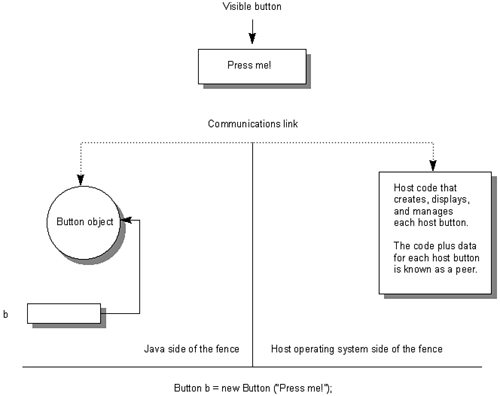
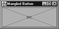
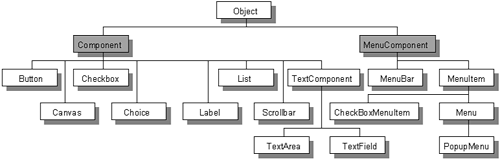
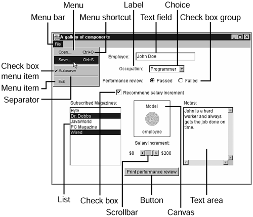
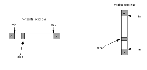
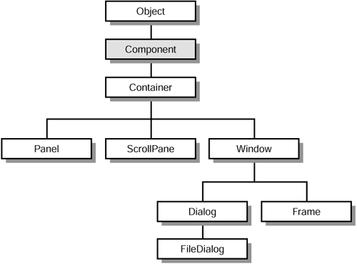
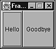
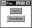
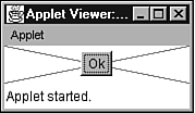
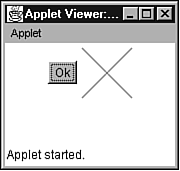
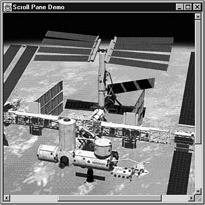
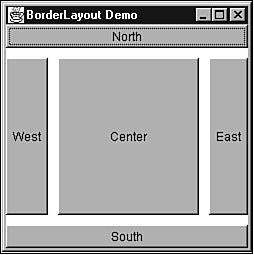
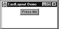
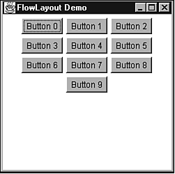
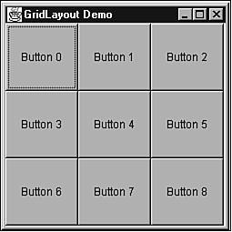
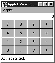
EAN: 2147483647
Pages: 353