| Perhaps the most commonly seen use of 3-Dgenerated animations is rotating text or logos in a Flash-generated user interface. Although these work as animated decorative elements, they can also be a functional part of the interface itself. With a little planning and forethought, any number of simple Swift 3D animations can be incorporated into menus , buttons , levers, doors, and sliding, folding, or flipping panels. But, remember, use restraint. If you've got everything on your page madly spinning and rotating, you're just going to distract your users, not engage them. This is a case of a little going a long way. It's like a simple black dress and pearlskeep it classy and elegant, not garish. In the next exercise, you'll take the output from the Swift 3D file and import it into a Flash file as the rotating main display panel of an interface. Exercise 12.3 Incorporating an Animated 3-D SWF into Your Flash Movie This movie has been started for you already. You'll import the 3-D sequence that was generated by Swift 3D and incorporate it into the interface. -
Open rotate.fla in the Chapter_12/Assets folder on the CD. You currently have two layers: the Interface (see Figure 12.7) and Buttons layers . Figure 12.7. Here's the 3-D interface before you import the rotating panel (in the file, the background is blue, not white). 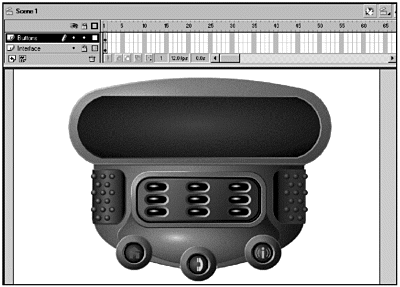 You want to import the rotating panel, but you don't want it to be on the main timeline. It should be in its own movie clip. -
Create a new movie clip (Insert > New Symbol) and name it panel. Click OK. -
Rename the current layer Panel. Choose File > Import, and select readout.swf in the Chapter_12/Assets/3D folder, or import the animation that you created instead. The rotating panel imports as a frame-by-frame animation on 1920 frames . Yes, it varies sometimes. No, I don't know why. -
If the SWF was exported in Flash 5 format, you're good to go. If it was exported in Flash 4 format, there will be an extra frame with text on it in frame 1. In this case, delete frame 1 by selecting it, right- or Control-clicking, and choosing Remove Frames. This frame is inserted by Swift 3D to get around an export issue with Swift 3D and Flash 4. You can safely get rid of it. -
Scrub through the frames. You will occasionally get one or two frames that don't render properly. Remove any bad frames. If you are using the readout.swf from the CD, you'll need to remove frame 18. -
You're going to need to modify this clipyou want all the frames centered on the movie clip's registration point (crosshair), and you need to break them apart so that you can fill the center with color . To make all your changes at once, select the Edit Multiple Frames button beneath the timeline; then select the Modify Onion Markers button and choose Onion All. (See Figure 12.8.) Drag a marquee around all the panels, and center them to the Stage using the Align panel (Window > Panels > Align). Figure 12.8. Use the Edit Multiple Frames with Modify Onion Markers > Onion All to select all the images on all the frames. 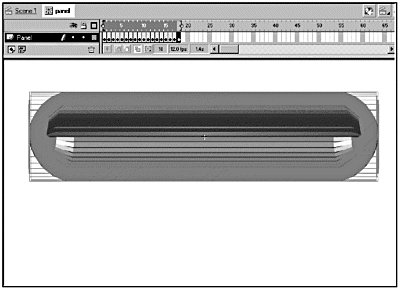 -
Before you deselect your mass of panels, choose Modify > Break Apart. Turn off the Edit Multiple Frames button. -
One more bit of prep work here: You need to fill the center of the panels with black. Select the Paint Bucket with a black fill, and fill the centers frame by frame. Make sure that you deselect the panel before you use your Paint Bucket. The keyboard shortcuts are useful here: V for the Selection tool and K for the Paint Bucket. -
Go back to your main timeline and add a new layer called Panel. Drag the panel movie clip from the Library onto the Stage, and center it over the open window on the Interface. (See Figure 12.9.) Figure 12.9. The rotating panel is in place in the 3-D interface. 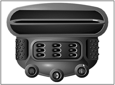 -
Save and test your movie. You could stop here. You've already integrated the 3-D element into your interface. But that would be boring. You've got all those little buttons at the bottom of your interface. Wouldn't it be nice if they actually controlled the 3-D panel? How about if they made the panel rotate and swap out section elements? To make that work, you could just duplicate the frames that you currently have for each of the sections of the navigation, but that would be inefficient and would bloat the file size . So how do you keep your file lean and mean but still make it interesting? Easy. You just use the one copy of the panel movie clip that you have on the Stage and overlay it with a movie clip that has the section information. Exercise 12.4 Adding Interactivity to the 3-D Panel To make your 3-D panel interactive, you'll have to use some ActionScript. -
First, you want the panel to rotate once and stop. Double-click the panel movie clip in the Library, and add a new layer called Actions. Add a keyframe in frame 10 of the Actions layer, and launch the Actions panel. Add the following action to the Actions list: stop(); -
You know that you need to talk to the panel movie clipit needs an instance name. Go back to the main timeline, and select the panel movie clip on the Stage. Open the Instance panel (Window > Panels > Instance), and give this movie clip an instance name of panel. Leave the Instance panel open; you'll be using it again. -
The Sections movie clip has already been created. Double-click it in the Library to open it and see what it does. Scrub through the timeline. Notice that every 10 frames there's a new movie clip. You'll also see three labeled frames: Blue, Yellow, and Green. (See Figure 12.10.) Figure 12.10. The sections movie clip in your Library contains movie clips for the three color-coded sections. The beginning frame for each animation has its own label name. 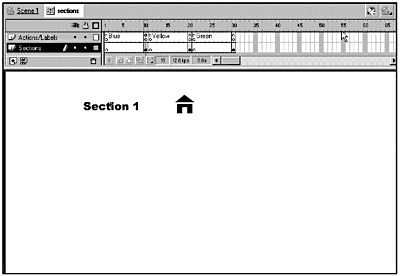 -
Go back to your main movie and add a new layer to the top of the stack; name it Sections. -
Drag a copy of the sections movie clip onto the Sections layer, and center it over the top of the panel movie clip. Make sure that the sections movie clip is selected, and use the Instance panel to give it an instance name of sections. If you have trouble selecting the sections movie clip, hide the Panel layer. You have only one thing left to dowell, three things, really, but that's only because you have three buttons to activate. -
Select the button on the left (blue), and launch the Actions panel. When the button is released, you want two things to happen. First, the panel movie clip needs to do its little rollover routine. Second, you want the section information for the button that you pressed to show up in the panel. Because the buttons are on the main timeline, you just need to tell the button the instance name of the movie clip that you're interested in and what you want it to do. You want the panel movie clip to go to and play starting at frame 1. -
Enter the following code in the Actions panel: on(release) { panel.gotoAndPlay(1); sections.gotoAndPlay("Blue"); } The line, panel.gotoAndPlay(1); tells the panel movie clip to go to frame 1 and start playing. The next line tells the sections movie clip to go to the frame labeled Blue and play. -
You need to do almost the same thing for the Yellow and Green buttons; the only change is the label name in the second gotoAndPlay(). Add the code for the button actions for the Yellow button: on(release) { panel.gotoAndPlay(1); sections.gotoAndPlay("Yellow"); } Also add the code for the Green button: on(release) { panel.gotoAndPlay(1); sections.gotoAndPlay("Green"); } -
Save and test your movie. Now you've not only integrated the external SWF, but you've also made it useful! The Background Interface To give the interface more personality than the black-lined, cartoon-like feel common to many Flash graphics, you need to add a background interface. I liked the metaphor of a remote control and designed one to hold my buttons. This graphic was actually completed in several stages. The interface was built around the 3-D panel imported from Swift 3D. The basic steps were as follows : -
Start with a line drawing (see Figure 12.11). Figure 12.11. The entire design for this interface is built around the imported 3-D panel. The initial design is a simple line drawing. 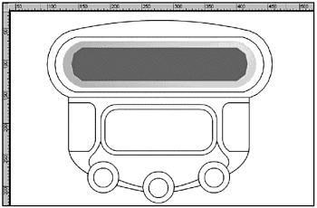 -
Add the basic colors (see Figure 12.12). Figure 12.12. When the line drawing is complete, the next step is to work out the basic color scheme. 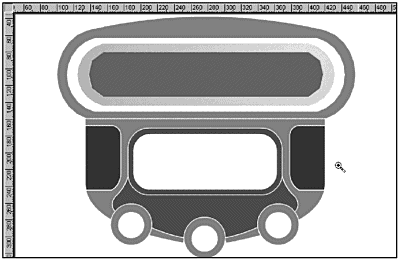 -
Add in the basic gradients (see Figure 12.13). Figure 12.13. The whole idea behind this exercise is to create a 3-D interface, so you can use gradients to give the existing fills a more three-dimensional feel. 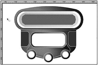 -
Selectively convert certain lines to fills and apply appropriate gradients (see Figure 12.14). Figure 12.14. The final step is what really unifies this pieceselectively converting some of the lines to fills and adding gradients. 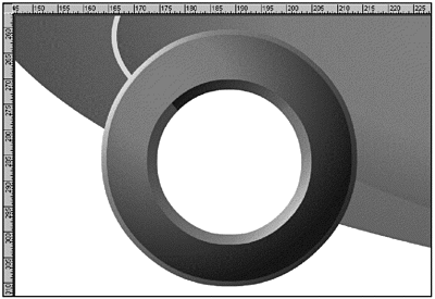 Perhaps the greatest point of interest worth mentioning here is that you can do away with that trite black-lined, cartoon-like look and achieve rendered quality results by selectively converting certain lines to fills (Modify > Shape > Convert Lines to Fills) and then applying the appropriate gradients. Like everything else, if used with proper lighting in mind, it creates a very solid, tight look and 3-D feel. That's a nice little terse description, but how do you really do it? This is one of those cases where practice is your best teacher. In the next exercise, you get to play around with converting lines to fills and adding gradients to the fills. Exercise 12.5 Converting Lines to Gradient Fills By converting lines to fills and adding gradients, you give your object a much smoother and more realistic look. -
Open linestofills.fla in the Chapter_12/Assets/3D folder. -
Use the Zoom tool to drag a marquee around the two button slots on the lower left of the uncompleted interface. As you can see in Figure 12.15, the two button slots look significantly different. The one on the right uses simple solid lines. The one on the left uses a line converted to a fill with a gradient. Figure 12.15. The close-up of the two lower-left buttons shows the difference between solid lines and lines that have been converted to fills with a gradient added. 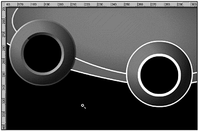 Pay attention to how the gradient is set up. The light source is to the upper left. That means that the outer rim of the button will show a highlight on its upper-left edge. Conversely, the inner rim shows a highlight on its lower-right edge. In the next step, you'll set up the second button to match the first. -
Select the Eyedropper tool and click on the gradient in the outer rim of the button on the left. Open the Fill panel (Window > Panels > Fill) and look at the way the gradient is set up. It's a four-color linear gradient, with the leftmost gradient well being a pale pinkish-red and the rightmost gradient well being nearly black. (See Figure 12.16.) The Hex colors for the gradient wells are as follows: Left: #FFCCCC Left center: #F80000 Right center: #660000 Right: #2F0000 Figure 12.16. The Fill panel shows the setup for the grad ient that you'll be working with. 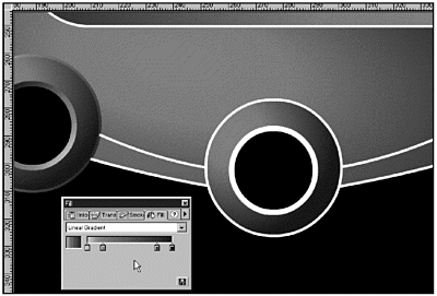 -
Select the complete outer rim of the button slot on the right. You'll have to Shift-click to get all the pieces. Choose Modify > Shape > Convert Lines to Fills. -
Select the Eyedropper tool again, and click the outer rim of the left button slot. The gradient should be immediately applied to the button slot on the right. Switch to the Arrow tool (V), and click on the Stage to deselect the gradient fill. You'll probably need to adjust the alignment of the gradient a bit. -
Select the Paint Bucket tool, and then select the Transform Fill button. Click the gradient that you just applied, and play around with the settings (rotate and expand) until you have the effect you want. There's no real science to this; you just have to eyeball it. Use the first button slot as your reference point. Figure 12.17 shows the rotated and expanded Transform Fill bounding box. Figure 12.17. Use Transform Fill to rotate and expand the gradient for your new fill until it accurately reflects the light source. 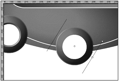 -
Repeat Steps 46 for the inner rim of the button slot. This time, you'll rotate the gradient with the Transform Fill tool so that the lower right is highlighted. -
You can continue in the same vein for the rest of the lines, not just the button slots. When you view the file that you started with next to the completed file (see Figure 12.18), you can clearly see how converting lines to gradient fills dramatically alters the look and feel of the entire piece. In fact, many people might question whether your interface was done in Flash at all. Figure 12.18. When used properly, converting lines to gradient fills can add a nearly photo-realistic feel to your Flash project. 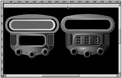 Yet another way to simulate 3-D in Flash is to use a little visual trickery along with scaling and brightness changes.  |