User Input Validation
User Input ValidationASP.NET provides a set of Web server controls called validation controls that provide sophisticated validation on both the client side and the server side depending on the validation settings and the browser's capabilities.
ASP.NET validation controls derive their basic functionality from the BaseValidator abstract class available in the System.Web.UI.WebControls . Table 3.10 lists some of the important members of the BaseValidator class. Table 3.10. Important Members of the BaseValidator Class
Using the Page.Validate() Method and Page.IsValid PropertyAs you can see in Table 3.10, each validation control maintains an IsValid property that indicates the status of the validation test. The Page control that hosts the Web controls also contains a property called IsValid that indicates the status of the validation for the whole page. When all the validation controls on the Web form set their IsValid properties to true , Page.IsValid also becomes true . If the validation fails on any of the validation controls, Page.IsValid is false . The Page class maintains a collection of the validation controls on a Web page that can be accessed through its Validators property. The Page class also contains a Validate() method that invokes the Validate() method of all the validation controls in the page. The Page.Validate() method is used to perform validation programmatically on all the validation controls of a Web page. ASP.NET validation is performed after page initializationthat is, after the Load event of the Page is raised but before the event-handling code is called. Therefore, you cannot know the status of the validation test in the Page_Load() event handler, and the data posted from the client should not be accessed at this stage of page processing. You should always try to use data posted from the client in event-handling code such as the Click event of the Button control. However, if you need to access client-posted data in the Page_Load() event handler, you can do so by calling the Page.Validate() method. Validation Web Server ControlsASP.NET provides the following validation controls that derive their functionality from the BaseValidator class: RequiredFieldValidator , RegularExpressionValidator , RangeValidator , CompareValidator , and CustomValidator . These validation controls are usually associated with the input server controls on which the validation needs to be performed. For validation to work properly, the validation control and the input server control should be placed in the same container control. The validation controls are usually placed next to the associated input control so that you can display error messages or indicators next to the input control. You can associate any number of validation controls with an input server control. For example, the Date of Hire input field in an Add Employee form cannot be left empty (validated through the RequiredFieldValidator control) and should be less than or equal to the current date (validated through the CompareValidator control). You'll learn more about the validation Web server controls in the following sections. The RequiredFieldValidator ControlThe RequiredFieldValidator control can be used to check whether the input control contains an entry. It makes the associated input control a required field in the Web page and ensures that some input data is passed to it. The control also trims whitespace prior to checking for the required field entry. The RequiredFieldValidator control contains a special property called InitialValue that can be passed the initial value of the associated input control. During validation, if the input control's validation property contains the same initial value or is empty, it sets IsValid to false , indicating that the validation failed. For example, a drop-down list might allow users to select a state and when the page loads, its initial value could be Select a State . If a RequiredFieldValidator control is associated with the drop-down list control, its InitialValue property can be set to the same initial value of the drop-down list Select a State . When the validation occurs, the validation control ensures that the item selected in the drop-down list is not the item set in the InitialValue property of the validation control.
The RegularExpressionValidator ControlThe RegularExpressionValidator control checks whether the associated input control's validation property matches a specified pattern. This pattern is specified by the ValidationExpression property using a regular expression. If you are not familiar with regular expressions, you can find more information in the Microsoft .NET Framework documentation. The RangeValidator ControlThe RangeValidator control is used to check whether the input control contains a value in the specified range. You can check the range of values against different data types such as String , Date , and Integer . Table 3.11 shows the important properties of the RangeValidator class. Table 3.11. Important Properties of the RangeValidator Class
The CompareValidator ControlThe CompareValidator control is used to compare the input server control's value against another value. The CompareValidator control can compare against a value specified to the validator control or against the value of another input control. The comparison can be made with different comparison operators such as equal, greater than, and so on. A special comparison operation can be used to verify that the associated input control's value is in the specified data type. You can make comparisons against various data types, such as String , Date , Integer , and so on. Table 3.12 shows the important properties of the CompareValidator class. Table 3.12. Important Properties of the CompareValidator Class
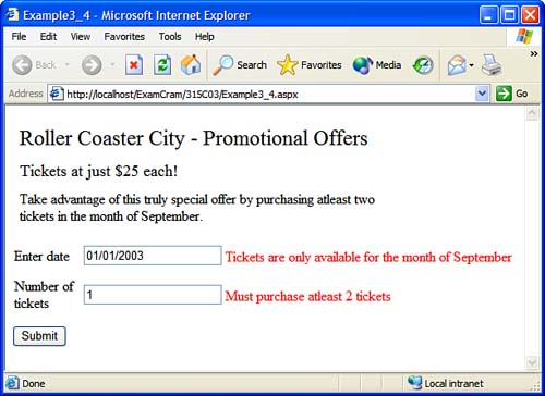
This example shows how to use the RangeValidator and CompareValidator controls on a Web form:
The CustomValidator ControlThe CustomValidator control allows you to build a validation control for a custom specification. You can perform any custom validation both at the server side and at the client side with the help of this validation control. This control exposes a property called ClientValidationFunction that specifies the name of the client script function to be executed for validation on the client side. This custom validation function is passed two arguments: The first one is the custom validator control, and the second argument is an object that contains two properties IsValid and Value . The Value property contains the value that is to be validated, and the IsValid property is used to set the result of the validation. At the server side, during the validation on the server, the validation control fires a ServerValidate event. An event handler containing the custom validation code is added to this event to perform validation on the server. The event sends a ServerValidateEventArgs object containing event- related data. This object contains two properties: The Value property contains the value of the control that is to be validated, and the IsValid property is used to set the result of the validation. The ValidationSummary ControlThe ValidationSummary control is used to display a summary of all the validation errors of a Web page. It displays the ErrorMessage property of the validation controls in the summary. If the ErrorMessage property is not set, the Text property is displayed as error messages for all the validation controls whose validations fail. Table 3.13 shows the important properties of the ValidationSummary class. Table 3.13. Important Properties of the ValidationSummary Class
|
![MCAD Developing and Implementing Web Applications with Visual C#. NET and Visual Studio. NET (Exam [... ]am 2)](/icons/blank_book.jpg "MCAD Developing and Implementing Web Applications with Visual C#. NET and Visual Studio. NET (Exam [... ]am 2)")
EAN: N/A
Pages: 191