|  A chart often makes numerical data more visual and easier to grasp. With Microsoft Graph, you can create a chart in a document. Just enter your numbers and labels in the datasheet , a spreadsheet-like grid of rows and columns that holds your data in cells (intersections of rows and columns ), and watch Graph create the chart , a graphical representation of the data. The chart has an X-axis (horizontal axis) and a Y-axis (vertical axis), which serve as reference lines for the plotted data. (In a 3-D chart, the vertical axis is the Z-axis.) Each data series , all the data from a row or column, has a unique color or pattern on the chart. The chart is made up of different elements that help display the data from the datasheet. You can format chart objects , individual elements that make up the chart, such as an axis, legend, or data series, to suit your needs. Create a New Graph Chart -
 | Click the Insert menu ' point to Picture ' and then click Chart. | -
 | Click the datasheet's upper-left button to select all the cells, and then press Delete to erase the sample data. | -
 | Enter new data in each cell , or click the Import Data button on the Standard toolbar to insert data from another source, such as Excel. | -
 | Edit and format the data in the datasheet as you like. | -
 | Click anywhere outside of the chart to return to the document. | 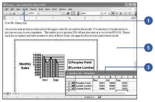 For Your Information Using a Datasheet To perform most tasks on the datasheet, you must first select a specific cell or range of cells. A selected cell, called the active cell , has a heavy border around it. To enter data into the datasheet, you can perform one or more of the following: type your own data into the datasheet, import information directly from another program, such as Microsoft Excel, or copy and paste a specified range of data or a complete worksheet into Graph. Once the data is entered into the datasheet, you can easily modify and format the associated chart. |
Format a Chart Object -
| | Click the chart in the document you want to format. | -
| | Double-click the chart object you want to format, such as an axis, legend, or data series. | -
| | Click the tab (Patterns, Scale, Font, Number, or Alignment) that corresponds to the options you want to change. | -
| | Select the options you want to apply. | -
| | Click OK. | 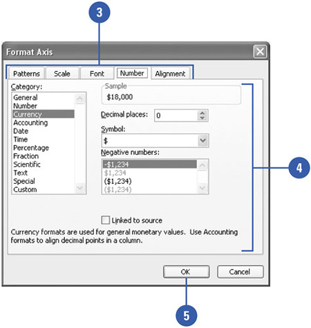 Customize a Chart -
| | Double-click the chart in the document you want to customize. | -
| | Click the Chart menu ' and then click Chart Options. | -
| | Click the tab (Titles, Axes, Gridlines, Legend, Data Labels, or Data Table) that corresponds to the chart object you want to customize. | -
| | Make your changes. | -
| | Click OK. | 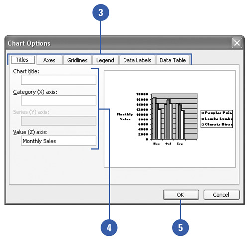 |