Blooper 56: Centering Everything
| < Day Day Up > |
Blooper 56: Centering Everything
One sign of a neophyte Web designer or developer is a tendency to center text, controls, and other elements on the page. It may be because HTML and website layout tools make centering easy, and some Web designers haven't yet learned that centering is usually a bad idea.
That explanation is supported by a similar phenomenon of the mid-1980s, when word-processing software became widely available: For a few years , most party invitations, brochures , wedding announcements, and garage-sale fliers had all their text centered. Why? Because it was suddenly possible. Eventually however, computer users learned that centering should be used sparingly. The phenomenon subsided.
Another explanation is that invisible HTML tables are often used as vehicles for laying out Web pages. The HTML standard is for the content of table cells to be left aligned by default, but some Web development tools automatically set the alignment to centered by default. With such tools, if the developer doesn't specify otherwise , text or other cell content will be centered.
Centering Text
Prose text written in a left-to-right language such as English
is harder to read when centered than when left aligned. [4] The reason has to do
with the way our eyes are trained to scan back and forth over lines of text.
When lines don't start in the same horizontal position, reading is disrupted. See what I mean?
Despite the difficulty of reading centered text, many websites display large blocks of centered prose. Witness, for example, a legal disclaimer at VitaminShoppe.com (Figure 8.13).

Figure 8.13: www.VitaminShoppe.com (Jan. 2002)-Centered legal disclaimer is harder to read than it would be if it were left aligned.
Centering Bullets
Bulleted text suffers from centering more than prose text does. Bullets are supposed to mark list items. Centering bulleted items "buries" the bullets, effectively neutralizing them. It requires slow, laborious zigzag eye movements.
Nonetheless, it is easy to find centered bullets on the Web. The New Hampshire Association of School Principles website has an example. Not only is its mission statement centered, but the bulleted list of links is too (Figure 8.14).

Figure 8.14: www.NHASP.org (Jan. 2002)-Everything is centered, making it hard to scan. Centering bulleted lists makes the bullets useless.
Centering Controls
If it can be placed on a Web page, it can be centered. This holds for controls and for text and other Web "content." Many Web designers do, either because they think centered controls are good or because center alignment is the default setting for their Web development tool.
For example, check out the search controls at zBuyer.com (Figure 8.15). The labels of the controls and the controls themselves are laid out in a column, centered. Besides being ugly, this layout makes the "Go" and "Search" buttons harder to see than they would be if they were all aligned with each other.
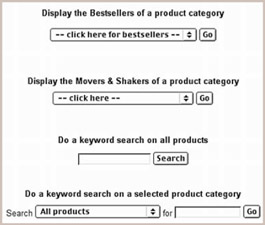
Figure 8.15: www.zBuyer.com (Feb. 2002)-Centered controls are harder to scan in addition to being ugly- It is harder to spot the action buttons.
Centering Everything
Our grande finale example of centering comes from the package-tracking page of ValcoElectronics.com (Figure 8.16). This page centers everything: prose text, controls, and links.
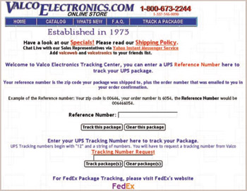
Figure 8.16: www.ValcoElectronics.com (Jan. 2002)-Everything is centered.
Avoiding the Blooper
If new Web designers and developers are the primary perpetrators of excessive centering, it might be tempting to just wait until everyone has enough experience to understand that centering should almost never be used. Of course, that may be a long wait. The Web will always have newcomers. We may be doomed to an eternity of centered Web content. Maybe instead, the World Wide Web Consortium should remove center alignment from HTML and its successors.
Assuming a perpetual supply of new Web designers and that HTML will continue to offer center alignment, the next best option is education, on a massive scale. I will do my part by providing rules about centering. The basic rule is, don't.
In case you need more detail, here are additional rules:
-
Don't center prose. Prose text should never be center aligned. It should be left aligned [5] or justified. Single-line headings and poetry are the only text that should be centered, and even those should be done only sparingly: Many headings are left aligned, and poetry is often not centered.
-
Left-align bullets. Bulleted lists should be aligned so the bullets are aligned; otherwise, the effectiveness of using bullets is greatly reduced. Itemized lists in general should not be centered.
-
Don't accept bad defaults. Don't center content just because it is the default in your Web development tools. The World Wide Web Consortium, which defines HTML, had good reasons for making left alignment the official default for content in table cells. If your Web development tool has center alignment as its default, it is wrong; you should change the default or use a different tool.
[4] For right-to-left languages, right-aligned text is preferred over centered.
[5] If the text is in a language that is written from right to left, it should be right aligned.
| < Day Day Up > |
EAN: 2147483647
Pages: 128
- Article 342 Intermediate Metal Conduit Type IMC
- Article 388 Surface Nonmetallic Raceways
- Article 411: Lighting Systems Operating at 30 Volts or Less
- Notes for Tables 11(A) and 11(B)
- Example No. D10 Feeder Ampacity Determination for Adjustable-Speed Drive Control [See 215.2, 430.24, 620.13, 620.14, 620.61, Tables 430.22(E), and 620.14]