Blooper 41: Too Much Text
| < Day Day Up > |
Blooper 41: Too Much Text
By far the most common mistake to make with text on the Web is to have too much of it. "Blocks of Text" is one of Nielsen's top ten Web-design mistakes for 2002 (see UseIt.com ).
Needless text is bad anytime (Strunk and White, 1979) but is especially bad on the Web. People don't read websites , they scan them. They scan for words and pictures that match their goals (Krug, 2000). Verbose link labels, instructions, and messages just slow people down and "bury" important information.
In Chapter 4, I showed a Checkout page at StanfordBookstore.com that asks a question and provides a poorly defaulted menu to answer it (see Chapter 4, Blooper 24: No Defaults, and Blooper 25: Faulty Defaults). The question itself (Figure 6.1) is an example of too much text.
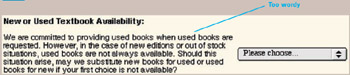
Figure 6.1: www.StanfordBookstore.com (Sept. 2002) ”Question is too wordy.
At the Association of Computing Machinery's website, members are asked to log in. An invalid log in results in a long and confusing error message (Figure 6.2). The last bullet point contains a triple negative!
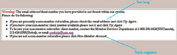
Figure 6.2: www.ACM.org (Sept. 2002) ”Login error message is too long.
Lengthy Links
Textual links, when too long and especially when in lists of links, can be difficult for users to scan. If text is repeated in adjacent links, "scannability" and legibility suffer even more. A long list of links from the California Department of Motor Vehicles' (DMV) website shows this (Figure 6.3). Some of the headings on the page are also unnecessarily wordy. The first heading, for example, needlessly duplicates the phrase "Driver License Information" from the page title just above it.
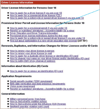
Figure 6.3: www.DMV.ca.gov (Jan. 2002) ”Long textual links are hard to scan, especially in lists and with text repeated in adjacent links.
Avoiding the Blooper
Text should be reduced to the bare essentials: no more than is necessary to convey the intended meaning. Good text on the Web is similar to good text in presentation slides. Thus Web designers should do the following:
-
Keep link labels short: ideally 1 to 3 words.
-
Avoid long passages of prose .
-
Use headings, short phrases, and bullet points.
Web-design authors Jakob Nielsen and Steve Krug both recommend brevity. Nielsen (1999) provides guidelines similar to those listed previously. Krug (2000) warns that long passages of prose won't be read and suggests that web designers "get rid of half of the words on each page, then get rid of half of what's left."
Examples of Cutting Needless Text
An excellent illustration of how wordy text can be cut comes from automaker Jeep.com . In September 2002, it revised the "Find A Dealer" page to simplify it and reduce its verbosity (Figure 6.4). A lengthy paragraph was reduced to one sentence and three bulleted steps. Jeep also eliminated another blooper: it didn't need both zip code and state (see Chapter 2, Blooper 9: Requiring Unneeded Data).
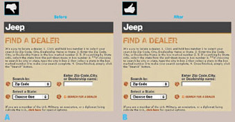
Figure 6.4: www.jeep.com (Sept. 2002) ” A ” Before. Too much text. B ” After. Text reduced and bulleted.
The lengthy question on StanfordBookstore.com's Checkout page could be reduced to one sentence, with a checkbox for responding (Figure 6.5).
Figure 6.5: Improved design for StanfordBookstore.com ”Label drastically shortened .
Even the shortened question is too long, because it covers both new and used book orders. It is asked at checkout and so could be simplified if made to depend on what the customer ordered. For example,
May we substitute used books if no new books are available?
If the customer ordered both new and used books, the site could ask two separate questions.
Avoiding Long Lists of Links
Lengthy links can be avoided by doing the following:
-
Confining the link to the most important phrase of a sentence
-
Removing repeated text from the links, putting it into a subheading
Lists of links can also be made easier to scan by spacing items more. If these design rules were applied to the California DMV's page, a more easily scanned list of links would result (Figure 6.6).
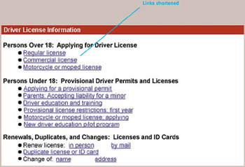
Figure 6.6: Improvement of www.DMV.ca.gov ”Wordy links shortened, repeated text moved to headings, line spacing increased, and headings shortened.
The Real Goals: Scannability and Clarity
It is important to realize that brevity is not itself a goal. Brevity is only a means to designers' true goals: ease of comprehension and navigation, scannability, and clarity. Brevity on the Web is advisable because of empirical observations that Web users do not read Web pages; they scan them. The point of brevity is to facilitate users' ability to comprehend and navigate by scanning.
If a designer forgets this and strives for brevity for its own sake, usability can suffer (Raskin, 2000). Needlessly limiting button or link labels to one word, for example, can appear to users as cryptic arbitrary codes that they have to learn in order to use a website. To paraphrase Albert Einstein, text on the Web should be as brief as possible, but no briefer.
| < Day Day Up > |
EAN: 2147483647
Pages: 128